

Design Poster Project: about Jan Tschichold who is a famous typographer.
This project was done in a typograhpy class 2013 Fall. (Instructor: Richard Poulin)
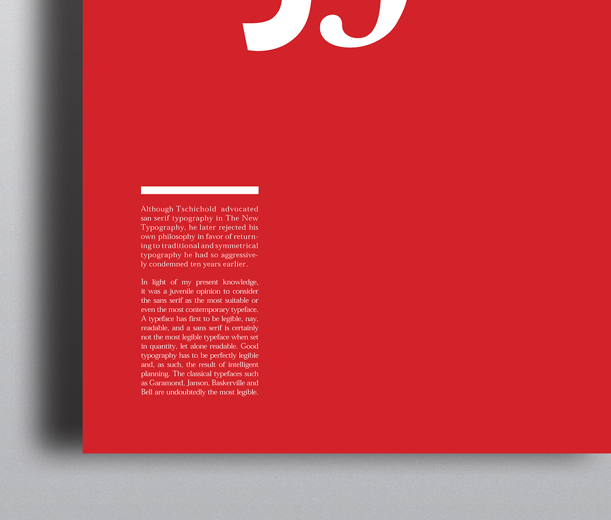
Please let me explain my work in detail.
Above all, the primary story is about Jan Tschichold's design theory.
As you may know, Jan Tschichold first advocated san-serif typography in his 'The New Typography'. However, He rejected his theory while stressing that it was juvenile opinion to consider the san-serif as the most suitable or even the most contemporary typeface.
Then, he went back to traditional style.
I was focusing on that story on my poster.
In detail, there are two 'J's on the very center on the poster and I even get them connected each other. It means that he went back to traditional style from modernism.
The first J is Gill Sans typeface as a meaning of modernistic style.
The reason why I chose the typeface is Tschichold saw to simplify the design through the exclusive use of Gill Sans and even Tschichold's redesigns of the Penguin books consist of the modern type Gill Sans.
The Second J is Sabon typeface which is well-known as his representative typeface.
Sabon is an old style serif typeface, rejecting the modern and fashionable in favor of solid 16th century tradition. As a matter of fact, it is inspired by Garamond and Granjon typeface. ::: rather expression of 'inspired'.. I would say it is a revised version of Garamond.. :*) :::
Furthermore ! I picked red as background color because he considered red as color of communism. Also he used to prefer red than the other color for strong contrast in design.
Thanks for reading and watching my work!

