


Lifestyle Rebrand Design for Lady Moon Co.
We had so much fun on this lifestyle rebrand design project we recently completed for Lady Moon Co. Owner Laura Wong reached out to Ulysses Design Co to help rebrand her business. She already had a strong identity, an active, loyal community and good brand awareness but wanted to take things to the next level. This was a great project for us to be able to collaborate with Laura to develop and grow her brand.
Lady Moon Co. is a online lifestyle coven for the modern witch, run by Laura Wong from Los Angeles. She has a loyal following of witchery practitioners from around the United States. Lady Moon Co. empowers its audience through witchery content, apparel range and podcast series.
Laura’s brand attributes she wanted to focus on were ‘modern, elegant and magical’. To fit this lifestyle rebrand design brief, we started with colour. We create a subtler, more muted palette to fit this more sophisticated brief. We added pale blue, off white, deep purple to a toned down version of her lavender and black to create a more elegant, yet magical palette.
The crystal ball and colour lavender were key indicators from Laura’s existing branding she felt were important to her audience. With this in mind we had to navigate creating a new identity, while retaining some of the legacy features of the original identity. We developed the crystal ball icon by using a crescent moon as its stand. We filled the crystal ball with wavy type to take it in a different direction from the previous logo. To maintain a modern look we used contemporary, yet timeless serif typography which we then hand drew for an inky feel.
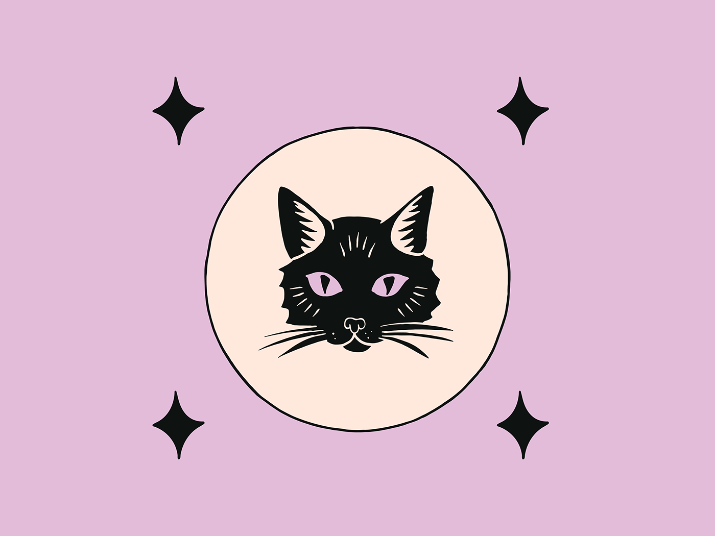
The wavy feel of the type portrayed the off kilter nature of the brand, and this theme carried through to the secondary logos. We created wavy wordmarks to use for horizontal and vertical use. A purple door in witch craft signifies a witch lives in that house. We used this theme to create a portal style logo filled with the cosmos, which reflects the magical brand attribute. Finally we created a whole suite of icons that tie in with witchery including a black cat, snake, candle and stars.
The result is a rebrand that remained true to the brand, but helped Laura take Lady Moon Co. to the next level. She has been able to reach her goal of elevating her brand and positioning it as modern, elegant and magical.
“Paul and Shalina are an absolute joy to work with! My already established brand needed a coherent branding makeover, and they were able to totally elevate and expand on what was already there. Great communication, easy to work with, and most importantly- great energy. Will be working with them again soon!”
Laura Wong


