


Project Overview
Launched in 1977 and successfully entered the analgesic market with rapid and excellent efficacy, Geworin has been with consumers for over 40 years and has established itself as Korea's representative pain reliever. Geworin Soft, released after Geworin Jeong, is a product that focus on 'woman wellness' in line with changing trends and consumer needs, and it needed a unique brand identity and key visual for the product.

Project Goal
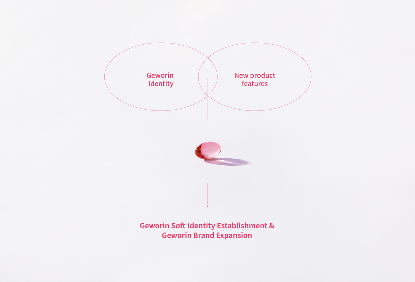
Started in 2019, this project was started with the goal of establishing the identity of Geworin Soft based on the existing Geworin brand value, and establishing consumer-friendly package design and system. The project was carried out considering the consumer awareness of Geworin as a 'fast-acting analgesic' and aiming the 'anti-aging' of the brand through asset linkage.

Brand Core Value
The brand value and direction of Geworin Soft was established by considering the trust that the existing Geworin delivers to consumers, the features of Geworin soft capsules, and core efficacy. In particular, we made the concept of 'My first menstrual analgesic', as the product is composed of mild ingredients that can be taken from 11-year-old girls.

Graphic Motif
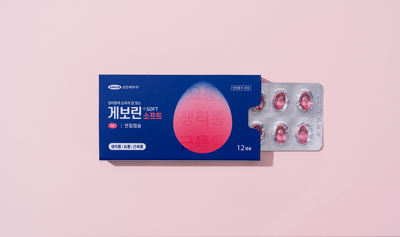
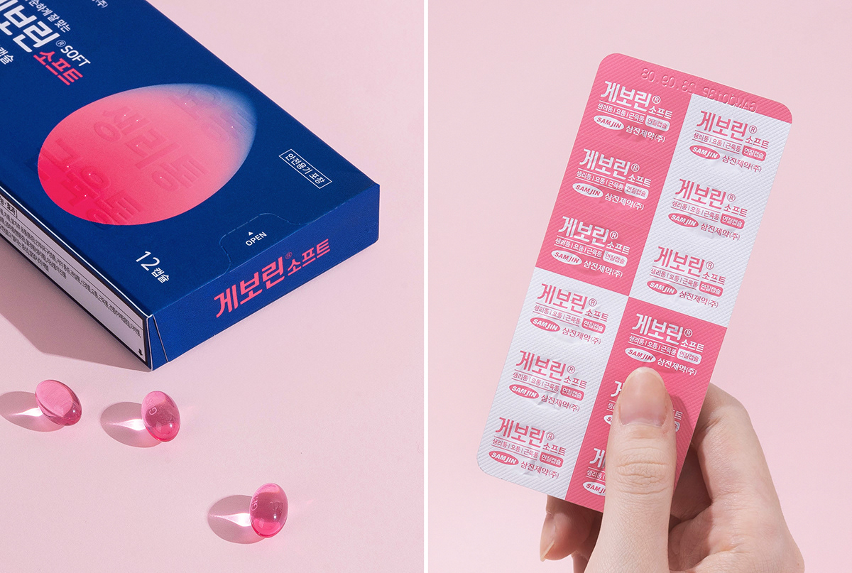
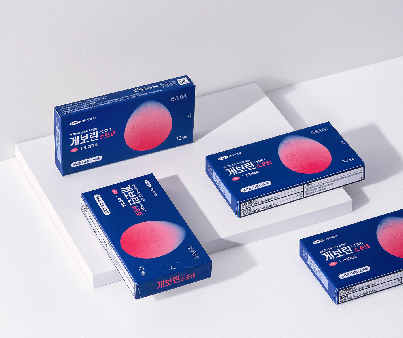
In order to convey the formulation and indications of the product on the package more easily and intuitively, we developed a new graphic artwork unique to Geworin Soft. By visualizing the shape of the drug dissolving and applying a gradient effect, we created a symbolic element to emphasize the 'soft but quickly permeable' product features.

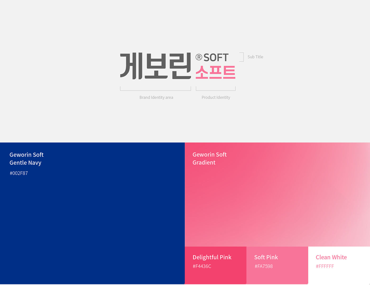
Brand Logo / Color System
Within the established Geworin logo system, we created a unified BI by maintaining the Geworin brand area while applying the soft logotype and brand color to the product identity area. The bold gothic logo type strengthens the trustworthy brand image of Geworin, and we rounded the end of the type to bring out a unique consumer-friendly mood.

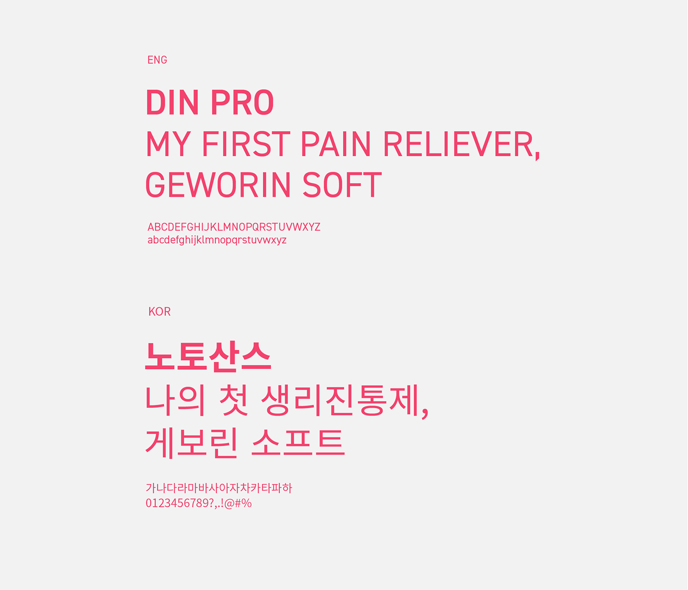
Typography
Based on Geworin Soft's core graphic motif, we have compiled key visual elements that can be used as a means of brand communication both online and offline. For Geworin Soft, DIN pro and noto sans typefaces similar to the formative composition of the brand logo were used. Among the noto sans fonts, I used a font between Regular and bold, which is optimal for package or application and can give a consistent feeling to the brand.
Package Design Strategy
In order to deliver not only the brand identity but also the reliable and professional image of pharmaceuticals, we tried to make the package design deliver accurate information by dividing the brand and communication areas. We placed the artwork and BI in the brand area, product efficacy and other information in the communication area, and then systematized the design so that it can be flexibly applied to the Geworin brand extension and new products.


Instagram


