


A Step Forward
––––
Fit4Life is the largest fitness training and technology distributor in Spain. After 15 years of experience, Fit4Life contacted us with the need of revitalizing its brand. The company main problem was that the original identity was designed a decade a half ago, and it didn't aligned with the current marketplace demands and competition.
Un paso hacia adelante
Fit4Life es el mayor distribuidor de tecnología y entrenamiento físico de España. Después de 15 años de experiencia, Fit4Life nos contactó con la necesidad de revitalizar su marca. El principal problema de la empresa era que la identidad original se diseñó hace una década y media, y ya no responde con las demandas y la competencia del mercado actual.
Agency:
Zenda Studios
Services: Participants:
· Rebranding · Project Management:
· Rebranding · Project Management:
· Stationary Design Facundo Kostelak
· Iconography
· Web Design · Brand Identity Design:
· Animation Bautista de Lusarreta
Unifying Complexity
––––
Since "Fit4Life" is complex word, the first challenge was to simplify and improve its readability while keeping it distinctive. After detailed iterations, we ended up with a word mark that unified horizontal and diagonal lines by customizing each letter anatomy.
Complejidad Unificada
Dado que "Fit4Life" es una palabra compleja, el primer desafío fue simplificar y mejorar su legibilidad manteniendo su distinción. Después de detalladas iteraciones, terminamosz con una marca tipográfica que unifica las líneas horizontales y diagonales al personalizar la anatomía de cada letra.
Dado que "Fit4Life" es una palabra compleja, el primer desafío fue simplificar y mejorar su legibilidad manteniendo su distinción. Después de detalladas iteraciones, terminamosz con una marca tipográfica que unifica las líneas horizontales y diagonales al personalizar la anatomía de cada letra.

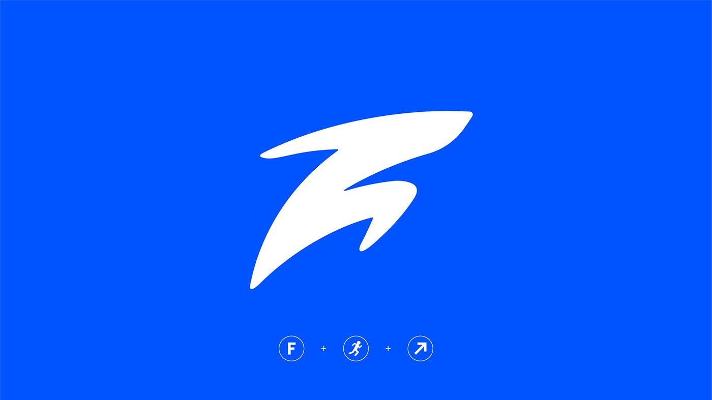
Revitalizing the Symbol
––––––
The original symbol was vital and positive, but hard to apply. We iterated many avenues and alternatives, but the ones that were a reference to the original identity made the final cut. By using the letter "F", the anatomy of an athlete, and an uprising arrow, the new shape prioritized function over form while keeping its original message intact: energetic vitality.
Revitalizando el Símbolo
El símbolo original era vital y positivo, pero difícil de aplicar. Recorrimos muchas alternativas, pero las que eran una referencia a la identidad directa a la original, tomaron mayor fuerza. Usando la letra "F", la anatomía de un atleta y una flecha ascendente, la nueva forma priorizó función sobre la forma manteniendo intacto su mensaje original: vitalidad energética.

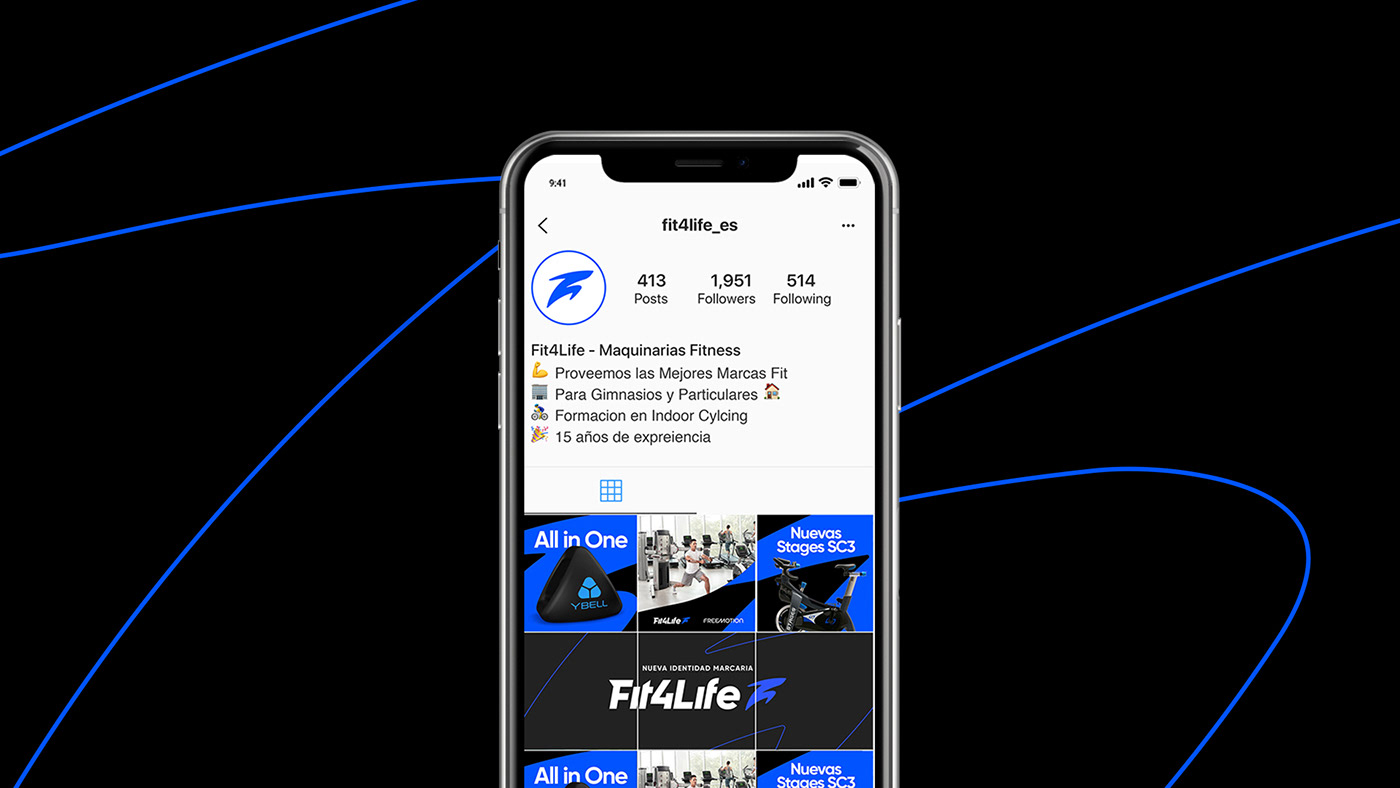
Breaking the Limits
––––––
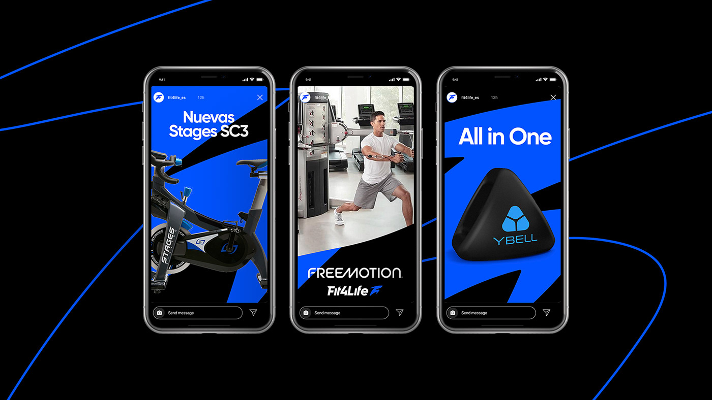
Due to the reduced marketing team, we kept Fit4Life's visual system simple, minimal yet impactful. By using frames from the symbol's anatomy, and imagery from athletes or products we created a system that can adapt to any scale and scenario needed.
Rompiendo los limites
Debido al reducido equipo de marketing, mantuvimos el sistema visual de Fit4Life simple, mínimo pero impactante. Mediante el uso de encuadres del símbolo, e imágenes de atletas o productos, creamos un sistema que puede adaptarse a cualquier escala y escenario necesario.
Debido al reducido equipo de marketing, mantuvimos el sistema visual de Fit4Life simple, mínimo pero impactante. Mediante el uso de encuadres del símbolo, e imágenes de atletas o productos, creamos un sistema que puede adaptarse a cualquier escala y escenario necesario.

A Versatile System
––––––
After talking with the marketing team about the performance and analyzing the brand's touch points, we decided that going beyond the standard vertical and horizontal lockups was needed. We crafted a system that contains four different alternatives and can adapt to different scenarios and circumstances.
Un sistema versátil
Después de hablar con el equipo de marketing sobre el rendimiento y analizar los puntos de contacto de la marca, decidimos que era necesario ir más allá de las típicas variantes verticales y horizontales. Por eso mismo, creamos un sistema que contiene cuatro alternativas diferentes y puede adaptarse a diferentes escenarios y circunstancias.
Después de hablar con el equipo de marketing sobre el rendimiento y analizar los puntos de contacto de la marca, decidimos que era necesario ir más allá de las típicas variantes verticales y horizontales. Por eso mismo, creamos un sistema que contiene cuatro alternativas diferentes y puede adaptarse a diferentes escenarios y circunstancias.
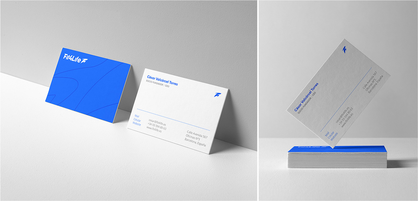
Beyond Stationary
––––
When designing the stationary applications, we double down on the versatile identification system and apply it throughout the entire set of pieces. These not only will work as pieces on their own, but they will serve as an example on how the system should be used when applied.
Más allá de la papelería
Cuando diseñamos las aplicaciones redoblamos el versátil sistema de identificación, y lo aplicamos en todo el conjunto de piezas. Estas no solo funcionarán como piezas, sino que servirán como ejemplo sobre cómo se debe usar el sistema cuando se aplique.
Cuando diseñamos las aplicaciones redoblamos el versátil sistema de identificación, y lo aplicamos en todo el conjunto de piezas. Estas no solo funcionarán como piezas, sino que servirán como ejemplo sobre cómo se debe usar el sistema cuando se aplique.

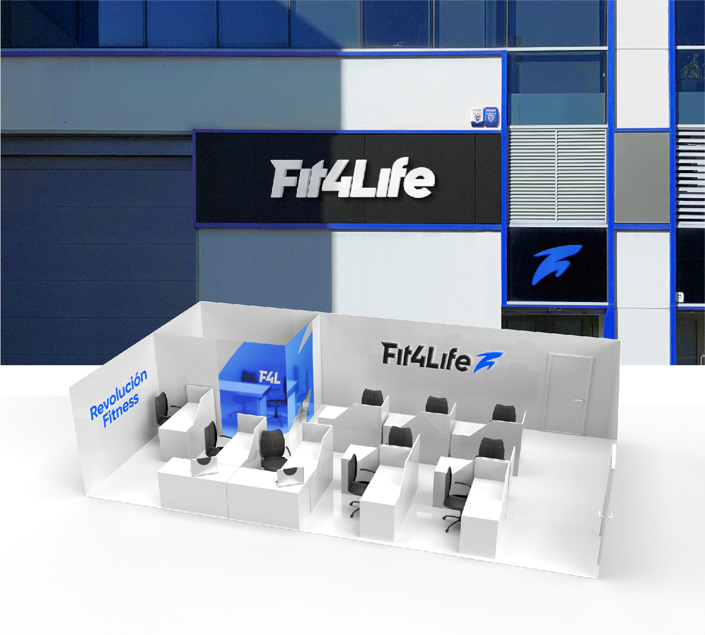
Keeping it Clean & Simple
––––
We redesigned the main office space. Desks were redistributed and optimized to take advantage of the incoming sunlight, and to improve communication between the team members. The private office was plotted with a semi-transparent blue to increase meeting's focus and privacy. Most walls were kept clean with the exception of the logotype and the brand's mission statement: fitness revolution.
Manteniéndolo Claro y Simple
Rediseñamos el espacio de la oficina principal. Los escritorios se redistribuyeron y optimizaron para aprovechar la luz solar entrante y mejorar la comunicación entre los miembros del equipo. La oficina privada se ploteó con un azul semi-transparente para aumentar el enfoque y la privacidad de la reunión. La mayoría de las paredes se mantuvieron limpias con la excepción del logotipo y la declaración de misión de la marca: revolución fitness.

Categorizing Fitness
––––
F4L has more than 30 products in their portfolio. A set of icons were designed to englobe and categorize them for better distribution and recognition inside the website.
Categorización Fitness
F4L tiene más de 30 productos en su cartera. Se diseñó un conjunto de iconos para englobarlos y categorizarlos para una mejor distribución y reconocimiento dentro del sitio web.
Categorización Fitness
F4L tiene más de 30 productos en su cartera. Se diseñó un conjunto de iconos para englobarlos y categorizarlos para una mejor distribución y reconocimiento dentro del sitio web.


Identification's Structure
––––
To keep things simple and concise, we opted to apply grid systems throughout both the symbol and wordmark. Doing this helped us filter out unnecessary details by finding ways to merge and reduce them.
Estructura de Identificadores
Para mantener las cosas simples y concisas, optamos por aplicar sistemas de cuadrícula tanto en el símbolo como en la marca tipográfica. Hacer esto nos ayudó a filtrar detalles innecesarios al encontrar formas de fusionar y reducirlos.
Estructura de Identificadores
Para mantener las cosas simples y concisas, optamos por aplicar sistemas de cuadrícula tanto en el símbolo como en la marca tipográfica. Hacer esto nos ayudó a filtrar detalles innecesarios al encontrar formas de fusionar y reducirlos.
Logotype's Redesign Launch
––––
A short video was edited to promote the company's rebrand. It was repurpose in all their social media accounts and sent as an email blast to their current client's and newsletter subscribers.
Lanzamiento de rediseño del logotipo
Se editó un breve video para promover el cambio de marca. Se reutilizó en todas sus cuentas de redes sociales y se envió en nu correo electrónico a sus clientes actuales y suscriptores de newsletter.
Se editó un breve video para promover el cambio de marca. Se reutilizó en todas sus cuentas de redes sociales y se envió en nu correo electrónico a sus clientes actuales y suscriptores de newsletter.
Thanks for your attention!
Gracias por tu atención!


