

B R I E F
The Quirky Pineapple Studio needed new merch to showcase their brand-voice for talks, classes and clients. These project was exciting because their want me to transform three awesome phrases combining lettering and illustration to create products that would need to look powerful, diverse and with a spice of retro-whimsical. Projects that have really in mind femela representation and positive messeges that wanna make it fun are the ones that I would feel more conftourble to make.
--
El Quirky Pineapple Studio necesitaba un nuevo merchandising para mostrar la voz de su marca en charlas, clases y clientes. Este proyecto fue emocionante porque quieren que transforme tres frases increíbles que combinan letras e ilustraciones para crear productos que deberían verse poderosos, diversos y con un toque retro-caprichoso. Los proyectos que realmente tienen en mente la representación femenina y los mensajes positivos que quieren que sea divertido son los que me sentiría más confiado de hacer.


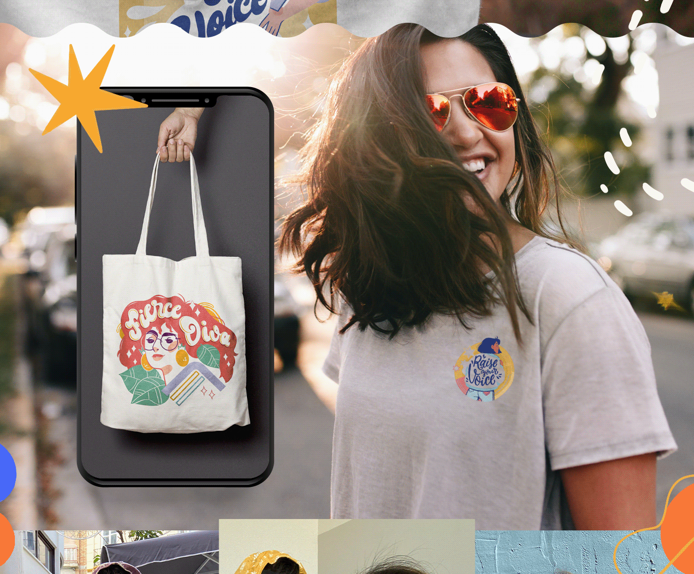
For me the designs needed to have a lot more from the 60's - 70's references give by the client. These two complicated decades due to their political, musical and fashion history. For me the reference needed to be not only in the lettering but in the illustration, so in order to reflect the best of that time I added elements that made the illustration feel dynamic; with the characters in poses similar to superheroes, full of strength and confidence. These people know their value, which in this case comes from phrases.
-
Para mí los diseños debían tener mucho más de las referencias de los años 60's - 70's dadas por el cliente. Estas dos complicadas décadas por su política, música y moda. Para mí, la referencia tenía que estar no solo en las letras sino también en la ilustración, así que para reflejar lo mejor de esa época, quería agregar elementos que hicieran que la ilustración se sintiera dinámica; con los personajes en poses similares a superhéroes, llenos de fuerza y confianza. Estas personas conocen su valor, que en este caso proviene de frases.
We also needed to keep in mind the printing technique they were gonna use, since it could change over time, so we went with flat bright colors (as their brand use) and a mid size color palette to start with digital prinintg, but with the possibility of just use the lettering and some other elements to make color palette smaller and keep the same fun vibe on them.
-
También necesitábamos tener en cuenta la técnica de impresión a utilizar, ya que podía cambiar con el tiempo, por lo que optamos por colores planos brillantes (como de su marca) y una paleta de colores de tamaño medio para empezar con la impresión digital, pero con la posibilidad de usar el lettering y algunos otros elementos para hacer que la paleta sea más pequeña y mantener el mismo ambiente divertido en ellos.


Even though these illustrations were think for t-shirts we would need to have in mind other uses for the future. Like hoodies, tote bags, enamel pins, etc. That why we didn't want to confort with minimal designs but with something that could pop to the eye once is apply in any type of merch.
-
Aunque estas ilustraciones fueron pensadas para camisetas, deberíamos tener en cuenta otros usos en el futuro. Como sudaderas con capucha, bolsos tote, pins y más. Por eso no queríamos confortarnos con diseños minimalistas pero con algo que pudiera llamar la atención una vez que se aplica en cualquier tipo de merchandising.


I'm always available for commissions so,
If you want to work with me, write me to esvaleriadiaz@gmail.com
Follow me too @esvaleriadiaz :)


