


--
Logo Redesign
Design de Marca e Produção Fotográfica.
Design de Marca e Produção Fotográfica.
Projeto realizado em 2019 de reposicionamento da marca Ponto Íntimo, uma loja conhecida na região do litoral norte do RS pela revenda de roupas íntimas e de moda praia. A imagem a seguir apresenta a antiga marca da loja Ponto íntimo. É notável a utilização de uma tipografia moderna, mas bem comum e sem nenhuma estilização de fonte. Acompanhando o nome da loja, um símbolo da flor de girassol em vetor com pouco contraste e genérico, além de um decodificador sinalizando o estilo de roupas da loja. Em suma, uma identidade fraca e pouco memorável.
Project carried out in 2019 to reposition the Ponto Íntimo brand, a store known in the northern coast of RS for the resale of underwear and beachwear. The following image shows an old brand from Ponto Intimate store. It is notable the use of a modern typography, but very common and without any font stylization. Accompanying the store's name, a generic, low-contrast vector of a sunflower flower and a decoder of the store's clothing style. In short, a flawed identity and little.
Project carried out in 2019 to reposition the Ponto Íntimo brand, a store known in the northern coast of RS for the resale of underwear and beachwear. The following image shows an old brand from Ponto Intimate store. It is notable the use of a modern typography, but very common and without any font stylization. Accompanying the store's name, a generic, low-contrast vector of a sunflower flower and a decoder of the store's clothing style. In short, a flawed identity and little.

--
Identidade Visual
Ter uma marca forte é essencial para se diferenciar no mercado. Deve ser marcante, rapidamente reconhecível e comunicar a imagem que a empresa deseja transmitir ao seu público consumidor. O processo criativo do projeto foi bem difícil, pois a cliente não tinha clareza dos seus direcionadores estratégicos, ficando em dúvida sobre quais elementos usar como símbolo, se um girassol, uma concha... até mesmo uma sereia citada discutido nas reuniões. Acredito que como designer, é fundamental saber comunicar e vender suas ideias, além de orientar o cliente sobre o que funciona e o que não funciona. Olhamos pro mercado, identifiquei marcas que ela gosta, empresas que ela acredita que o seu público também consome e com essa chuva de informações, comecei com os desenhos à mão de possíveis logos. Escolhi dois tipos diferentes de tipografia e símbolos para apresentar as primeiras versões e captar o gosto do cliente. A seguir, apresento os três elementos usados para inspiração e a nova identidade visual.
Having a strong brand is essential to differentiate yourself in the market. It must be striking, quickly recognizable and communicate the image that the company wants to convey to its consumer audience. The creative process of the project was very difficult, as the client was not clear about its strategic directions, being in doubt about which elements to use as a symbol, whether a sunflower, a shell... even a mermaid mentioned discussed in the meetings. I believe that as a designer, it is essential to know how to communicate and sell your ideas, in addition to guiding the client on what works and what does not. We looked at the market, identified brands she likes, companies that she believes her audience also consumes and with this rain of information, I started with the hand drawings of possible logos. I chose two different types of typography and symbols to present the first versions and capture the customer's taste. Next, I present the three elements used for inspiration and the new visual identity

espaço

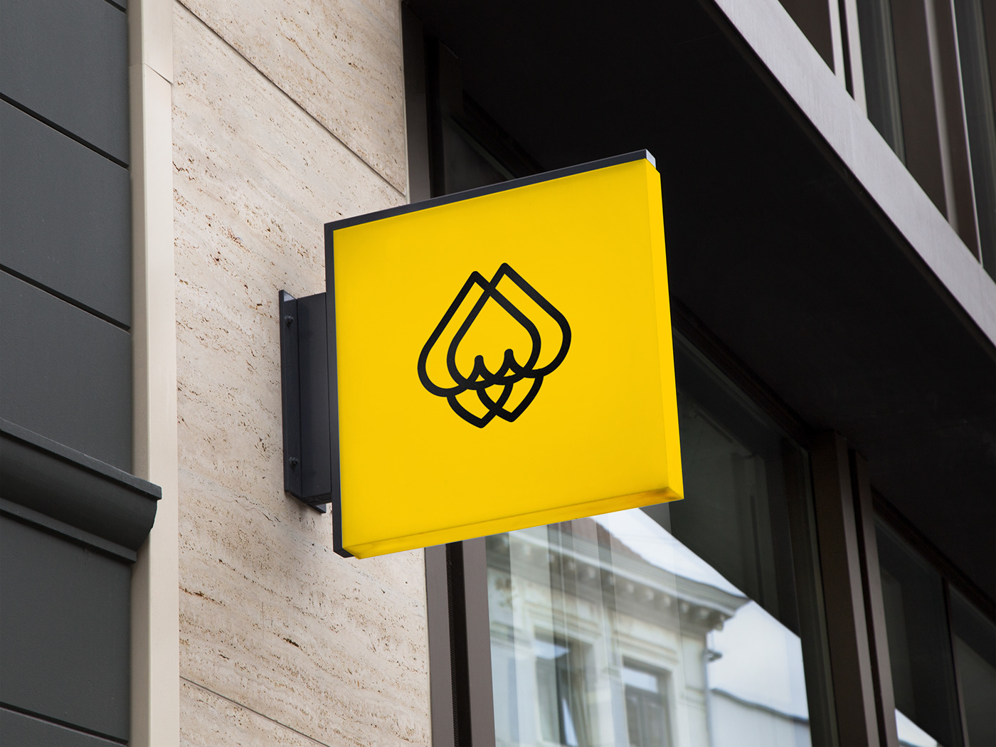
Mantendo sua essência jovem e moderna, agora com uma tipografia mais robusta e estilizada, traz o amarelo vivo do girassol como base da paleta cromática e um símbolo intrigante e autêntico, além do novo slogan que reforça o posicionamento da marca: A beleza de ser, você, de ser belo do jeito que você é. No canto superior direito, de forma discreta um identificador de que essa é a Ponto Íntimo da praia de Tramandaí, o que também remete ao usuário do perfil de loja no instagram. Agora com uma forma sólida e bem definida, essa identidade visual é moderna, forte e marcante. Os cantos curvados e arredondados mantém a organicidade e o símbolo facilita a identificação, o que solidifica a marca na memória do cliente.
Keeping its young and modern essence, now with a more robust and stylized typography, it brings the bright yellow of the sunflower as the basis of the chromatic palette and an intriguing and authentic symbol, in addition to the new slogan that reinforces the brand's positioning: The beauty of being, you, to be beautiful just the way you are. In the upper right corner, discreetly an identifier that this is Ponto Íntimo da Praia de Tramandaí, which also refers to the user of the store profile on instagram. Now with a solid and well-defined shape, this visual identity is modern, strong and striking. The curved and rounded corners maintain organicity and the symbol facilitates identification, which solidifies the brand in the customer's memory.


--
Produção Fotográfica
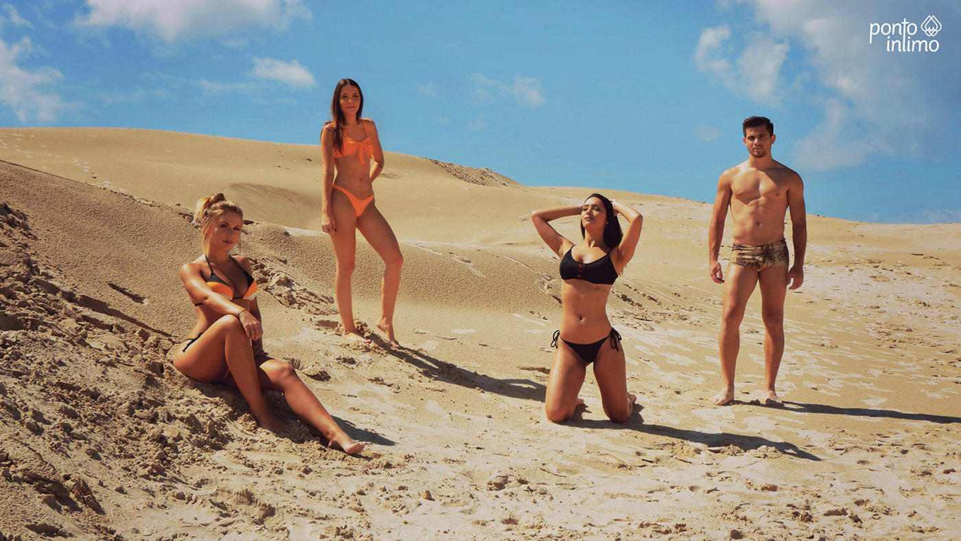
A produção fotográfica foi realizada nas dunas da praia de Cidreira - RS, onde tive o apoio da fotógrafa Laura Bittencourt e a assessoria do designer e estilista, Mário Ferreira na curadoria das peças da nova coleção que combinariam com a nova proposta da identidade visual.
A produção fotográfica foi realizada nas dunas da praia de Cidreira - RS, onde tive o apoio da fotógrafa Laura Bittencourt e a assessoria do designer e estilista, Mário Ferreira na curadoria das peças da nova coleção que combinariam com a nova proposta da identidade visual.
The photographic production was carried out in the dunes of the beach of Cidreira - RS, where I had the support of the photographer Laura Bittencourt and the advice of the designer and stylist, Mário Ferreira in the curatorship of the pieces of the new collection that would match the new proposal of the visual identity.


See ya :)


