


Illustrations for Clayton digital presence, website, security reports, social communication and lots more


In the last five years I was involved in making asset illustrations for Clayton, a company that makes AI-powered code reviews for Salesforce. I started working on their website in 2019 and then went on to work with them making illustrations for their security reports, images for their social media accounts, developer apps digital communication and lots more. They have just revamped their digital presence with a new website and overall brand image designed by Limberbrands. I've contributed with a fresh set of illustrations for their website, some of them a up-to-date take on existing characters, some of them completely new ones. Thanks to Emma and Joseph Harries for the precise and insightful art direction, and to Claudia Orecchioni and Lorenzo Frattini and the whole Clayton team for being some of the best possible clients to work with. To many more years of amazing work!
________________________________________________________
If you are curious, the rest of this projects are some of the previous assets I've developed for them during the years.


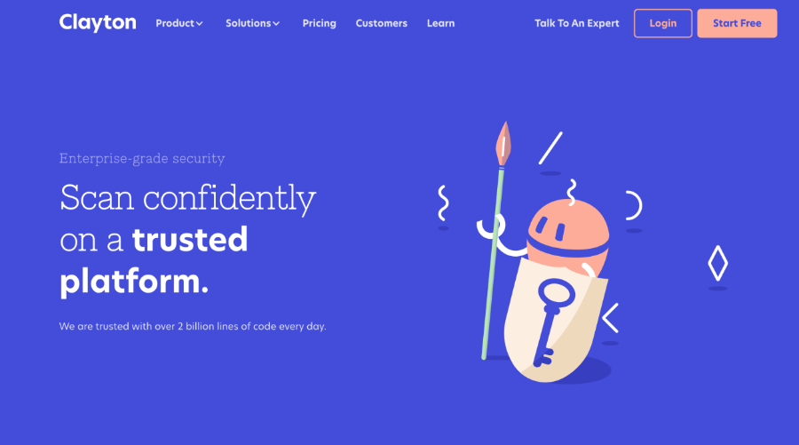
My style of illustration is quite concise, with plenty of flat colors and heavily stylized characters, but I usually work on them with textures, digital ink brushes and noisy gradients to obtain a more "imperfect" and rough effect. This time the assignment was: no texture, no gradients, just plain svg.


The challenge was to be as clear as possible in communicating what they do and how they do it, but still making those illustrations visually interesting and engaging.

It was very much a team effort, the feedback of the project manager and AD that developed their branded image were fundamental, thanks to them I found a number of new solutions to visual puzzles that I usually resolve differently.

One of the main topics was how to visualize data leaving them undefined and vague enough to represent the large range of different markets and sector of their clients, and still visually interesting. I decided to use a geometric Memphis Pattern-style motive.


I added to Clayton's branded colors - electric blue and mint - an orange accent color that gave me a little bit of space to play, while keeping the palette coherent and minimal.
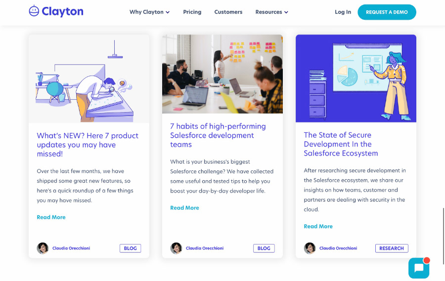
Once we finished working on the assets for the website, we started thinking about the illustrations for their digital communication. I kept all the characters and background elements from the website, and reworked them with my usual patterns, ink brushes and gradients. I felt a more illustrative approach can give a more humane, warm and empathic feeling to the illustrations.


We worked on a report on The State of Secure Development In the Salesforce Ecosystem, some contents and their overall image on social media (Linkedin, Twitter and Facebook).


Finally, we started working on a little animated loop meant to replace the hero illustration the homepage, to explain visually what Clayton does, and how. I made the first illustrations and sketches, then Marco Benisi translated them from static images to animation. As Mark Twain said “I didn't have time to write you a short letter, so I wrote you a long one” it's pretty much the same with a short loop animation: it need to be short, effective, clear, funny, get the message across, and all the above in just a couple of seconds.


We tried a lot of different versions of the scene until we landed on one that was the foundation for the animation.

And then Marco worked it and reworked it until it was jus right.


