


That Frown | Typographical Poster
This project that began in early April was based around the idea of designing a typographical poster that would help poke fun at the saying “Turn that frown upside down”, by the way of a visual style that combines minimalism and simplicity together.
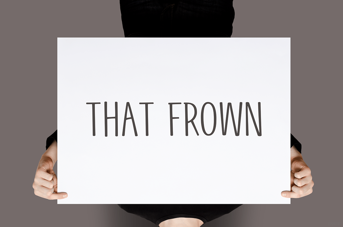
As you will see, the final outcome consists of the words “that” and “frown” being displayed on A1-sized paper, alongside a person holding the paper itself whilst hanging upside down, as this effectively visualizes the saying in a more humorous and somewhat surreal style-of-context.
Also included is that of a grain texture to help push away from a look that would appear too flat and too polished for my own personal liking.
So, be sure to tell me what you think in the comment section below!
This is a non-commercial project.
*Some imagery has been subject to alteration and editing*
Credits:
Fonts - Geektastic
Imagery - Pixabay
Display Mockup - Photoshop4u
Final Outcome
Follow Me:
Pinterest: http://www.pinterest.com/karlbembridge
Dribbble: http://dribbble.com/karlbembridge
Flickr: http://www.flickr.com/photos/kbembridge
Instagram: http://instagram.com/karlbembridge
Vimeo: http://vimeo.com/karlbembridge
Pinterest: http://www.pinterest.com/karlbembridge
Dribbble: http://dribbble.com/karlbembridge
Flickr: http://www.flickr.com/photos/kbembridge
Instagram: http://instagram.com/karlbembridge
Vimeo: http://vimeo.com/karlbembridge


