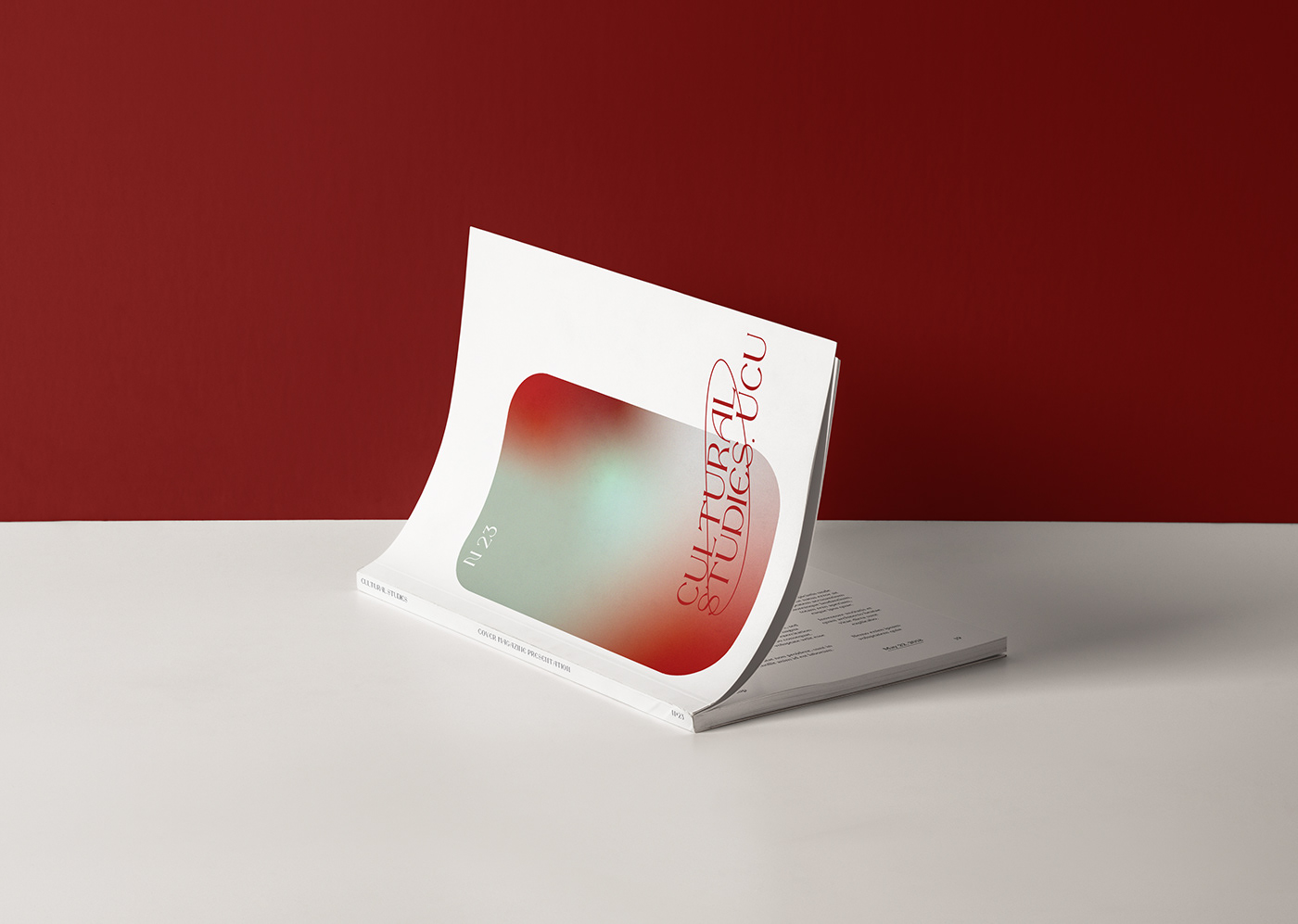
The main features of identity are gradients that combine three colors of programs. Gradients are a symbol of interdisciplinarity. Textual explanations and paragraphs are the idea of "explaining the complex in simple words."
A font logo with a typeface called the "Night's Watch", inspired by Rembrandt's painting (my reference to "We are on guard for science"). I was inspired to orbit by three things: the NASA logo, the round shape as all-encompassing, and the science logo as such - because we have a logo for the humanities, we reject stereotypes that inexact science is not science.