SOVREMENNIK 20/21
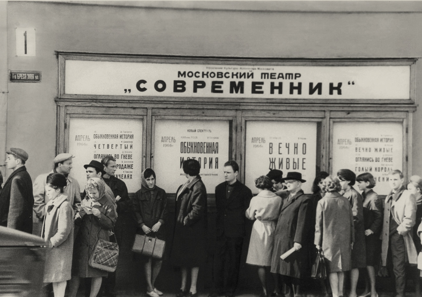
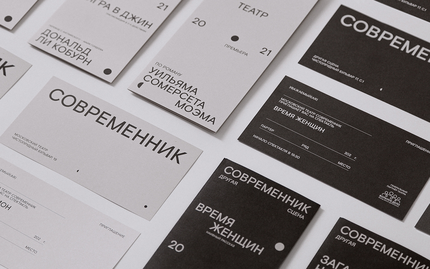
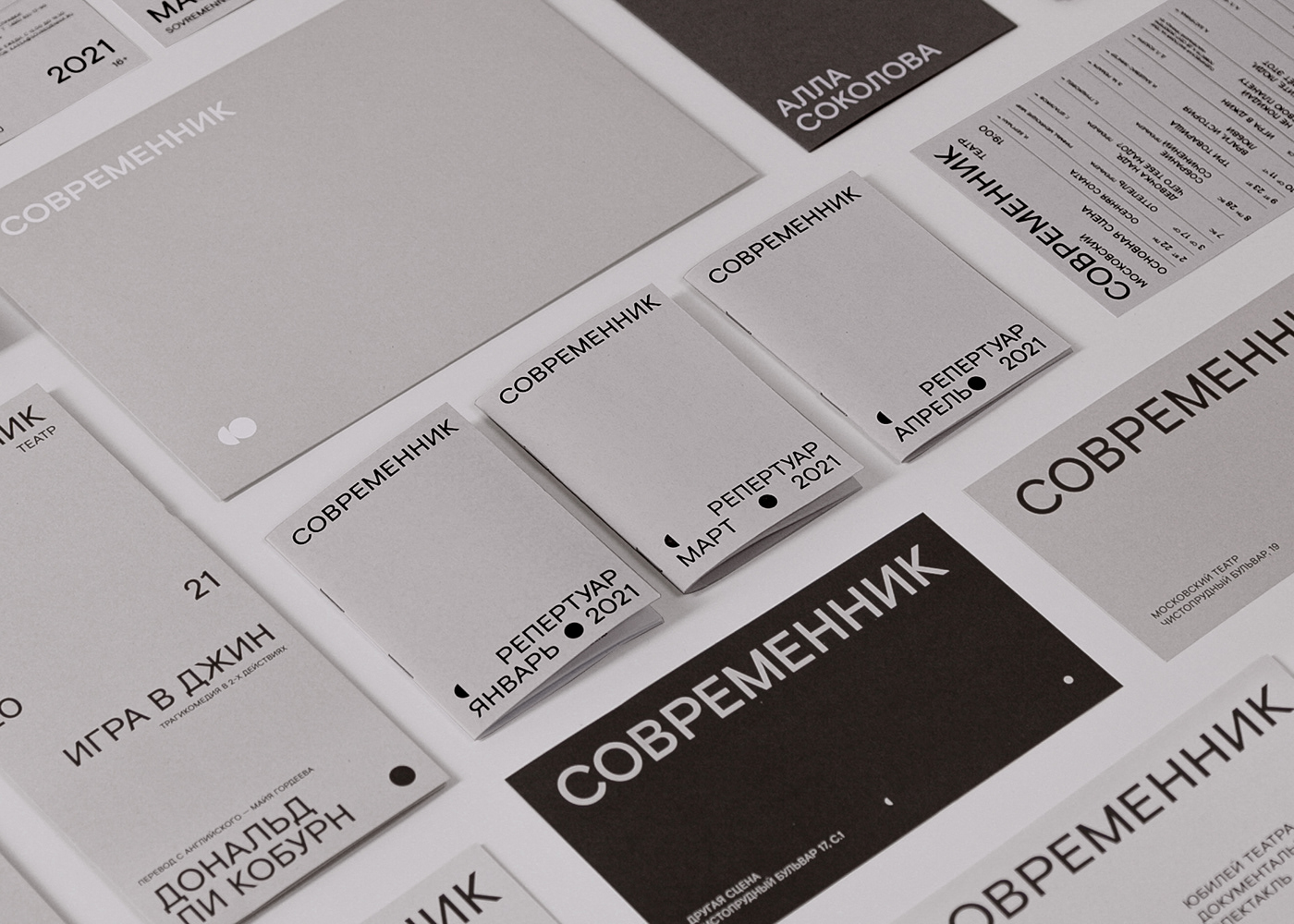
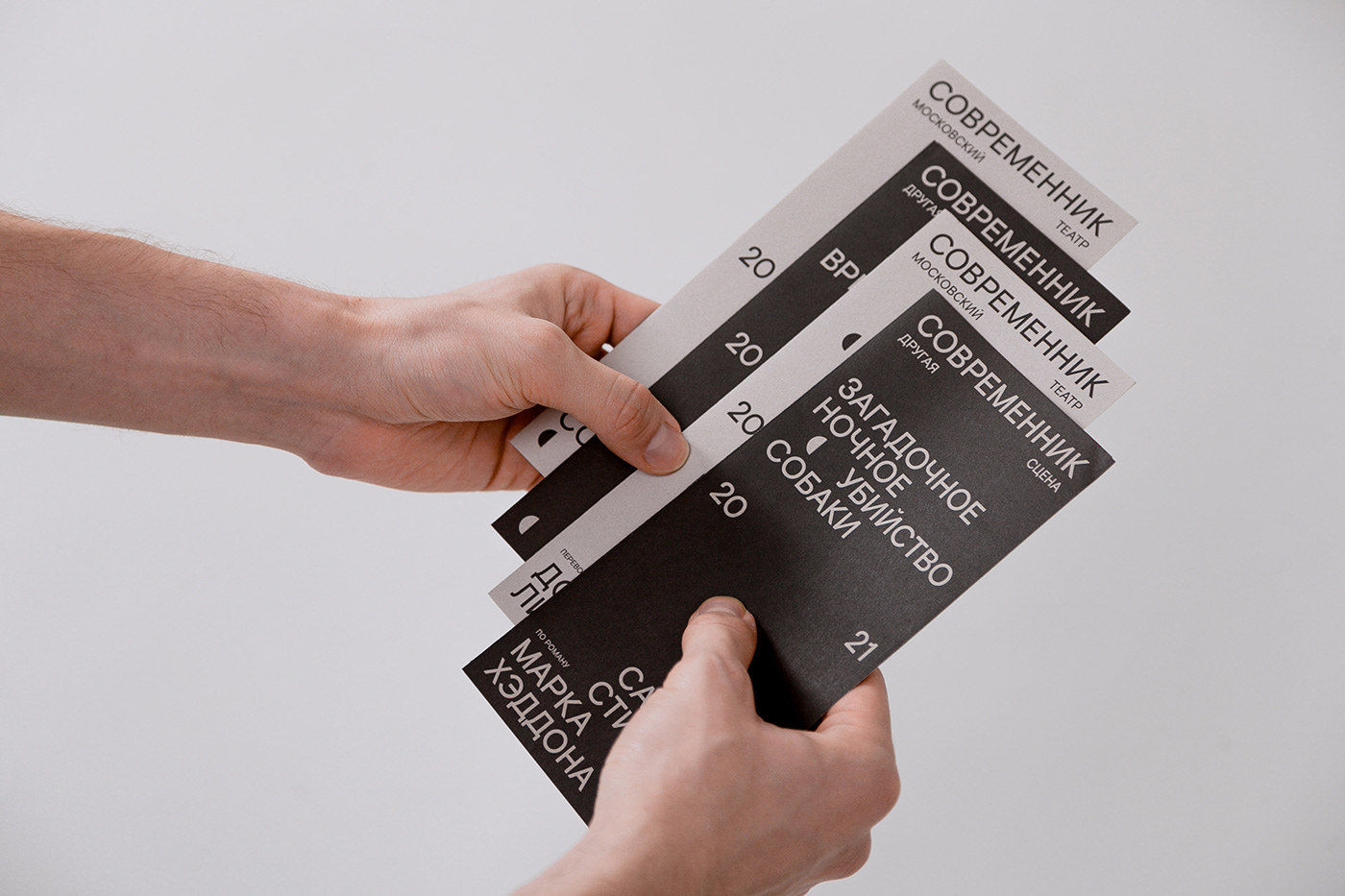
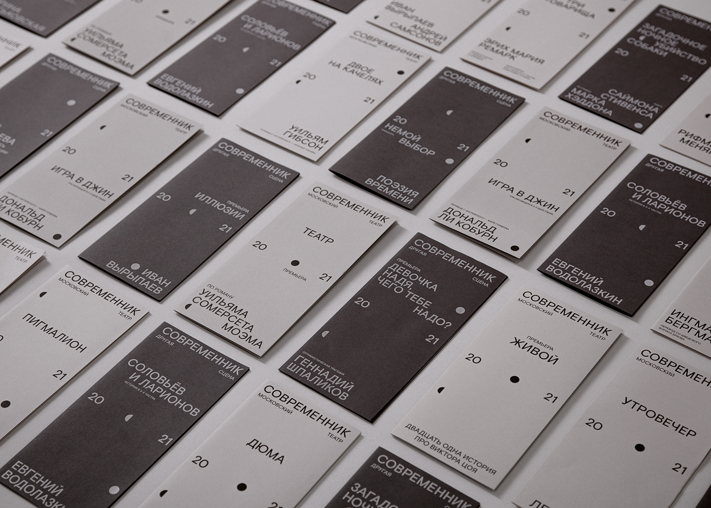
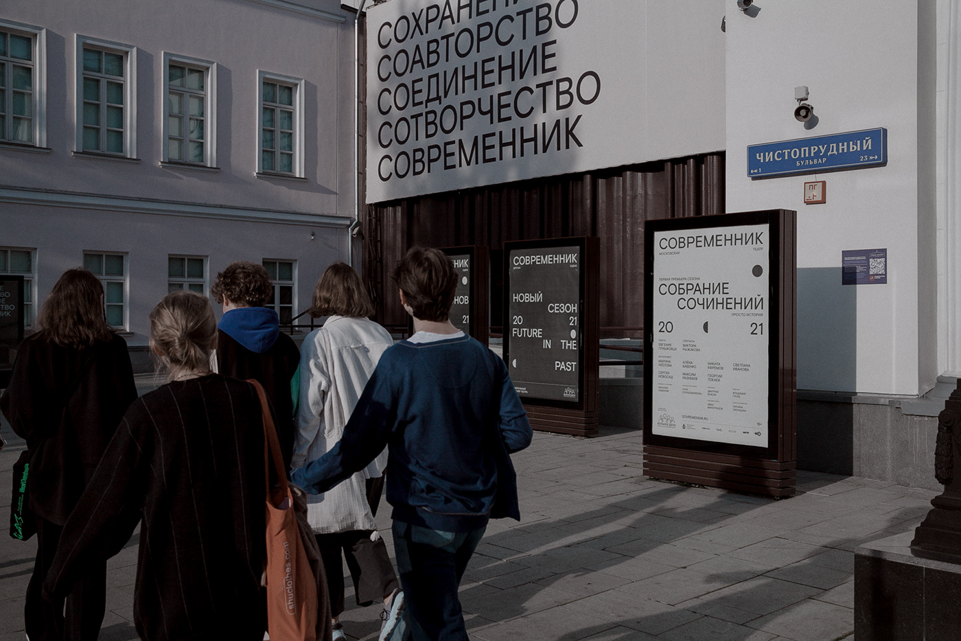
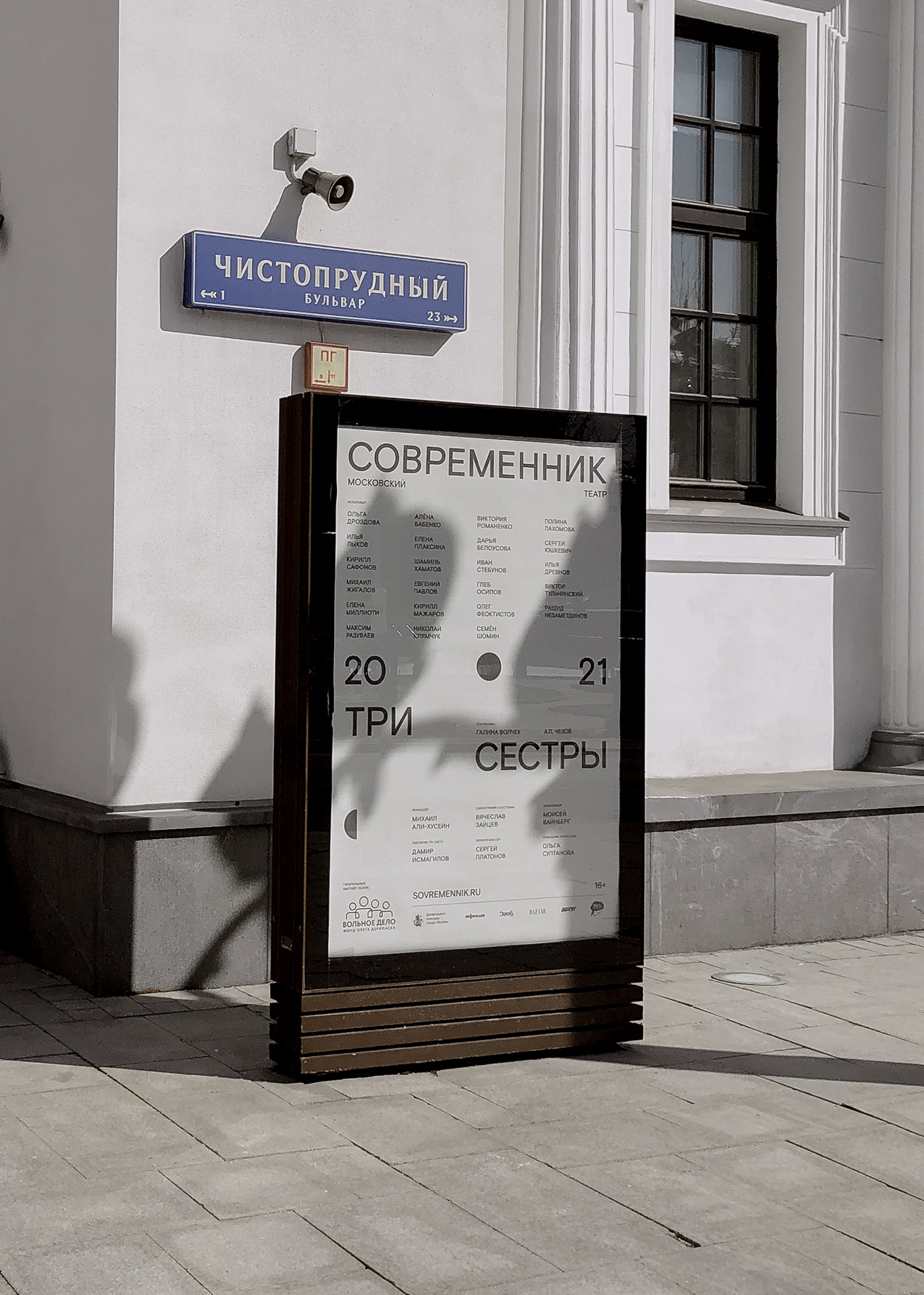
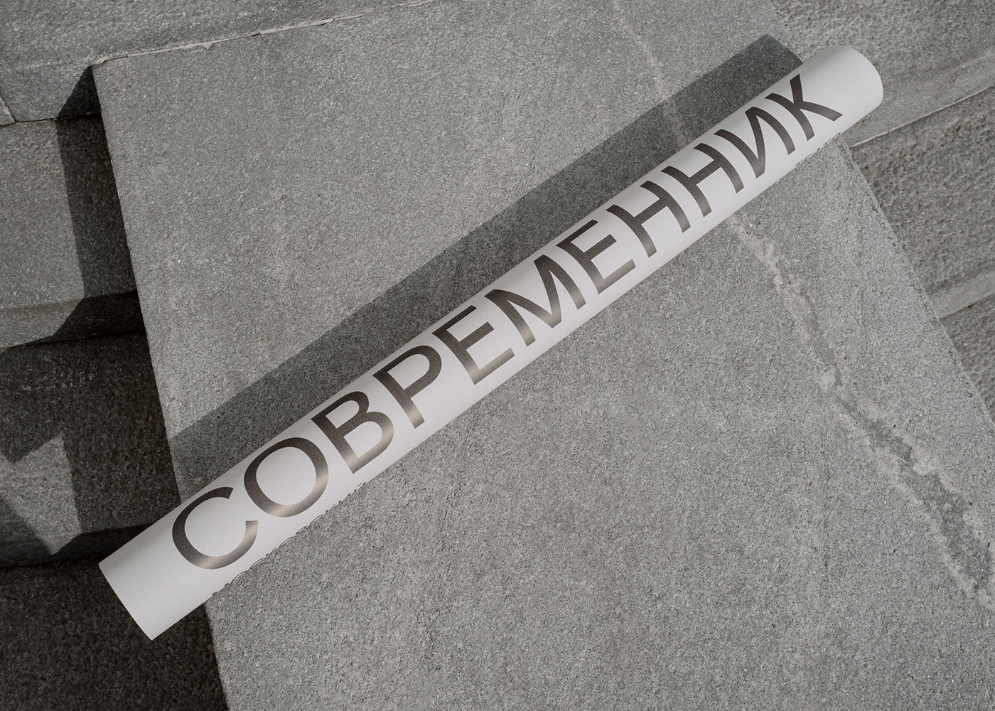
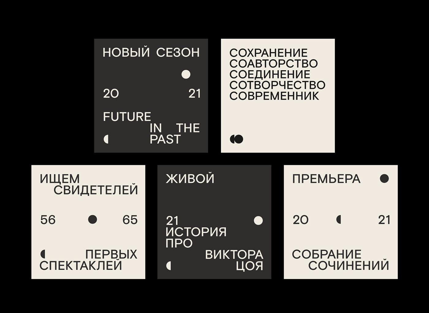
A new brand for the Sovremennik Theatre in Moscow. In 2021 Sovremennik celebrates its 65th anniversary. For the anniversary theatre is renewing its values, visual codes, and graphic identity. The concept of the new identity of Sovremennik is based on the theatre’s old graphic design from the 60s and 70s. Back then posters were only using typography with no pictures. We took that idea and tried to amplify it: the new “logo” of Sovremennik is written in the same font as all other information, it stands out only because of its placement in the composition.
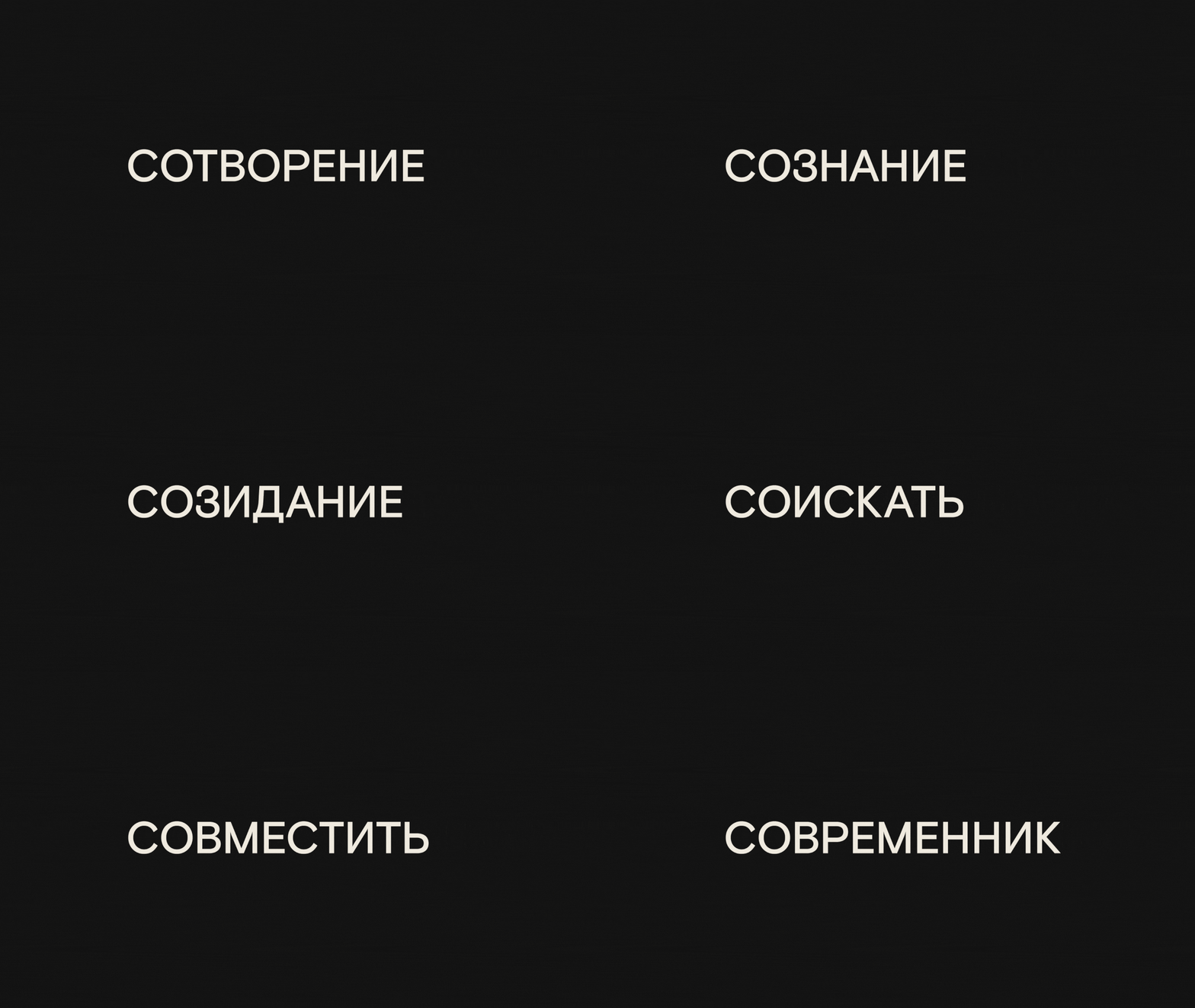
While working on the new identity we realized that a lot of words in the Russian language with the same prefix “CO-“ are in tune with values that the theatre’s new team is bringing: conservation, connection, collaboration. These words became a part of the theatre’s new brand communication.
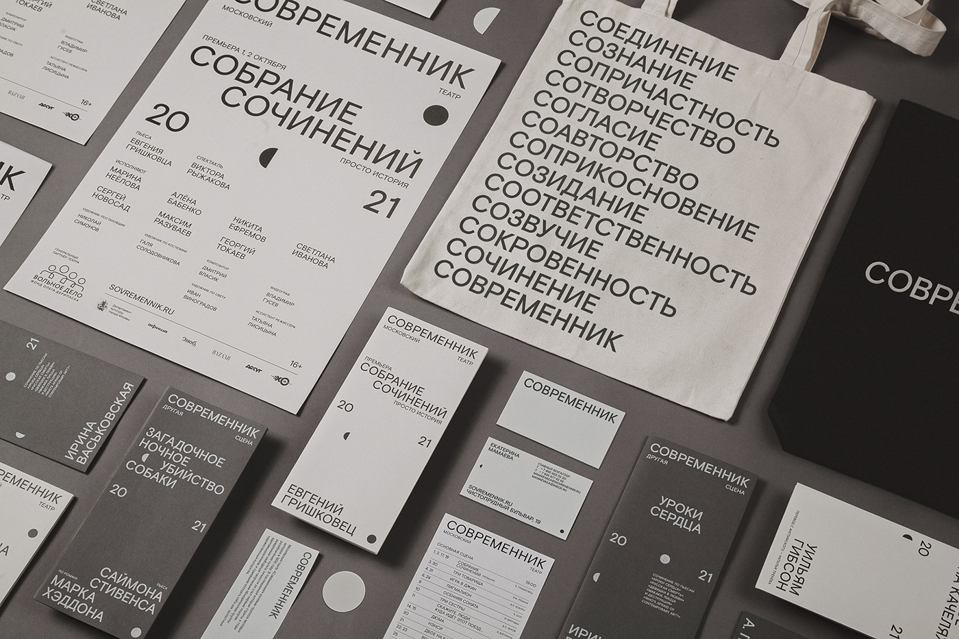
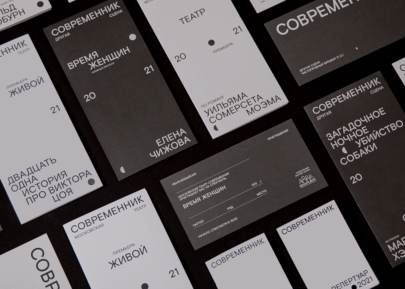
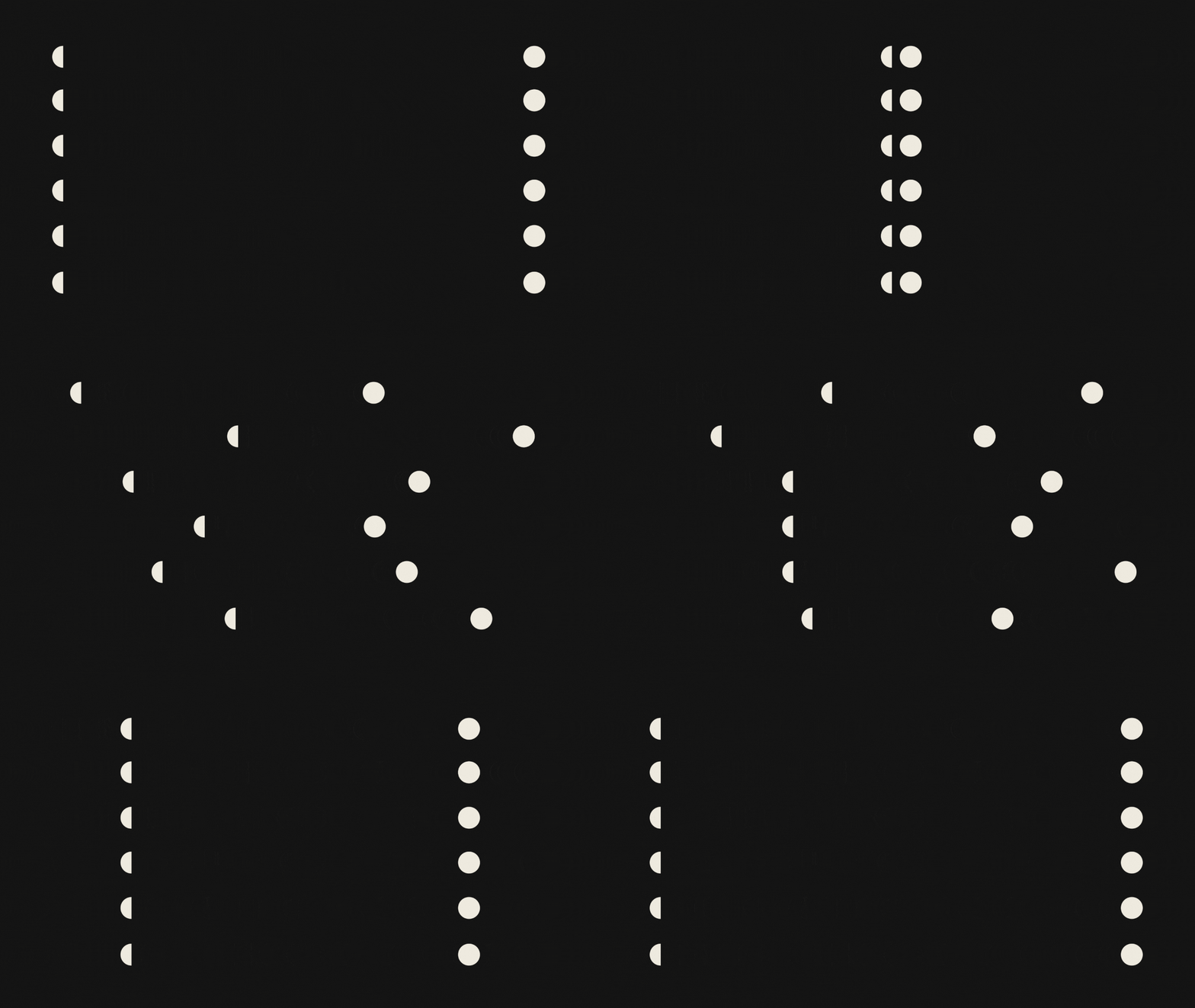
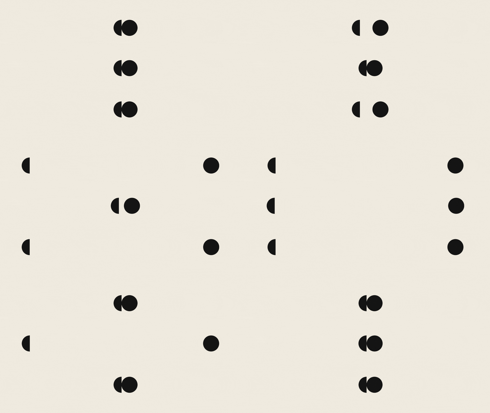
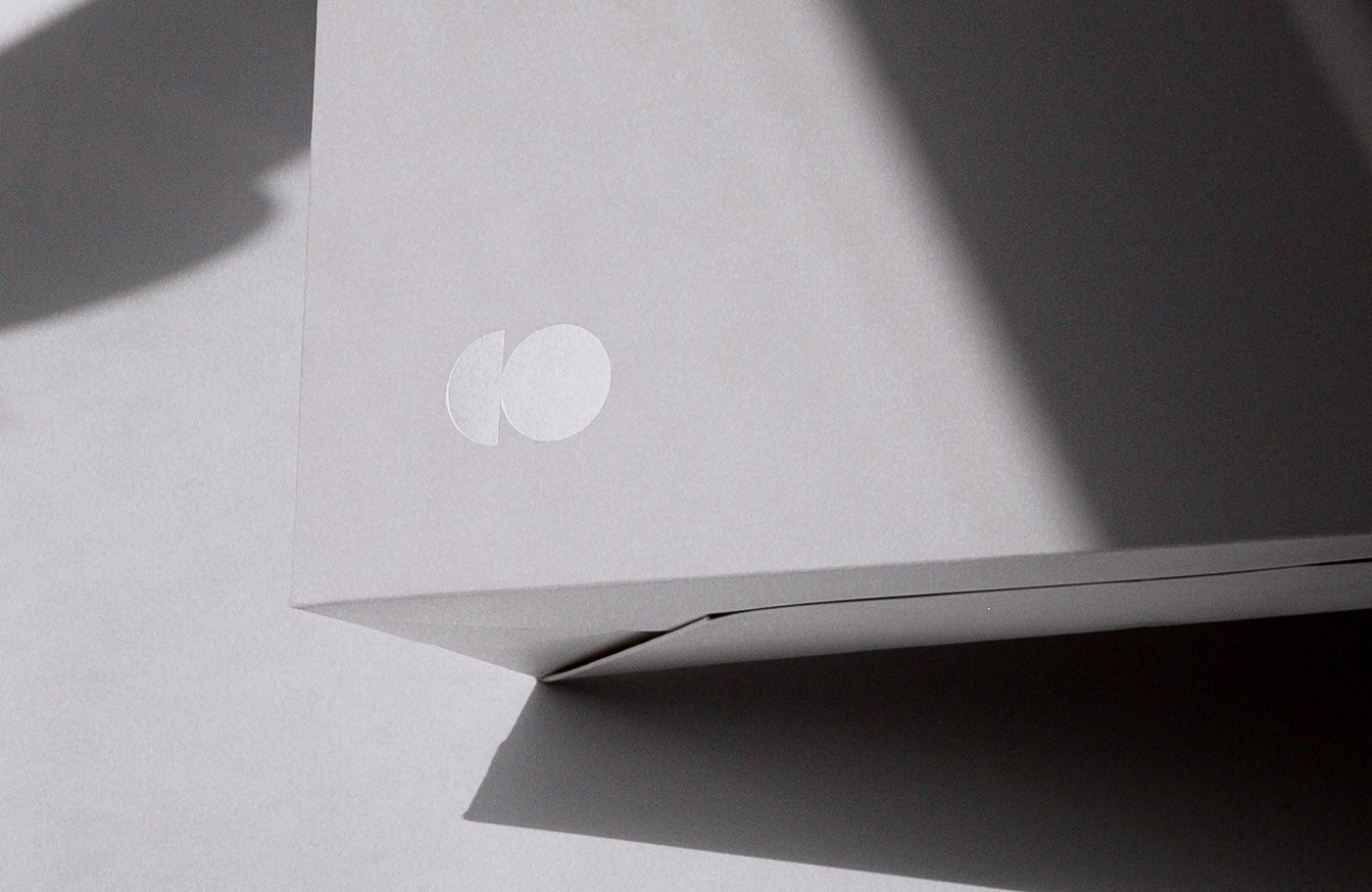
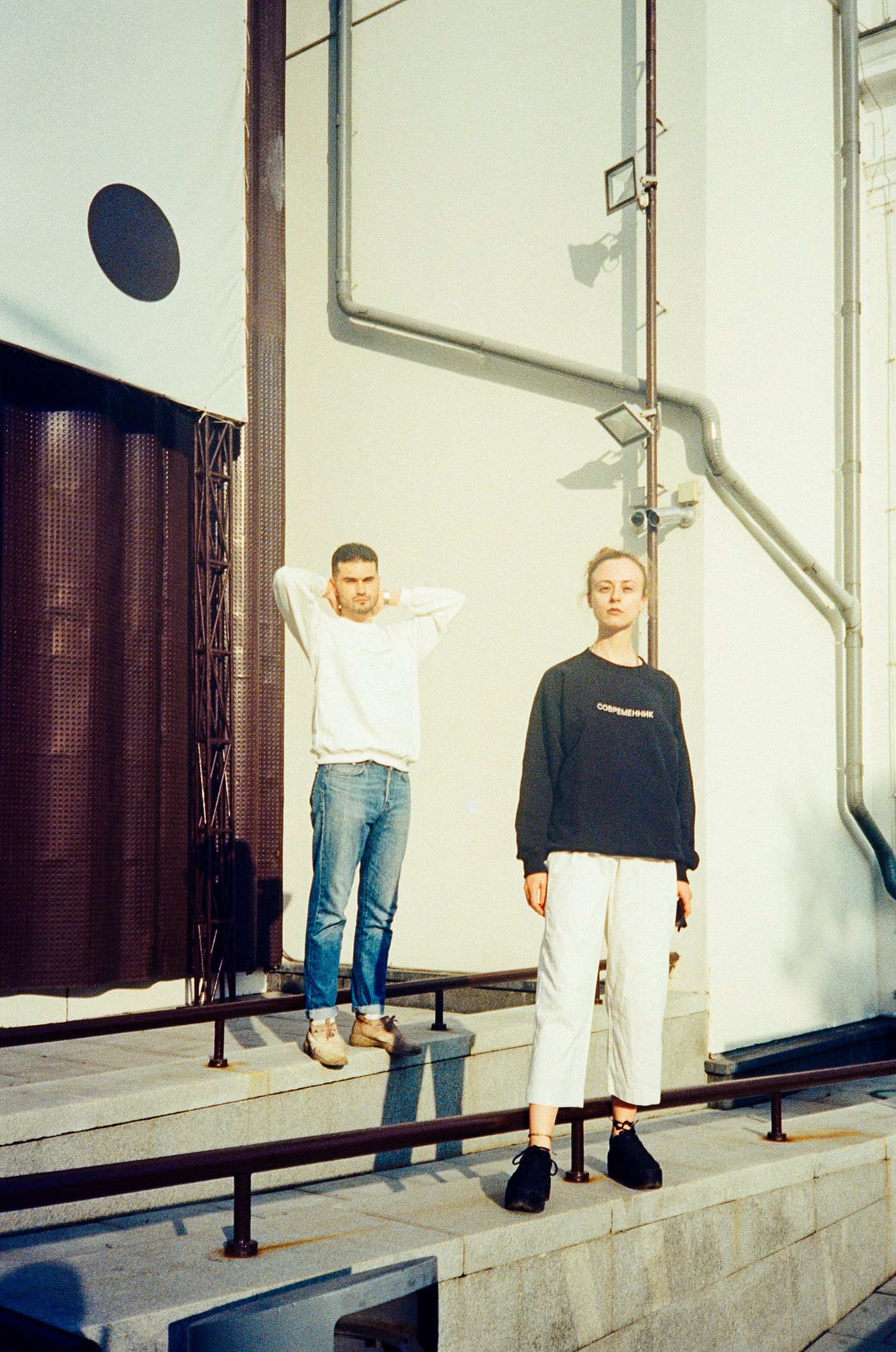
Based on that idea we came up with a symbol “CO” — crescent and moon. The sign is designed to be placed dynamically in the composition. In many instances “C” and “O” can stand apart, and in our opinion, it only shows the idea of connection, because there canbe no union without separation.












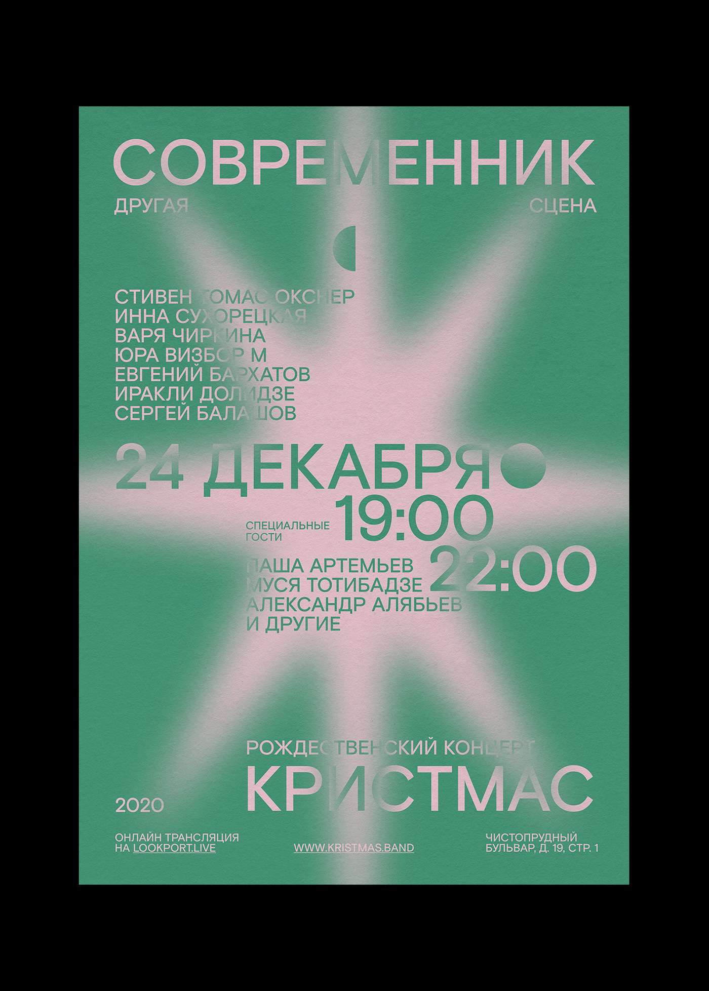

Graphic identity for Christmas concerts


Сognitive (special project)

Art director: Stefan Lashko
Lead designer: Nadi Kosenkova
Fonts: Basis Grotesque, Nostra
Client: Современник
Year: 2020 – 2021


