Label 21 | Brand Identity
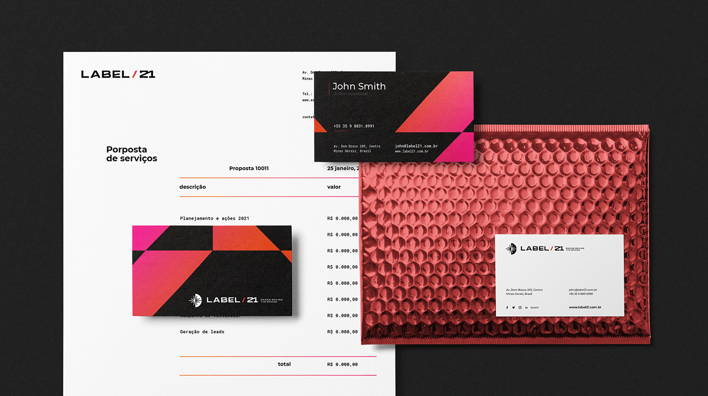
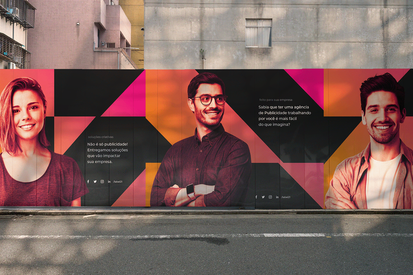
Label 21 is a Digital Marketing company, focused on customer communication solutions with its audience. Although new in the market, it seeks to be a solid company, recognized in the national market and with a broad vision to act directly or indirectly with current technologies, offering services of digital marketing, communication, creation of digital and printed arts, management of social networks and advertising picture.
Social @estudiokuumba
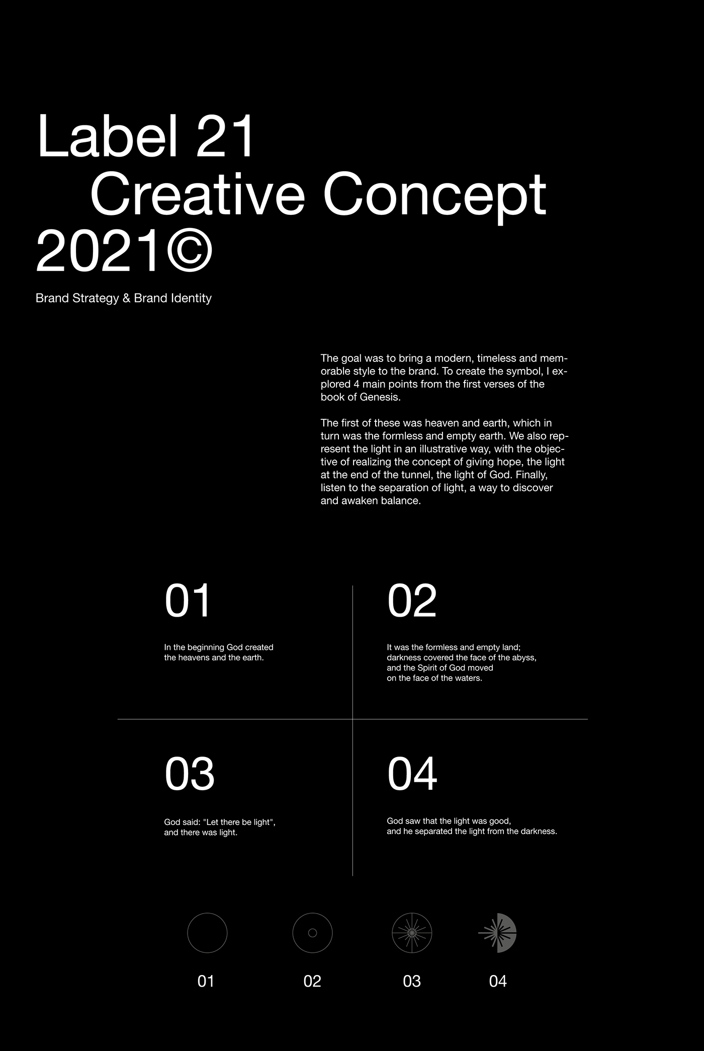
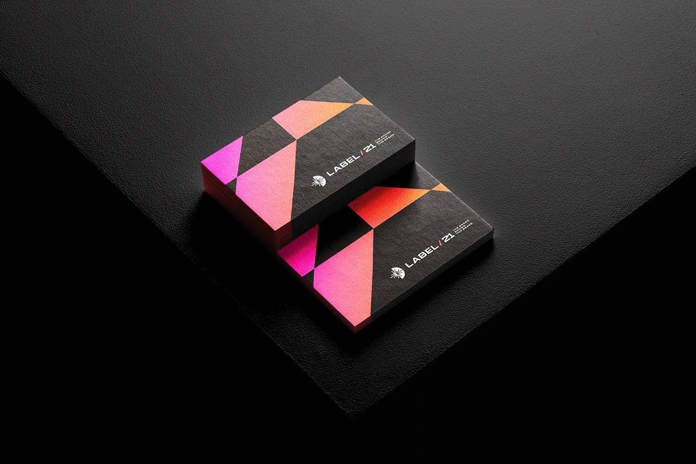
The challenge was to create a strong, contrasted and dynamic brand, which will refer to the strength of God, linked to the creation of the creator based on Genesis 1 and through its form, will communicate a new and renewed digital marketing company.
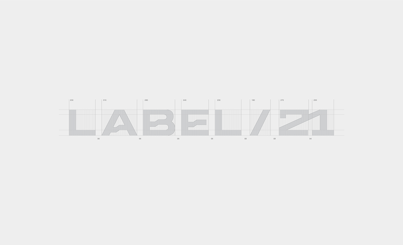
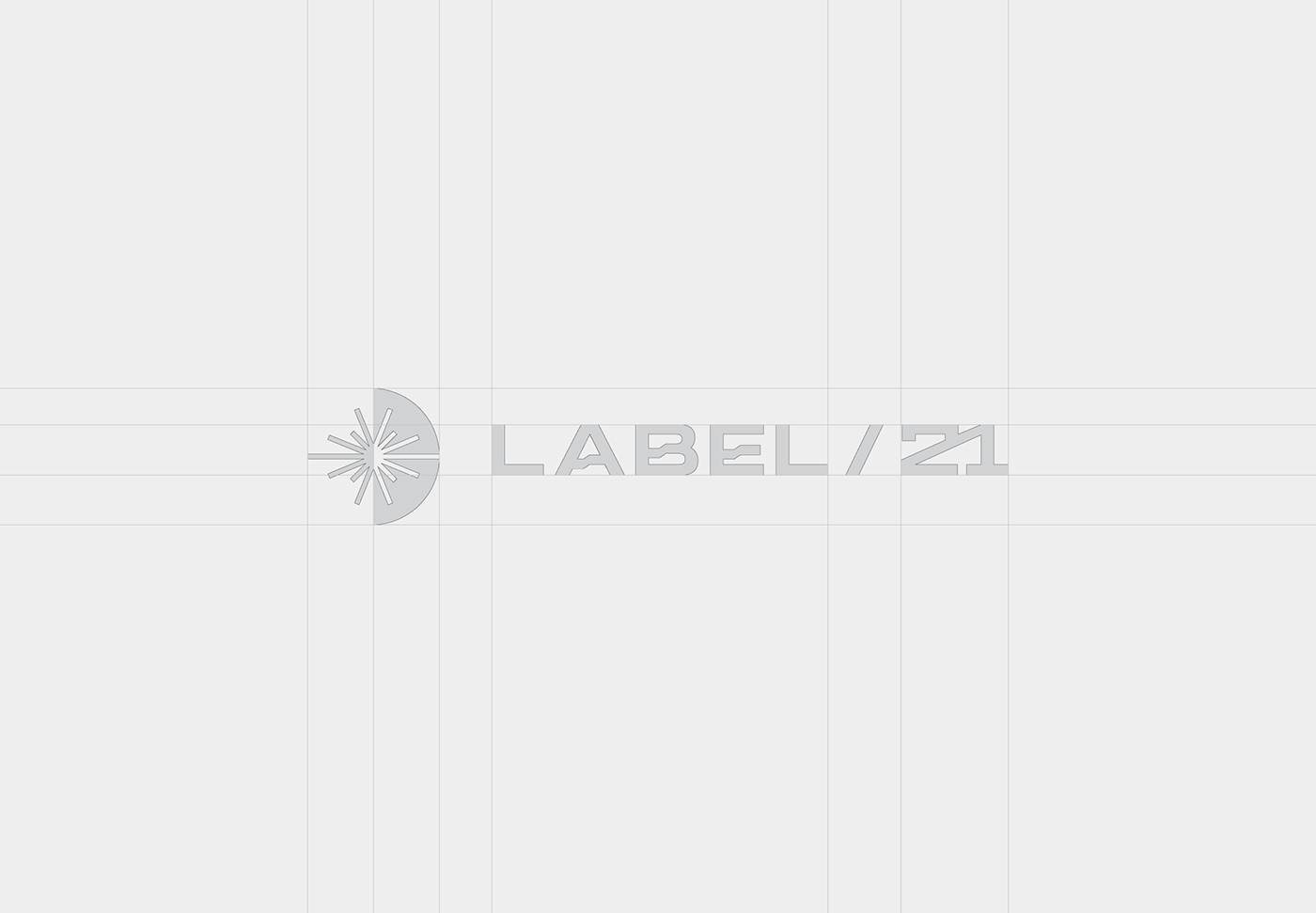
Considering the importance of the typographic voice to convey corporate messages, we created a personalized logo, inspired by a typeface without a geometric serif, Its linear nature suggests a modern style, with a technical and functional appeal. Suitable for any design environment, the combination of these qualities makes the logo highly legible and very distinguishable.
The result is a professional typography, which conveys the modernity of the brand, without losing its technological and audacious personality.
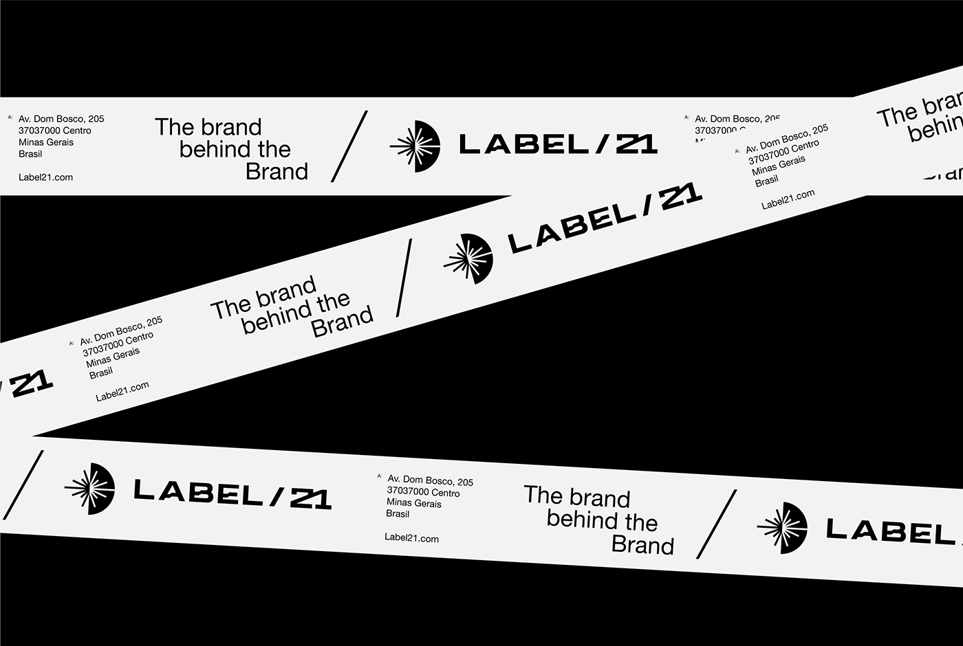
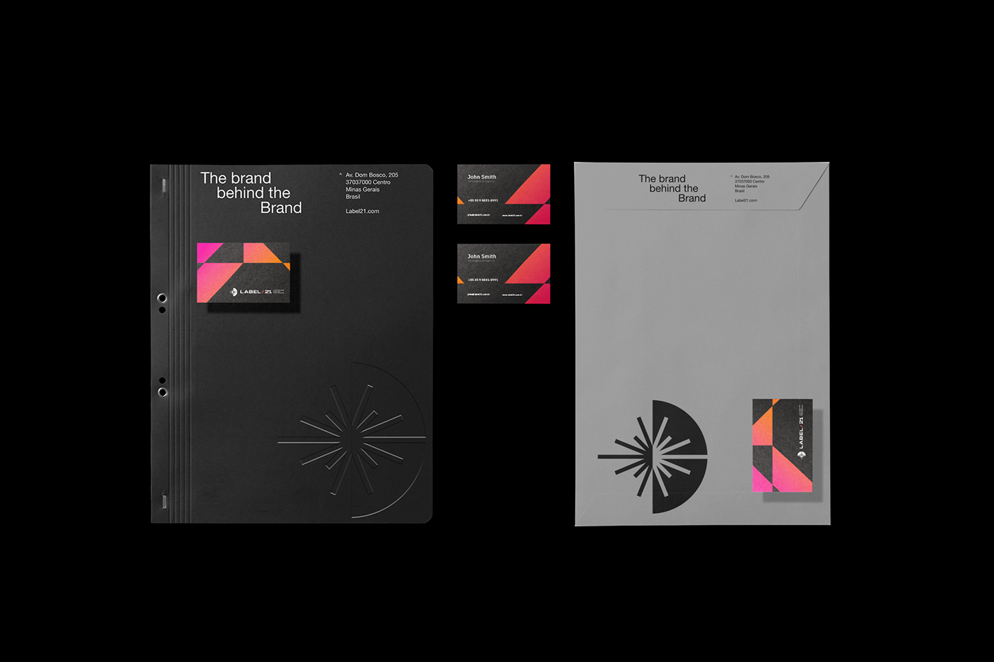
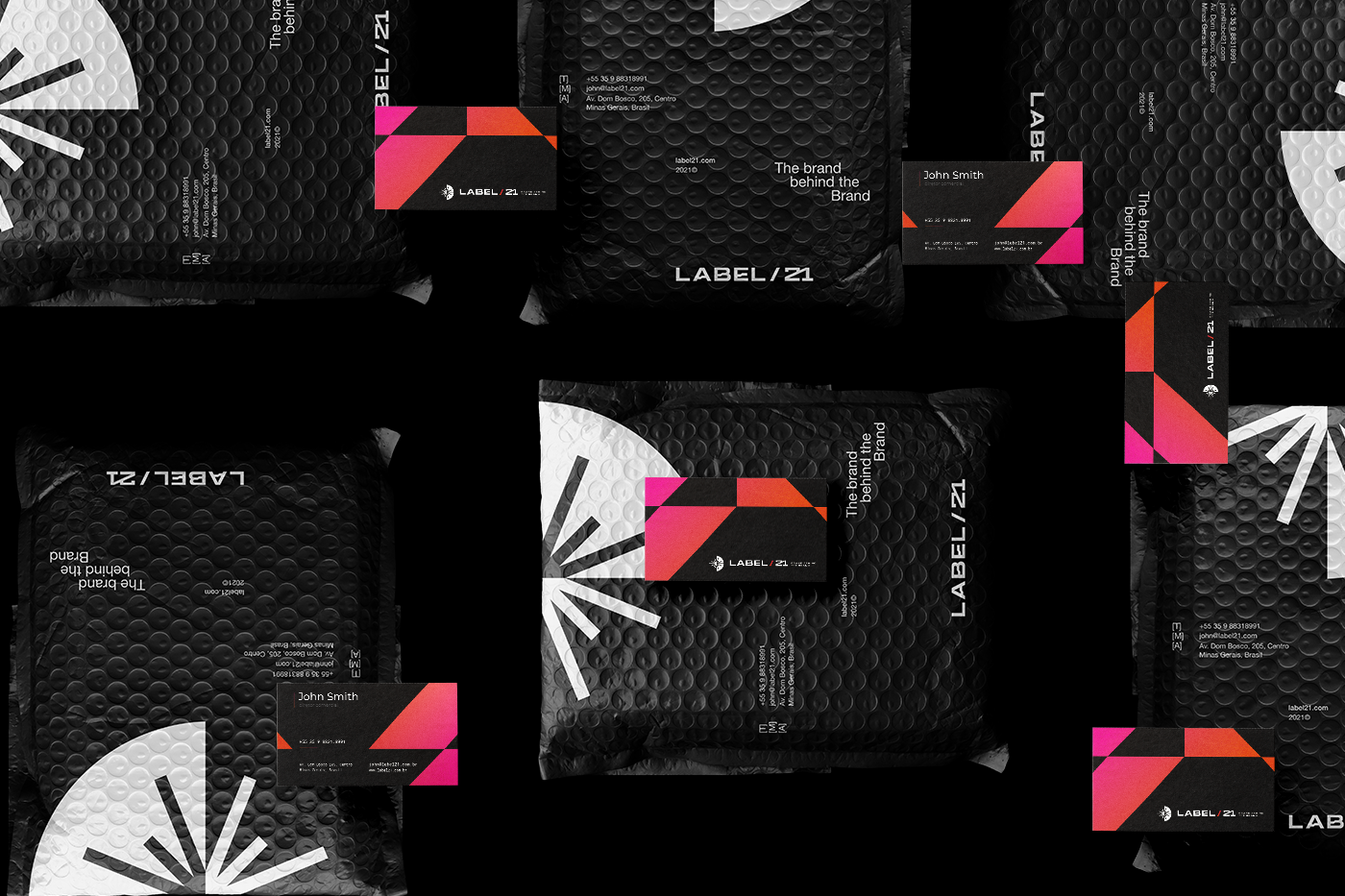
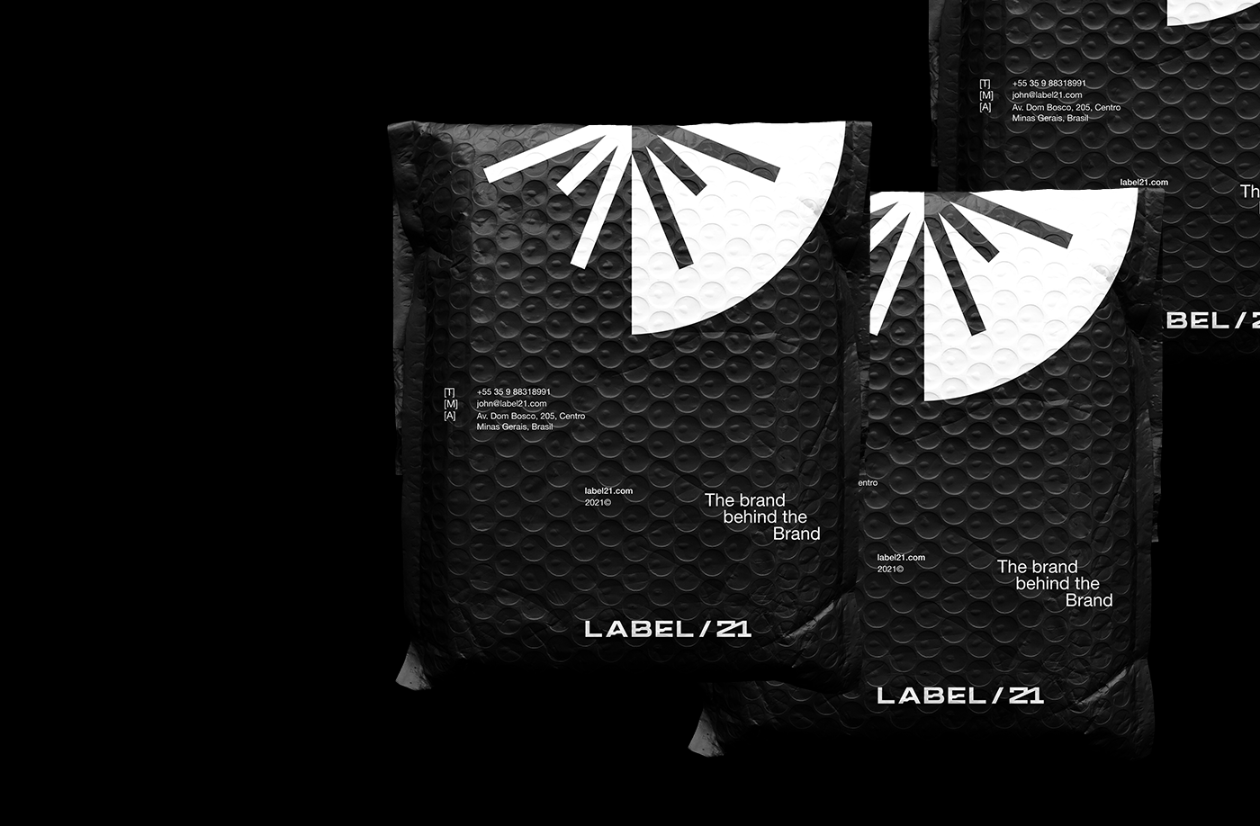
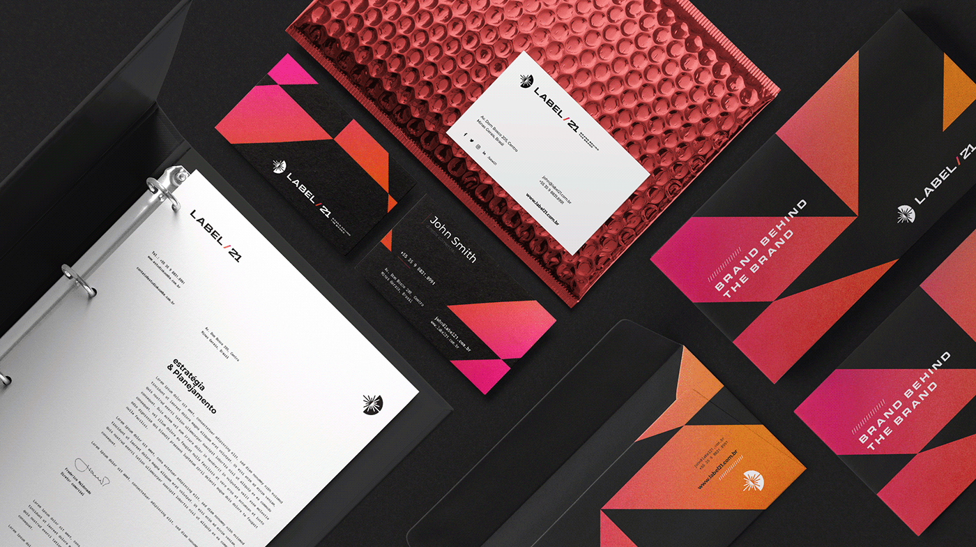
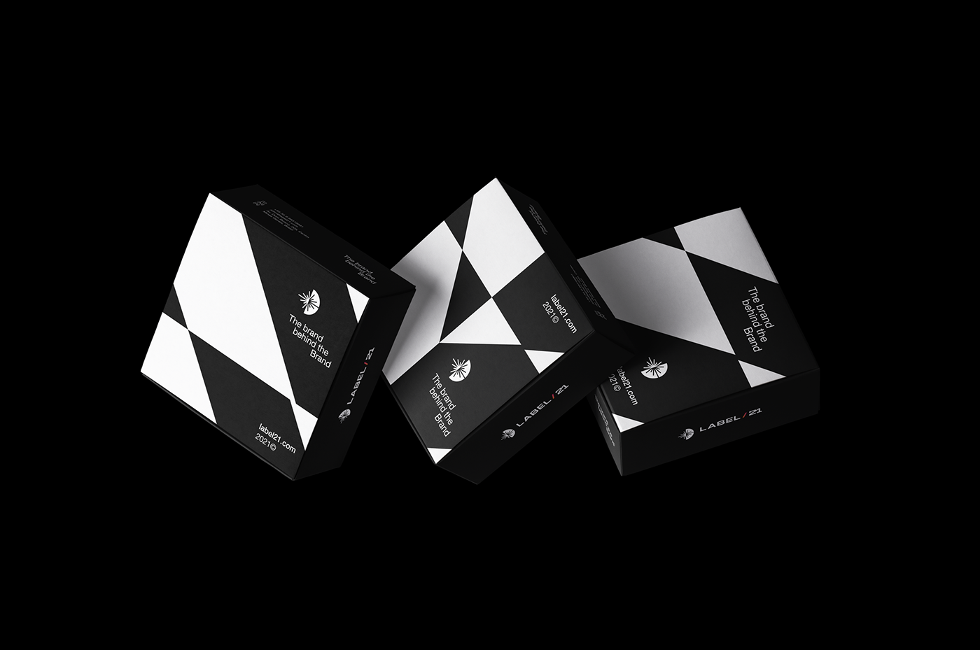
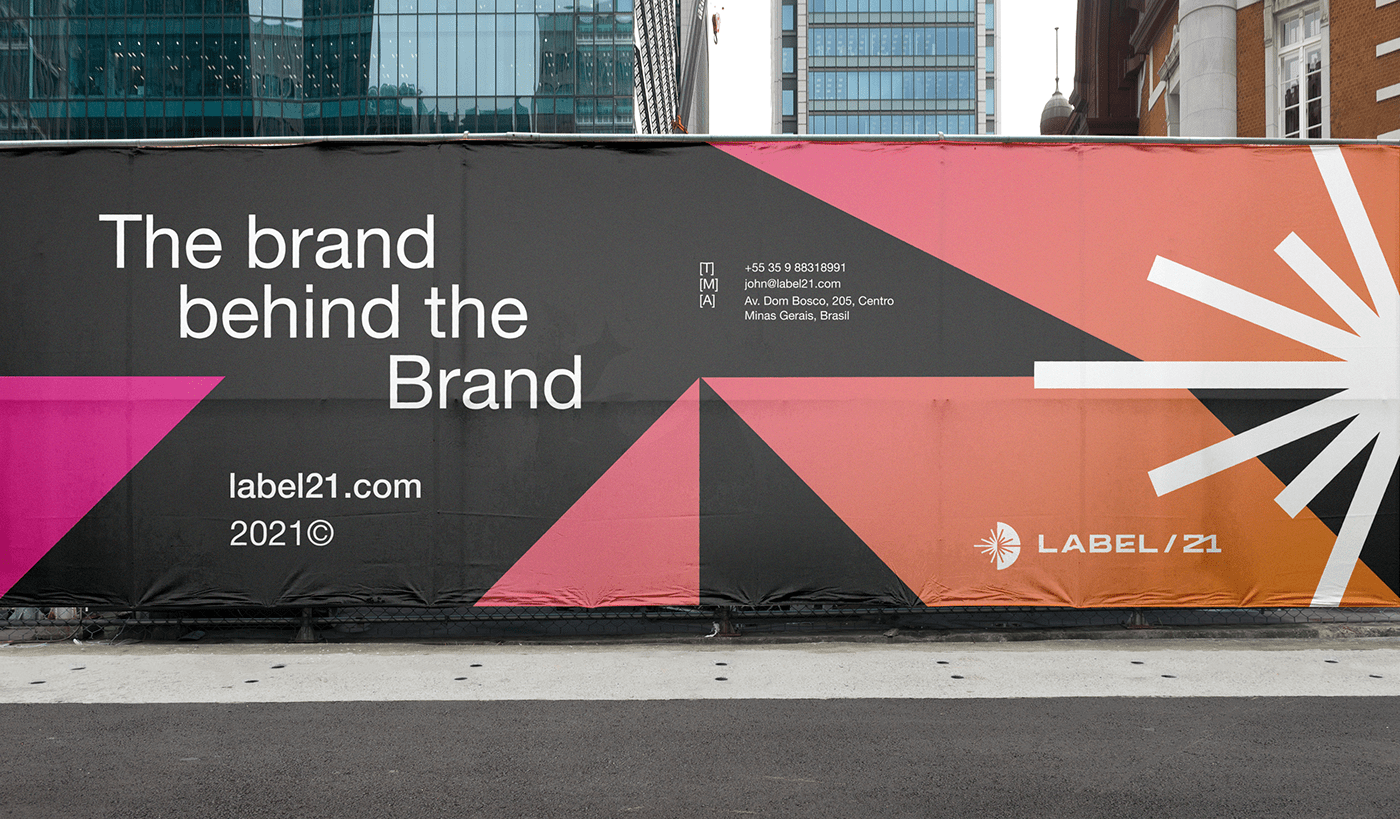
The solution was to develop a symbol based on the first four verses of Genesis 1. The forms and counter-forms of the symbol and the logo are used as a graphic support for the visual identity. A dynamic, modern and audacious brand, which can be used both online and offline.