

Dokoiku Japan is a new travel website designed for independent travellers who wish to explore off-the-beaten-track in Japan. The website covers comprehensive yet accessible information travelling across regional Japan.
I started working with the client, who himself is an expert travelling regional Japan, from the initial stage of building the brand. I was responsible for brand naming, logo designing, style guideline and itinerary design to be implemented in WordPress website.
Dokoiku Japanは、日本国内の隠れた名所など、主要観光地以外を自力で旅したい外国人旅行者を対象とし、主に田舎などの地方を旅する際の情報を分かりやすく紹介することに焦点をあてた、新しいタイプの旅行サイトです。
今回私は、自身が日本の地方の旅行のエキスパートであるクライアントと、ブランド構築の初期段階から制作に携わり、包括的なブランディング(ネーミング、ロゴ制作、スタイルガイド制作)と、WordPressウェブサイトに組み込む旅程表のデザインを担当しました。

1. Brand Naming
We wanted a brand name to speak the concept of the website in short and memorable 2 combined words, and avoid using words that commonly used by competitors.
Among a long list of relevant words, the combination of ‘Dokoiku(どこ行く)' = Where to go? and ‘Japan(日本)’ struck us the most. The casual Japanese word ‘Dokoiku’ conveys friendliness, and to pair it with ‘Japan’ indicates numerous secret places we can explore in the country. In addition, it’s catchy and memorable enough for foreigners. And ‘Dokoiku Japan’ has officially born.
ブランド名は、短く、かつ覚えやすく、他の日本旅行関連事業で既に使用されている単語の使用を避けることに念頭に、ウェブサイトのコンセプトを分かりやすく表した、2つの単語の組み合わせを考えました。
事業に関連する様々な単語を組み合わせ、多くの数に及んだ候補リストの中から、'Where to go?' を意味する「どこ行く?(Dokoiku)」と「日本(Japan)」の組み合わせが、私達にとって一番深く印象に残りました。カジュアルな語句である「どこ行く?」は親しみやすく、また「日本」と組み合わせることで、日本国内で訪れることのできる無数の場所の可能性を暗示しています。また、この語句の組み合わせは実にキャッチーであり、外国人にも覚えてもらいやすいとの理由から、「Dokoiku Japan」に決定しました。

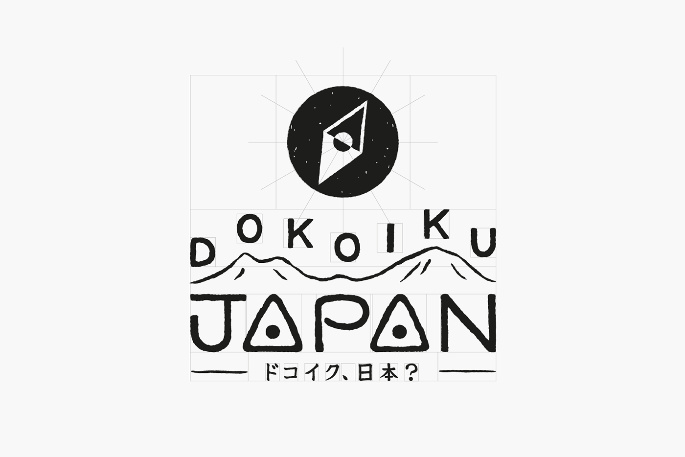
2. Logo Design
Logo design is fundamentally followed simplicity that represents modern Japanese design, with a playful and vibrant touch that make the logo more open and accessible for international audiences.
We brainstormed ideas in drafts using many relevant motifs such as Mount Fuji, rising sun and local train lines, in order to seek the most effective yet simple approach to reach our objective.
クライアントからの要望は、現代日本を代表するデザイン要素であるシンプルさを基軸としつつも、堅苦しくなく遊び心のある、外国人でも親しみやすいようなロゴを、というものでした。
ドラフト段階では、富士山、日の出、地方路線など、様々なモチーフを用いたアイデアを提示しました。ブランドコンセプトをシンプルに視覚化する上で、最も効果的なモチーフは何かを探りながら、様々な改善を行いました。


After some experiments, we liked the design of hand-drawn type ‘Dokoiku’ popping up like musical notes on top of the mountain range that represents The Japanese Central Alps, combined with the type ‘Japan’ in which two A's resembles triangle-shaped Japanese rice balls, tied with a short line of brand’s Japanese name ‘ドコイク、日本?’ to emphasis the authenticity of Japan-related business as well as accuracy of travel information.
The logotype comes with an icon that represents the Rising Sun(Japan) and a compass(explore) for browser favicon and app icon.
検討を重ねた結果、日本の中央アルプスを表すなだらかな山脈の上に、’Dokoiku’の文字を音符のようにリズミカルに配置し、また単語の中の2つの’A'をオニギリに見立てた、ユニークな’Japan’の文字というデザイン案に落ち着きました。これに加え、旅行情報の的確さや正統性を明示するために、ブランドの日本語名「ドコイク、日本?」をロゴ下部に小さく添えました。
また、ブラウザのファビコンやアプリ用に使用する目的で、日の丸とコンパスを象ったシンプルなアイコンも制作しました。


3. Style guideline and Blog Itinerary Design
We set the brand key colour as vermilion, the most prominent colour in Japanese culture. We also set a couple of sub-dominant colours along with it for the website use.
ブランドのキーカラーは、日本文化との結びつきが最も強い朱色をメインとし、それに沿った控えめな色相の補色をいくつか設定して、ウェブサイト内の様々なスタイリングで使用できるようにしました。

We choose website font as serif-based in which high legibility encourage to read long articles as well as to prove the authority.
Website Itinerary design focused on articulately translating meticulous travel information in the minimum volume of elements to be implemented in WordPress by only cords, and update by client’s end.
サイトで使用するフォントは、ブランドの持つ取っつきやすさを保ちつつも、信頼感を損なうことのないよう、可読性に特化したセリフフォントをメインフォントに設定しています。
ユーザーの観点に立って綿密に作られた旅程表は、Wordpressテーマをカスタマイズし、コードのみで実装可能なようにデザインしました。最低限の要素で、最大限の要素を伝えることを念頭に置いています。


