- H O O T E N Y O U N G -
A M E R I C A N W H I S K E Y
|
Designing cigars was an incredibly awesome venture for me as a designer, so when Hooten Young introduced a 12-year aged whiskey, I couldn’t have been happier to make it look as smooth as it tasted.
L O G O D E S I G N // I L L U S T R A T I O N // P A C K A G E D E S I G N // M O T I O N G R A P H I C S //
A R T D I R E C T O R O F P H O T O G R A P H Y // P H O T O G R A P H Y B Y : J E A N N I E A L B E R S

- H O O T E N Y O U N G -
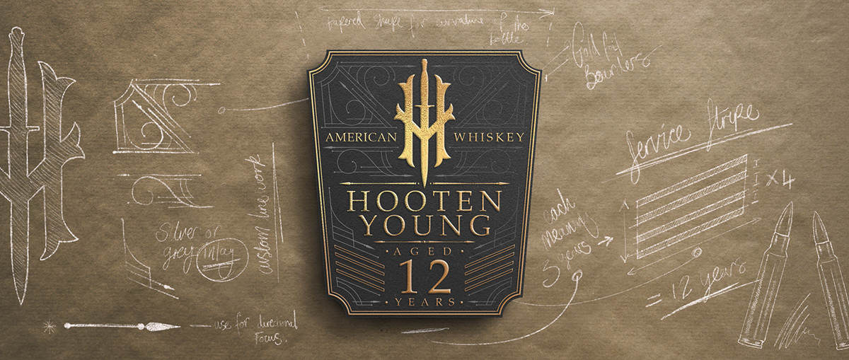
w h i s k e y l a b e l
|
After creating a custom line pattern for the branding, I looked into military symbols and meanings and learned that a soldier receives a service stripe on their sleeve for every three years served. I wanted to honor this gesture by branding the whiskey with four service stripes, symbolizing the 12 years it spent aging in the barrel.
- H O O T E N Y O U N G -
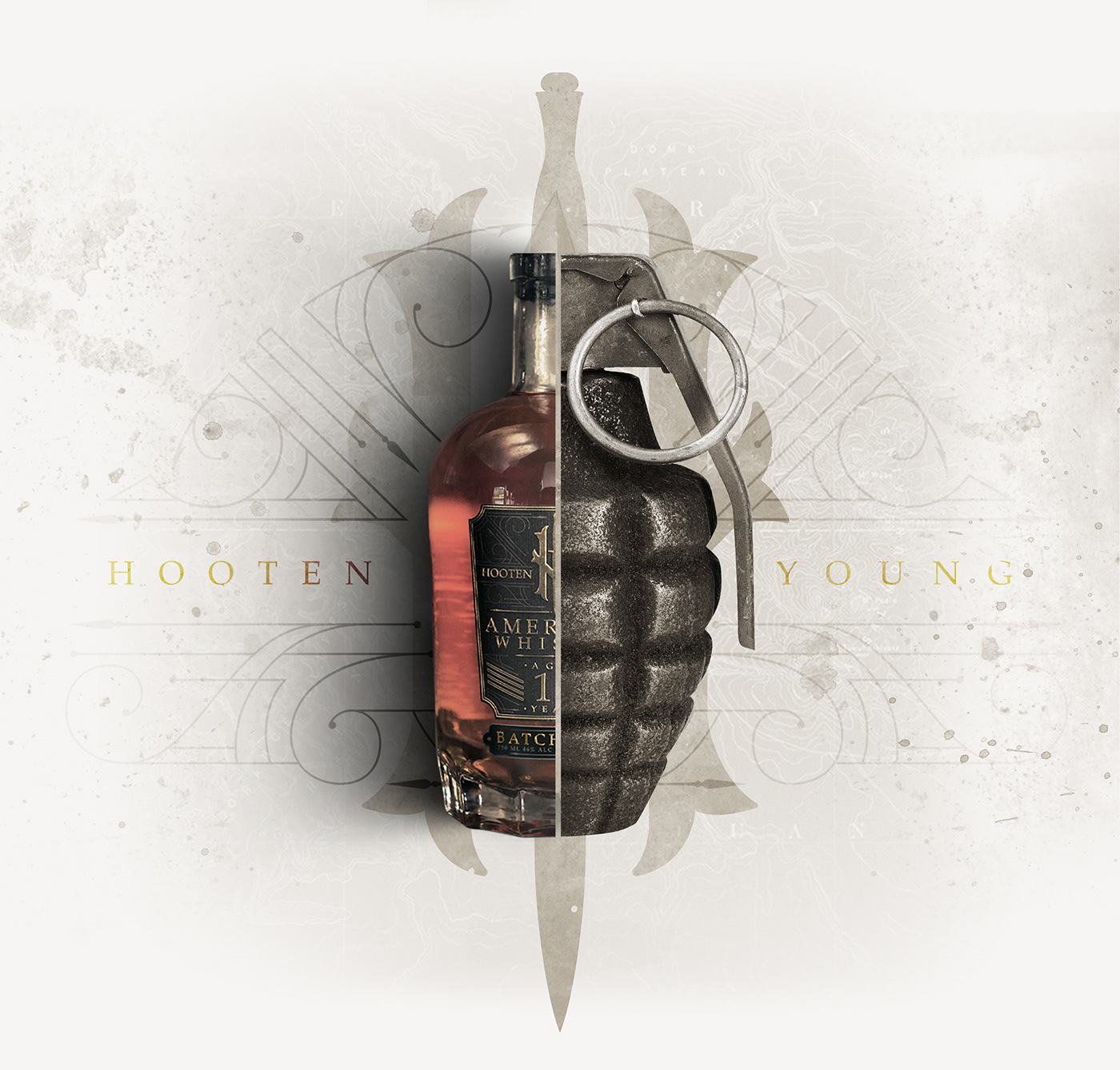
B O T T L E B L U E P R I N T
|
Choosing the bottle itself was actually quite simple. Its dimpled base reminded me of a grenade shell, which led to other design concepts and choices. When considering the seal and how awkward they usually are to peel off, I wanted a novelty that would take the wrapper off quickly and in a unique manner. By putting a repurposed grenade pin inside the seam, bartenders and consumers would be able to quickly rip off the seal in a memorable fashion.

- H O O T E N Y O U N G -
A M E R I C A N W H I S K E Y
|

- H O O T E N Y O U N G -
A M E R I C A N W H I S K E Y v i d e o a d
|
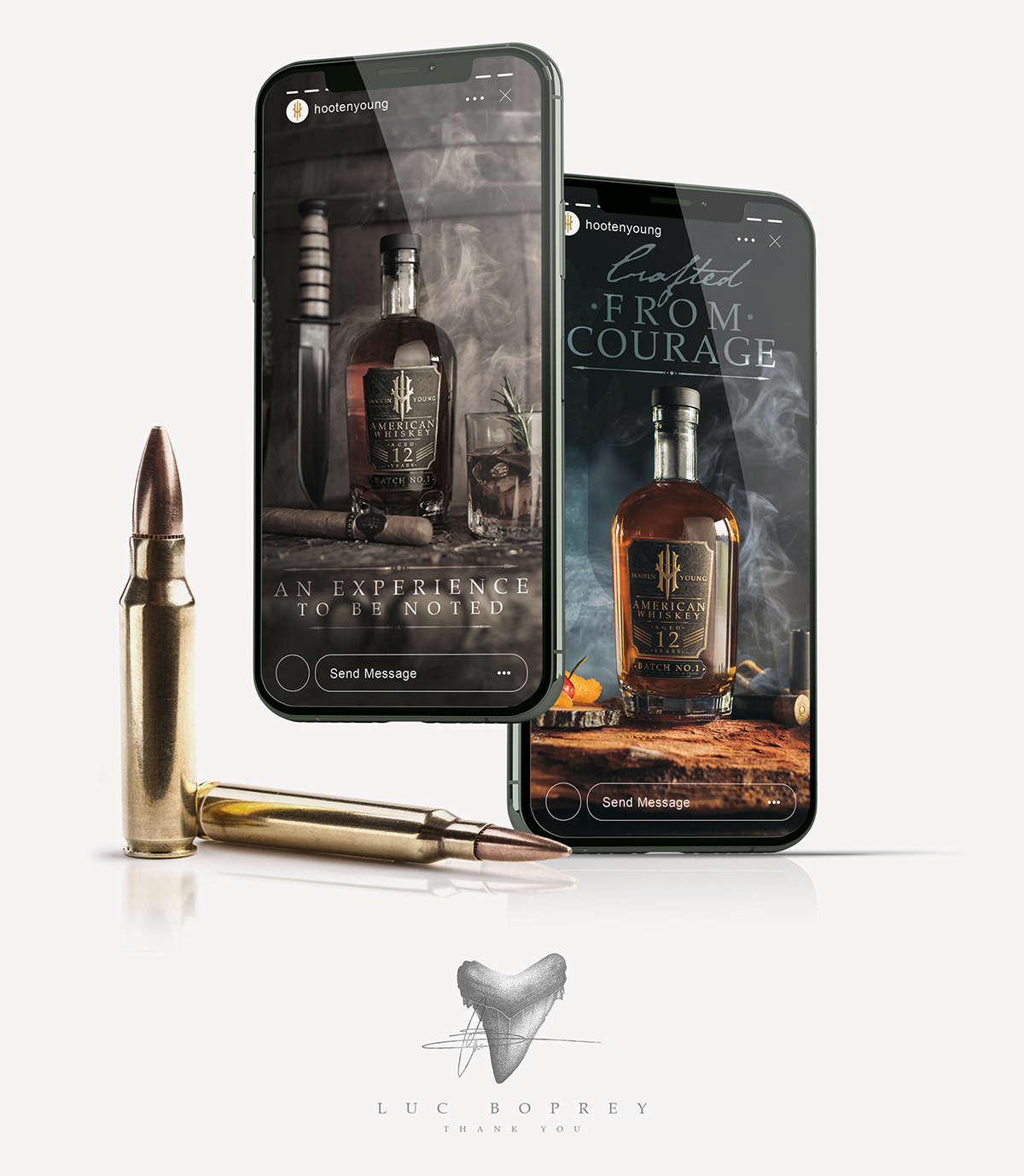
- H O O T E N Y O U N G -
s o c i a l m e d i a
|