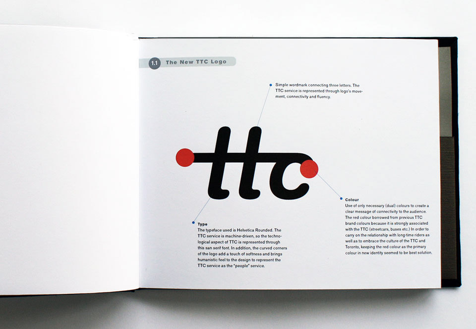
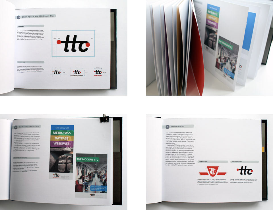
Current modernization of Toronto Transit Commision (TTC) services influenced the redesign of TTC identity. The new TTC wordmark reflects its service transformation to a new, better tomorrow. The logo reveals the TTC service in its simplest form. Since safety and good customer service is the key for TTC, the smooth line in the logo connecting two points shows that the TTC does everything to connect riders to their desired destination without any disturbance and unpleasant incidents.
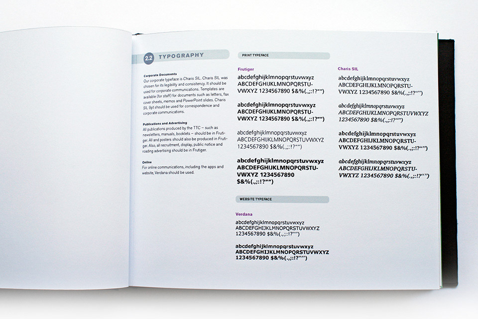
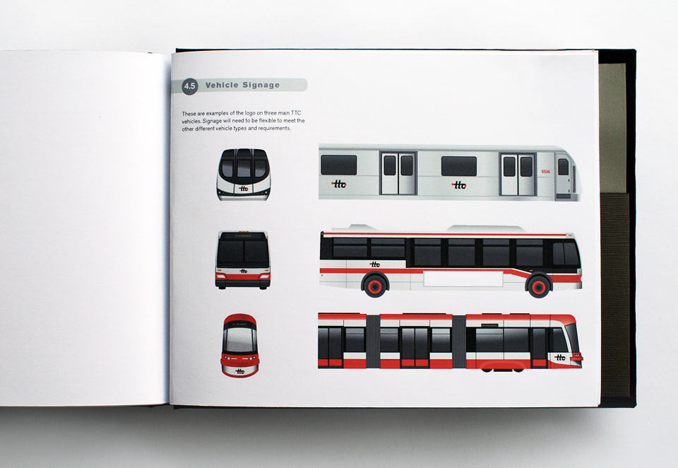
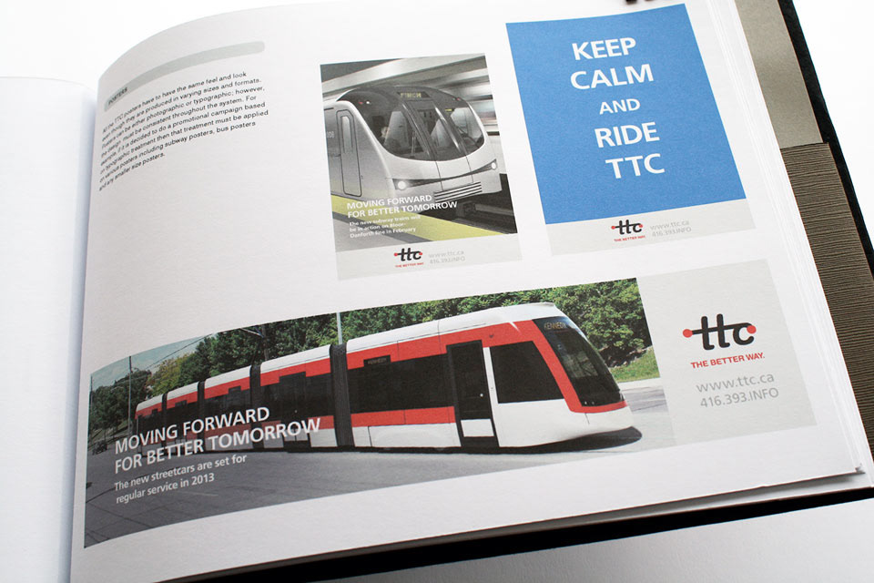
The TTC corporate identity manual was created to promote the visual identity in the most consistent, convenient and efficient way. It gives precise guidelines on usage of logotype, colours and typography on various applications of TTC system.
