
Flanco is an intuitive workspace managing platform. It ensures efficient and safe office flow as well as smart use of office resources.
Our task was to create the logo, visual identity, including application icon, that reflects the uniqueness of the platform.
The story behind the brand
According to the founders of Flanco, the platform was inspired by their own experience, working in various offices and open spaces. As well as by the lack of efficient, united and user-friendly platform to control office space. The office crowd used to depend on separate tools, which usually led to overbooking and slower exchange of information.
On the top of that, the global pandemic happened, so many public spaces, including offices, had to adapt to new safety requirements.
So Flanco was born. It optimises the flow in the workspace and allows to increase work efficiency, manage office resources and spaces smartly, synchronise workspace-related data and lets efficiently protect the team in these curious times.
In short, forget all the unnecessary movement, overbooking of meeting rooms, and inefficient use of existing resources in your office!


Inspiration and result
The philosophy of the brand is based on understanding that every work space is unique and Flanco adapts to any setting resources in any situation.The brand name itself unites the words "Flexible and Connected".
The logo was also inspired by this notion. As in any smart office it is highly important to reach the perfect harmony between people and working spaces and its resources. So the logo does reflect this synergy. On the one hand, the logo is the stylised letter F.
However, it is also the metaphor of the workplace from above. The bigger graphic detail marks the office desk or office resources in general. While a dot is the symbol of the person behind the desk. Both elements look harmoniously "floating" in the space, reflecting the smooth workflow.


Inclusive visual system
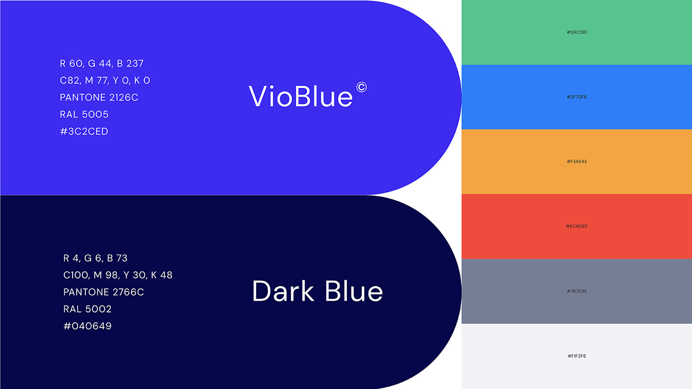
The blue colour and its variations dominates the brand's visual identity. It's not a surprise that this colour is often used for B2B companies. However, to mark the novelty and modernity of the platform the vibrant and eye-catching blue and its variations was chosen in this case.
The sleek geometric forms in the logo as well as in a visual identity communicates the flexibility of the platform and its adaptability to business needs and constantly changing environment.