


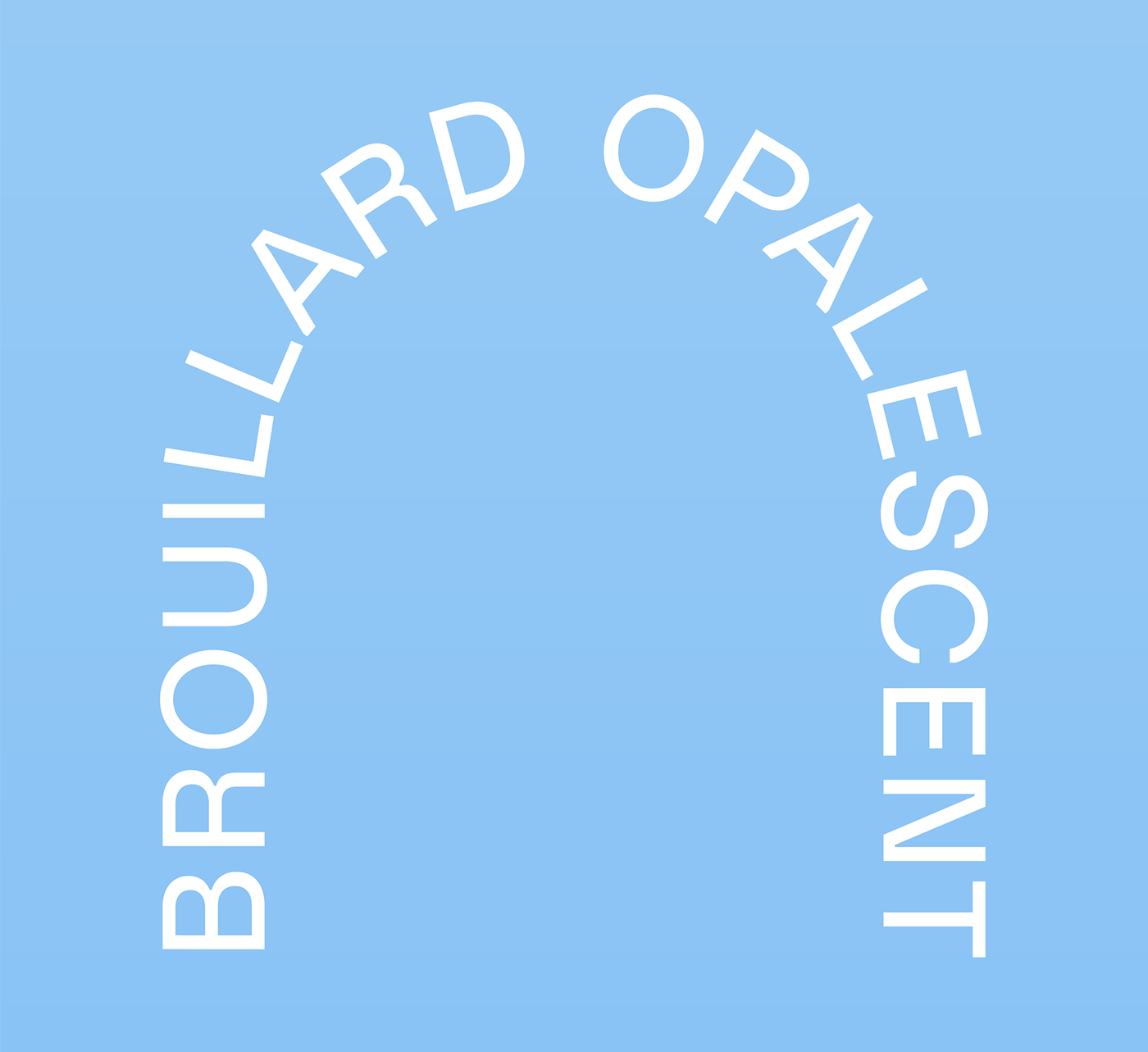


Citerne
The tough face with leakproof joints
By the sweat of tired brows and endless shifts, La Manic wasn’t built in a day. Thirteen towering arcs, countless cubic metres of concrete. A stone giant swallowing the horizon, the river catching in its throat. Days are long at the Manic, getting thirsty from cutting off so much water. On the road, a long tank hitched to the cab, the icy sky washing down the chrome cylinder. Refrigerated, pressurized, confined liquids slosh and splash to the rocking of the dusty track. Cut the engine. A ladder to the tank dome, slow and steady. Break time, a tall cold one, malt and hops straight down the gullet. Look around, an endless expanse of drowned earth, raw power for miles. One eye open in the pitch black of night.
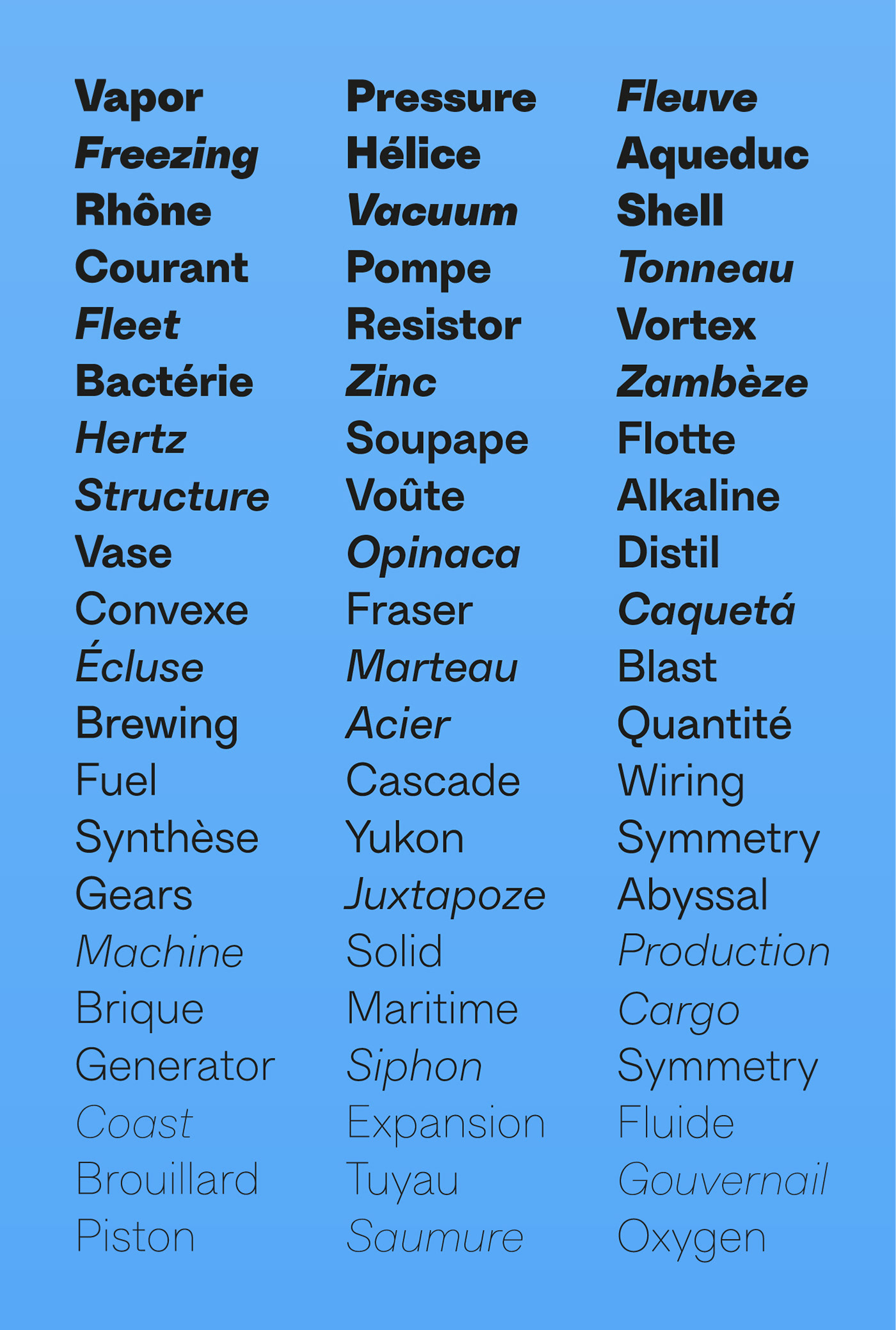
A first version of Citerne was conceived in 2017 as part of the new visual identity for Reservoir, a gourmet brew pub on Montréal’s Duluth Street. After some time spent maturing, Citerne now exudes a robust confidence. The construction of its sturdy and unadorned letterforms adapts to any scale, making Citerne a typeface that won’t shy away from the task at hand.
Exclusively available on
—
Designer: Feed
Developer: Feed
Publisher: Feedtype
Release date: February 2021
Available licenses: Desktop, Web, App
Available Styles:
Thin
Extralight
Light
Regular
Medium
Bold
Black
© 2021, Studio Feed Inc.

