


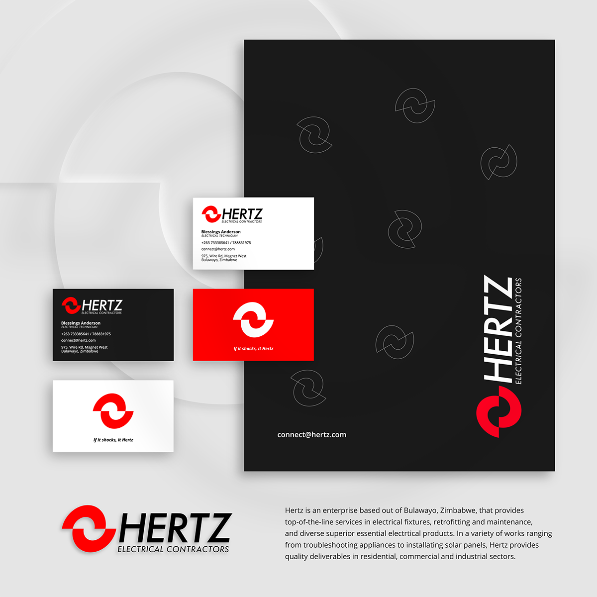
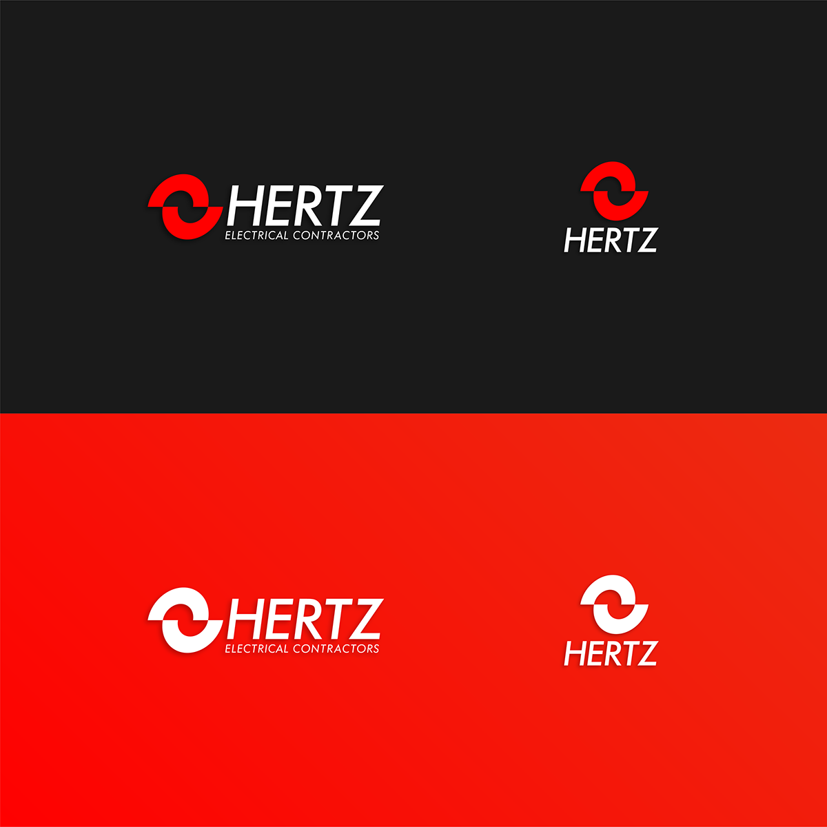
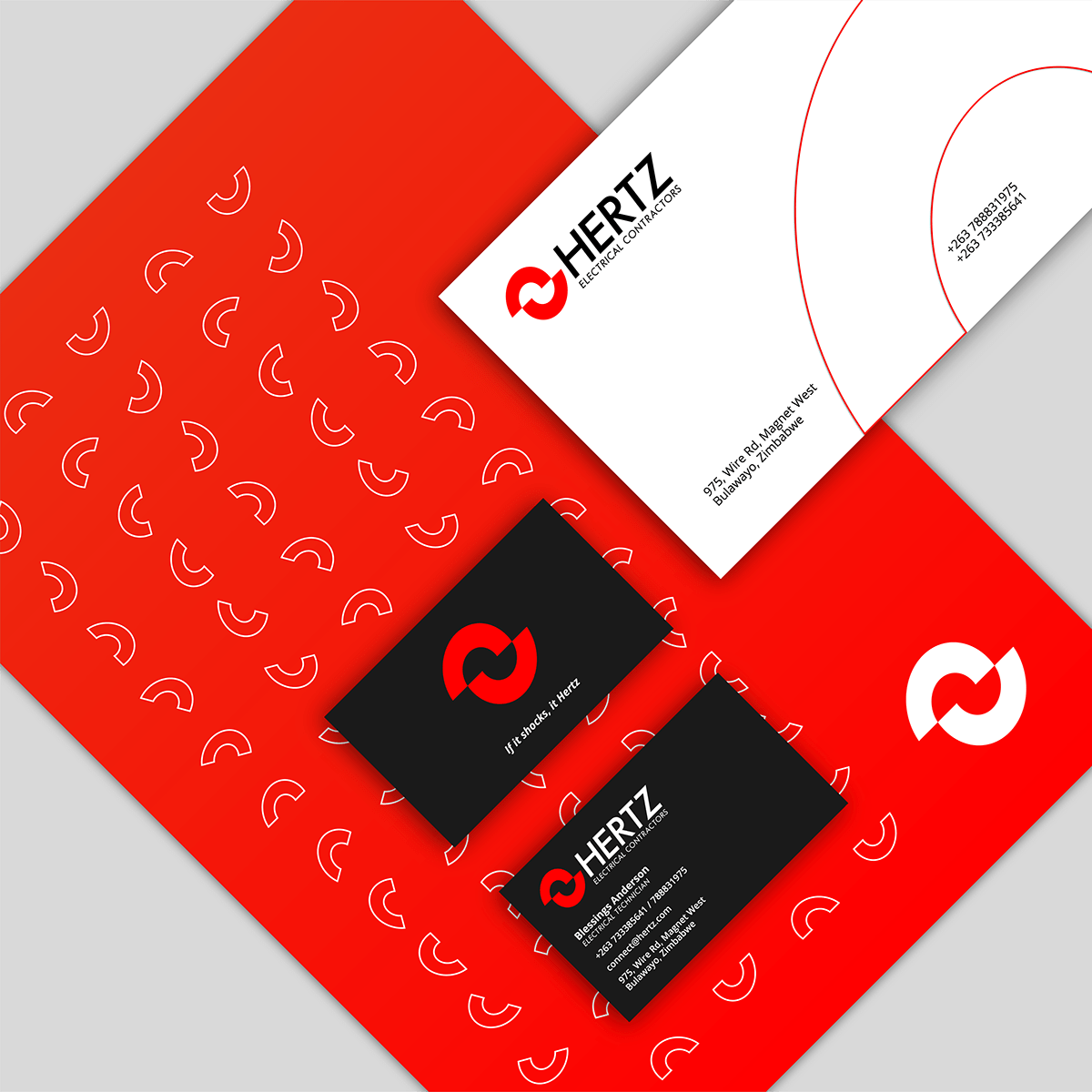
For the brand, we thought of three words: Sharp, Powerful, and Professional. We give the founders at Hertz a brand image that showcases their drive to deliver, be what it may. For this, we chose pure red to represent the brand.
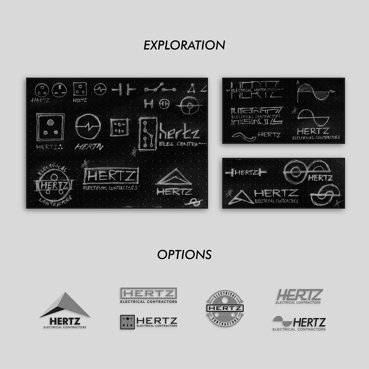
The exploration for the logo started with multiple elements pertaining to electricity. We showcased a variety of logos, each resonating a distinct idea and vision for Hertz to carry forward. We then pitched why Hertz will be best represented by the logo that you see here today!
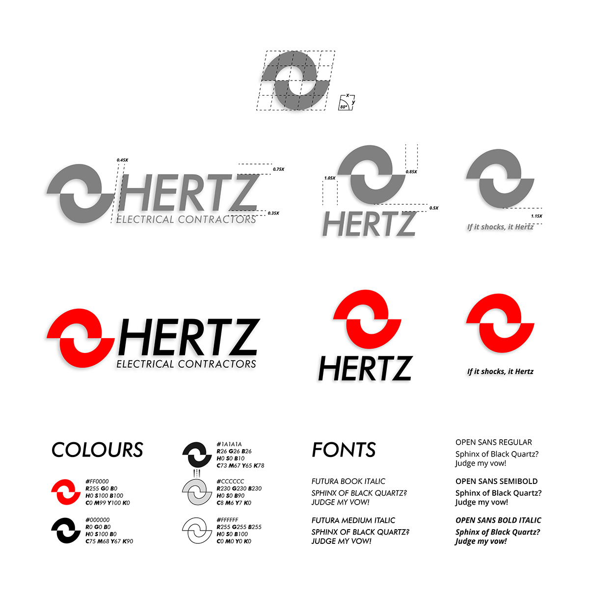
The logo is a forward-leaning wavelength, simply signifying a helping hand gently pulling forward a 'helpee'. The wordmark is sharp and rightly expresses the company's core values.
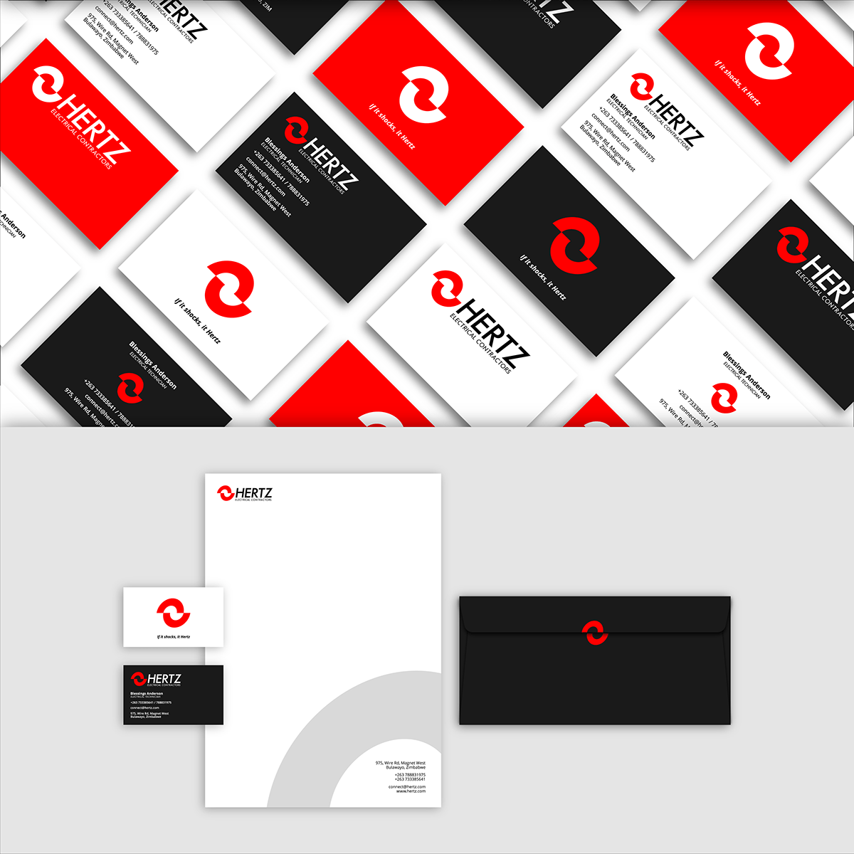
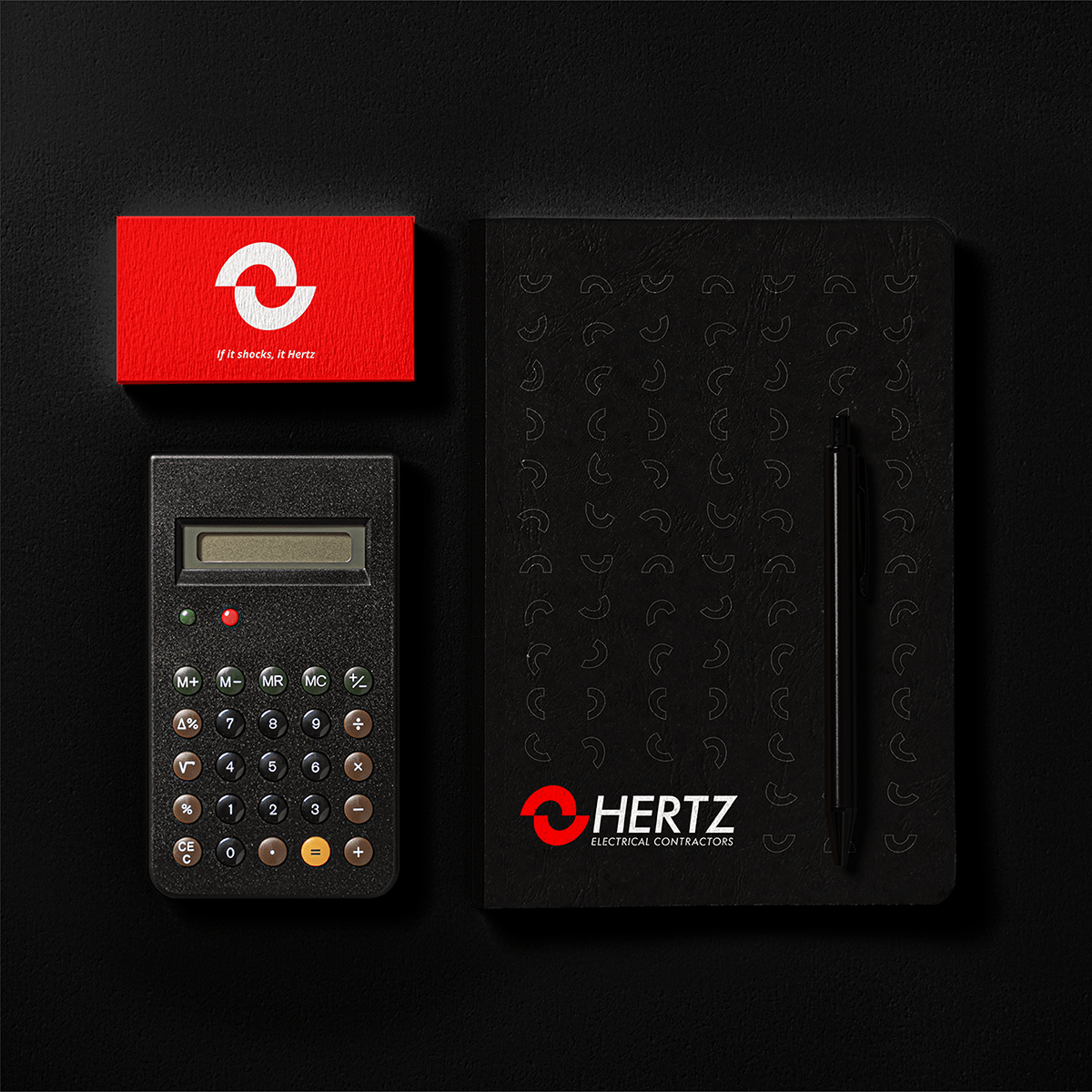
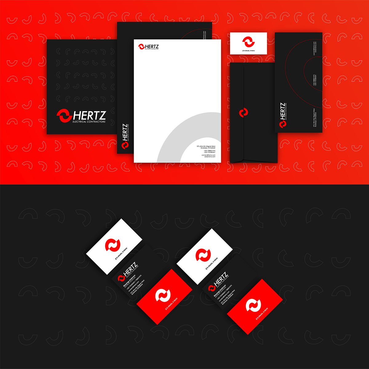
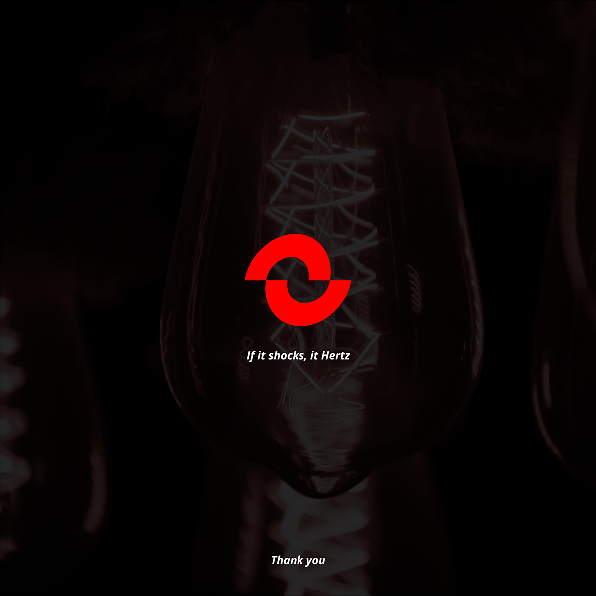
At its heart, Hertz is still a company made by the generation of today that likes to be as casual and funky as it can be straight and bold. To help them show this, we took the Zimbabwean way to come up with a catch phrase for the tagline, If it shocks, it Hertz!

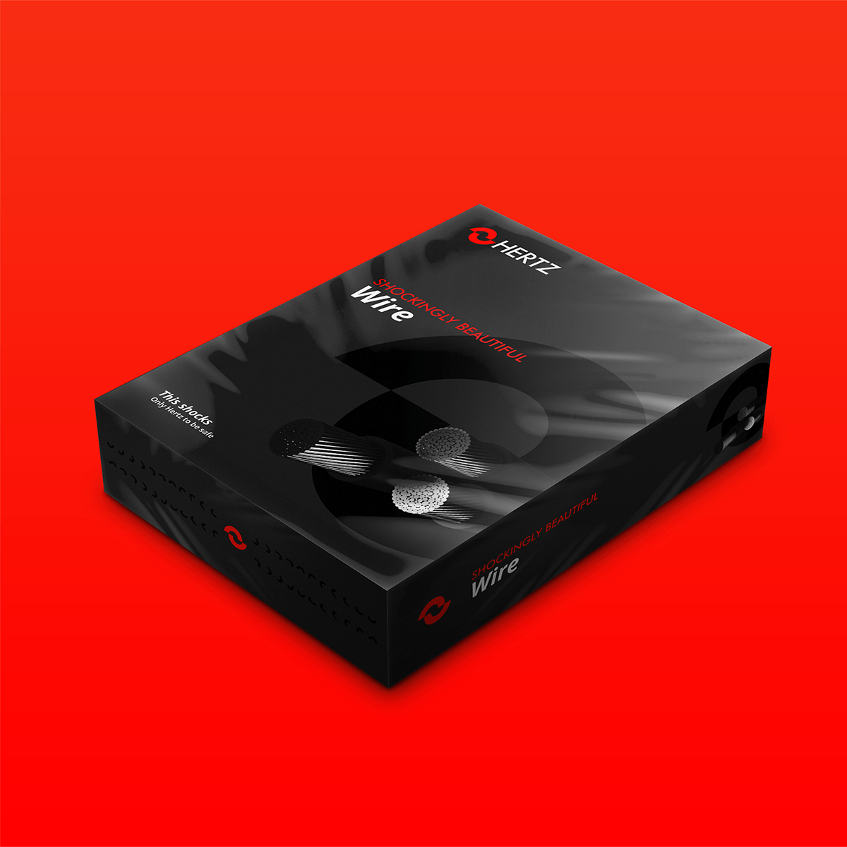
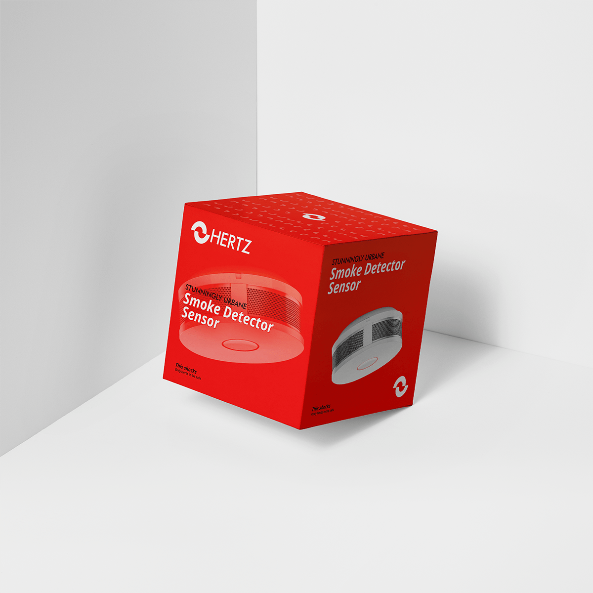
Hertz is expanding into retail business and resale of quality-assured electrical appliances and products. We proposed the following set of designs for packaging of products that Hertz already works with, and gave them another playful tagline to suit - Only Hertz to be safe!
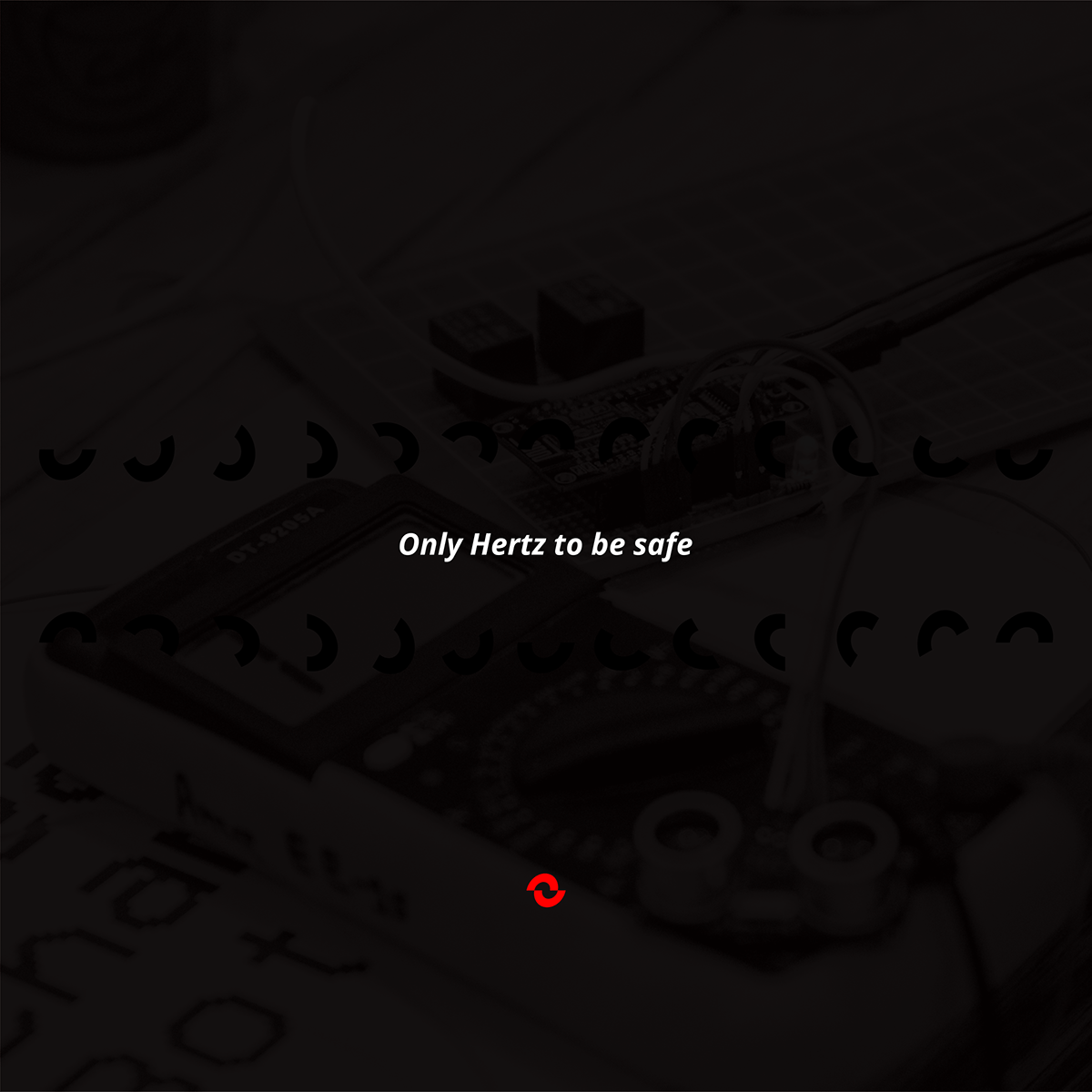

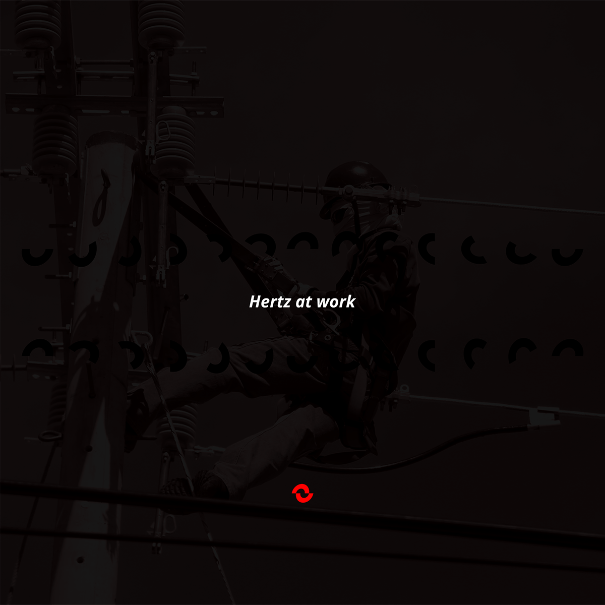
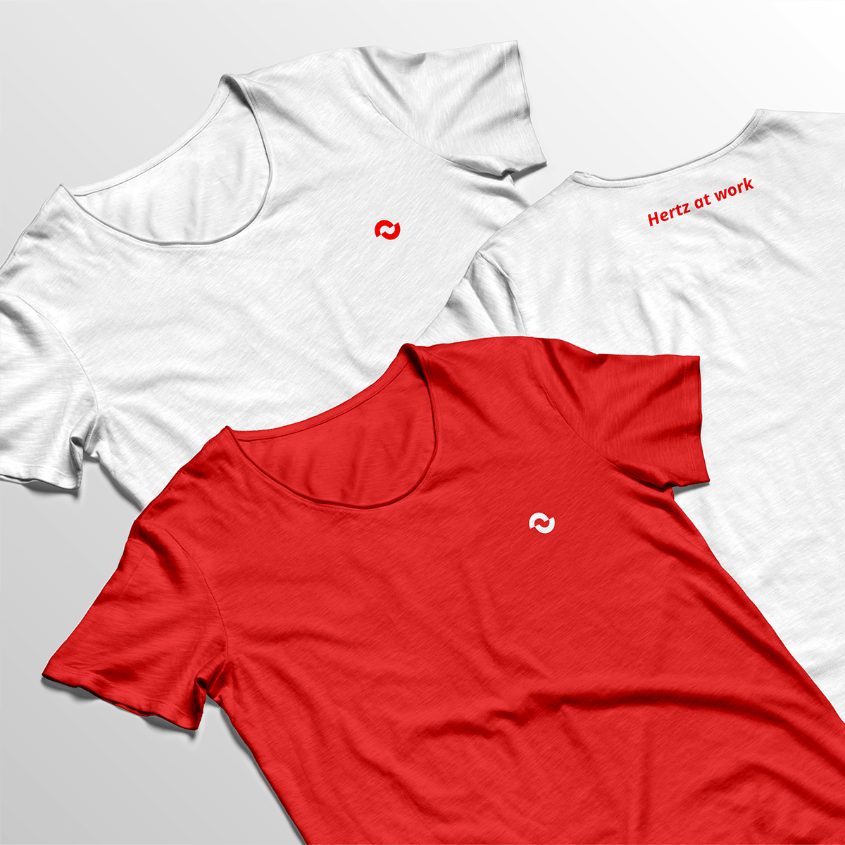
The founders at Hertz consider it to be their duty (and not their job) to ensure their customers the best service. It is a tough task on ground, it is joyous when done, and we have known the importance to highlight this as a fact. Thus, we gave Hertz another playful (and real) tagline for their apparel: Hertz at work!
For all your designing and printing needs


