EN
We started the process by analyzing the identity elements that were being used. It was a logo, composed by a gradation of brown squares, representing skin tones, accompanied by the typeface and tagline, in Helvetica Bold and Light, without other identity elements, applications or developments.
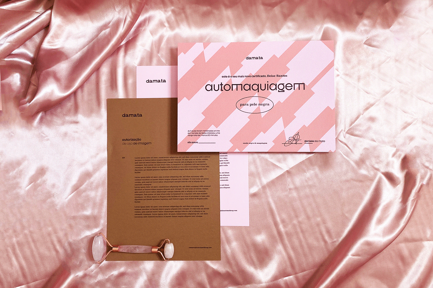
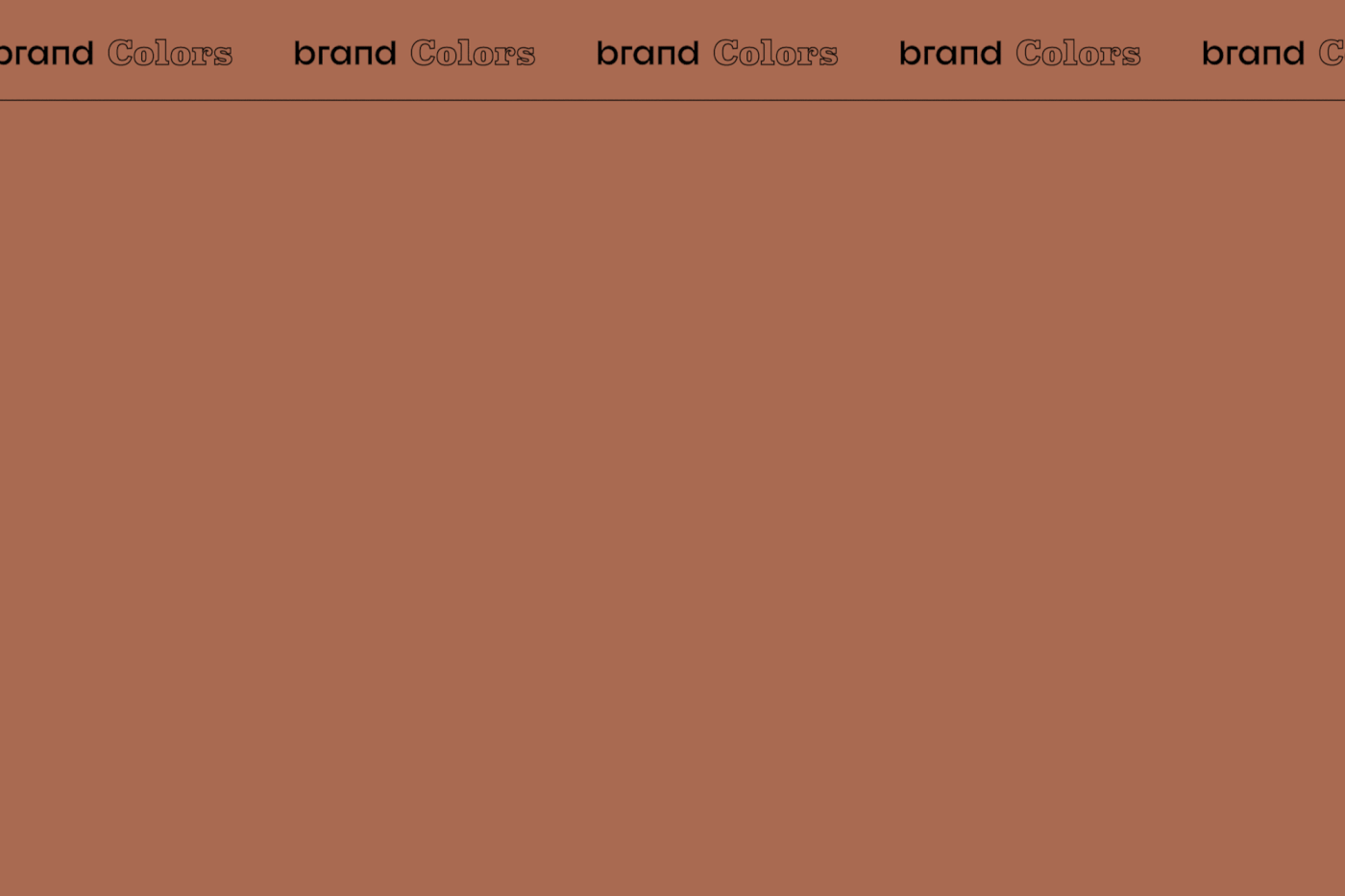
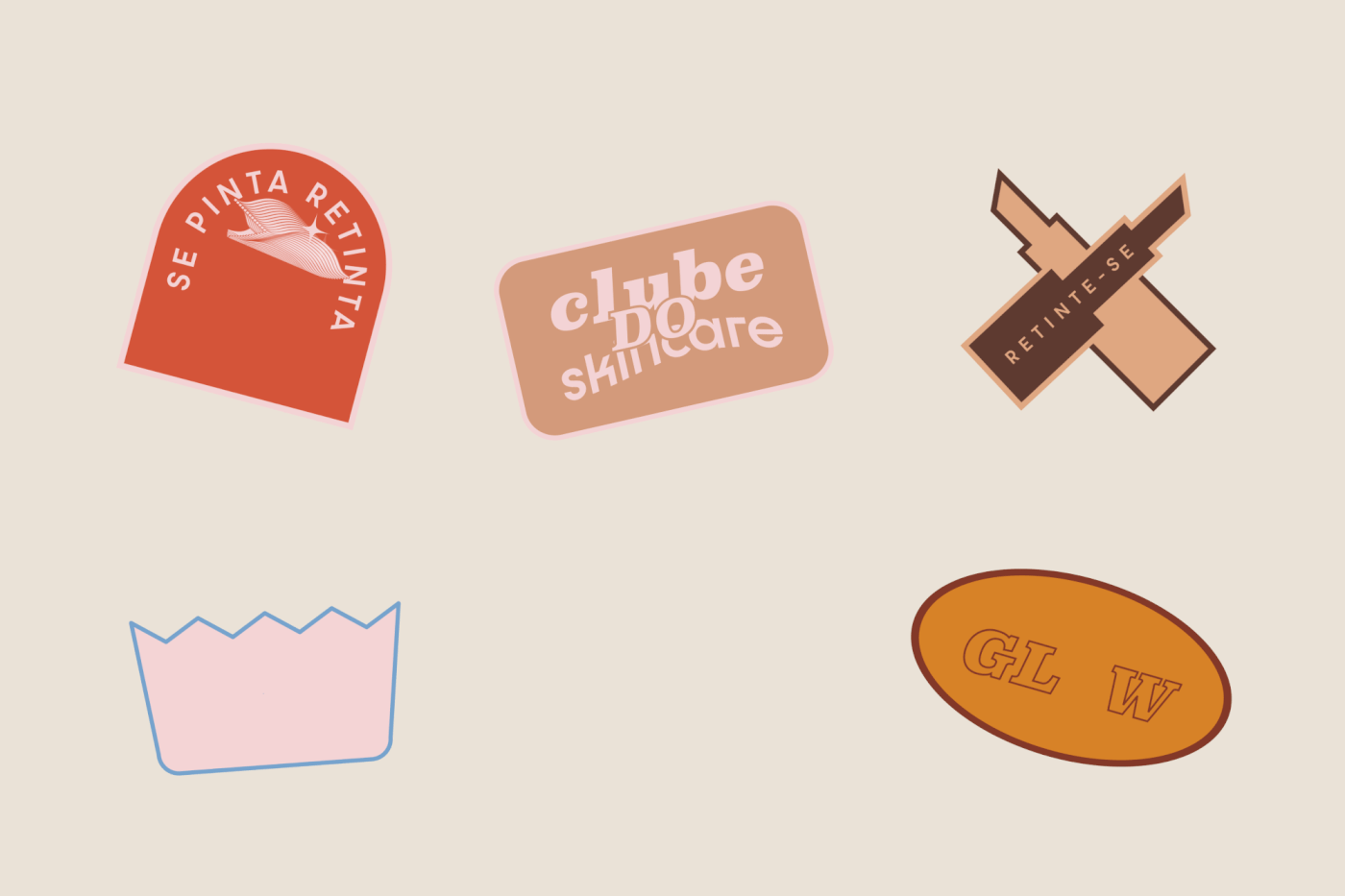
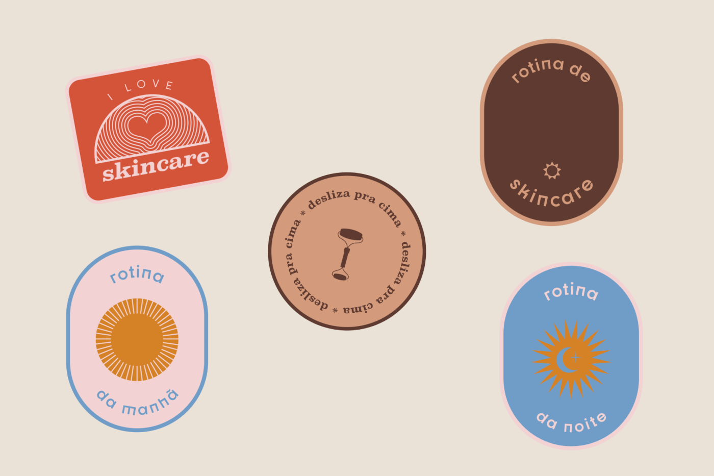
We appropriated the idea of the skin tones present in the logo, moving them from the symbol place to compose the brand's color palette, which now consists of four earthy tones associated with candy colors: blue, red, yellow and pink, in reference to the main sub-tones of black skin in Brazil.
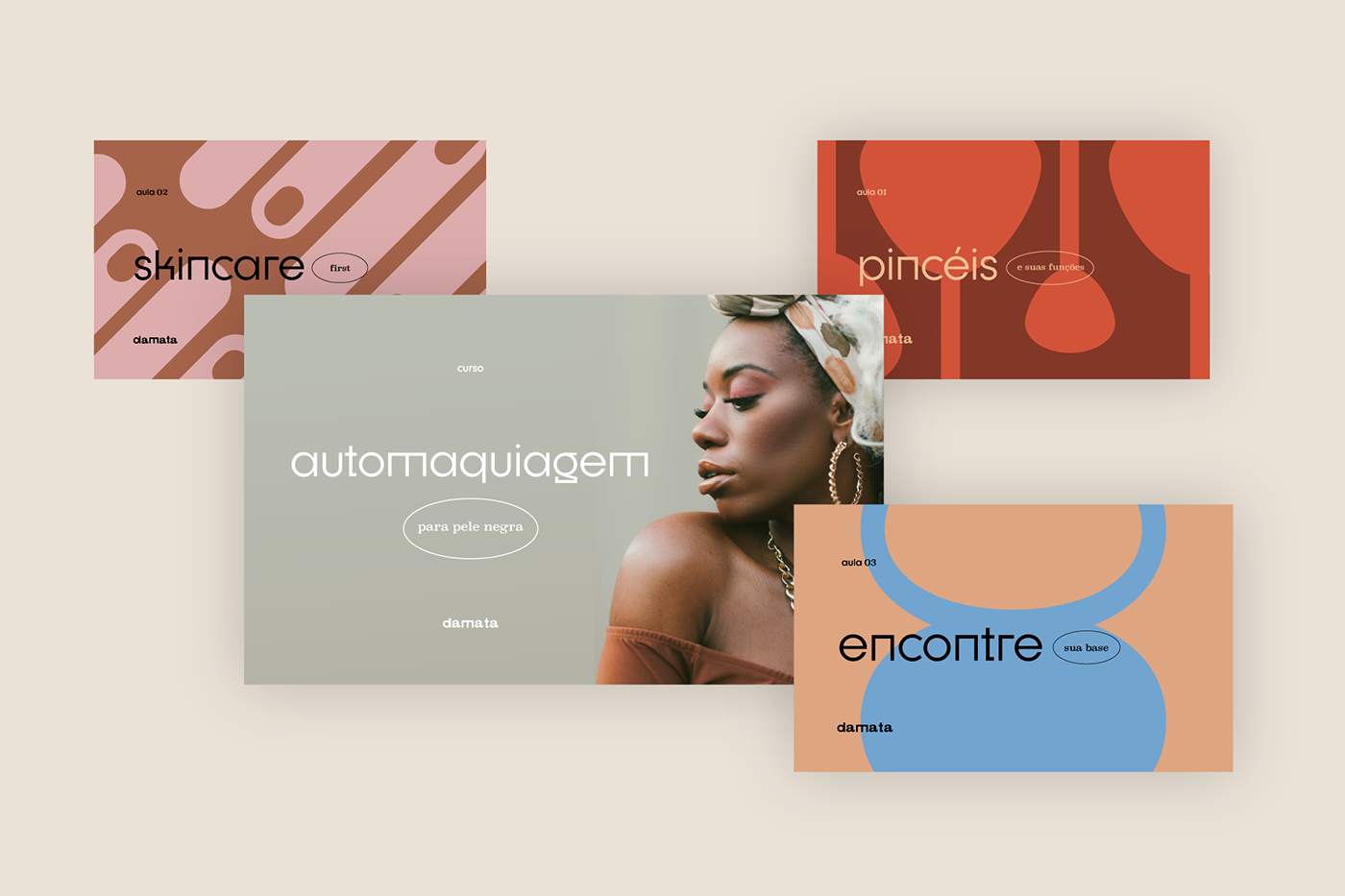
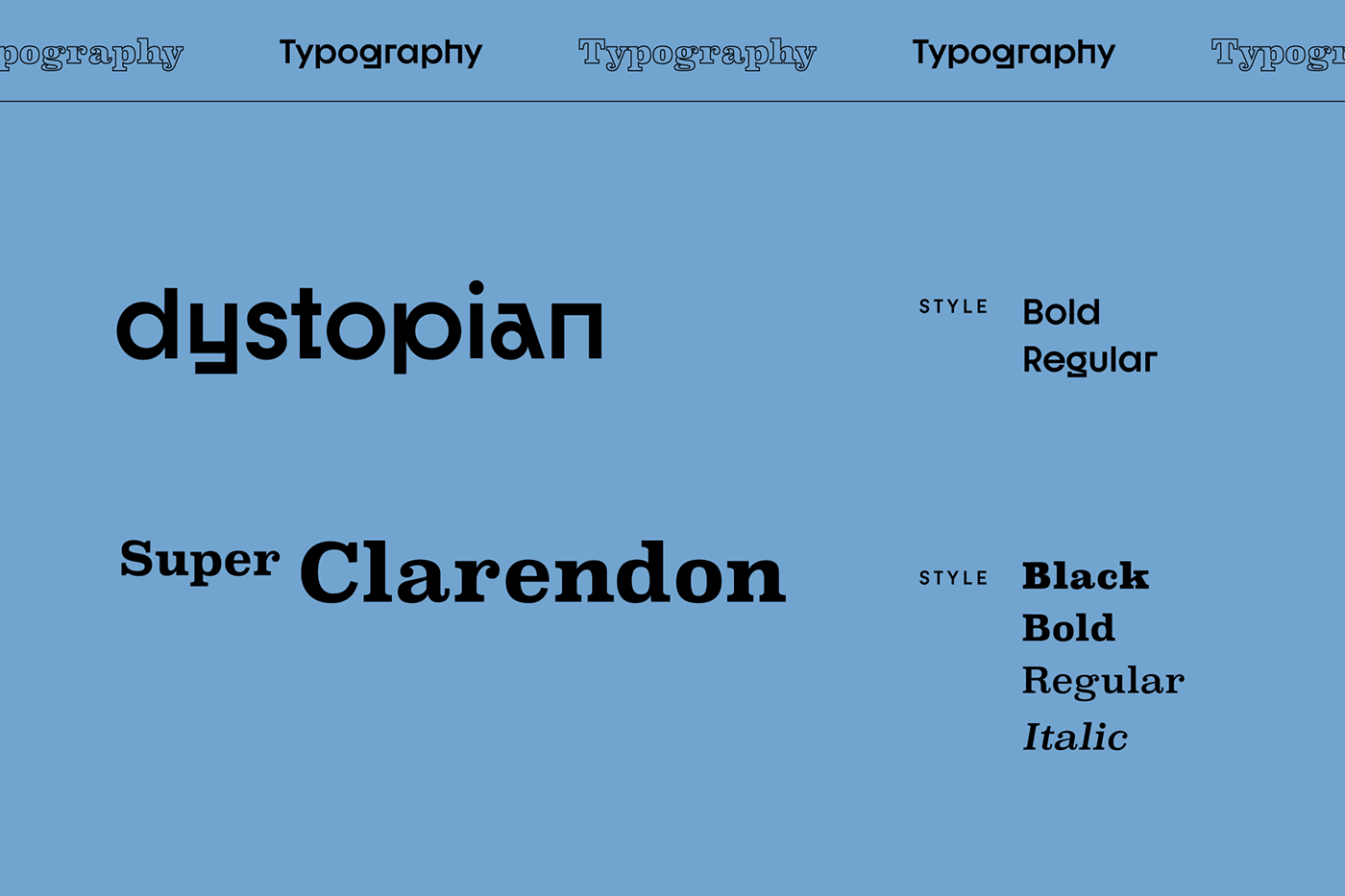
The intention of seeking harmony and complementarity also guides the decisions about the typography of the work. The contrast of the rebellious Dystopian, with its variation of glyphs, and the classic friendly SuperClarendon, bring a certain boldness to the brand. Combining the characters of the two types, the new logo is formed, which synthesizes the uniqueness of the brand, now without the tagline 'make up', since the goal was to treat makeup as a starting point, not as an end.
PT
Por tratar-se de um rebranding, iniciamos o processo pela análise dos elementos de identidade que eram usados até então. Tratava-se de um logo, composto por uma gradação de quadrados marrons, representando tons de pele, acompanhado do tipograma e tagline, respectivamente, em Helvetica Bold e Light, sem outros elementos de identidade, aplicações ou desdobramentos.
Apropriamo-nos da ideia dos tons de pele presentes no logo, deslocando-os do lugar de símbolo para compor a paleta de cores da marca, que passa a ser constituída por quatro tons terrosos associadas às candy colors azul, vermelho, amarelo e rosa, em referência aos principais subtons de pele negra no Brasil.
A intenção de buscar harmonia e complementariedade guia também as decisões sobre a tipografia do trabalho. O contraste da rebelde Dystopian, com sua rica variação de glifos, e da clássica e amigável SuperClaredon, conferem certa ousadia (freshness/eye catching) à marca. Intercalando os caracteres dos dois tipos, forma-se o novo logo, sintetizando a singularidade da marca, agora sem a tagline ‘make up’, uma vez que o objetivo era tratar a maquiagem como ponto de partida, não como fim.

EN
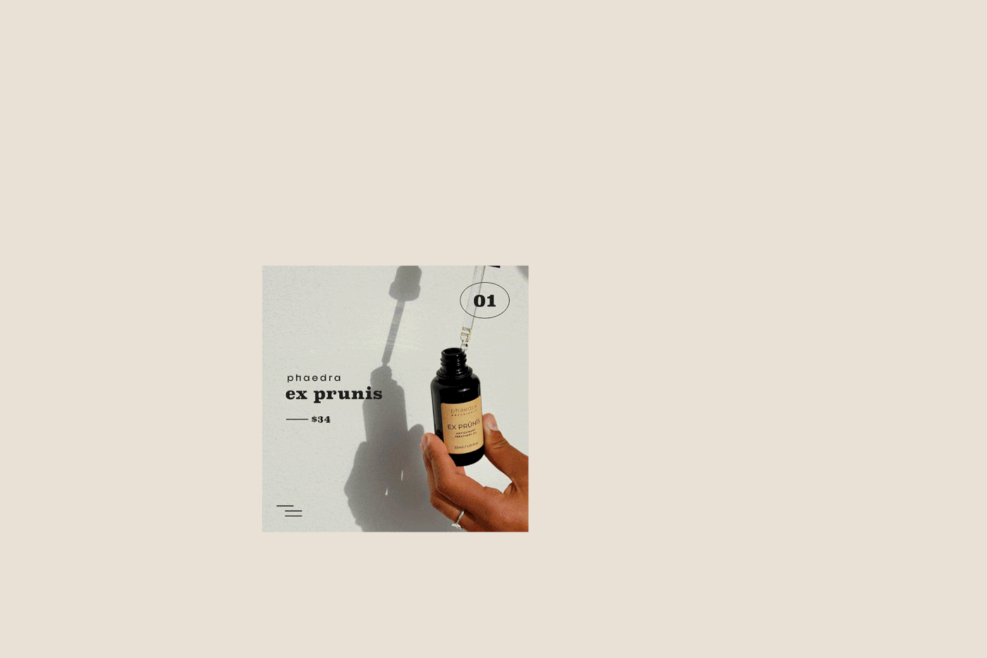
Social media is the main point of contact with the brand, so we proposed solutions that would promote the integration of the brand in these mediums. The result is a series of stickers, gifs and filters with strong mimetic appeal and that convey the brand's message at the speed of communication media.
The synthesis of this production is a brand that dialogues directly with its public and that is understood in a unique way in its most diverse fronts, from the make-up school to the social projects. An identity that can expand in perspectives and possibilities.
PT
Sendo as mídias sociais o principal ponto de contato da marca, propomos soluções que promovessem a integração da marca nesses meios. O resultado é uma série de stickers, gifs e filtros com forte apelo mimético e que transmitem a mensagem da marca na velocidade das mídias de comunicação.
A síntese dessa produção é uma marca que dialoga diretamente com seu público e que é compreendida de forma única em suas mais diversas frentes, da escola de maquiagem aos projetos sociais. Uma identidade que pode se expandir em perspectivas e possibilidades.
EN
The 'DaMata' paradigm is in showing that makeup - and self-care at all - can be tools to enhance the beauty of the black person, as opposed to the idea of using it as a way to disguise black features. Adding melanin to millenials represents bringing the possibility that young black people can also feel part of the group that guides discussions and consumption patterns on the internet. Even though 54% of the Brazilian population declares itself black, the cosmetic-dermatological market has paid no attention to the specific necessities of this group.
Lastly, the brand assumes a role in building an active community, debating solutions for themselves, exploring new possibilities and reaffirming their self-esteem. Thus, the construction of this identity did not aim to affirm something, on the contrary, the whole process was an exercise in exploration and discovery. If there is a goal, it is to provoke. To provoke us as designers about what it is to be black and what kind of visuality we build to represent blackness. To provoke disturbance. Instability. We believe that this is an inexorable question, at least as long as the existence of this project, by itself, is a subversion.
PT
O paradigma ‘DaMata’ está em mostrar que a maquiagem – e o autocuidado como um todo – podem ser ferramentas para realçar a beleza da pessoa negra, se opondo à ideia de usá-la como um modo de disfarçar os traços negróides. Adicionar melanina aos millenials representa trazer a possibilidade de que jovens negros também se sintam parte do grupo que guia as discussões e os padrões de consumo na internet. Ainda que 54% da população brasileira se declare negra, o mercado cosmético-dermatológico pouco se debruça sobre as necessidades específicas desse grupo.
Por fim, a marca assume um papel de construir uma comunidade ativa, debatendo soluções para si, explorando novas possibilidades e reafirmando a sua autoestima. Sendo assim, a construção dessa identidade não visava afirmar algo, pelo contrário, todo o processo foi um exercício de exploração e descoberta. Se há um objetivo, é provocar. Nos provocar enquanto designers a respeito do que é ser negro e de que tipo de visualidade construímos pra representar a negritude. Provocar inquietação. Instabilidade. Acreditamos que essa é uma questão inexorável, ao menos enquanto a existência desse projeto, por si só, for uma subversão.