
“Brazil. This colossal mix of contrasts. Miscellaneous people, references, cultures and native wisdom. A cauldron of possibilities of continental measure. Yes, we are a TV channel with ‘Brasil’ in our name. The celebration of many Brazils that fit into one. Canal Brasil’s new brand aims to materialise the richness of our culture and the history of our typography in cinema, art and design. It is diversity in motion.”
Diversity in Motion
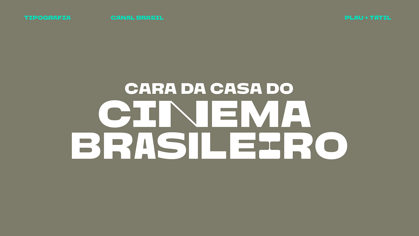
Designing a typeface for TV channels is always a dream job for us type designers. “Canal Brasil” is part of Brazil's top cable TV provider, Globosat, promoting creative and artistic production of all kinds.
We partnered with branding agency Tátil to design the channels’ bespoke typeface.
Canal Brasil had a very long lasting identity, deeply rooted on Brazilians’ minds. But changes within the company led to new shows and a novel approach that required a brand refresh.
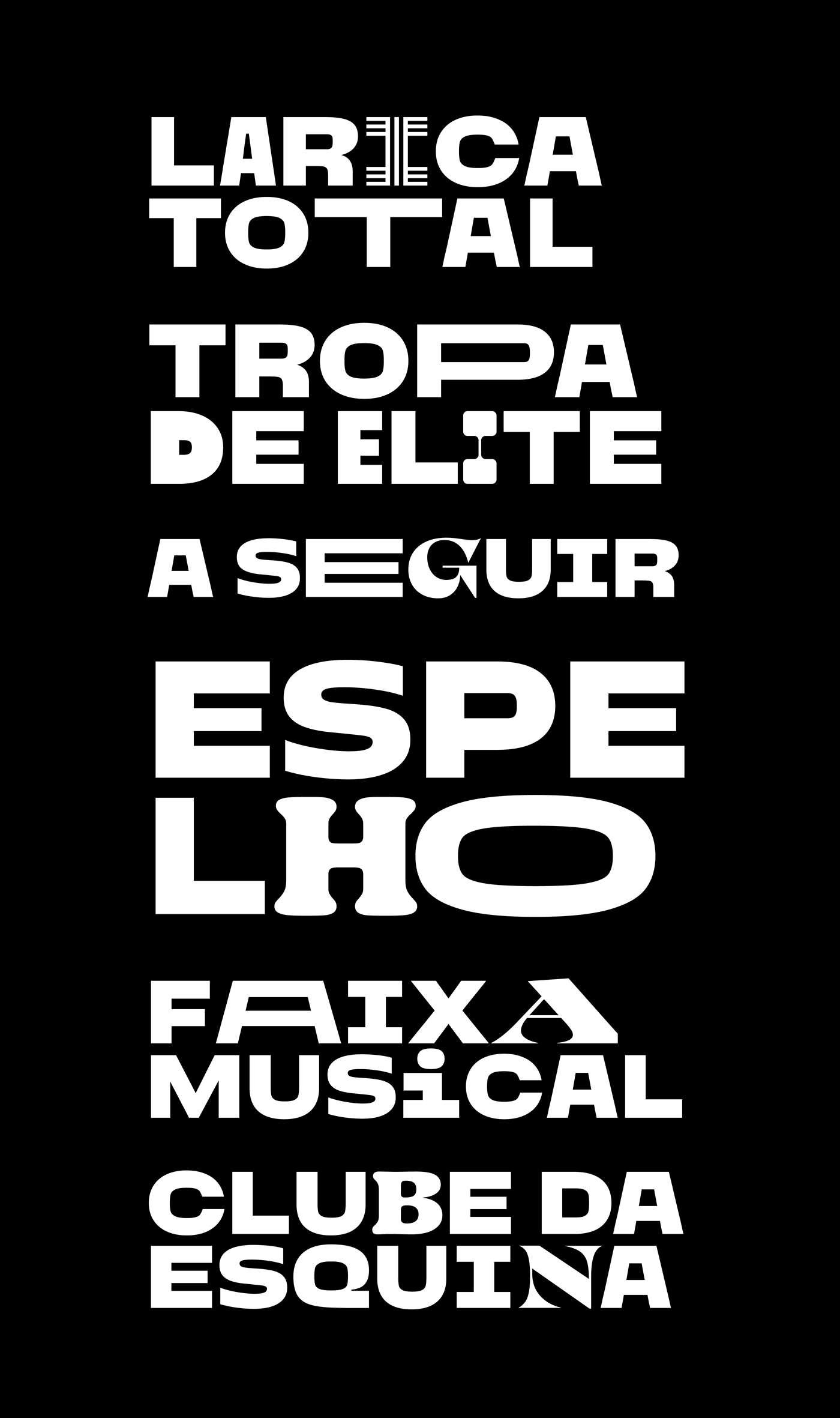
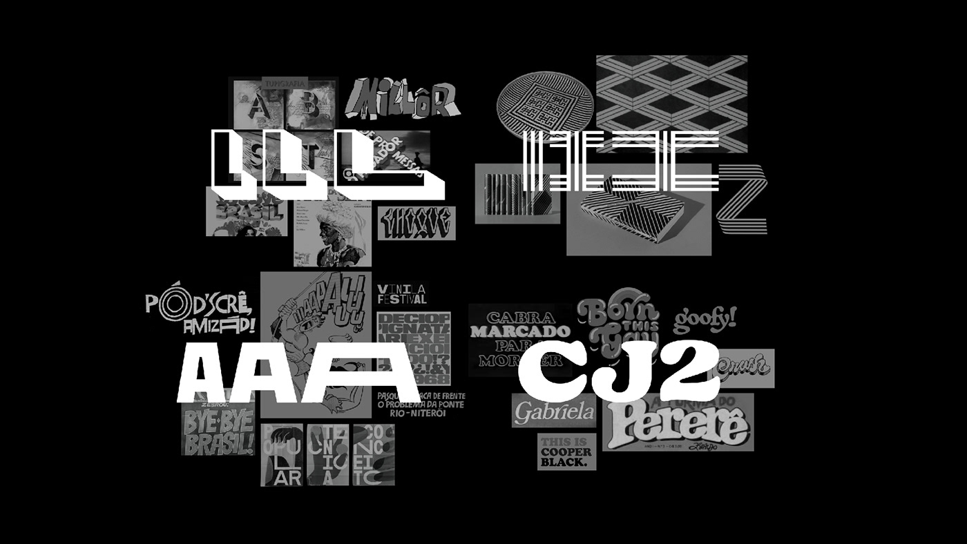
Tátil designed a type based approach inspired by the country's culture. From beloved movie classics and entertainment behemoths all the way to mainstay cultural references.
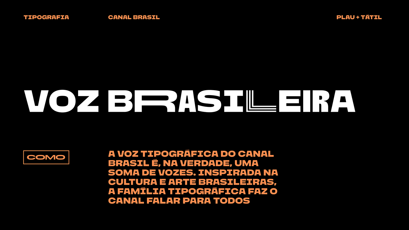
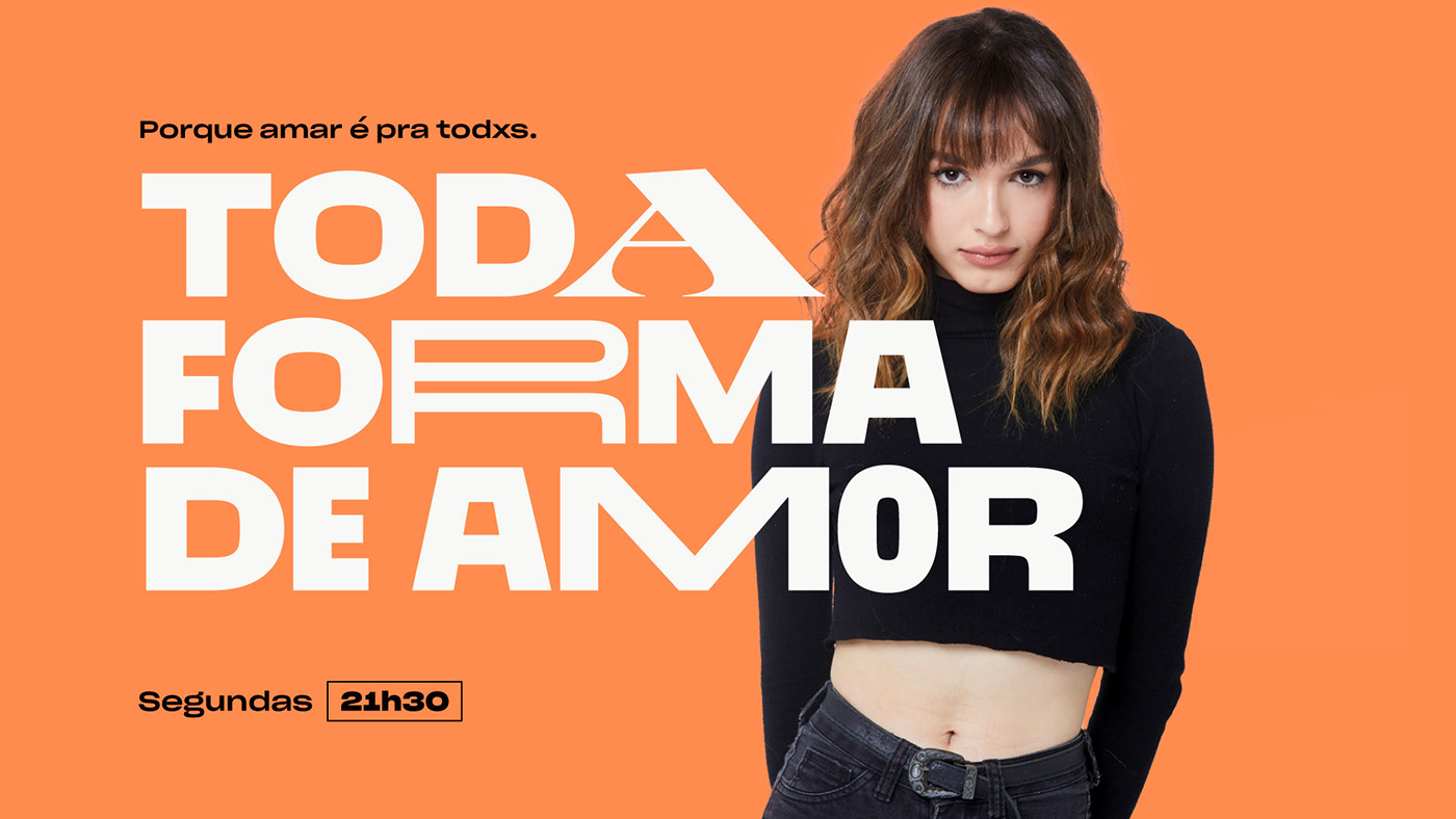
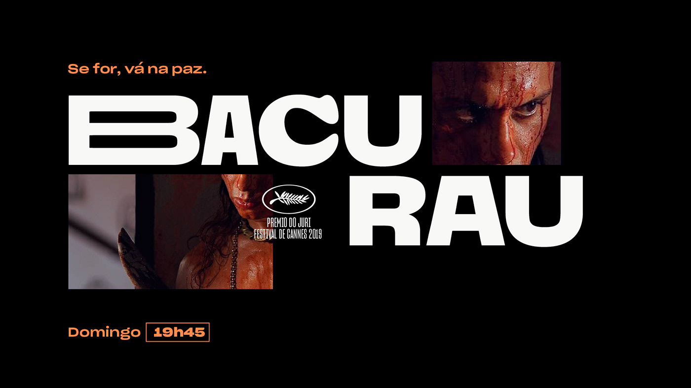
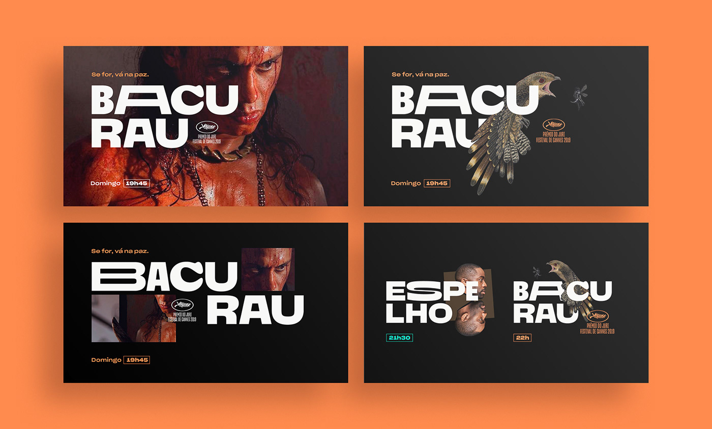
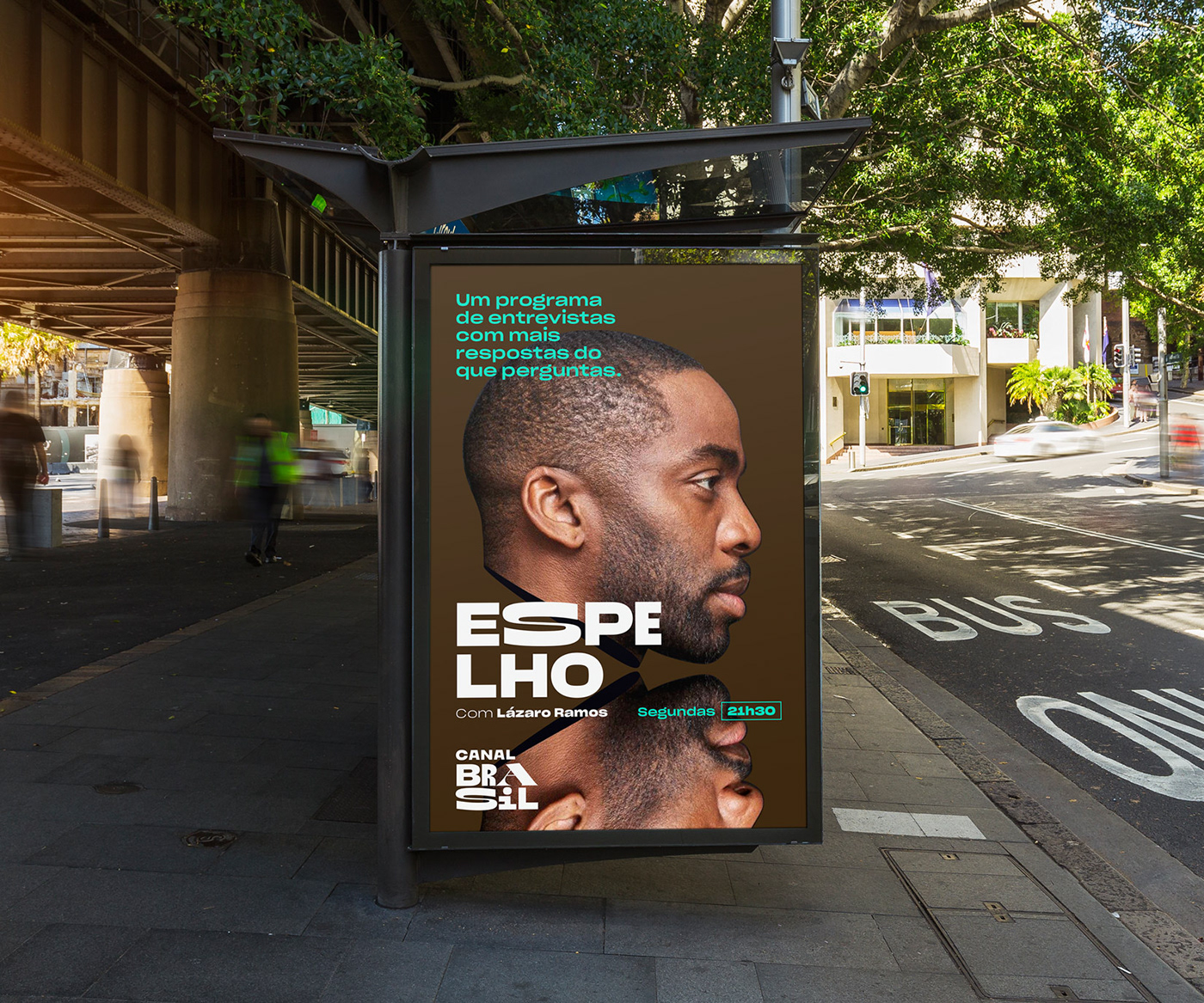
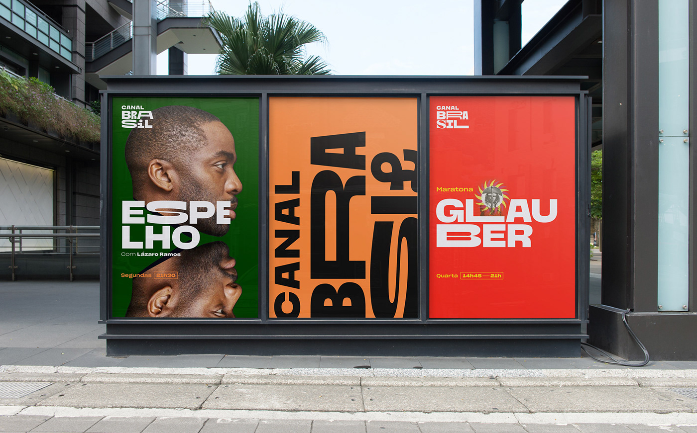
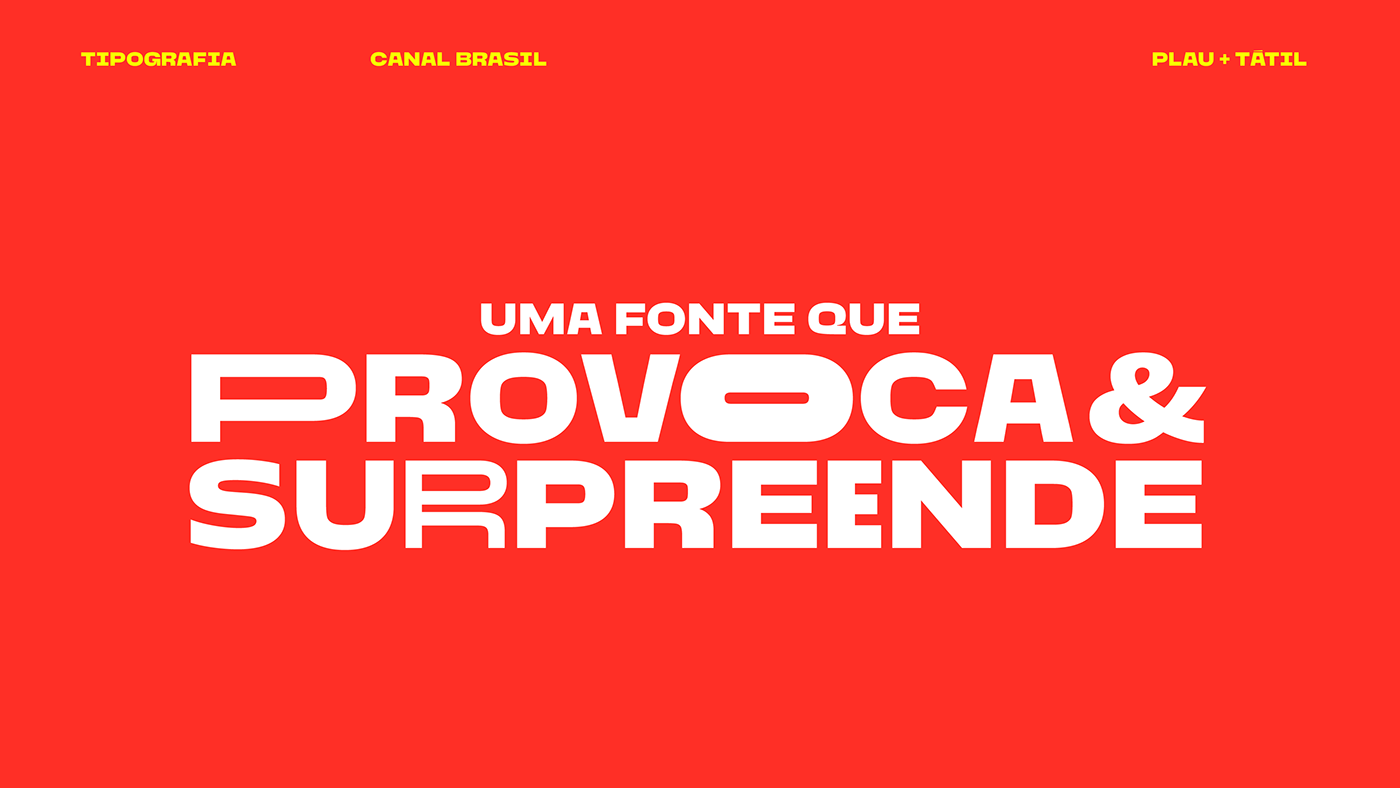
We like to call a brand's type identity its "type voice". In this case, it's safe to say that Canal Brasil's type voice is, really, an array of voices. Being so inspired by Brazilian art and culture, this typeface make Canal Brasil truly speak to all.
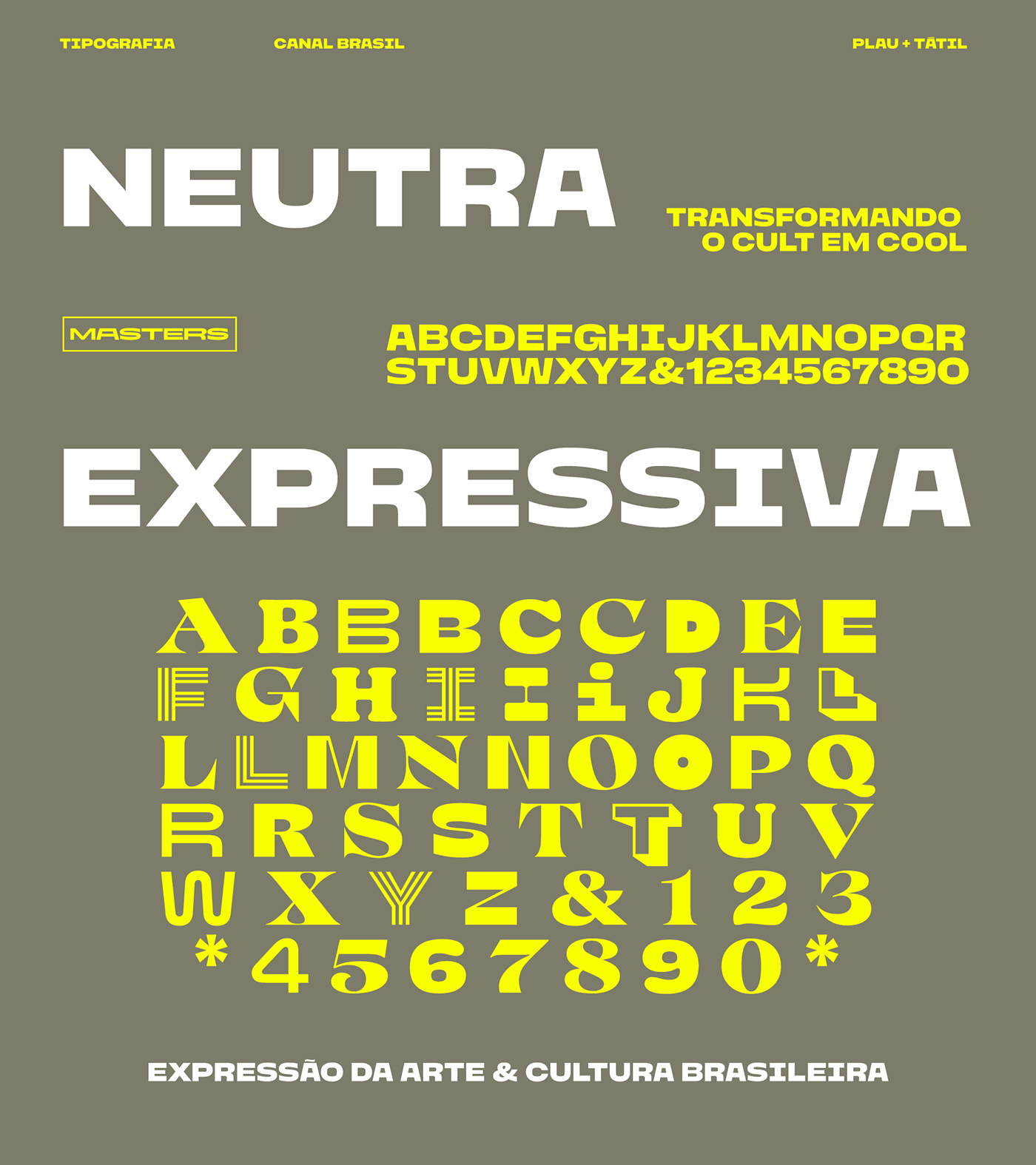
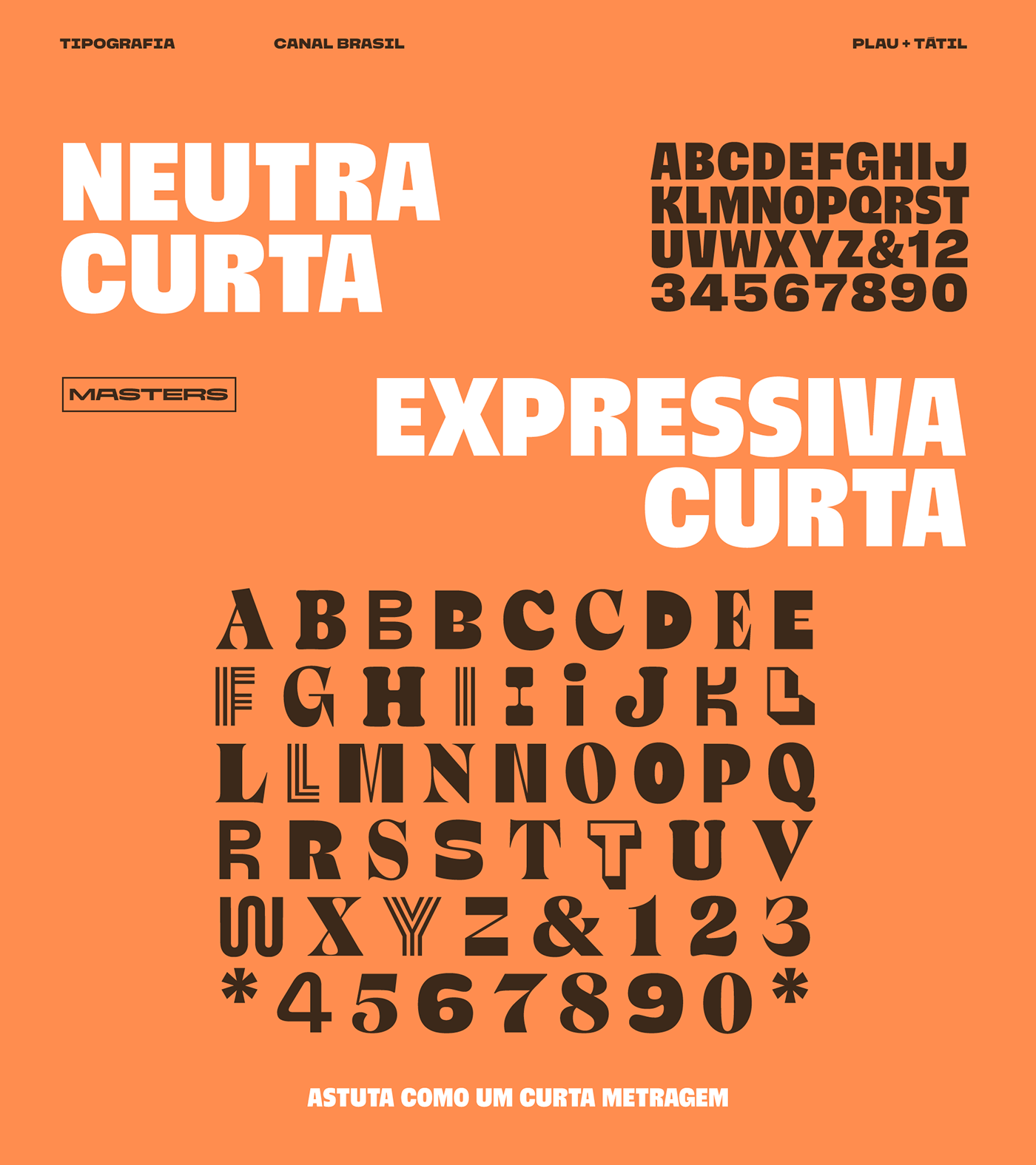
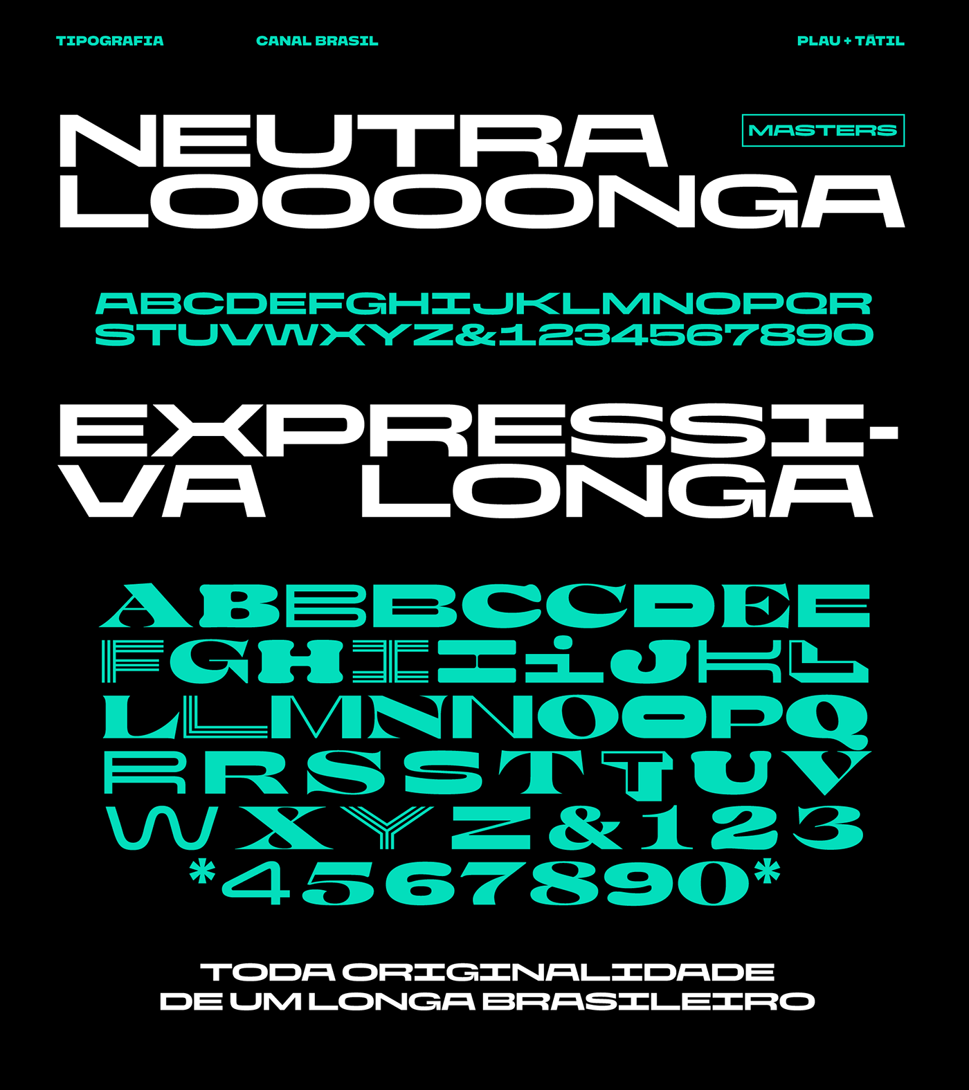
The typeface
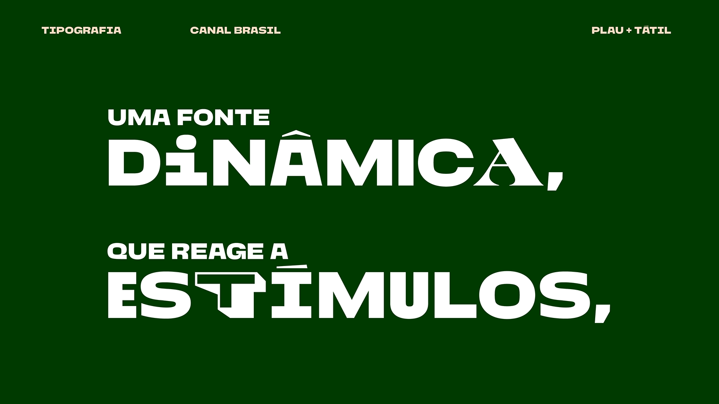
A variable font that speaks, that reacts in a lively and organic way. It varies, adapts, interacts and demands an analysis of our own identity.
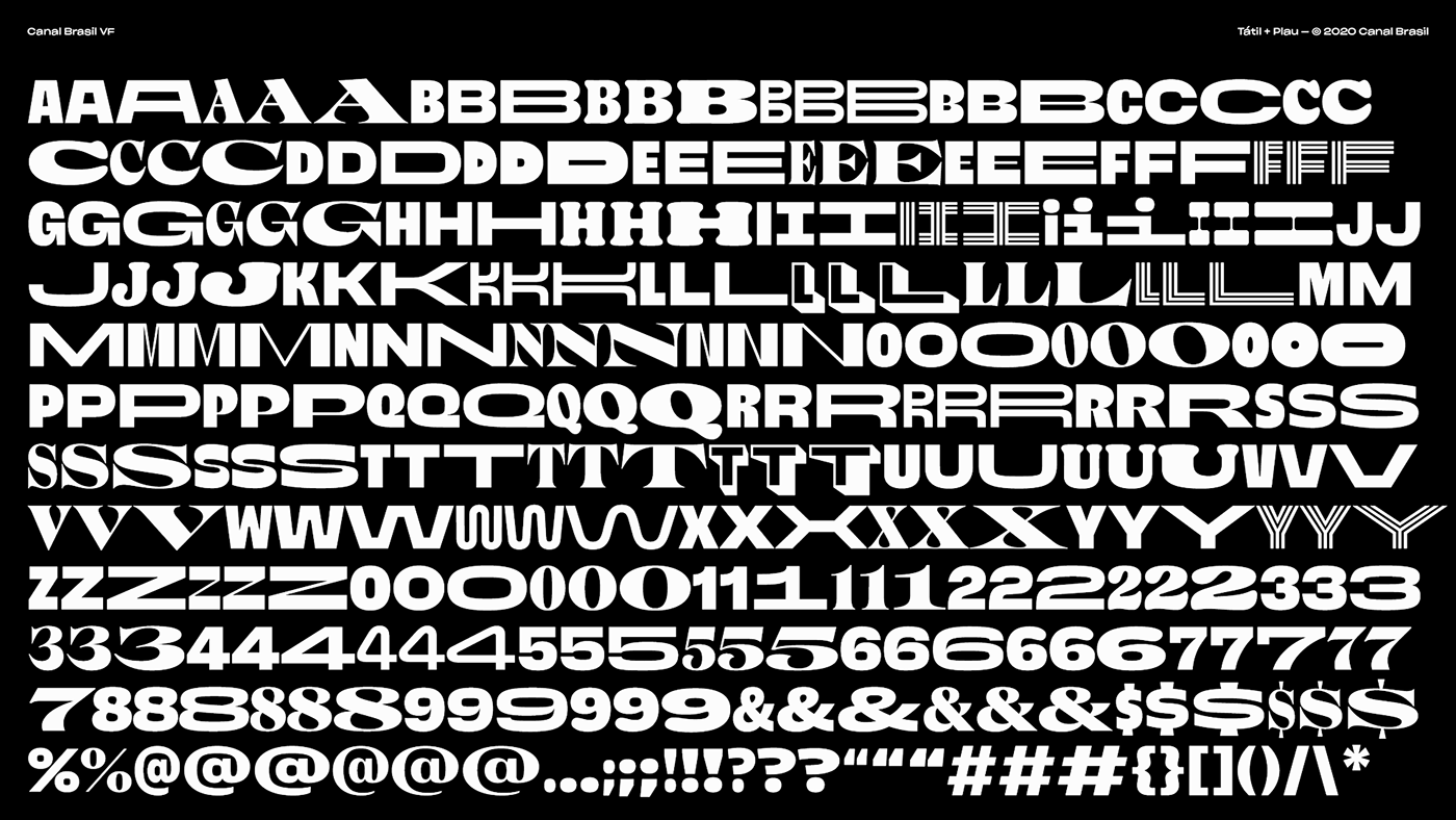
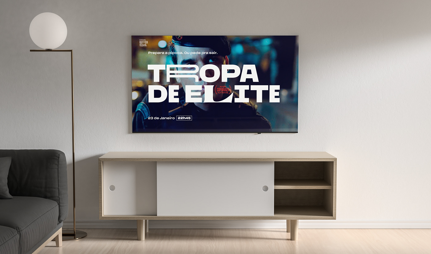
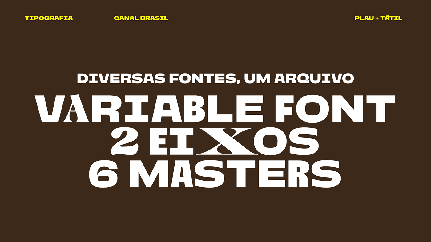
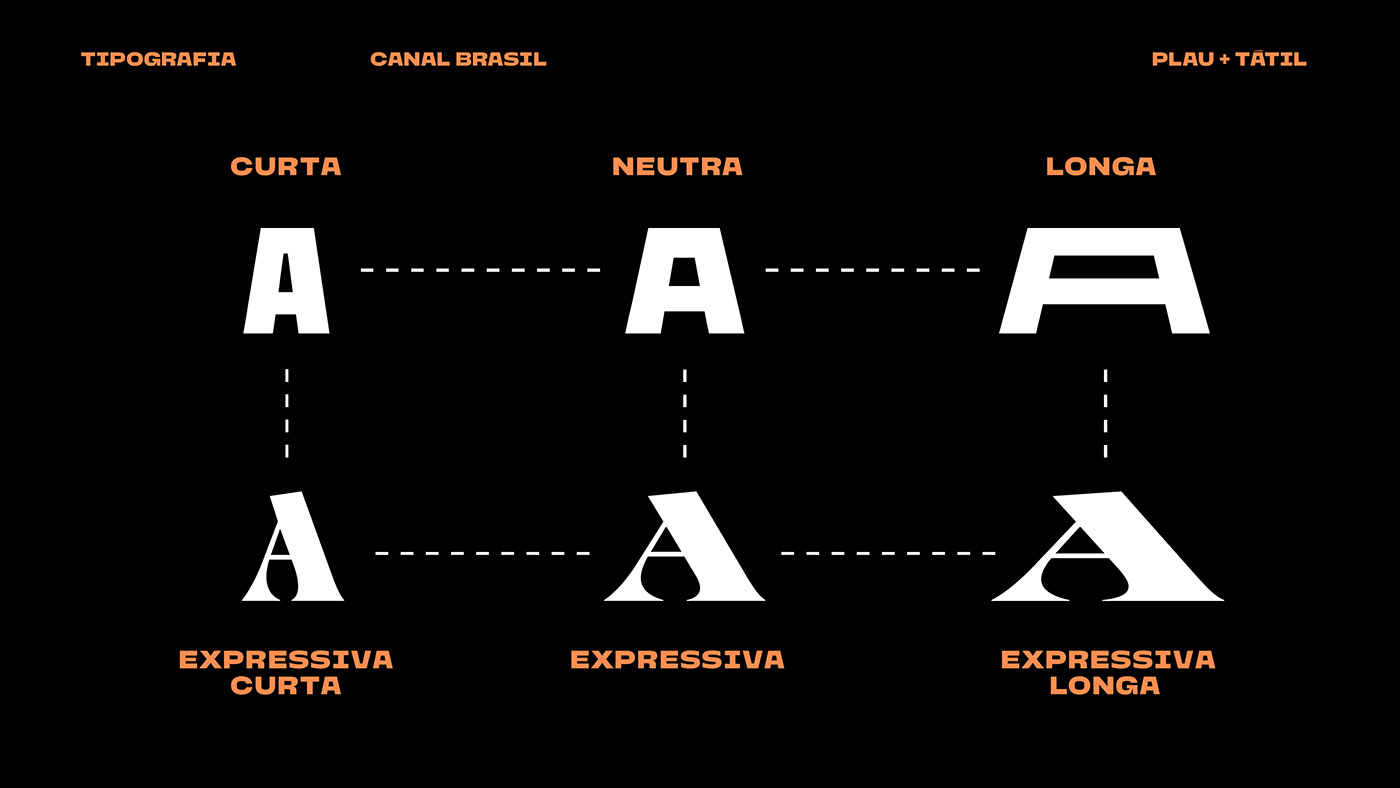
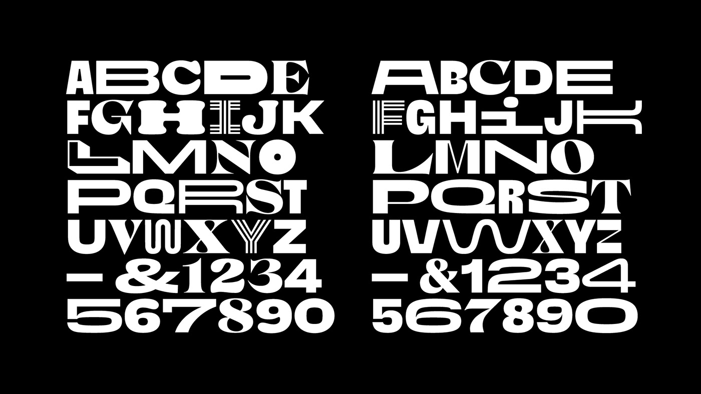
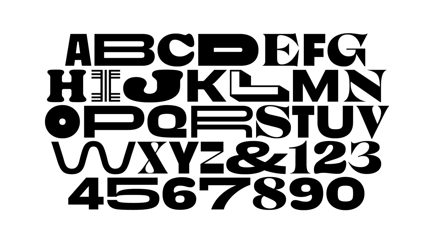
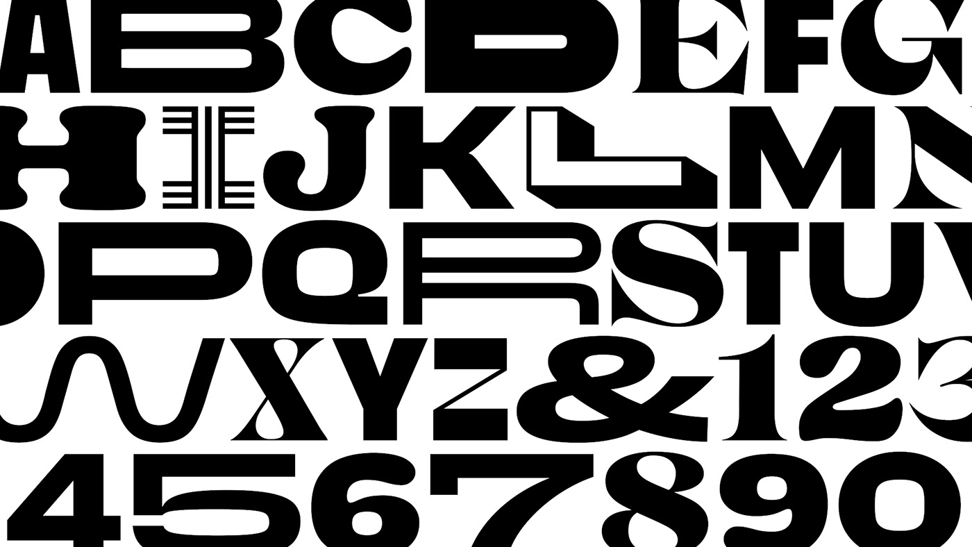
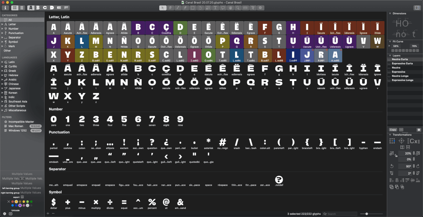
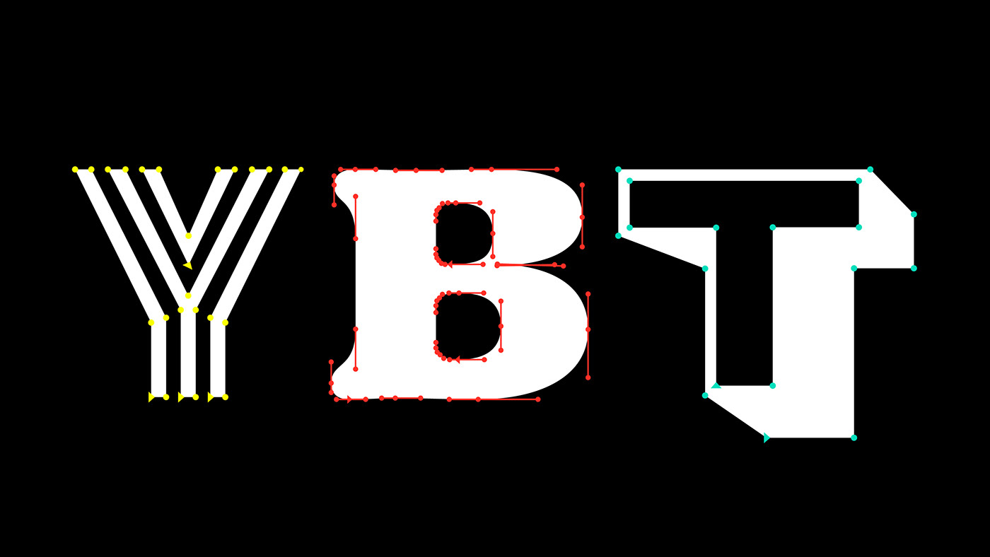
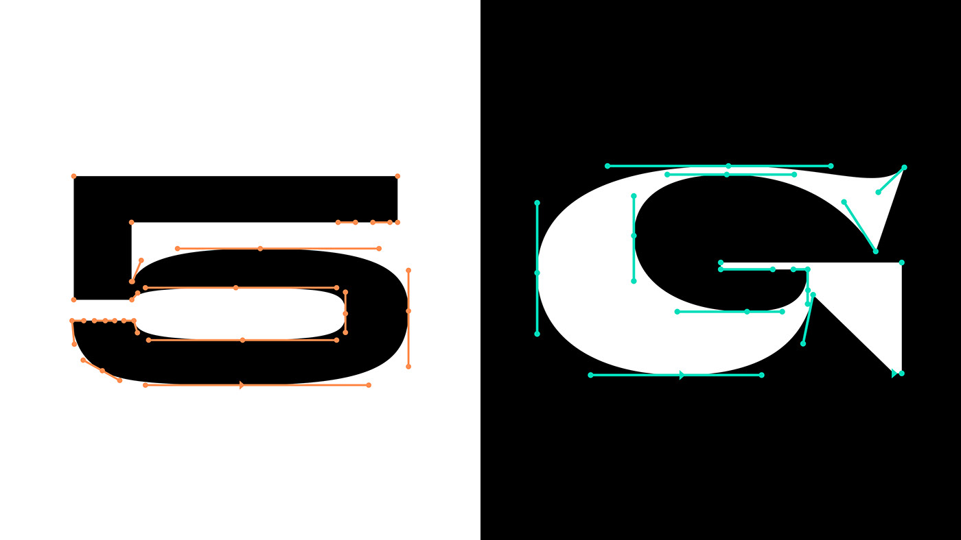
Under Tátil’s creative direction and materialised by Plau’s typographic expertise, Canal Brasil VF is a display, all caps variable font with two axes: width & expression.
Inspired by a deep look at our graphic history and contemporary practices, it is, on the one hand, a complex but careful exercise in combining type, and on the other, a delightful process of cultural and aesthetic synthesis.
Moving targets and technical challenges
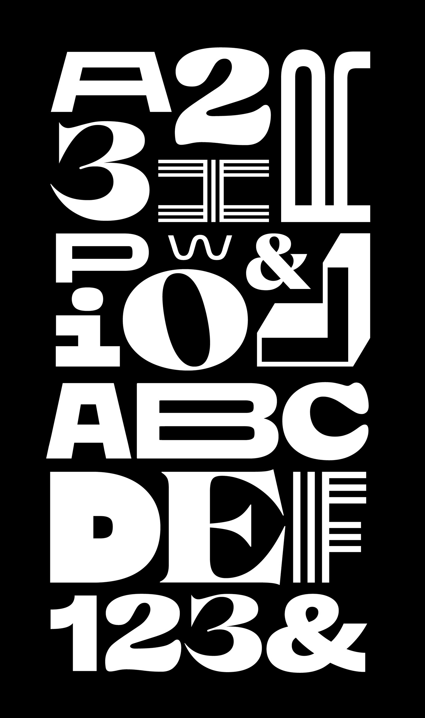
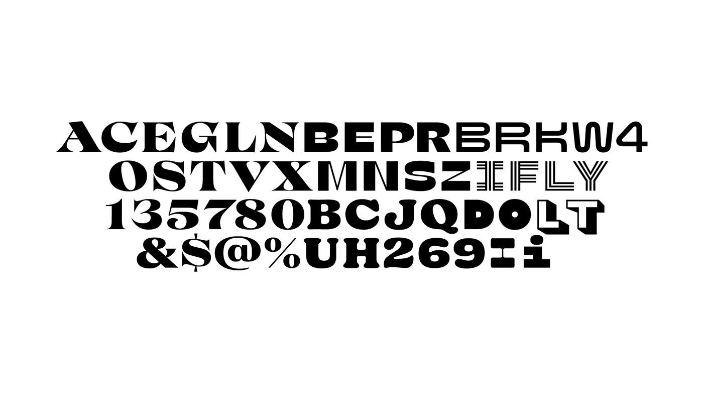
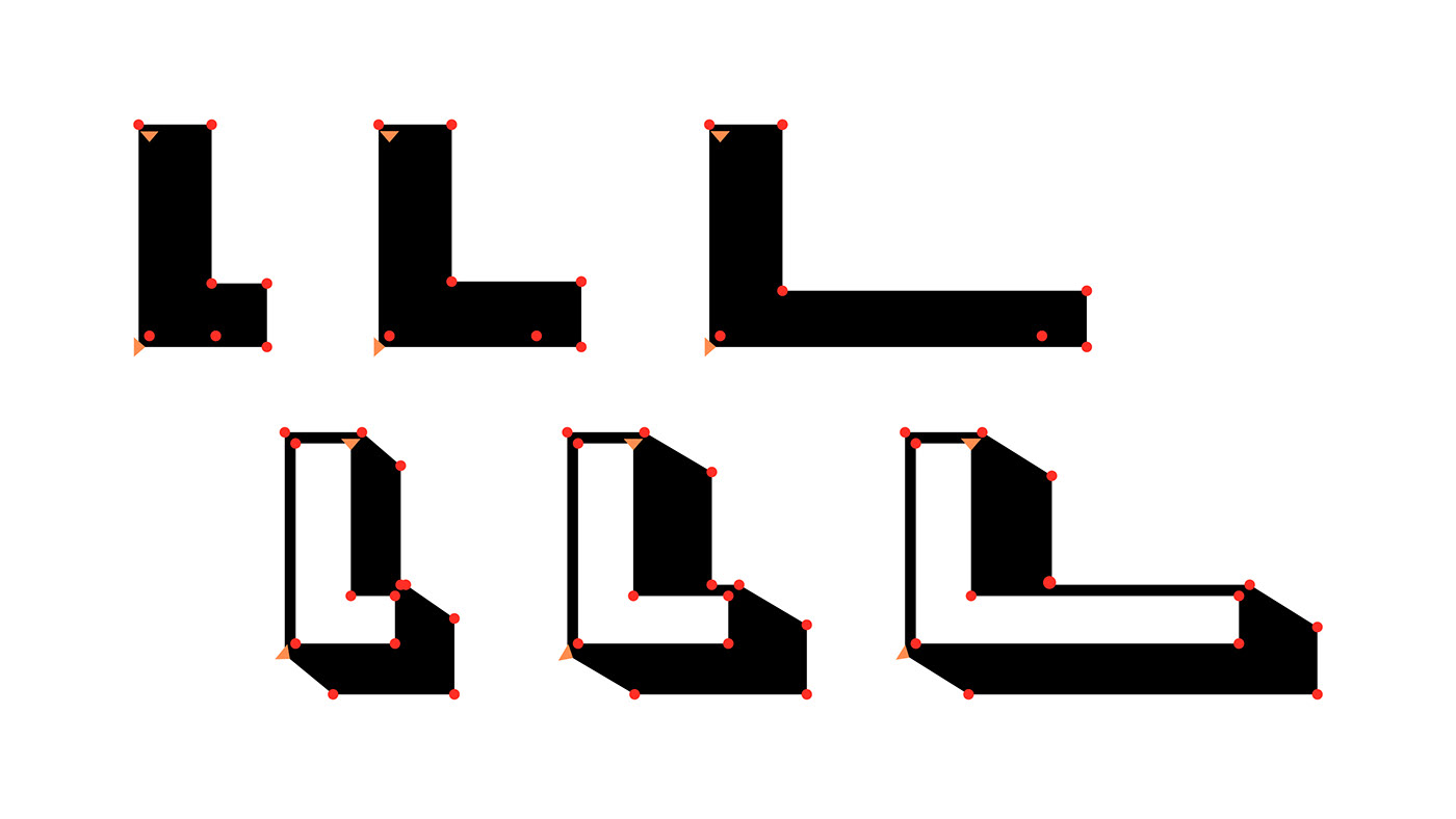
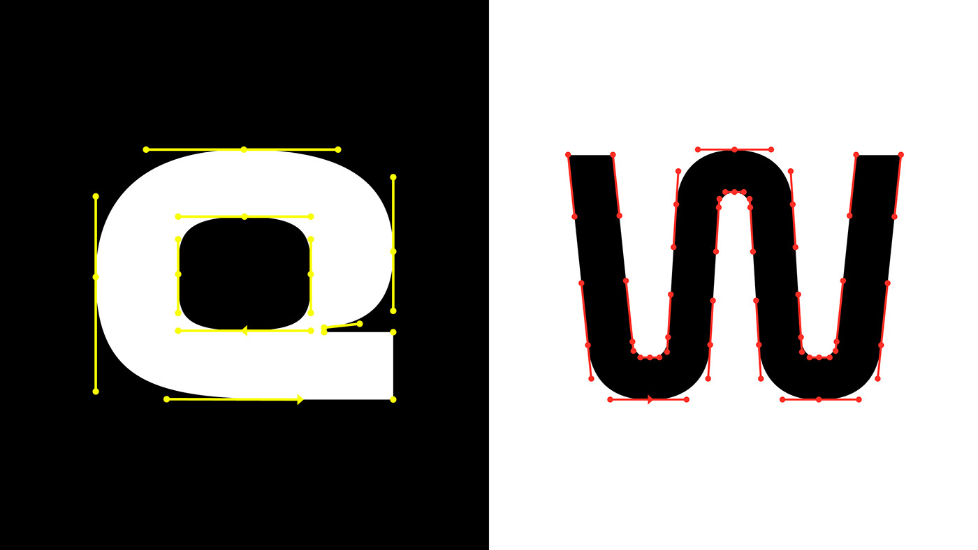
There were many technical hurdles to overcome in the making of the project. Not only all letters needed to morph from a general grotesque into expressive territory (serifs, blobs, multiple strokes and more) but it needed to make it in three different lengths: narrow, regular and extended.
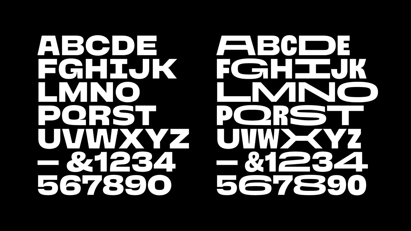
Take the uppercase letter I for example: 4 points and you're done, right? What if you need it to look like an ancient Brazilian indigenous proto-letter, with multiple strokes. Suddenly 4 points turn into 60, split into multiple objects that need to flow smoothly in-between keyframes. Now add multiple styles and variations for each letter.

Brazil at its best
The result is a typeface that represents the Brazilian culture in its single most important aspect: diversity.