

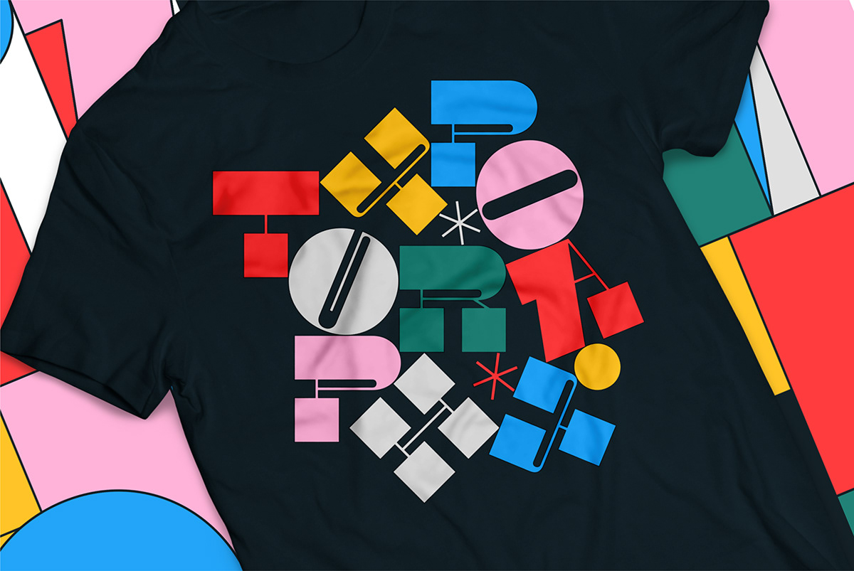
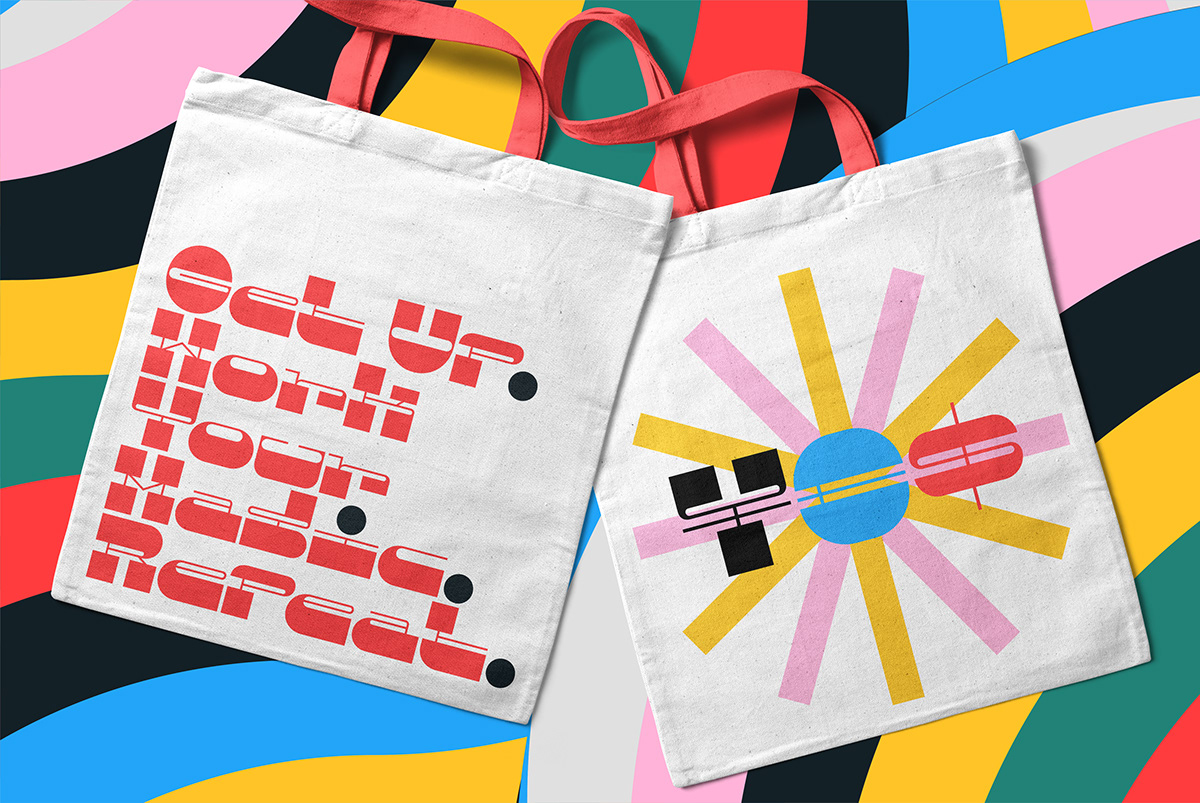
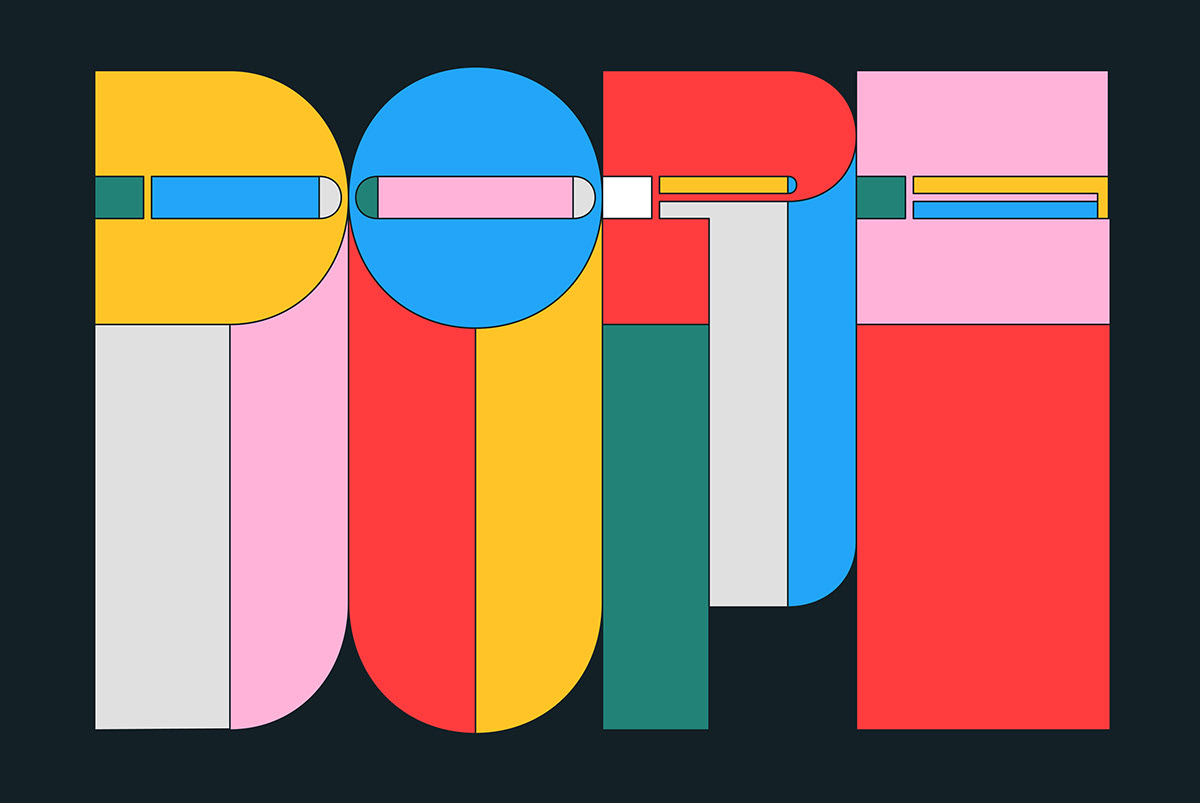
Pata Slab: the ultra-heavy optimism we all need in 2020
Pata Slab is the type equivalent of a catwalk stomp down a city sidewalk, a font that’s assertive, funky and more than a little sexy. Named after a colloquialism for ‘feet’, Pata features ultra-heavy slabs and contrasting hairline centers that rise from its chunky footprint. The resulting, retro-inspired vertiginous curves add instant attitude to any design.
Developed in 2020, Pata is a type of its time.Pata is all upside, as it is a typeface with no descenders — one that elevates all characters to grow upward from the baseline (because, c’mon, we could all use something uplifting right now!) All uppercase characters were built to fit precisely inside a square, so they’re all the same width and height. The lowercase alphabet, eñes, cedillas, punctuation, numbers and symbols all follow the same height restrictions. Despite all that confinement, Pata sports standard-height terminals that connect seamlessly so there’s nearly endless options for modular ligatures. The upshot of all this meticulous awesomeness is that laying out, customizing and stacking text super simple.
Pata Slab was created by In-House International, designed Alexander Wright in collaboration with Rodrigo Fuenzalida. It's available for Opentype format (.otf) compatible with Mac and PC.
Available at YouWorkForThem ($10)


Pata Slab was created by In-House International, designed Alexander Wright in collaboration with Rodrigo Fuenzalida. Available to buy at YouWorkForThem in Opentype format (.otf) compatible with Mac and PC.
See what folks have to say about Pata on the internet medias: CreativeBoom | Type01_


