


Introduction
In 2019 was the 50th anniversary of the publishing house Anagrama (founded in 1969), during this time it has published around 4000 titles. Throughout five decades, different literary genres have predominated, from essays and political texts in the 70s, chronicles and reports in the 80s, Hispanic narrative... and many collections have been created, for example "Cuadernos Anagrama", which aims to act as a platform for the concerns of our time.
For the 50th anniversary, a special series was published within the "Compactos" collection: fifty fundamental titles from the catalog, fifty years of essential reading. In addition, the collection has illustrations specially commissioned for the occasion. Given that it is an important date, a stand will be designed to commemorate Anagrama's trajectory, focusing mainly on the presentation and promotion of the new collection.
For the 50th anniversary, a special series was published within the "Compactos" collection: fifty fundamental titles from the catalog, fifty years of essential reading. In addition, the collection has illustrations specially commissioned for the occasion. Given that it is an important date, a stand will be designed to commemorate Anagrama's trajectory, focusing mainly on the presentation and promotion of the new collection.
Concept
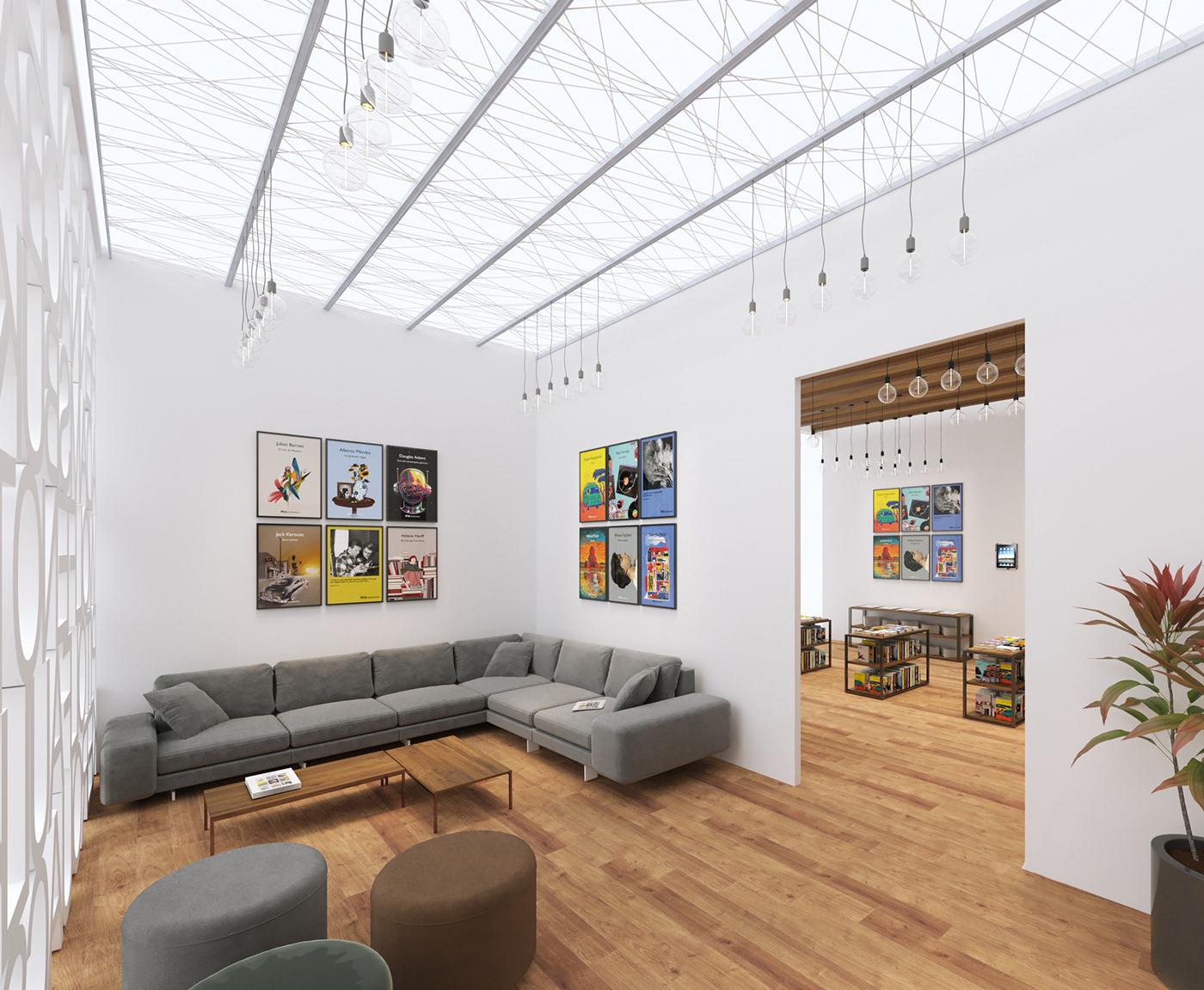
The Stand is a mix between the industrial and the classic, that is why the furniture material combines wood and black iron. The timber used is mango wood, as it is one of the most common in furniture manufacturing, and the tones range from light brown, dark, golden and some very subtle reddish and black. Combined with iron, a very common metal, a practical and highly aesthetic piece of furniture emerges, suitable for the environment that has been created.
The walls are modular, so as to facilitate the transport and assembly of the stand. For the letter wall, technical plastic will be used, a very hard type of plastic that has gradually replaced traditional technical materials in many applications, because they outperform them in weight / strength ratio and other properties. In addition, technical plastic is much easier to manufacture, especially when it comes to complicated shapes.
The floor is parquet, so that it is in harmony with the wooden furniture, as well as the beams that fulfill the function of the ceiling. For the ceiling, forms and materials have been used that do not enclose the place, that let in light and the exterior can be seen, both with the beams that cover the first room and with the metallic structure of irregular lines that covers the second.
s
Moodboard
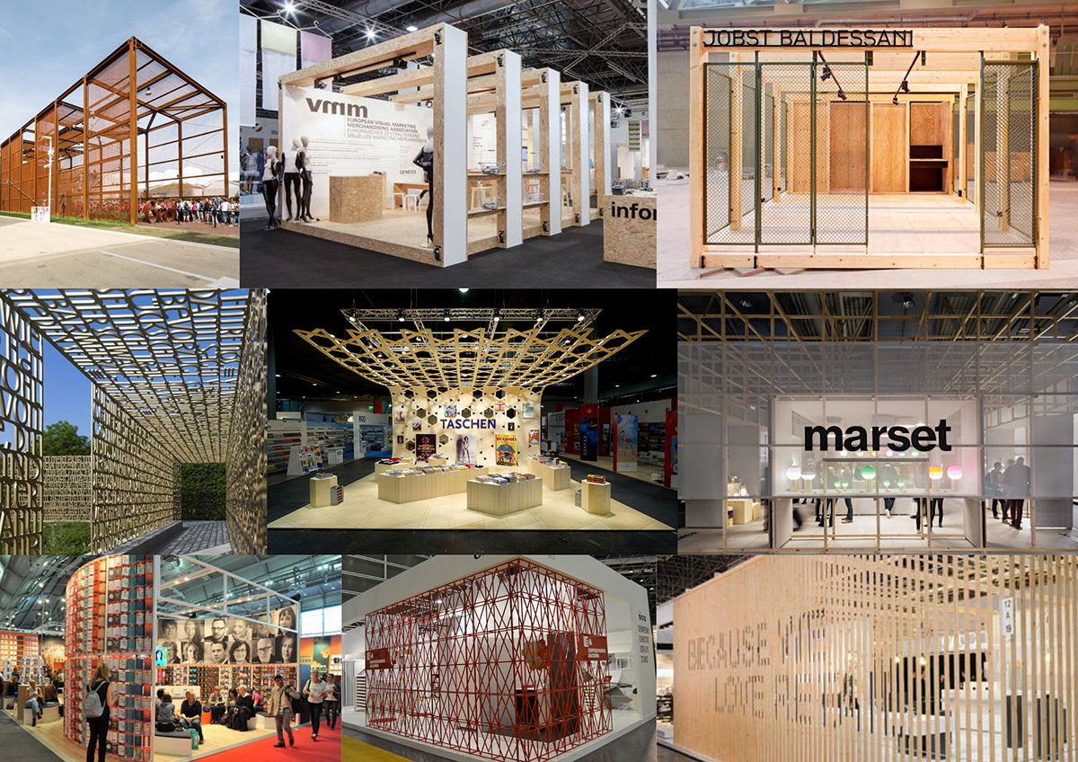
The first moodboard focuses especially on what will be the design of the Stand structure. The main objective is that the user does not feel that he is inside a cube, but in an open space that is part of a set. The main colors would be white, black and the light brown of the wood, the shapes are very important, and the letter is a characteristic element. I find the structural geometry of some stands interesting, and that the wall is used to display relevant information. As for the lighting, as natural as possible, to create a warm and pleasant atmosphere, and that it is located on the ceiling, so that we do not have unnecessary objects that hinder the user's journey.
The second moodboard is more focused on the interior, the books are the protagonists, so all the decoration revolves around them. For the exhibition of books, you have to take into account the space and make the most of it, if the shelves are hollow and allow you to put the product on both sides, you gain much more storage space.
kmm,


Visualizations
We have created also a set of visualizations to help understanding the dimensions, style, materials and distribution of the Stand. We used Google Sketchup to make the basic 3D model. Then we imported the 3d model into 3ds Max so we could add more detail to the basic structure, and also add the furniture and all of the assets that we wanted to have in the stand such as books, bags, posters or magazines. Afterwards we added all the textures from the Collection of this 50th Anniversary of Anagrama, into all these assets and worked on the lighting of the Stand. Finally we decided the camera angles and rendered them with Corona Renderer.

-

-

-
-

-


-
-


Merchandising
Merchandising plays a very important role in the stand, since our goal is for the customer to not only take home a book, but also an experience and a memory of an event such as the 50th Anniversary of Anagrama. For this reason, all the merchandising created is directly related to the «Compactos 50» collection.
The illustrations that characterize the collection appear on all the products, and in the case of the bookmarks it has been chosen to give prominence to famous phrases of our most recognized authors, accompanied by an image of their own, without neglecting the color that so much defines Anagram.
There will be various types of notebooks, the special edition magazine «Compactos 50», posters, bookmarks, pens and Tote Bags.
-


Animation
Besides the Still images we also decided to jump with the project into Unreal Engine, initially, just for testing purpouses, but we ended up playing like if we were in the real Stand with our film camera. The result was this short animated movie to show the space and feel the materials and lights in another and different way.
Thanks for watching


