
A Garden at Night
"A Garden at Night" explores the relation between body and landscape through concepts of trauma, performance and writing. It is divided into two walks, both formally demarcated. One is a mirrored accordion-folio with an interplay between several artistic illustrations and poetic sentences; the other is composed of four texts written by four authors: Allen S. Weiss, Pedro Pousada, Nancy Perloff and Tiago Madaleno.

A brief context
The project is based upon the story of a garden that Kurt Schwitters had in its childhood and the tragic event of its destruction. It constructs an allegory that reflects on the paradoxes and symbols inherent to the representation of that lost garden.
The exhibition had a 25 minutes cycle. 10 minutes in light, 15 minutes in dark. The light changes influenced the perception of a series of texts that were painted on the wall with photoluminescent ink. When the light was on, the texts were almost invisible, when it was dark, they glowed in green. That phenomenon, almost magical, mysterious, invited the body and the eye to rediscover the place after the light went off.
The book invokes the idea of the wanderer, so familiar to the philosophy behind the English garden, to reenact this dialogue between body and landscape. In the English gardens the body drifted between the picturesque views that comforted the eye and the pleasure of wandering aimlessly. That tension, between the formal eye that wanted to find in Nature similar images to those found in the tradition of Painting and the body that urged to be free and surprised with the wonders and deceptions of Nature, became central to the development of the book as an object.
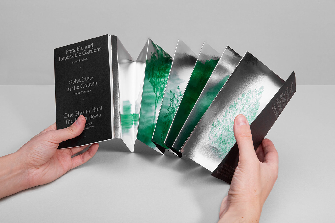
In that sense, the book is divided into two paths: one is composed of text, where, in a theoretical approach, three authors write about Gardens, Kurt Schwitters and Text Expanded into Space; the other is a mirror accordion folio that plays with reflection, montage and perception.
The exhibition had a 25 minutes cycle. 10 minutes in light, 15 minutes in dark. The light changes influenced the perception of a series of texts that were painted on the wall with photoluminescent ink. When the light was on, the texts were almost invisible, when it was dark, they glowed in green. That phenomenon, almost magical, mysterious, invited the body and the eye to rediscover the place after the light went off.
The book invokes the idea of the wanderer, so familiar to the philosophy behind the English garden, to reenact this dialogue between body and landscape. In the English gardens the body drifted between the picturesque views that comforted the eye and the pleasure of wandering aimlessly. That tension, between the formal eye that wanted to find in Nature similar images to those found in the tradition of Painting and the body that urged to be free and surprised with the wonders and deceptions of Nature, became central to the development of the book as an object.
In that sense, the book is divided into two paths: one is composed of text, where, in a theoretical approach, three authors write about Gardens, Kurt Schwitters and Text Expanded into Space; the other is a mirror accordion folio that plays with reflection, montage and perception.

Material choices
The book is composed by a 240gr black cardboard which offers the structure. That structure is divided into two sides: the interior one has a mirrored plastic surface, that was hot glued over the black cardboard, on top of which it was offset printed ten images of trees; the exterior one is predominantly constituted by the black color of the cardboard, on top of which it was offset printed a series of poetic sentences and images.
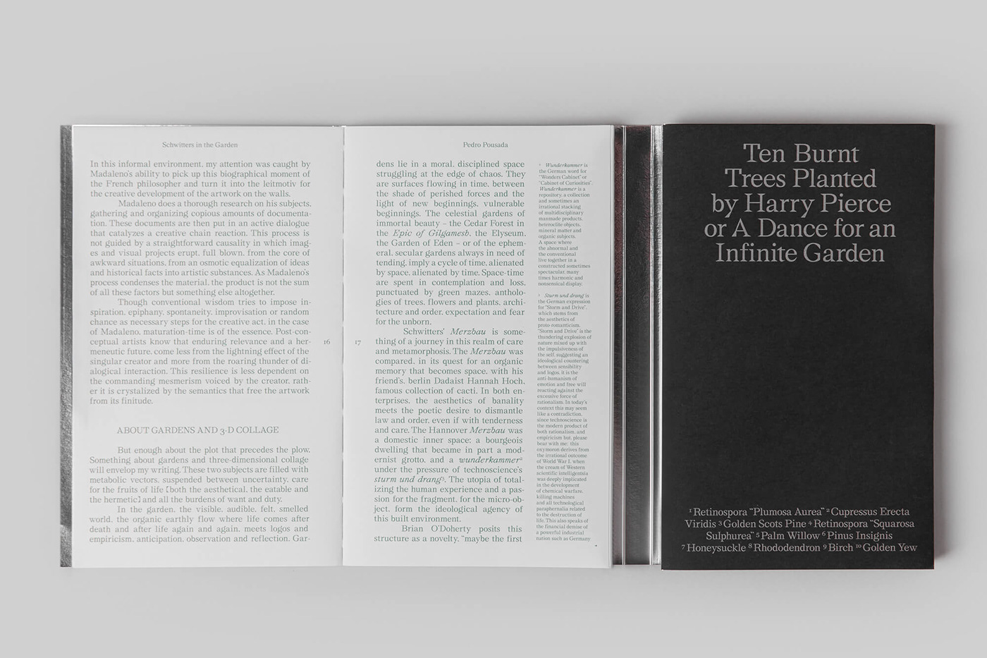
This double approach came from another story that was crucial to the project: the relation between Harry Pierce and Kurt Schwitters. In the last days of his life, Kurt Schwitters became friends with an English landscape designer called Harry Pierce. This resurgence of the Garden, that suggests a full-circle experience in Schwitters’ life, instigated me to develop a fiction around their relationship. In this speculation, Pierce would be Schwitters’ double, a representation of Schwitters’ repressed desires, what he could have been if he had not lost his childhood garden.
The main idea to the accordion folio was to invoke stories from both characters in both sides of the book structure: on one side, there are ten images of painted trees, taken from some of the species that were part of Harry Pierce’s first attempt to build a garden at the Cylinders Estate. That garden was tragically consumed by a fire that he started and unintentionally lost control when attempting to erase some weeds; on the other side, Kurt Schwitters’ spasmodic dance is recalled proposing a fusion of his body with the surrounding landscape.
The mirror interior, with its accordion folio, also invites the reader to play with the landscape composed by the several individual trees. Through its position and the reflection of the images (that became multiple), the book proposes an infinite, unstable landscape.


Typefaces
We have used two typefaces: Stellage (display, regular and italic) and Bickham Script Pro.
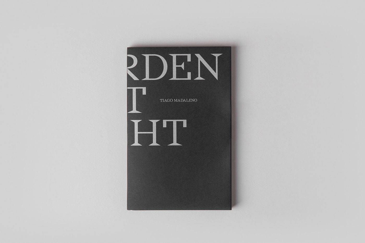
The Stellage font appears in the texts and in the front and back cover. It was chosen because its properties establish a bridge between the more natural aspect of the serif fonts, popular in the botanical books, and the more rigid, geometric, non-serif fonts, that recalls the modernist sensibility.
The Bickham Script Pro was used in the back of the accordion folio in the poetic sentences approaching Schwitters’ spasmodic dance. Its design recalls the context of baroque choreography and its dancing notation, for instance used by George Bickham in its drawing The complete Figure of the Minuet from “An Easy Introduction to Dancing” (1755).


Color choices
The book has three main colors: black, green and silver.
The black color appears as the exterior color (front and back cover; and back of the folio). In a more obvious way, it establishes a connection with the “Night” present in the title. But besides that, it provides the object a hermetic feeling, which conveys a sense of mystery that recalls the exhibition’s experience. At a first glance, it is difficult to understand the book content from its exterior: the front cover has the title cut in half; the book is much larger, due to the folio size, than the portable dimensions that it appears to have. The black color is related with the unknown, the possibility of wonder through discovery.
The green color is present in the images of the painted trees printed in the accordion folio and in the text part. Despite being an obvious color to portrait Nature, its choice is also related with the fact that it was the main color present in the exhibition. The text part was also in green (both the texts and the images) as a way to reassemble the look of a botanical book.
The silver color establishes a formal connection with the mirror accordion folio. At the same time, the silver brings a sensibility to light (when it is handled it has different tones of grey almost as if it was shining) that is very much connected with the project’s approach.


design: Atelier d'alves
designers: Sérgio Alves, Cátia Lima with the artist Tiago Madaleno
client: RAMPA
printer: Gráfica Maiadouro
production manager: Susana Fernandes
photography: Álvaro Martino
year: 2020
the full project: atelierdalves.com/projects/a-garden-at-night/
size closed: 19 x 12 cm
size opened: 19 x 168 cm
paper: munken lynx + pop set black
printing technique: offset print / 2 colours
you can buy it by sending an email to rampacultura@gmail.com


