
Pilot Vacation Trading Feature
Problem Statement
Scheduling 4,000-plus pilots for an airline such as Alaska Airlines is a big job. Part of that process is to allow pilots to bid on their vacations, which are awarded by seniority.
Each year there is approximately a month-long “season” in which pilots are required to bid for their vacations. Later there is a “season” in which they are encouraged to trade vacations if they were not awarded some vacations they had bid for.
In previous years, these annual events were tedious and complicated. The staff which managed pilot scheduling had to balance a lot of information coming from many sources. There were often errors, and long documents explaining how to trade vacations. The scheduling staff had to spend a lot of time with data entry, managing various spreadsheets, and copy-pasting information from one system to another.
The Crew Systems team I was in was asked to create a better solution to help reduce the burden on the IT call centers and the schedulers, and to help pilots trade vacations more efficiently. There were also opportunities for some pilots to trade vacations unscrupulously, and little oversight to prevent cheating.
Alaska Airlines must maintain commitments with the Pilot’s Union, and this was one commitment which was considered a priority for 2020.


Users and Audience
The Pilot Vacation Trading feature was added to an existing pilot’s website. This website is used by pilots and airline business as part of daily operations.
The particular UI described in this case study was for pilots.

Roles and Responsibilities
My role in this project was Lead UX/UI Designer. I was accountable to a bigger UX Team working on flight operations and business web projects. I was part of a specific product team building web solutions for flight crew scheduling and systems.
In addition to a product owner and several full-stack developers, I collaborated with two pilots representing the pilot’s union, and the scheduling manager.
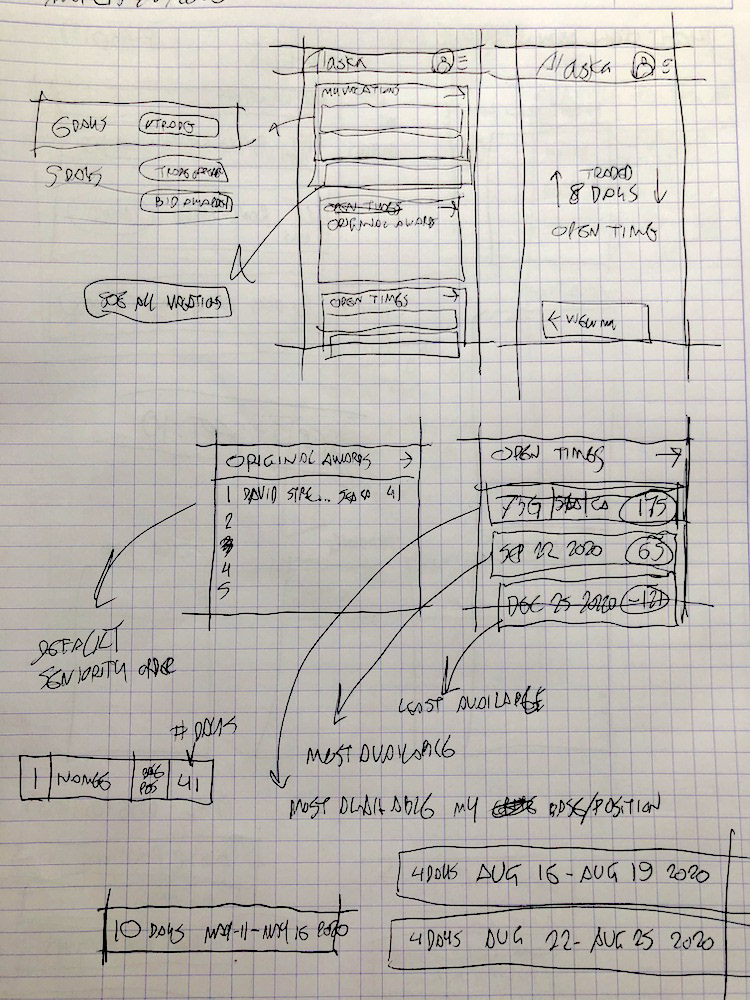
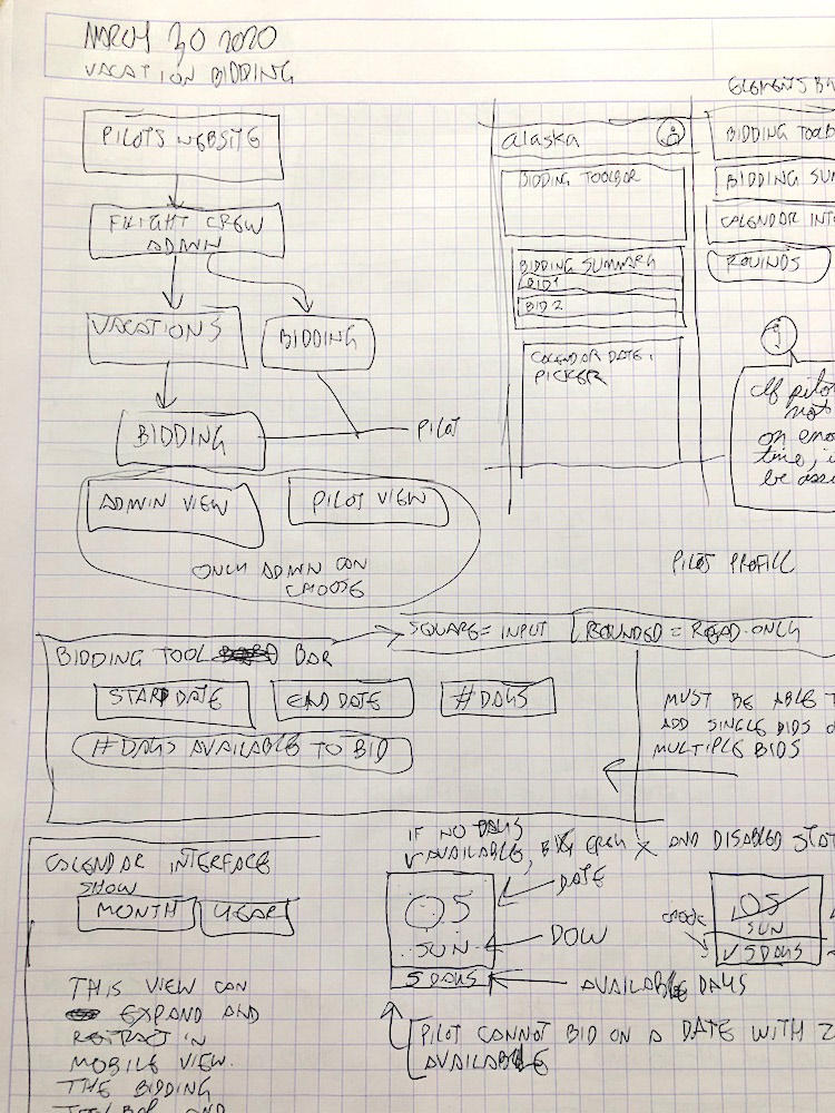
My responsibility was to conduct research, diagram solutions, wireframe UI, design the full UI, and handoff polished mockups and specifications to the engineering team.
During production, I supported the engineering team with further mockups, specifications and assets.
After the project launched, I conducted user surveys and usability testing.

The Solution
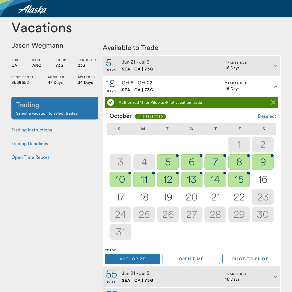
I designed a solution which utilized the user’s mind map of existing user interfaces, as well as their unique lexicon. Many of the challenges the existing process had involved asking the user to input redundant data, and requiring them to print a form out for reference while they were completing their vacation trading.
I designed the interface to automatically fill in data which was readily available from APIs and SSOs. The design reduced errors by preventing a user from getting to the point where they could make a prohibited entry, and making it clear what their next task was.
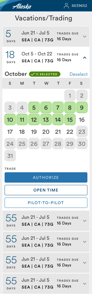
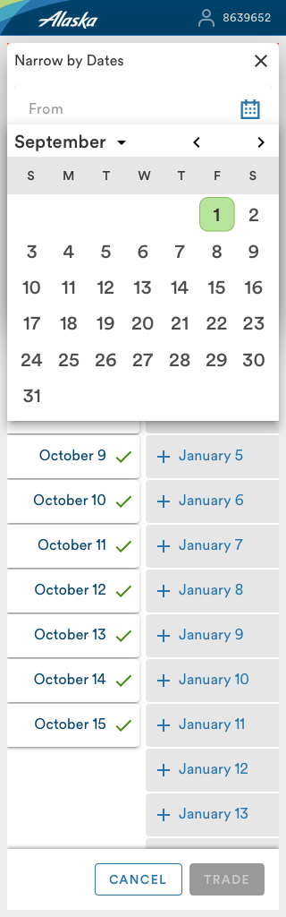
During research, I also found that a majority of the pilots would make their vacation trades on a smartphone or a tablet. I optimized the design for mobile, and ensured a smooth transition from desktop to tablet to mobile.
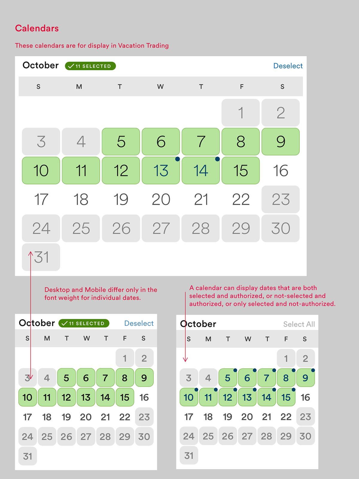
I streamlined the user interface by replacing wordy descriptions with colored components and icons, and improving the signal-to-noise ratio by removing redundant text and input fields.


Project Outcomes
The project shipped in time for the 2020 Pilot Vacation Trading season. We sent surveys out to pilots directly before and after the trading period.
My design allowed the pilots to complete trades easily on their smartphones or tablets.
It prevented them from making many of their previous mistakes.
The colors introduced into a previously neutral user interface helped communicate the actions required by the user much better.
The process took fewer steps to complete.
My product team also took steps to improve the speed of completing trades on the back end.
The variety of colors and type sizes helped establish a visual hierarchy of interface components, giving the user visual cues about what to focus on and what order to complete the tasks in.
The more balanced signal-to-noise ratio allowed a cleaner interface, and ensured what was visible on the screen really needed to be there.
We set up an analytics dashboard for the feature to track metrics about devices, location, pilot position, etc., which affirmed a lot of our qualitative studies, and gave insight about where to improve in the next update.
The surveys sent to pilots both before and after the vacation trading season returned mostly positive feedback. Because of a system-wide shutdown at the beginning of the trading season, some of the critical features included in the design were not available. This led to some negative feedback in the survey.
Usability testing conducted with the beta site immediately before the trading season gathered valuable insight on what we can improve when we build an update.
Some pilots described it as a beautiful design. One pilot told a senior manager of our side of the business that my design was “ridiculously user friendly.”


Challenges
Many pain points which surfaced in discovery sessions were out of scope for the first iteration of the new feature. Even though there was much enthusiasm from all attending about innovative solutions, the product team had to restrict what was in scope.
Because my team was made up of full-stack developers, there was no single member of the team with advanced front-end skills. Many of the interfaces I presented relied on the most advanced CSS and JavaScript capabilities, but the developers who worked on the designs did not have sufficient skills to bring it to life as fully as I had envisioned.
Outcomes and Lessons
The surveys and the usability testing showed that the business which initiated the project were reached with success. The feedback acquired through the surveys and usability testing showed areas to improve or redesign when the product team makes an update.
In this project I learned that pilots love visual design and enjoy a gamified user interface.


