


Client: view.sa
Role: Rebranding, Branding Strategy, Identity Design
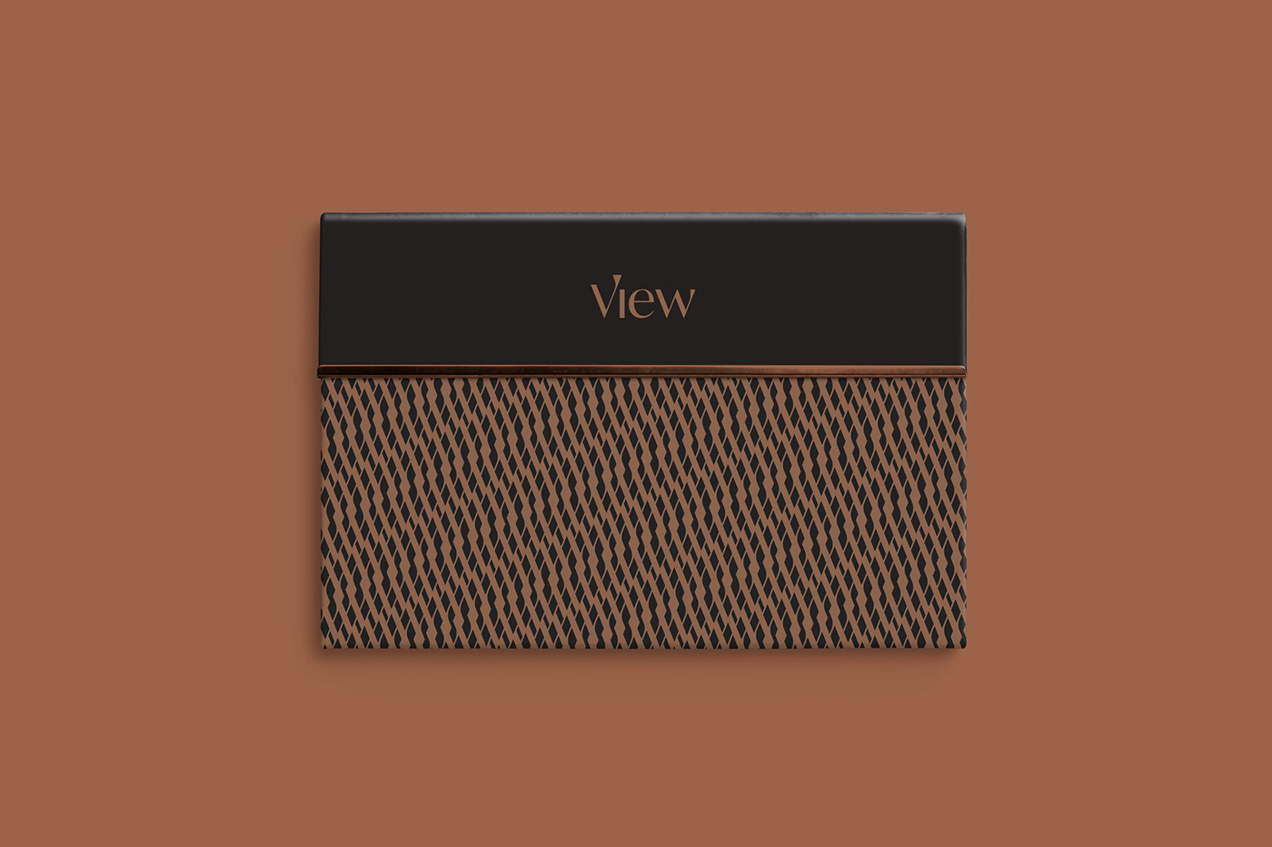
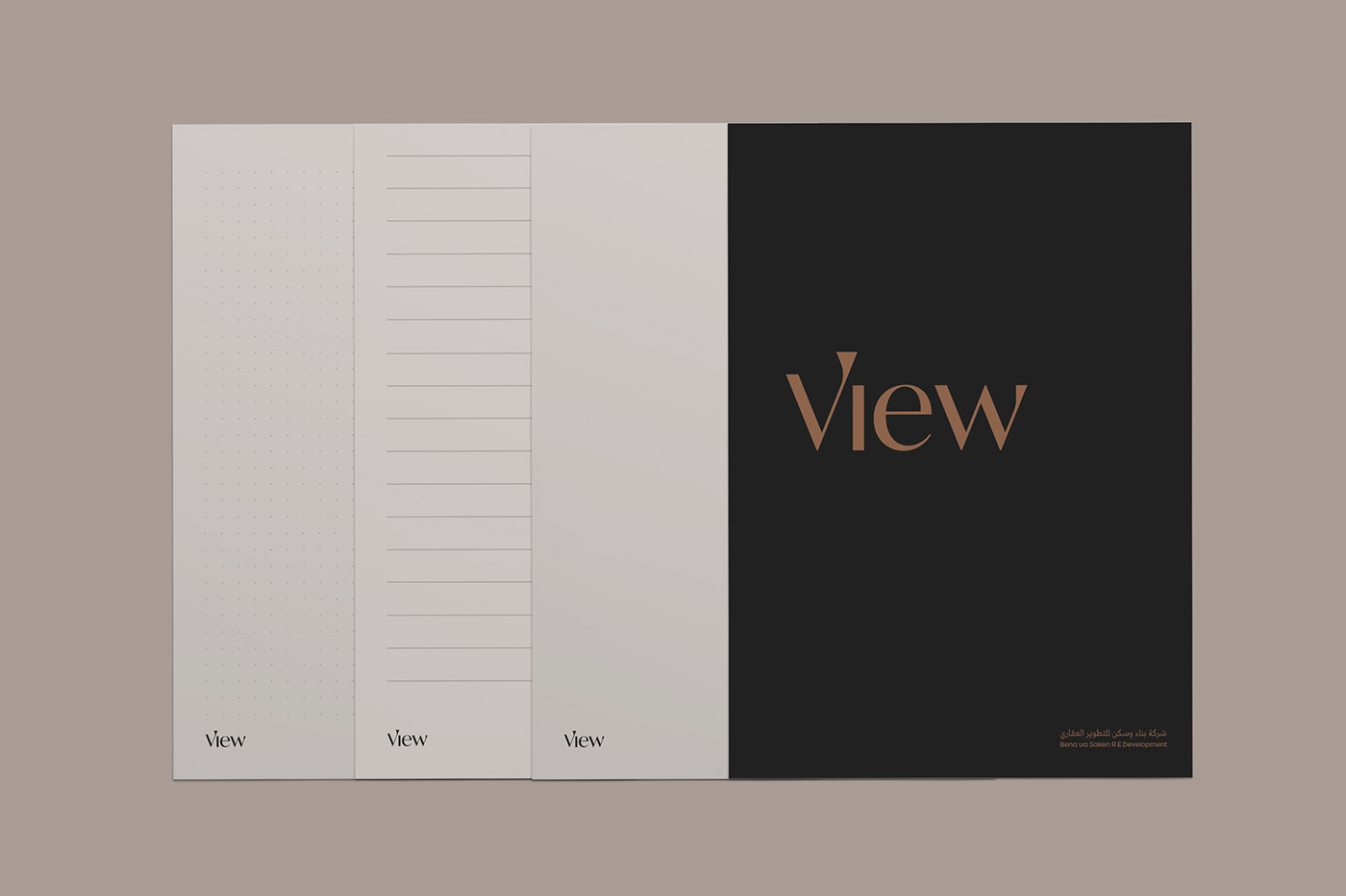
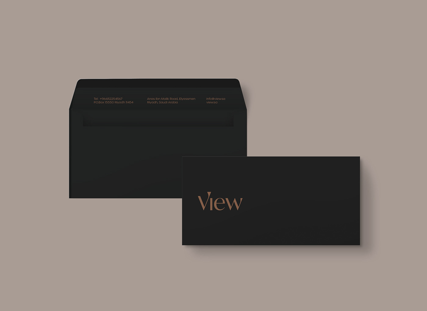
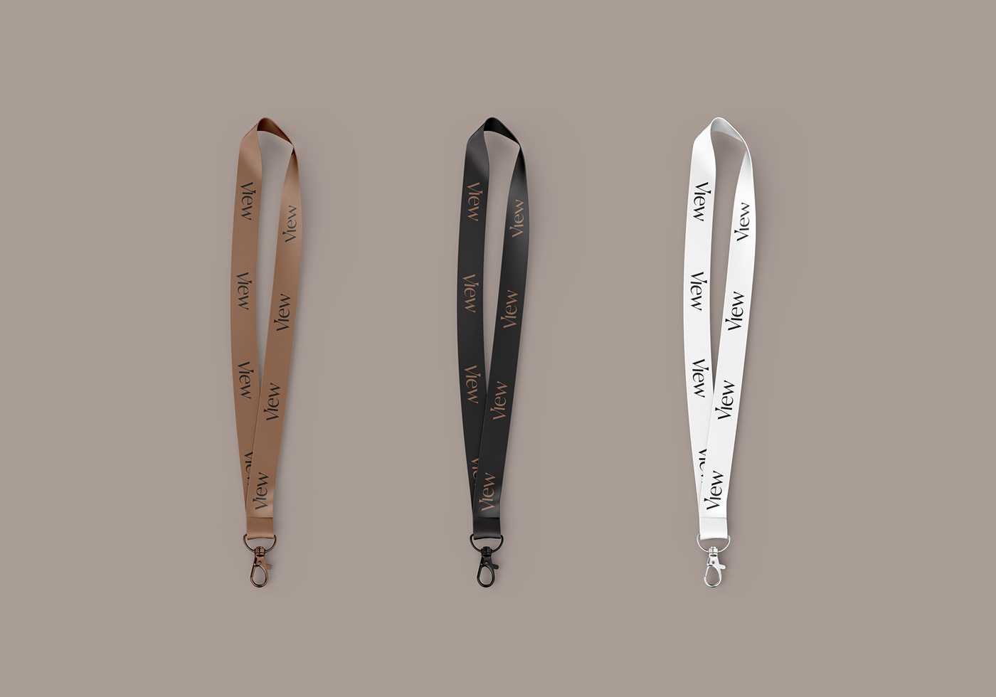
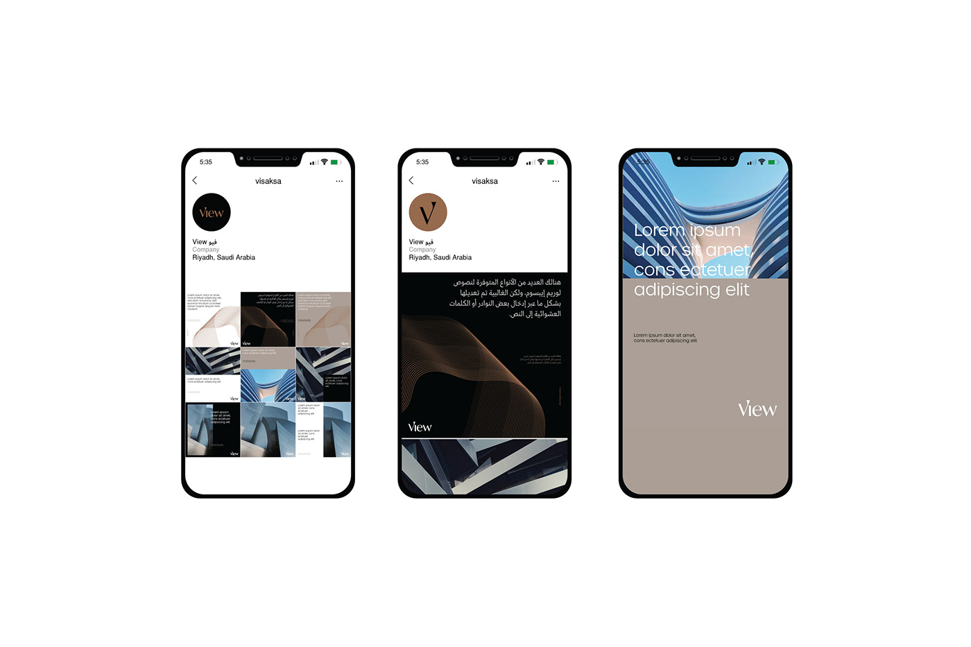
Creating an identity that gives a feeling of luxury, elegance, and luxury living
View is a Saudi company established in 2011 to be an effective contributor to urban development in Saudi Arabia and the Middle East, relying on the high expertise and modern technology in all stages of development and implementation to reach the best architectural and construction designs.
The official name of the company is "Bena Uasken بناء وسكن" but the company decided to change it to "View" to follow the global trends as well as its new strategy.
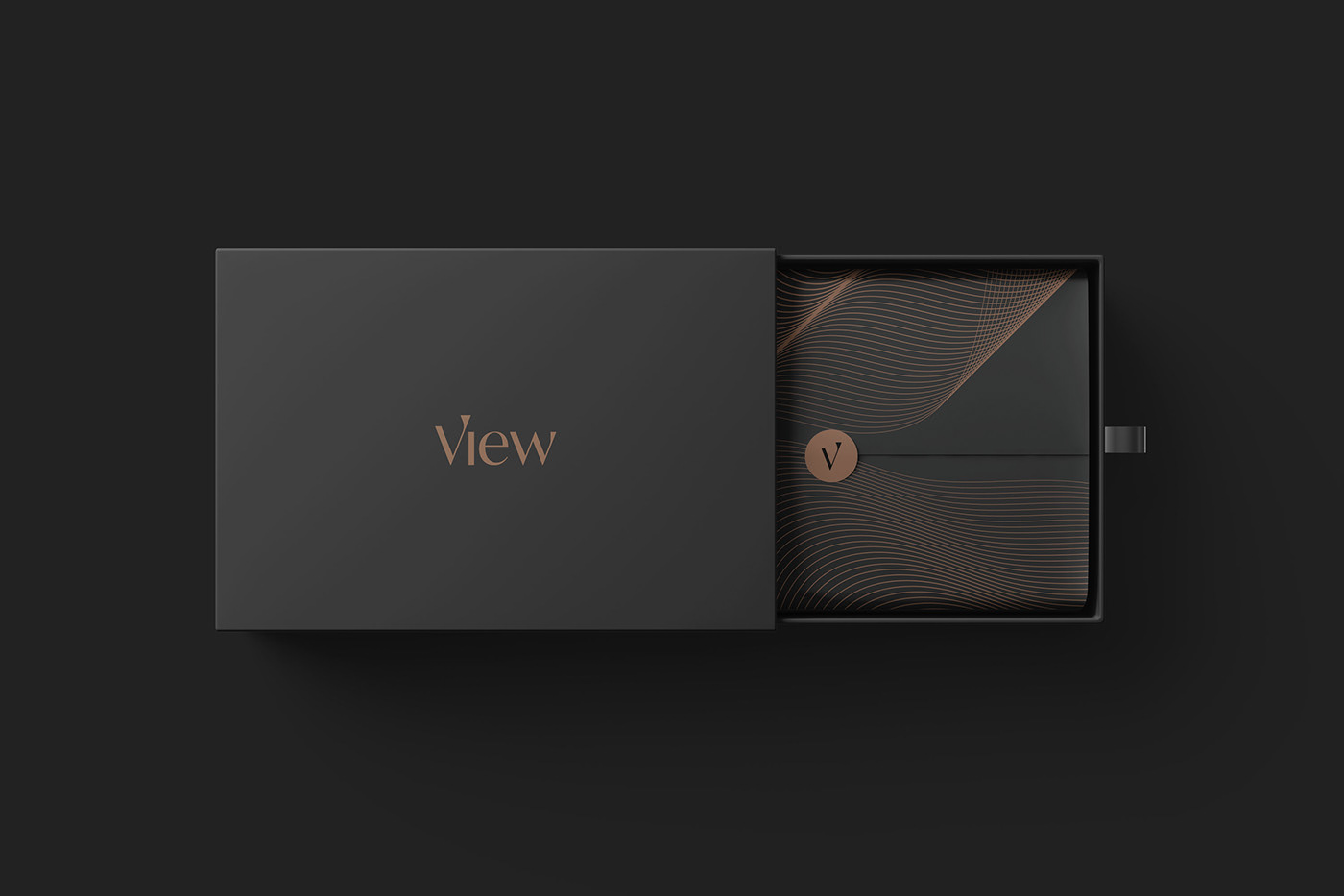
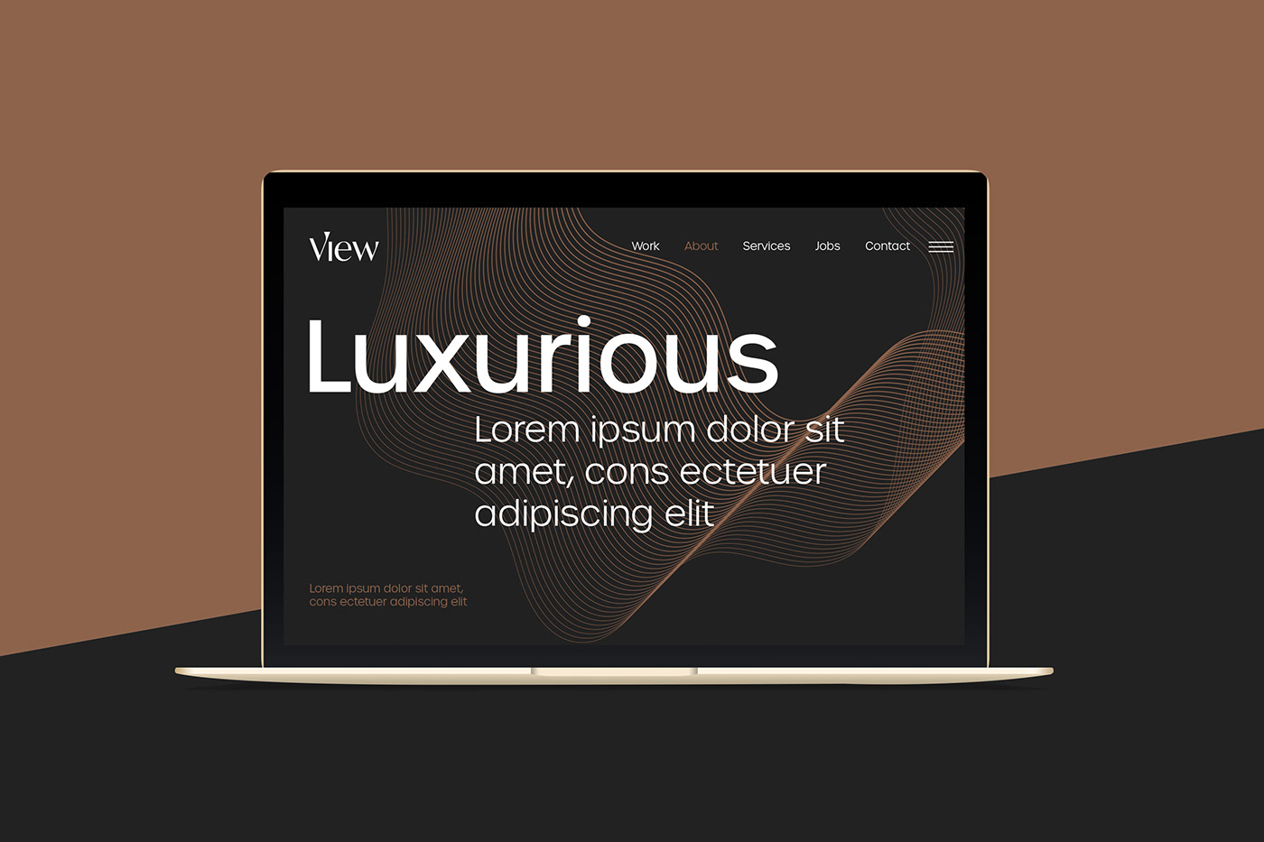
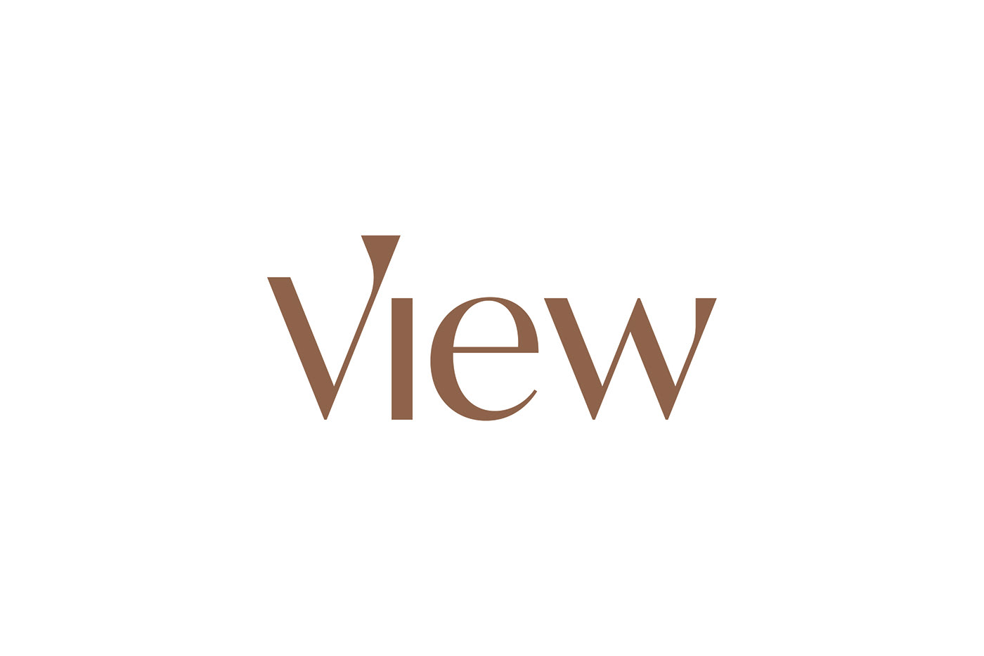
YaStudio mission is to create an elegant, modern, simple, and smart identity to achieve its goals and strengthen the company name. The wordmark logo is sans-serif home-made typeface, the dot "i" at the end of the first letter "V" - which as already the monogram - is to make a personality character that expresses the meaning of the name, ensign, and going forward.
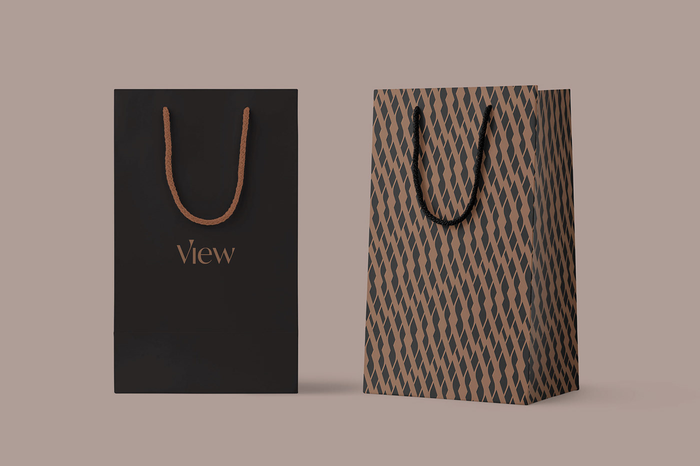
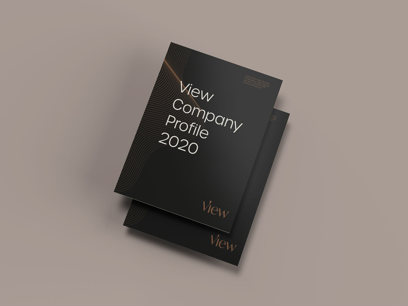
The colors black, copper and warm gray is to make it elegant whether in prints or digital items.
More at: yastudio.net/work/view