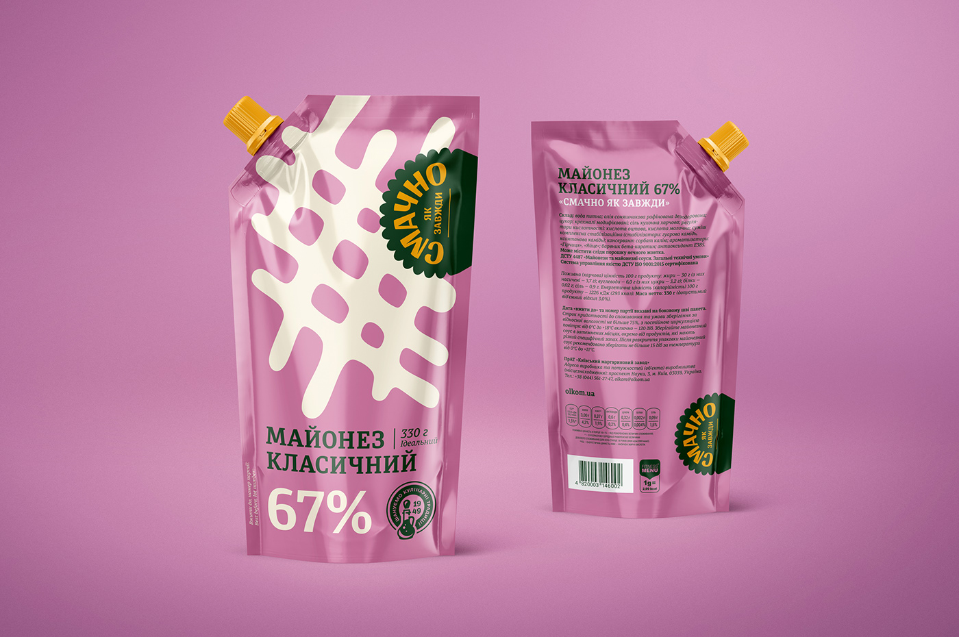
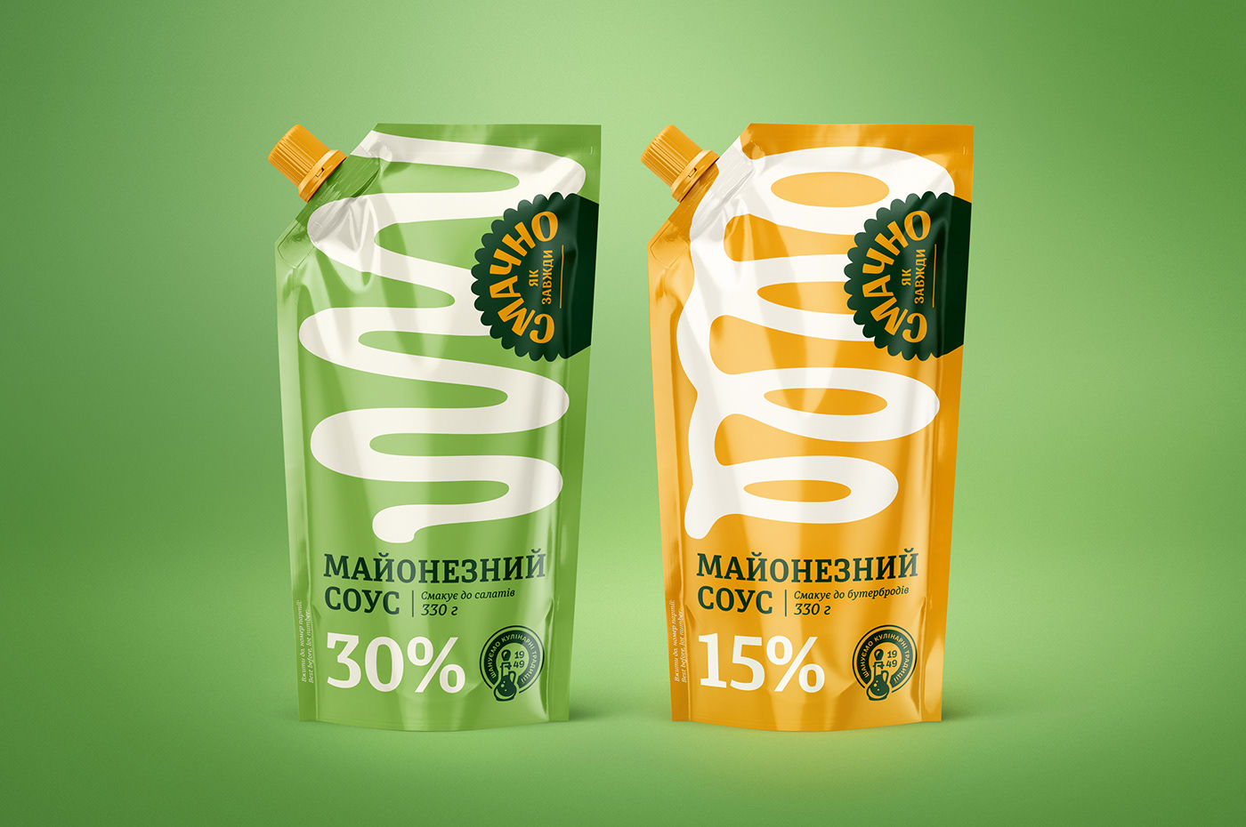
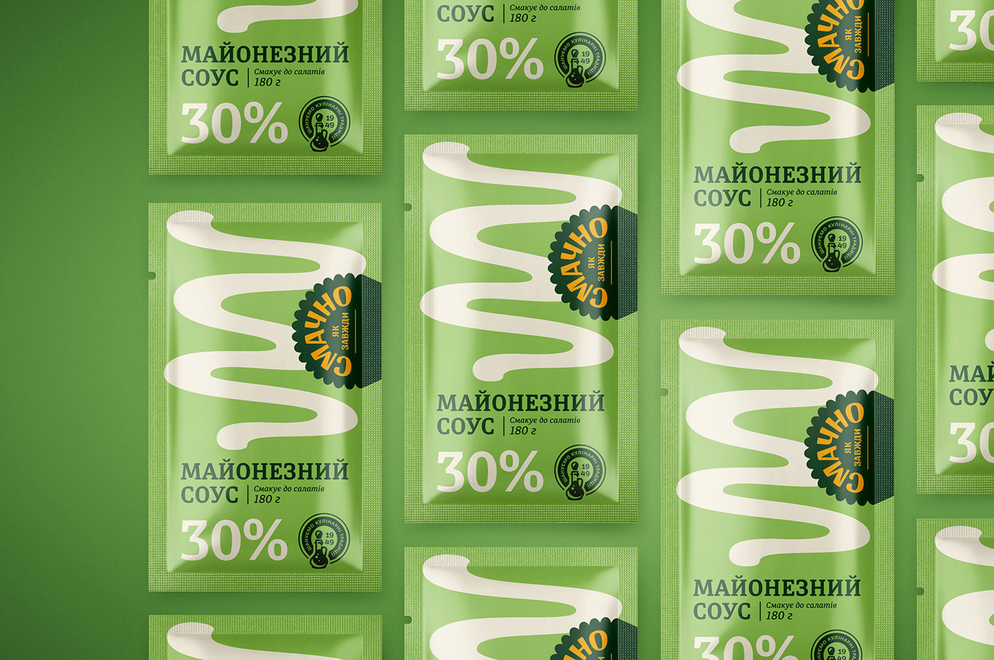
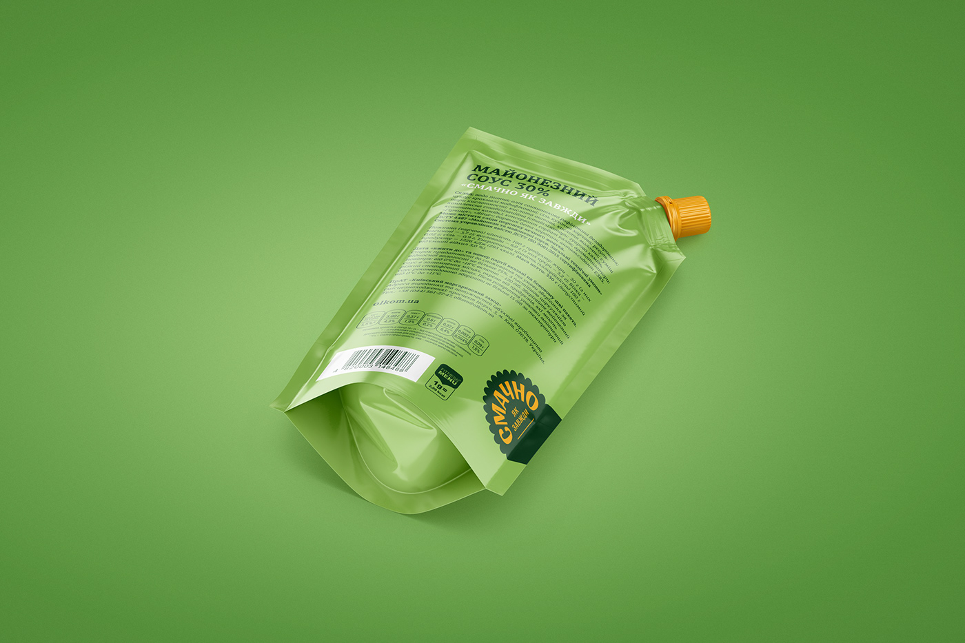
Tasty As Always
Mayonnaise sauces series
Tasty As Always (Смачно Як Завжди) is a junior brand in Olkom company's portfolio. Over 15 years it gained popularity in a low price segment and offers inexpensive yet delicious sunflower oil-based products. We were commissioned to rethink and update the overall brand appearance starting from the mayonnaise sauce series.
Scope of works: visual strategy, rebranding, packaging design, typography, copywriting.


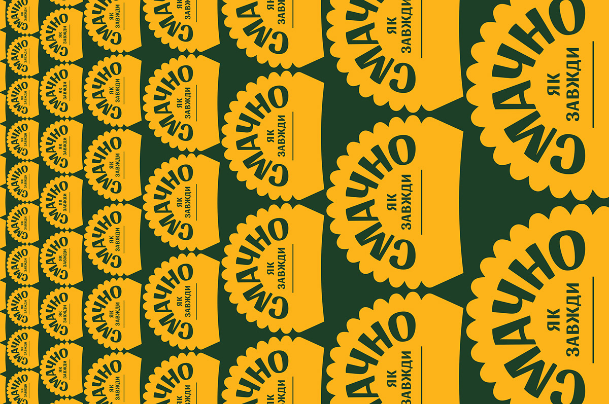
Смачно Як Завжди
The new logotype tells the story of a delicious dinner, wherever it happens: in a cafe, at home, or on a picnic. A hearty homemade meal unites a family, and it is Tasty As Always. "Honoring culinary tradition since 1949" became a slogan of the series. It helps to reflect the history and dedication of the factory.
Mayonnaise is a delicate sauce that already became a common part of everyday nutrition for many Ukrainians. The target audience is rather conservative, while numerous competitors scream with their detailed, colorful designs and food photos. Thus, the main challenge was to find a balance between affordable simplicity and delicious elegance. The strategy is to show mayonnaise sauce as an ingredient for a favorite meal and not as a final dish. New clean and bold packaging design helps to stand out on the shelf because of its distinctive graphics, high readability, and live colors rarely used in a sauce category.