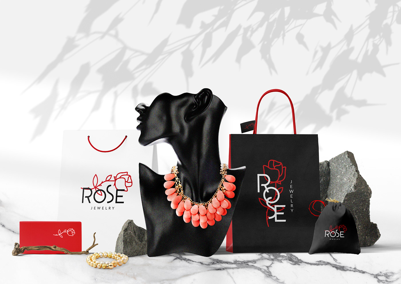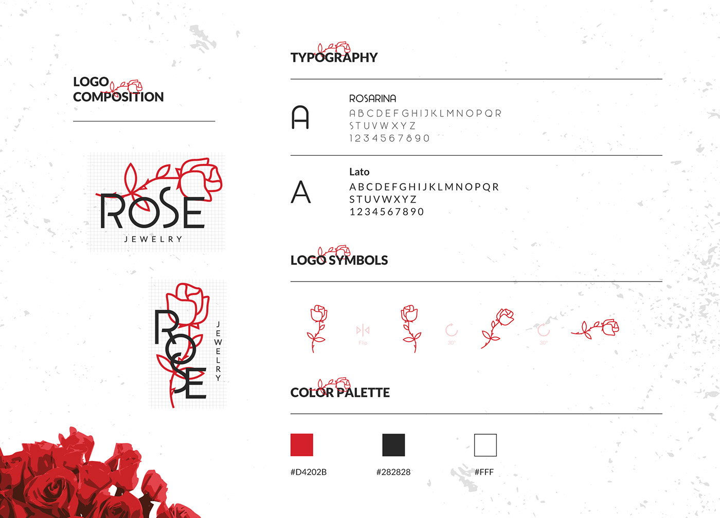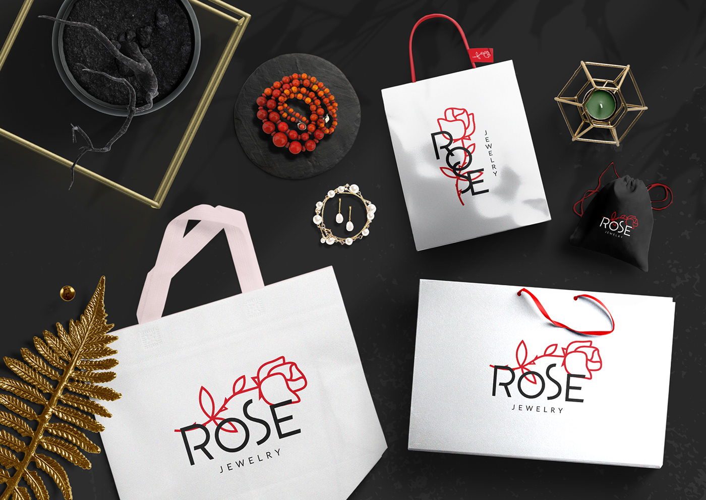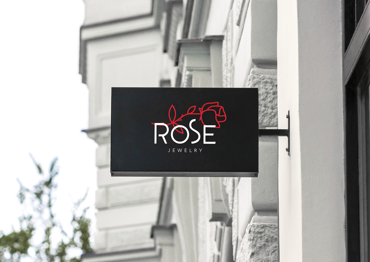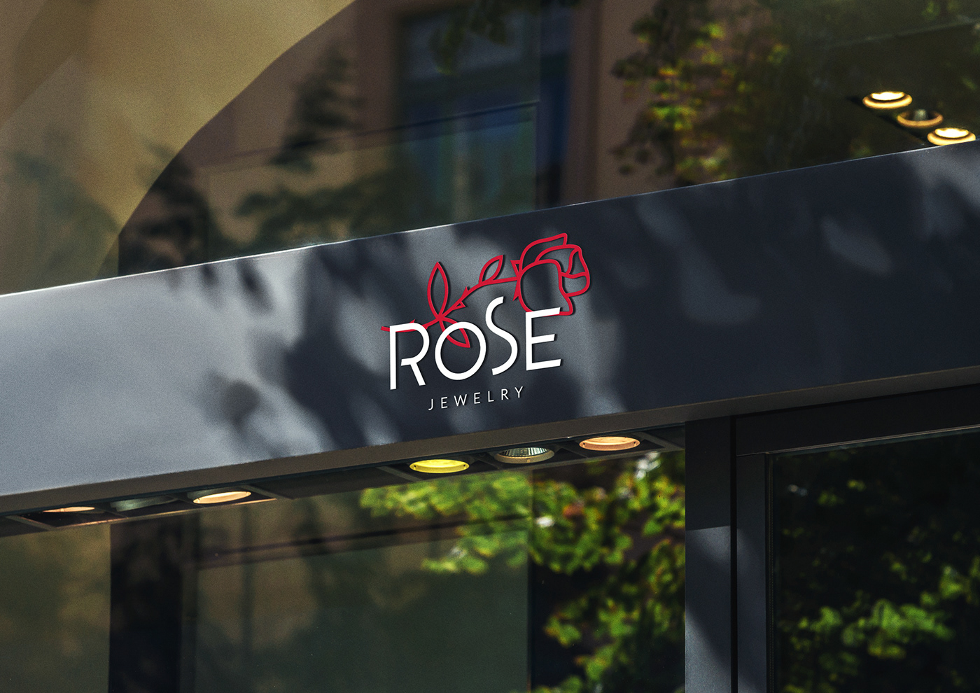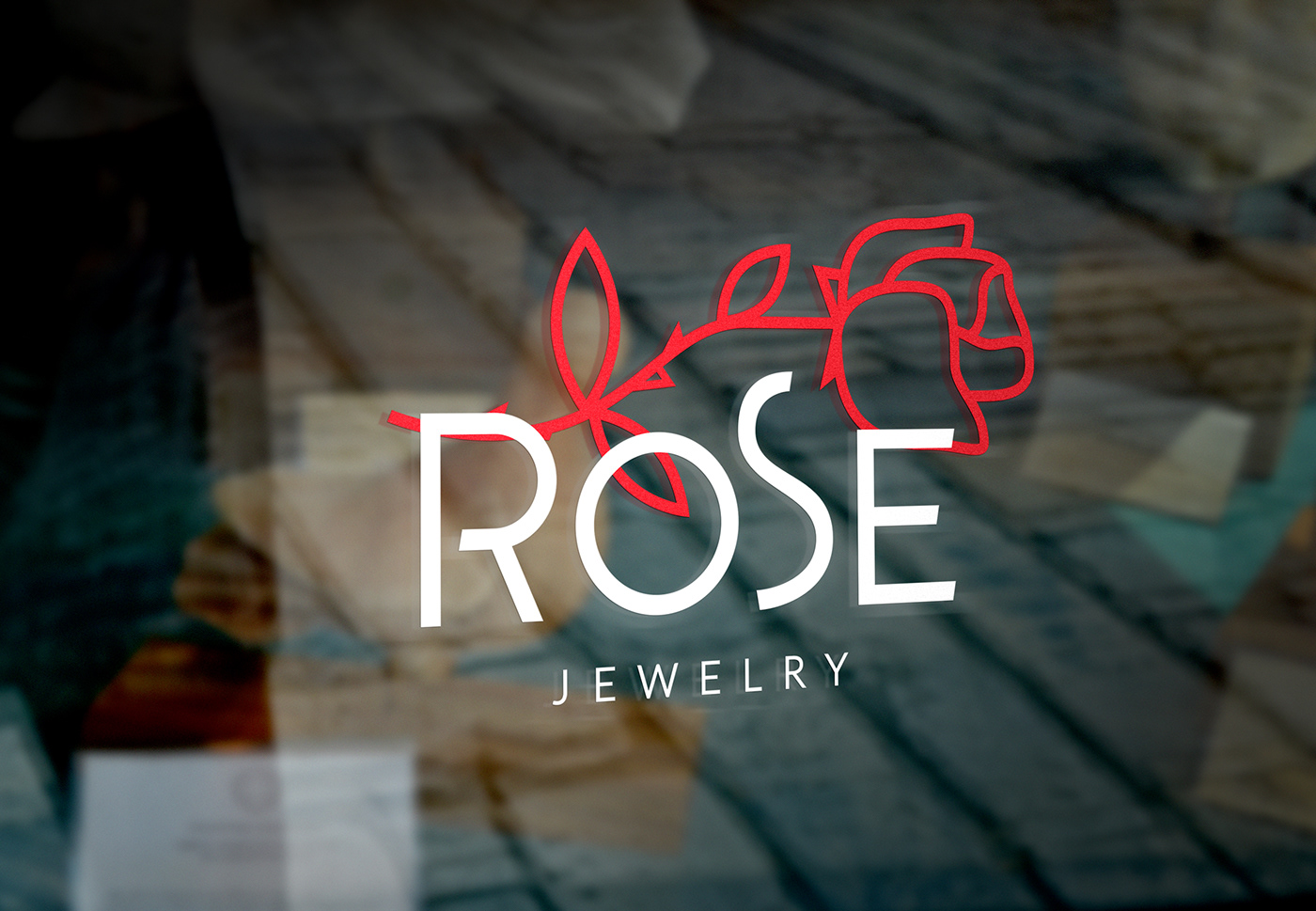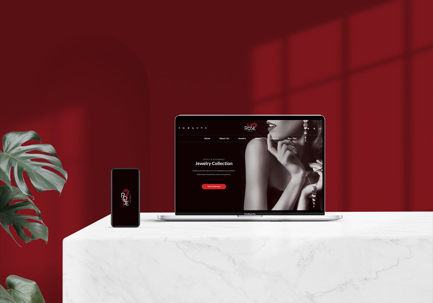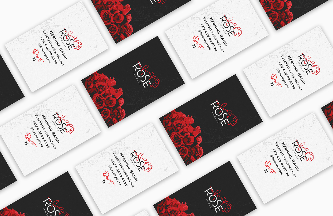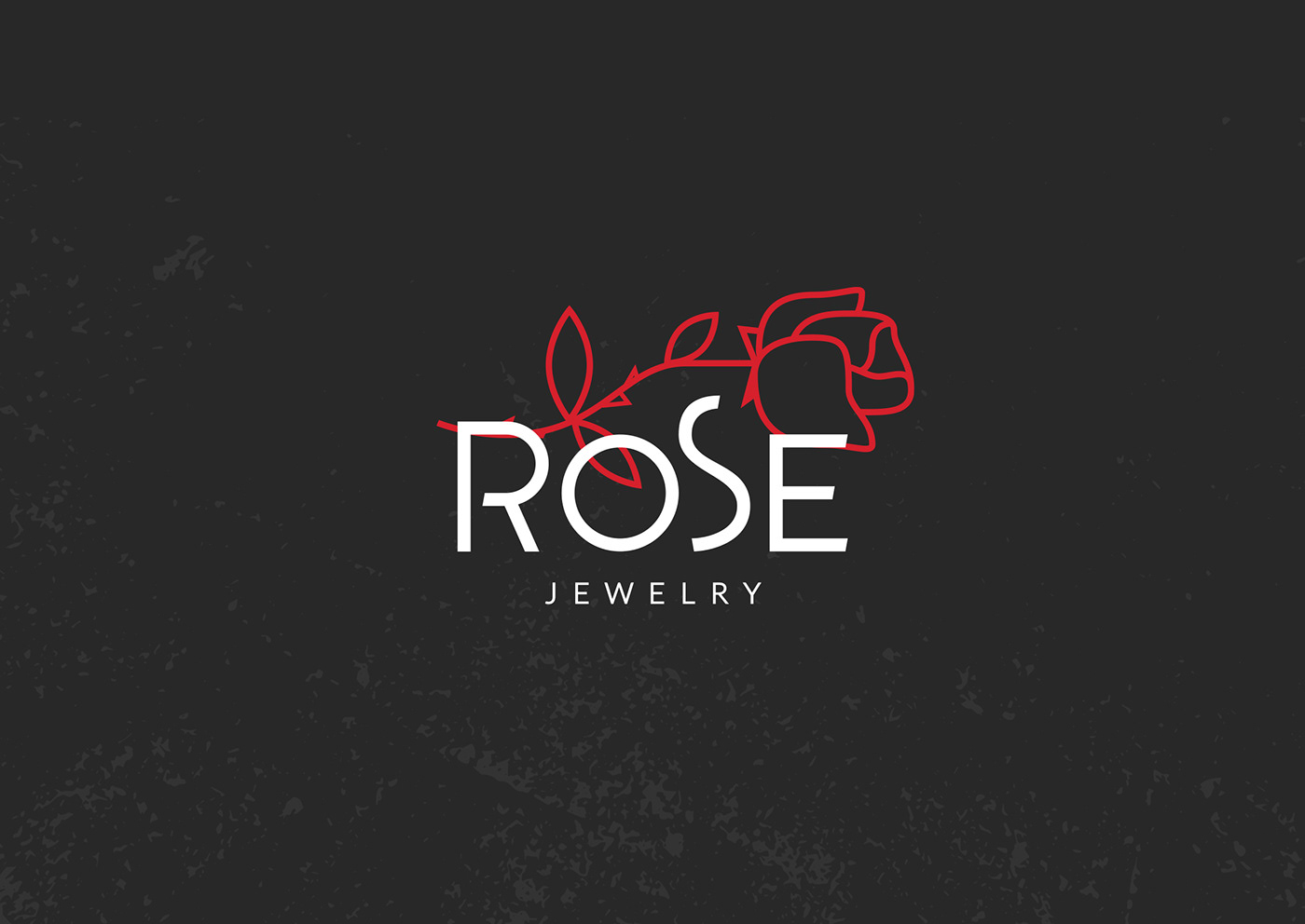
Not too dark, not too grungy - was a sentence I kept repeating to myself working on the identity of Rose, as it was such a challenge to still go down that dusky lane - only goths and Lolitas are known for or at least appearing to be - and conserve the overall luxurious feel the client insisted upon for a brand that grew in me with every step of its making. I mean who doesn't love roses? and jewelry... The logo comes in two lockups, one that is horizontal, another that is vertical, with a hand-drawn then vectorized red rose that doubles as a logo symbol and an ornamental graphic element that appears all throughout the visual identity of the brand, an identity that speaks in elegant lines and tame dark color tones - red, black and white, with simple typography, sensual graphics, scattered textures and solid materials.