

This branding project for local independent cafe Brew Birds came about after I approached them, keen to do some fun logo experimentation with their original branding.

As usual, I began my visual
explorations in the sketchbook.
Working within the limitations
of the cafe’s current font, then
thinking more freely and outside-
the-box with a wordless logo idea.
explorations in the sketchbook.
Working within the limitations
of the cafe’s current font, then
thinking more freely and outside-
the-box with a wordless logo idea.

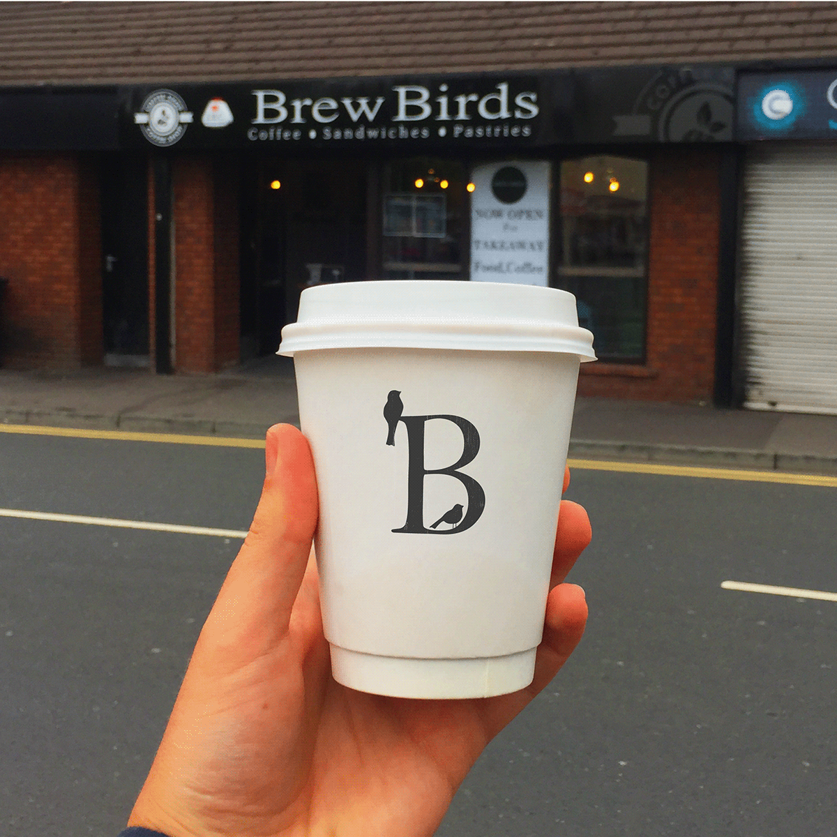

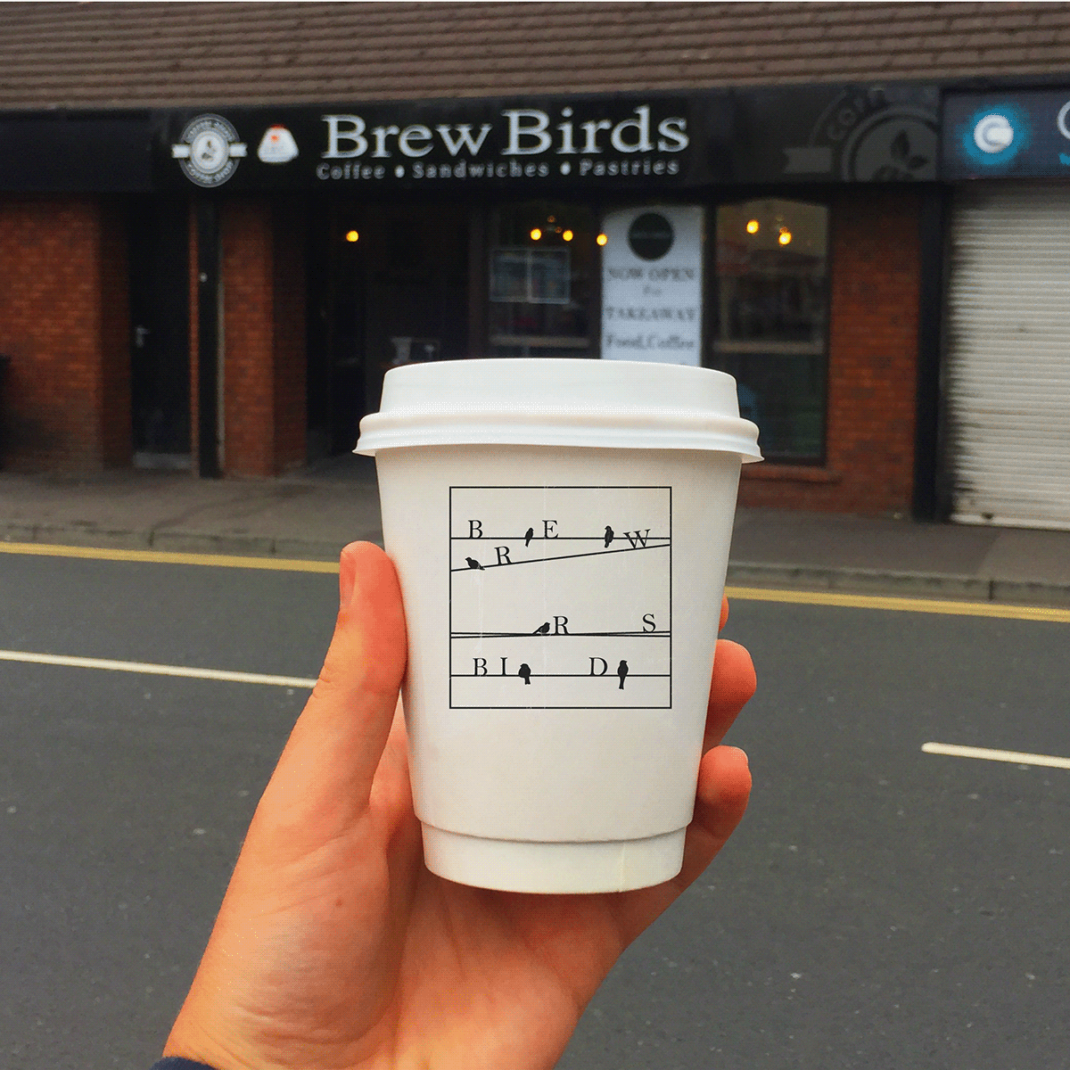


The result has been a light-hearted relationship built from nothing, as well as a fun and experimental proposed logo that communicates more about their identity as a young local brand. In this time of uncertainty, I was able to provide a dimension of enjoyment beyond the typical stresses for a small business, and for me, this is was an important exercise in client-engagement style.
...
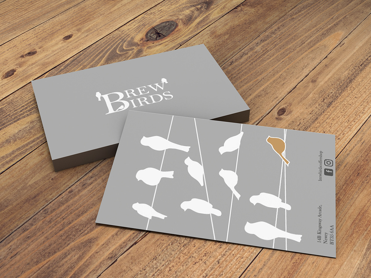
As well as designing new logos and takeaway cup designs, I was commissioned by Brewbirds off the back of our first successful collaboration to work on a loyalty card design. Cafe loyalty cards are a vital interaction in the customer-brand journey, as cafes continue on their upward trend, therefore a cafe’s loyalty card must stand out and say a lot about them! The above design, that continues the bird-on-the-wire theme, was well-received by the client.
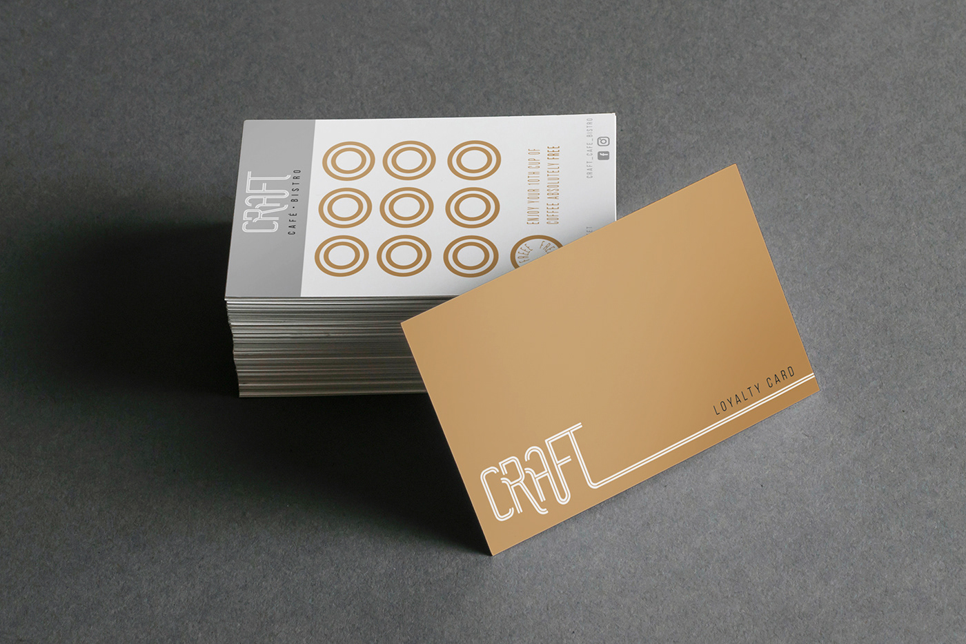
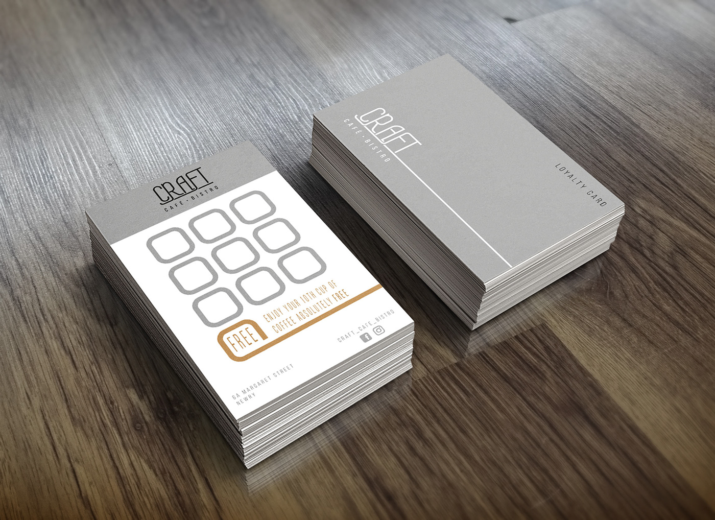
Furthermore, Brewbirds requested that I design loyalty card for their newly-opened sister cafe Craft. I was delighted to take this opportunity and test my real-world graphic design skills.
Thank you for looking!


