
I lead a brand launch campaign alongside a team of amazing thinkers and creators, crafting visual strategy and brand identity for the first apparel brand created by and for Trans and Nonbinary folks.
Role: Creative/Design Director & Strategist
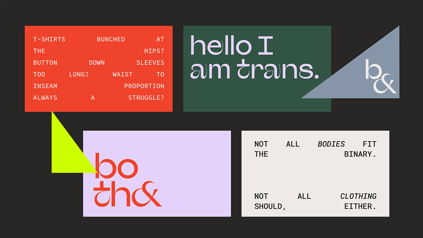
Both& initially approached me early this summer. Their founder, a trans man, was interested in creating a start-up in an unusual way, building out a community and online presence for trans and nonbinary folks in order to better understand what they struggle with and wish they could find in clothing before producing any actual clothing. This meant that the role of storytelling and visuals-- both in terms of graphics and photography--was critical to their mission. Both& wanted to strike a delicate balance between inclusivity, diversity, and body positivity, while also taking the lead in presenting trans and nonbinary bodies and clothing as aspirational, cool, and sexy.
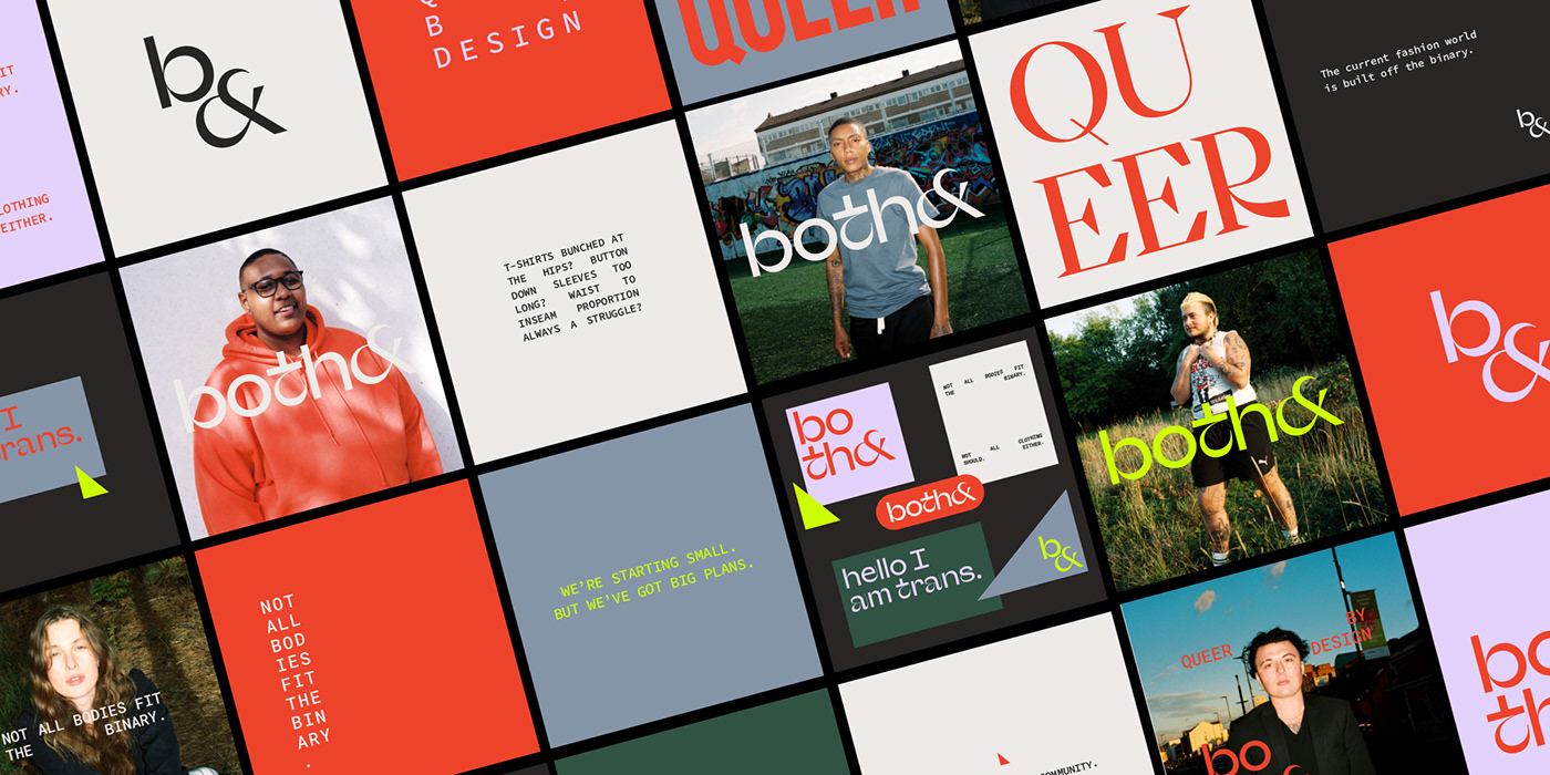
I started by developing the overall visual strategy alongside art director and photographer Mischa and founder Finn, then went on to exploring the logo, logo system, typography, and color system, balancing the need to come across as sleek and elegant against tones of queer 'pop' and flavor. The typography was particularly important, given how central words are to the project, and needed to compliment the photography series produced by Both&'s art director. The result is a very contemporary, human-first aesthetic that elicited media coverage interest from the design world within three days of launch.
The last phase was creating a visual toolkit for social media and communication purposes. That included numerous pre-designed social posts, templates and guidance around using it, that visual strategy and direction later flowed into the garment design itself, as created a unified over arching strategy - aiming for simplicity, comfort, and beauty.
Credits :
Client : Both&
Founder & CEO : Finnegan Shepard
Design Director & Brand Advisor: LIŔONA
Art Director & Photographer : Mischa de Stroumillo
Fashion Director: Seth
CFO: Casey Judson
UX Lead: Peter Scott Reid
UX Researcher: Isabel Eggers

I wanted to make sure that the brand identity is balanced along an interesting spectrum; one end being a fun, queer, and upbeat vibe, the other an idea of freshness, minimalism, and simplicity. I started building the brand components on that spectrum: Logo system, Color system, Typography system, each having its own internal gradient of identity.
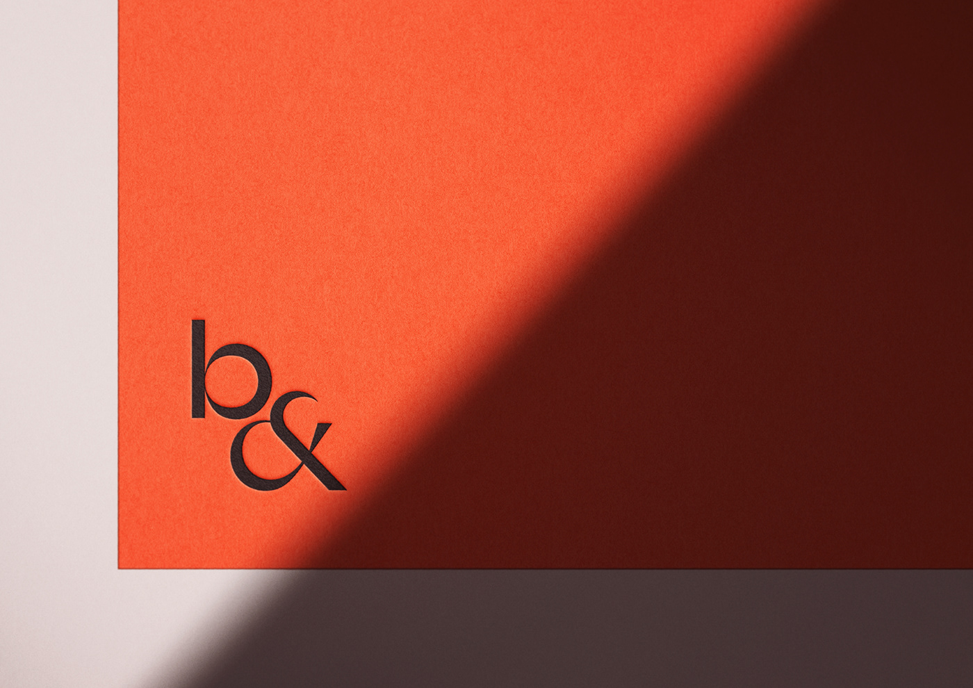
First, the logotype. We wanted to make sure the viewer can easily understand what they're looking at, and for Both& to start building brand recognition around the name. Thus, the full logotype was always going to be the written word. Later, from the full logotype, I created the Logo system, which involved a stacked version as well as a logo icon(the standalone B&).
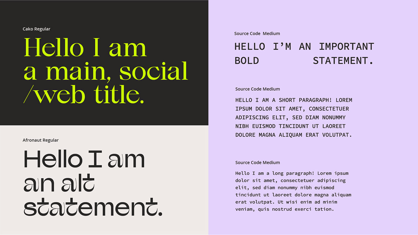
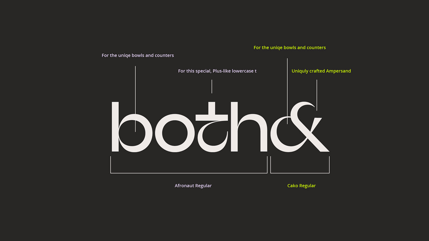
For selecting typefaces, I searched for the perfect harmony between that cool queer vibe and something that feels sophisticated and resonates with fashion. I chose to combine two different typefaces to achieve that feel, incorporating "Both" (Afronaut Typeface) with the Ampersand (Cako Typeface) - Afronaut has an amazing set of glyphs that truly inspired me. When I showed it to the team, everyone fell in love. The problem with Afronaut was the Ampersand, which we felt wasn't communicating what we needed, so I went on a hunt for the perfect Ampersand to pair with our written name. Luckily I've already worked with Cako before, and it turned out to be the absolute perfect match, with relatively similar accents, bowls and counters.