While I think it's important to note that UX is not itself defined by deliverables, in order to communicate the results of UX activities, we need visuals to express these concepts. Here's a few I've made over the years. I've expanded many of these into their own posts.
HealthSparq Pattern Library Design Process
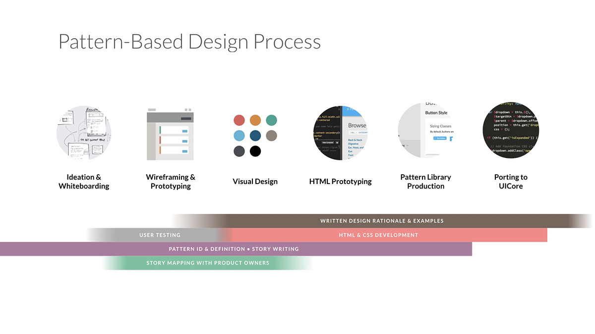
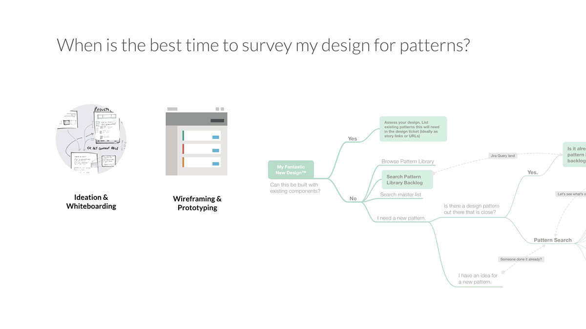
To streamline the design process between the front-end teams, product managers, and UX teams, I ran the internal Pattern Library project and acted as its product manager.
To solve some of the knotty problems of search in the consumer healthcare space, there was a lot of exploration on the design side. As a result, the UX team frequently came up with non-standard design patterns that cost more time to implement, and worse—created non-standard UI patterns that users might find confusing.
To help designers and the UI team streamline pattern-based design and increase their velocity and quality, I built some presentations and content around both the workflow and logic for finding and choosing patterns. Here you can see some of the animated illustrations used in those internal presentations. I also made a few into giant posters that really helped get people together and visualize the process as a whole.


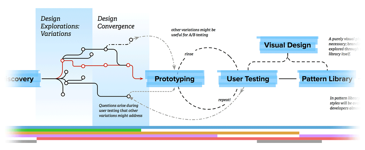
Healthsparq Product Design Process diagram (version 1)
"To help all our various internal teams visualize our design process and where they fit within it, we sketched this out the other day in a meeting that included our director of product, some front-end guys, our user researcher, and the design/UX teams." Read the full post on the Healthsparq Design Team Blog.
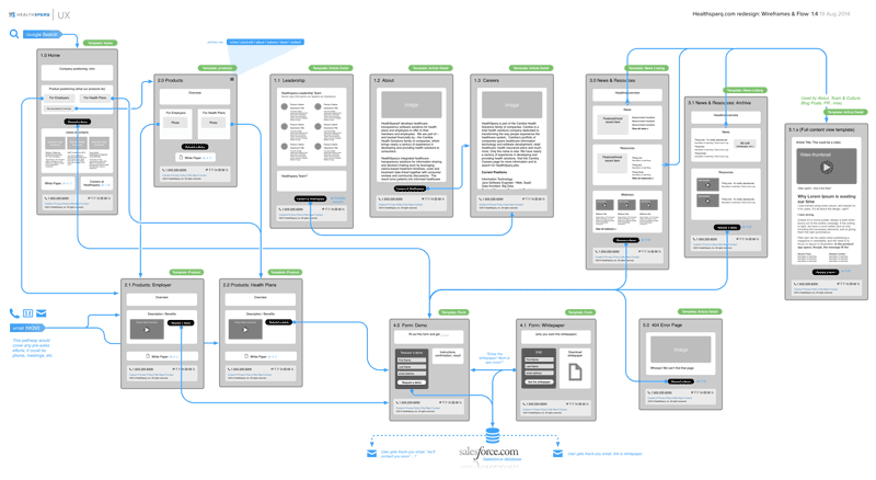
Corporate Website Flow Diagram
This is a "combo diagram" for a redesign of healthsparq.com (view Behance project). It shows user paths, site hierarchy/flow, basic page template designs, and calls-to-action. We print it out on a large-format printer to keep everyone clear on where we're headed.
You can read more details about the redesign I wrote up on our UX team Tumblr.
Older works
Some of these date back to the mid-2000s, and I would probably do things a lot differently now. It was a different time with different business models and best practices. But, I learned a lot from these processes, and have improved them along the way.
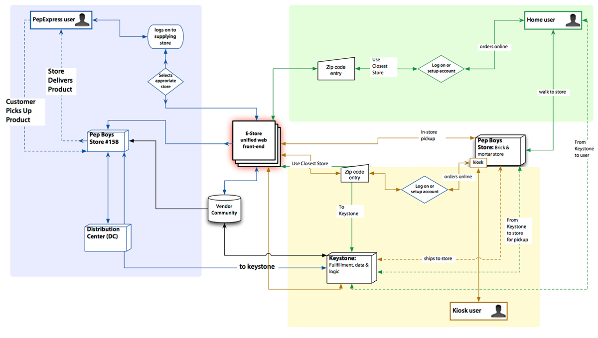
Proposed online auto store ecommerce business system map. This was generated over a multi-day stakeholder interview.
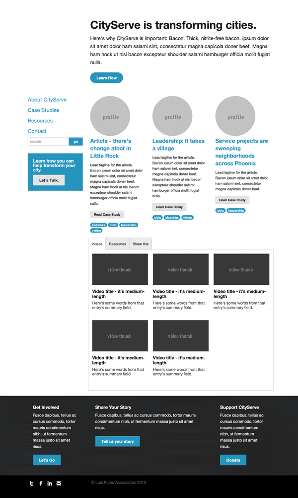
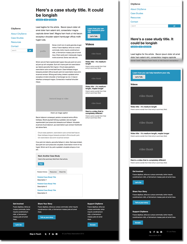
Homepage prototype, done using the Foundation CSS framework. The production site leveraged the new, semantic Section module, which transforms the tabbed area at bottom to an accordion design pattern in mobile widths. View the full CityServe project here.
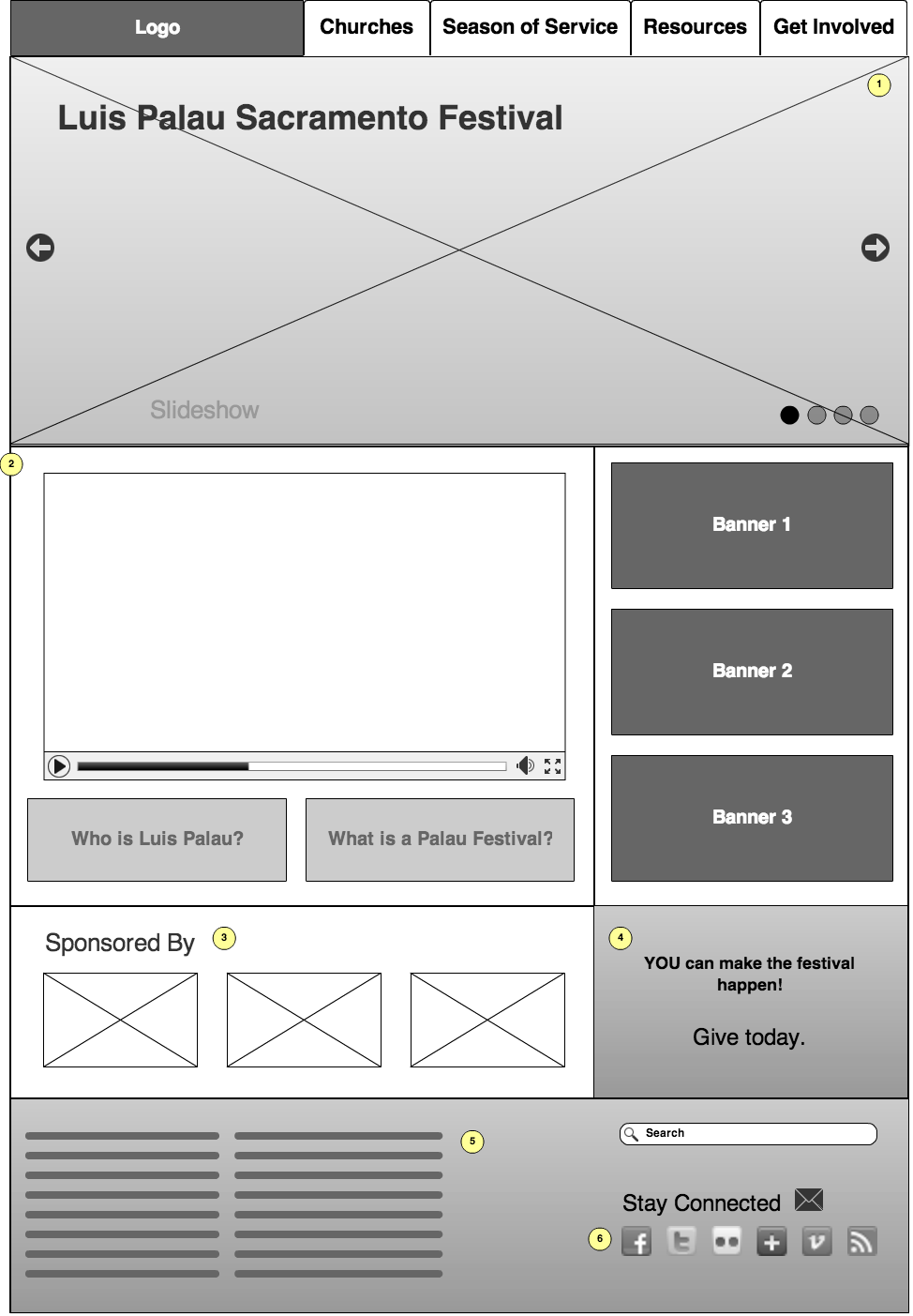
Wireframes, created with MockFlow.
While it did slow things down a bit, the speed at which I was able to gain client consensus on features made it worthwhile. While I don't like the Flash-app basis, I do like MockFlow's ability to export nicely formatted spec documents and multiple formats. The callout features were a good way to clarify and get client feedback, which isn't easy with HTML prototypes [alone].
When possible, I prefer to build with HTML for web apps, as it speeds the transition (or transformation) into live web code.
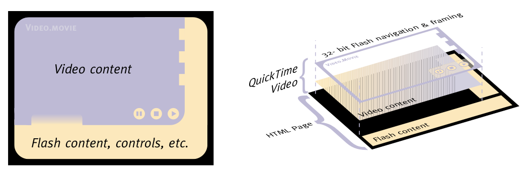
Explanatory illustrations for the tech team; back in the days before Flash video was native to Flash (via FLV), there were various methods for controlling QuickTime videos via Flash. View the full proposal here.
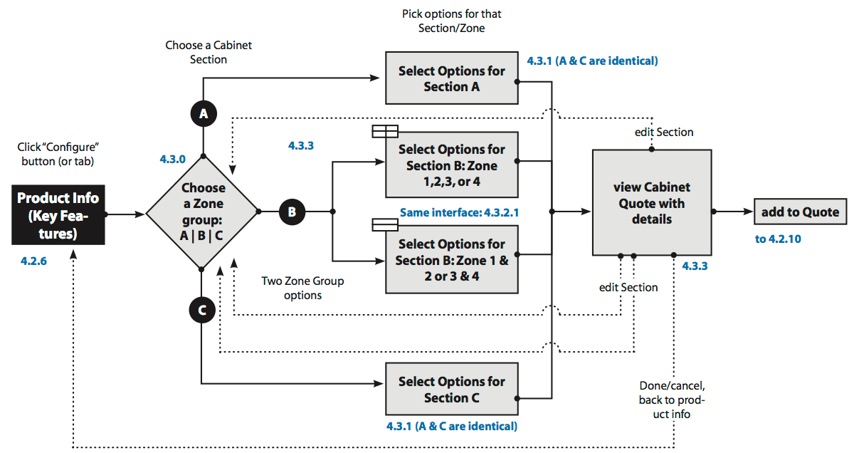
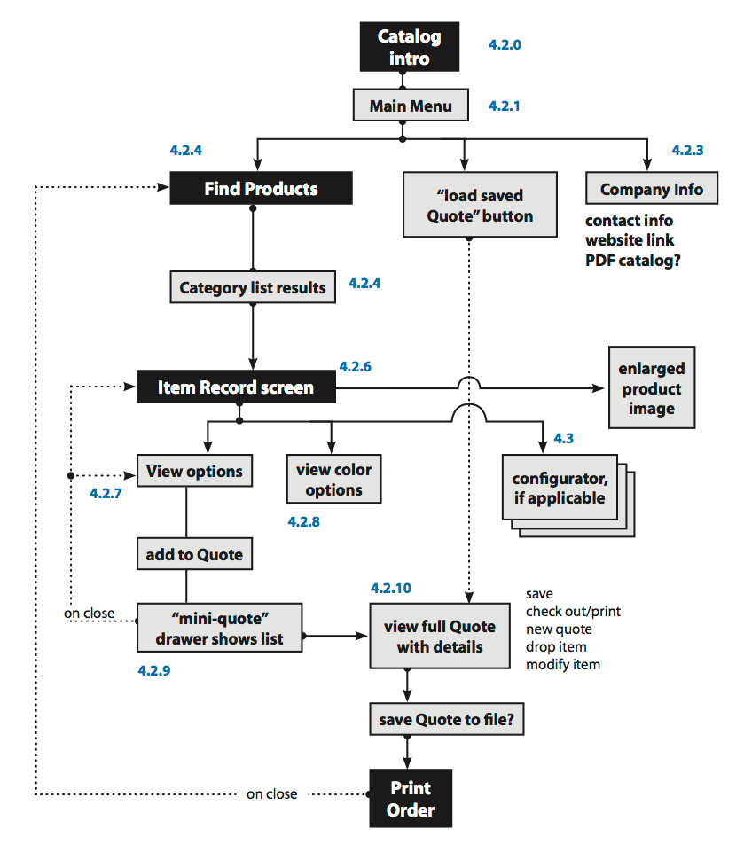
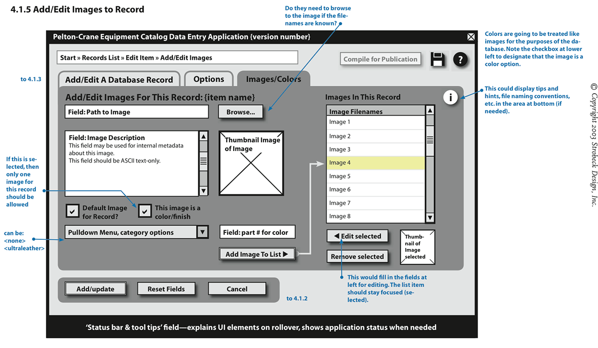
Pelton-Crane dental equipment configurator design document examples. This and the following diagram represent user flows through the application.
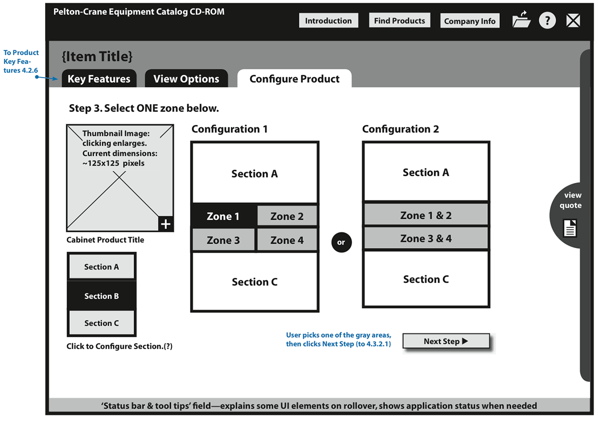
Configurator UI.
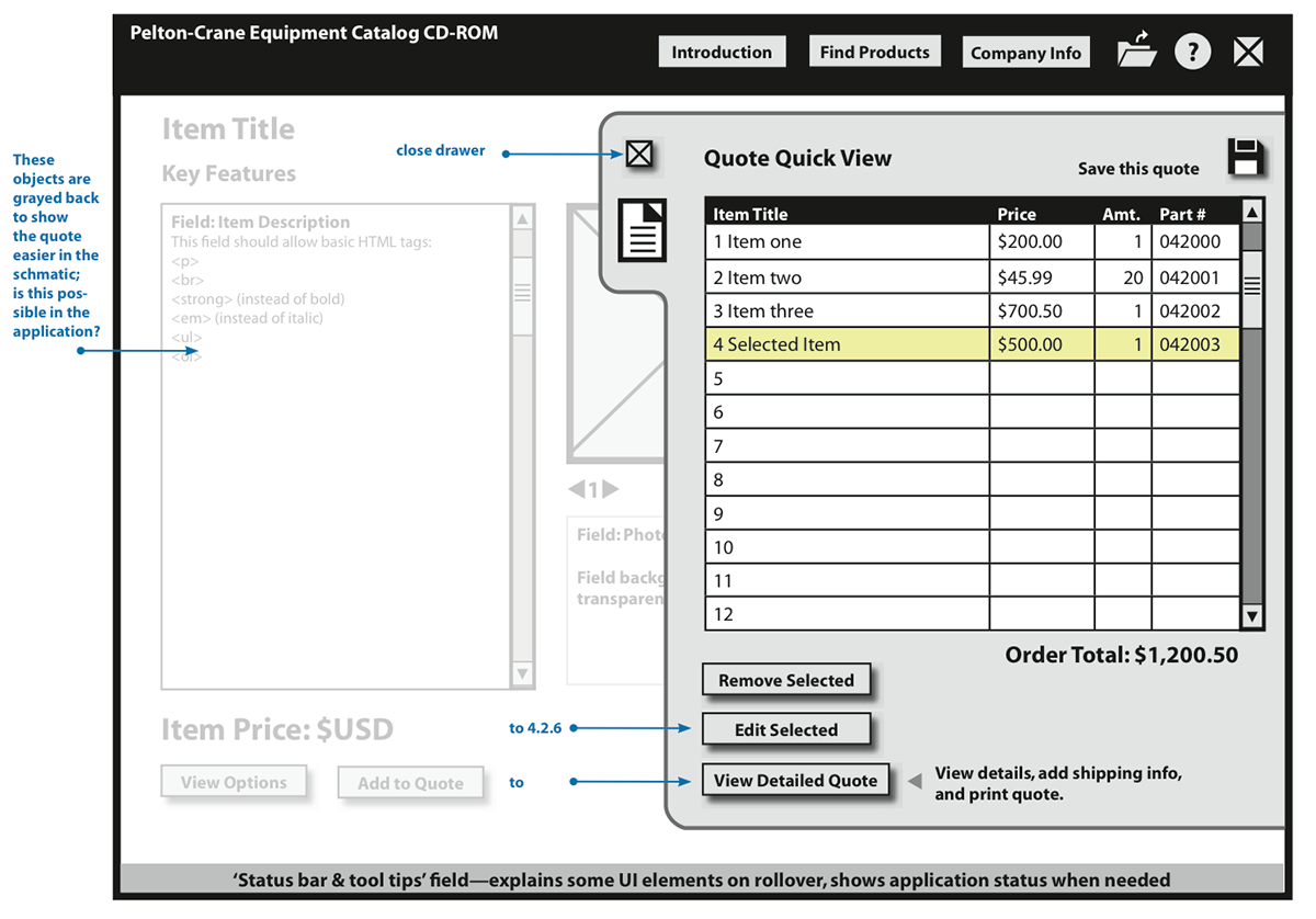
Quote builder for reps.
This wireframe shows a Flash banner at the top area of a company website.
Wireframe for interactive parallax-scrolling Flash banner.


