


Today the ice cream industry is majorly focused on creating healthier forms or alternatives to the classic dessert.
Butter dot on the other hand aims to build upon the very purpose that ice cream has served for centuries together. For us it is still about fun, it is still about celebrating an occasion, it is still for those late-night temptations, & still the cure to a bad day.
That being said, consumers of indulgent foods are looking for convenience, joy, treating and family appeal. This brand is made to deliver on taste, enjoyment and indulging.
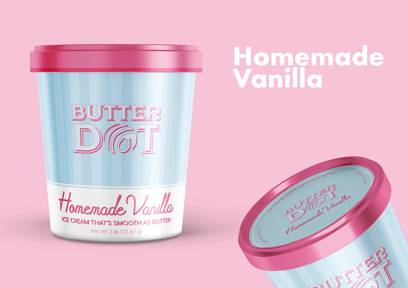
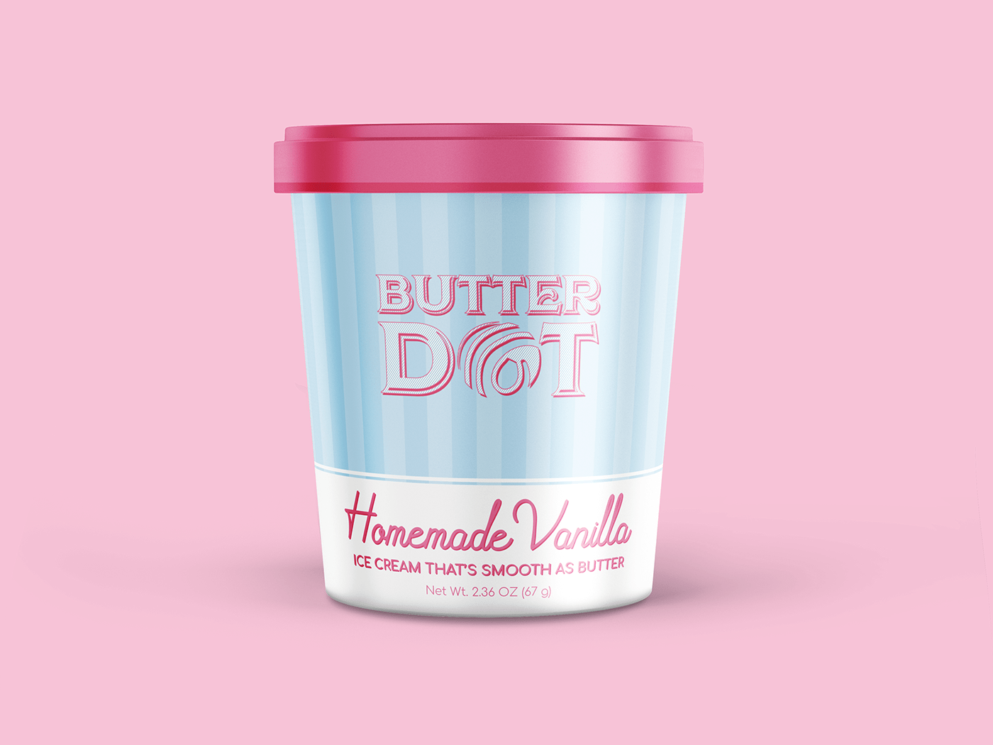
The name was chosen to reflect on the smoothness that comes with our hand-churned ice cream. That along to keep a classic, & fun yet elegant vibe inspired the logo design.
The packaging is designed to convey a playful yet confident feel. Something that will appeal to adults as well as children. Hence the inspiration from the classic red & white striped pattern that is often found in carnivals or vintage ice cream stands. Since these places are often associated with fun & excitement irrespective of age, gender, or culture.
Overall the design is made to stand out from the existing brands yet not seem overly whimsical such that people see it as something too premium & not affordable cause, after all, it’s ice cream & everybody screams ice cream!


Thank you!
Appreciate if you do.


