The case
This is how the Foundation's previous website looked like in 2012:

From the first look at it, it becomes clear that this is one of those cases where you feel like the time has stopped. So it was obvious that the website needed a complete redesign along with a new content management system and information architecture reorganization.
We were asked to do this job. And this is the solution we provided:

Original front page design visualization.
The solution
After nearly two months full of briefings, sketches, meetings and prototypes, this is the result of our job - a brand new website with reinvented layout and color theme that reflects three different messages:
» magenta - for "I want to help you"
» green - for "I need your help"
» cyan - for "I want to learn about you"
This way it's easy to distinguish between different sections of the website and their content. Main sections dedicated to mentioned messages are colored accordingly.
We chose WordPress for the content management as it's easily customizable and very flexible when it comes to developing an information architecture from scratch.

Current (2013-08-27) front page design and layout. It was adjusted to better support the needs of the moment.

We completely redesign the layout and helped to rewrite the content of the homepage. Every important element is now clearly visible and accessible.

"Our actions" subpage with navigation index. Each tile represents individual subpage.

"I want to help" subpage index with most important sections clearly visible, i.e. information about donations, link to Marketing section for additional info about what kind of help is currently needed, search field to find any particular child (the money can be donated to each child individually) and index of subpages about different forms of help.

"I need help" subpage index with most important sections clearly visible, i.e. frequently asked questions, knowledge database, access to accounts management, information about "AMICUS" Rehabilitation Centre, information on how to contact psychological and social/legal support, classifieds from Foundation, parents and supporting enterprises and index of subpages about different Foundation's projects dedicated to help the disabled.

Contact page with division between each structure of the Foundation.

An example page of one of the supported children. It consists of most vital information about the child, such as its name, subaccount number (needed to provide donations directly), date of birth, disability and information how to provide the donation to this particular person.
Parents can also write their own call for help that will appear above the donation info.
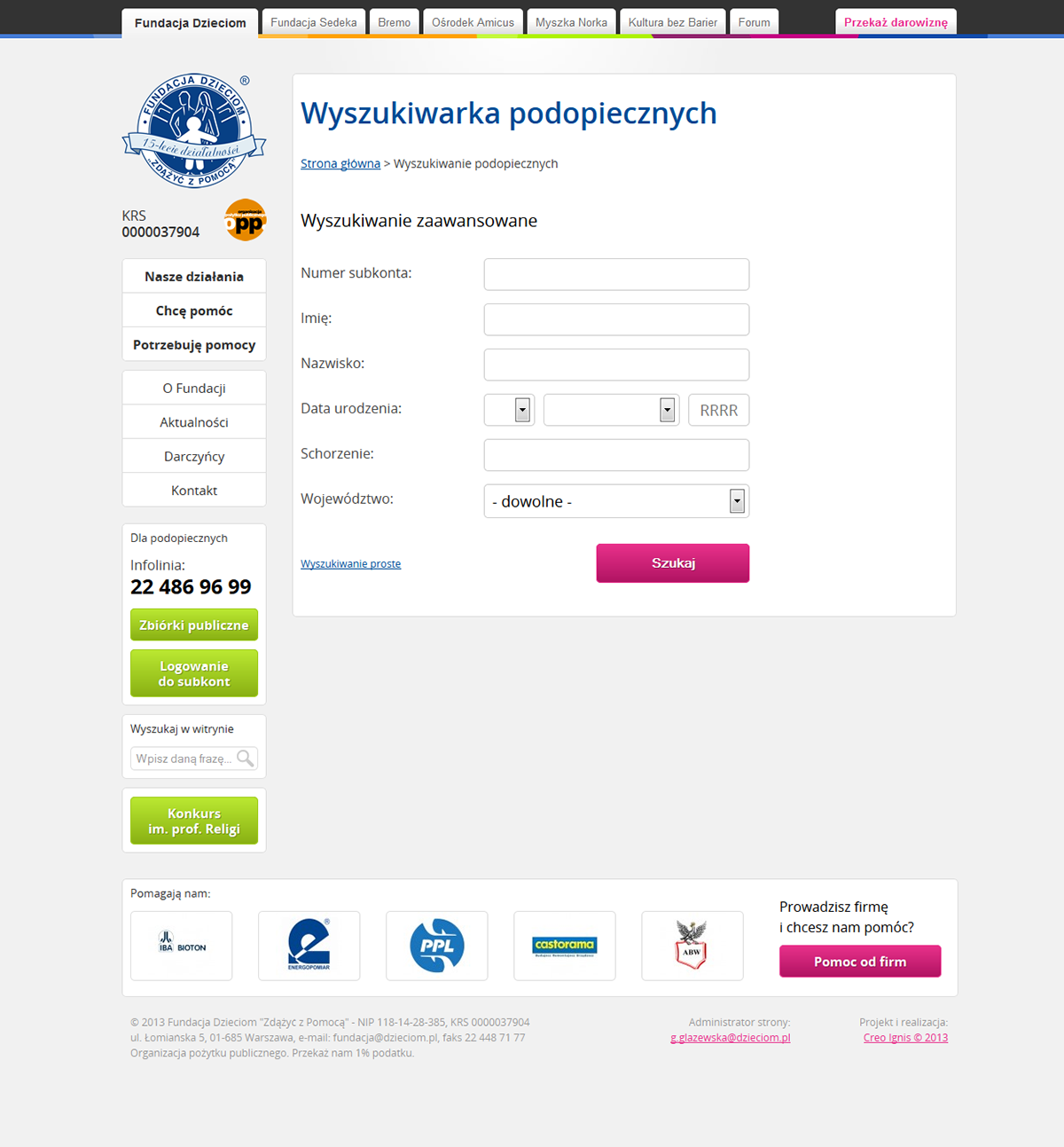
Search engine (advanced search page) that allows to filter the list of supported children.

This is how the ward database index looks like. For the ease of administration, we implemented the database management system to be accessible directly in WordPress - of course different levels of permissions are also supported.
The database can be easily searched, filtered and changed. We provided tools for bulk actions, as well as an import system that lets the user change the database by uploading a specially constructed Excel file.
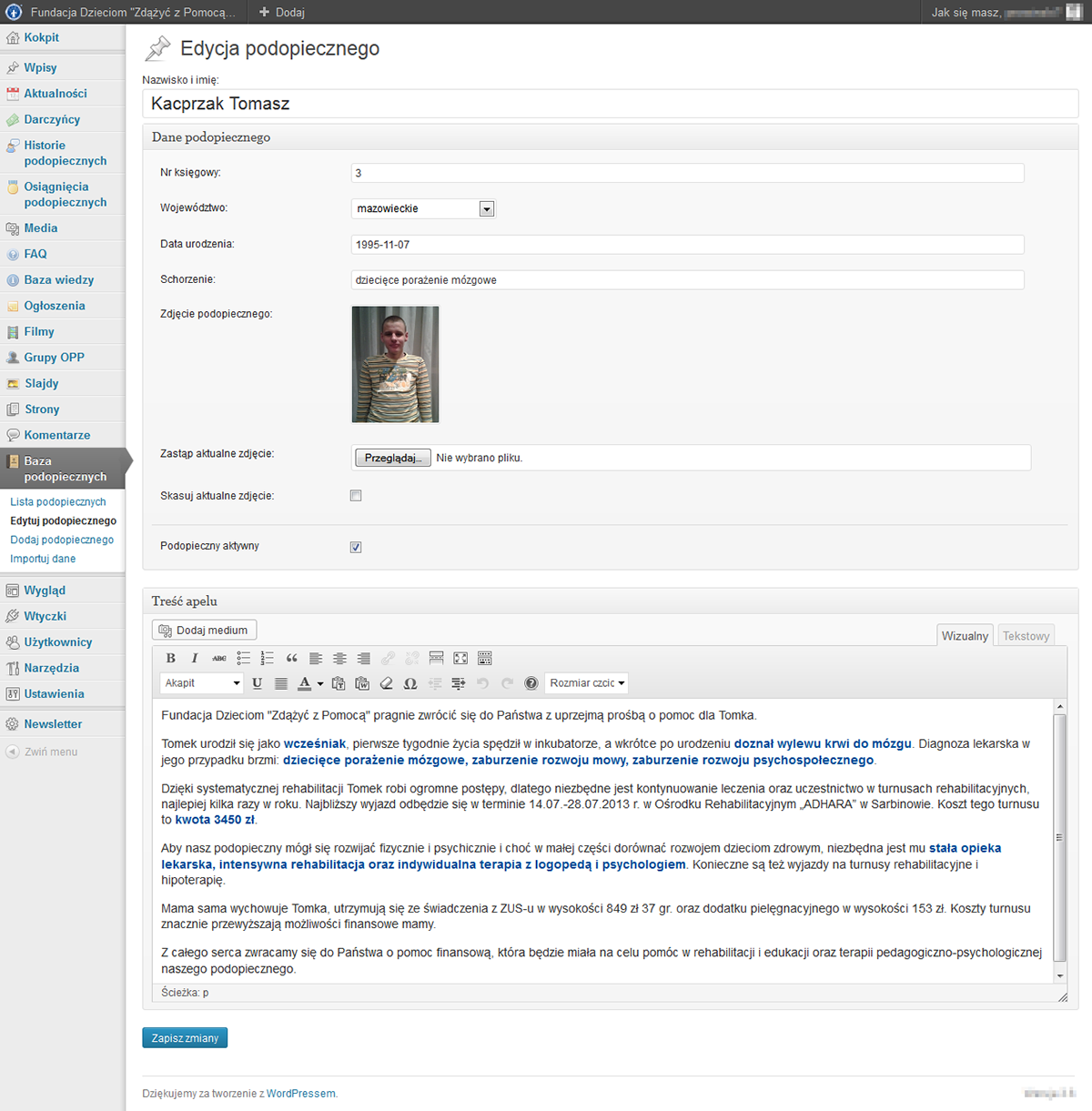
The look of an example ward edit page. Every information can be easily adjusted through form fields.

