Love the White Space
"I like the idea, but why is there so much empty space?"
How many times have you worked with a designer and been confused as to why the design you paid for doesn't take up the entire real estate of the page? Conversely, how many times have you as a designer had to explain the value of white space to a client?
If you answered "never" I'd really like to know who you work with and how I can get in on that! Most likely, you're probably thinking about a handful of times you've had a conversation about white space either as a client or as a designer. Why is it this concept continues to be a point of conflict?
What is is about white space that scares clients
despite being beloved by designers?
I've asked myself this many times, and the answer always comes down to lack of understanding and proper education on the purpose of whitespace. So, what is the purpose of whitespace in design?
Let's start with what whitespace is:
1) The part of a design that is intentionally left empty. (Operative word here being intentional)
2) The space around and between elements such as typography, imagery, color, etc.
(Also called "negative space")
3) A compositional and stylistic tool.
4) One of the best tools in the arsenal of a designer to direct the viewers eye across the page.
(Bonus challenge for designers out there: Design a poster entirely in
black and white using only white space as your hierarchal tool.)
That's a good overview, but certainly not where the definitions end. For now, I'm going to keep it simple -- we'll go into passive vs active white space later. Basically, if you need to remember one thing it's that whitespace is as intentional a graphic design tool as typeface selection is. Proper use of whitespace can indicate luxury, high quality, prestige, and class in a design while cluttered designs (while having their place in the field) do tend to look cheap.
Take a look at the comparison below. Note how the advertisement on the right looks more refined, higher-quality, luxurious while the one on the left no longer holds that same impact.
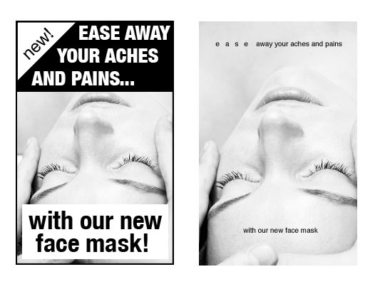
This is one of the benefits of using whitespace properly, and intentionally within a design. However, that's not to say lack of whitespace is an inherently bad thing. There are styles of design where lack of whitespace is used, but it is used just as intentionally with a significant amount of skill and consideration put into its use within the design itself.
Every decision a visual designer makes is one with significance and purpose. If something is added or taken away from a design, there is a functional reason for it.
When a designer presents you with a composition and you notice a fair amount of white space, think about what it could possibly be doing for the design. Is it used as a hierarchal tool in order to lead the eye through the information on the page? It it used as a stylistic choice in a logo where there is an object within the white space (one of my favorite applications of white space), or is it used to convey a certain message about the subject of the design?
(Below: A well known example of negative space usage in a logo.)

The take away I hope you've garnered from this is that white space is just as much part of a design as the space that is occupied. It serves a purpose, and was placed there intentionally. When in doubt, talk to your designer. An experienced Visual Designer will have no problem walking you through the process of decisions made that lead to the final product.
In fact, if you find that you're working with a designer that can't explain what they are doing, their process, and the decisions that go into it you might want to reconsider if that is the designer for you. Part of our job is communicating with our clients, helping them understand what we do, and lead them through the process!