Product details page optimization for Rothy's
How I helped Rothy's optimize their product details page to reduce user friction and boost add-to-cart/conversion rates, ultimately increasing profits.
Project Overview
During our collaboration with Rothy's, we observed a user behavior pattern wherein individuals tended to bypass the product details section, instead focusing their attention on customer reviews in search of information they were unaware was also present in the product details. Through a combination of lean UX research and A/B testing, we successfully established that restructuring the description into concise, scannable bullet points resulted in a notable upsurge in "add to cart" actions and conversion rates.
Furthermore, our efforts to integrate illustrative elements previously featured solely on an internal webpage into the Product Detail Page (PDP) contributed significantly to enhancing Rothy's overall brand coherence. This strategic alignment ensured a more unified and compelling brand representation across the entire website, fostering a stronger brand identity for Rothy's.
Tools
User Testing, Sketch, InVision, Optimizely
Team
1 UX designer, 1 developer, 1 project manager, 1 copywriter, 3 stakeholders
My Role
UX/UI design, User research
Key Performance Indicators (KPIs)
Add to cart rate, Revenue per visitor
Step 1: Surveys
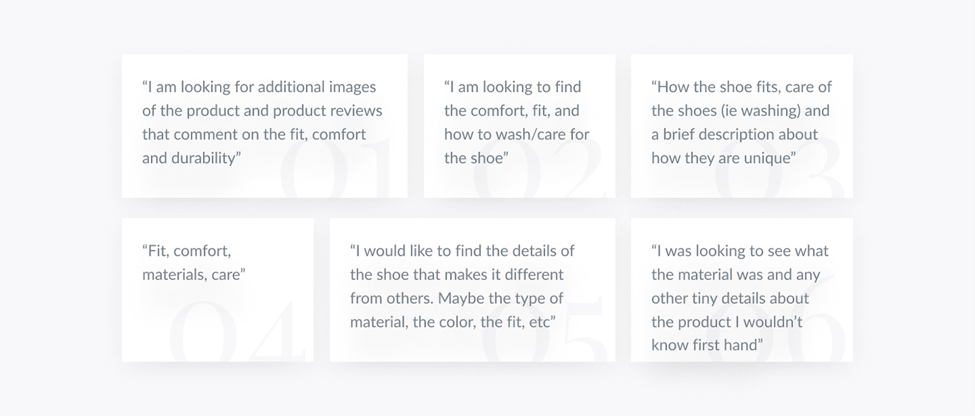
After the project kickoff, we defined our research strategy and objectives. Understanding the target audience and their needs were our priority. First, we built an online survey and shared it in various relevant communities to help us determine what aspects about a Rothy's shoe the user base was most concerned with learning more about.
In just a few days, we received 17 submissions. Based on these, we identified 4 common points, which lead us to the next step: Fit, Comfort, Materials, and Care.
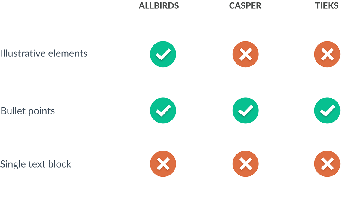
Step 2: Competitive Analysis
Once it was decided what we were looking for we had to see what the competitors were doing and how we could leverage our approach for Rothy's. We audited multiple competitor websites analyzing various points of interest such as look and feel, accessibility, usability, and narrative.
Step 3: Wireframes and Prototypes
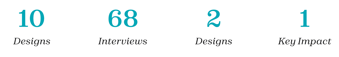
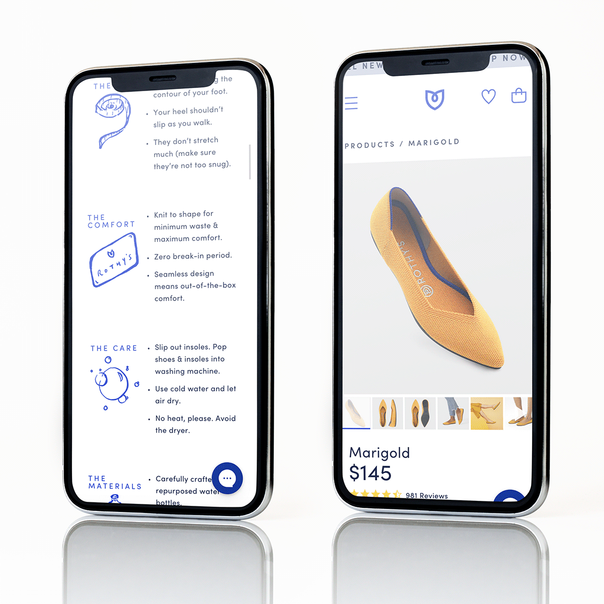
In the interest of time I wireframed with a pencil and paper approach. Presenting 10 designs to the stakeholders we were able to narrow down to 5 options that would be translated into hi-fidelity prototypes using Sketch. Then, I improved them by adding a few relevant illustrations that were underutilized brand elements and copy provided by the marketing team. At this stage, the hi-fidelity prototypes were defined enough for some user testing to help us discern which designs were the strongest.

Step 4: User Interviews
We started recruiting subjects for the test who fit our criteria. We did 4 usability tests and through this were able to identify 2 variations of the designs that were most successful, and could move forward to the live A/B/C test.
1. Bullet Points with illustrations
2. Bullet points without illustrations
Step 5: A/B/C Test
I collaborated with the developer to create live versions of my designs directly in Optimizely until we were ready to launch our test. The test functioned by funneling in 33.33% of users into either variation A, variation B, or the control (the current PDP design at the time). We reached statistical significance in around one week's time which lead to two key findings.
The ability to scan content was crucial
The details section was found to be overlooked because it did not take advantage of the way people read (or rather don't read) online. According to studies done by the Nielsen Norman Group, users scan through content online in either a zig-zag or lawn-mower pattern while looking for key terms in the content.
Breaking up the content was imperative
The variation that utilized bullet points performed better than the control, but it was the variation that utilized both bullet points and illustrations that ended up performing the best. It was found that breaking up the text by bullet points made it easier to digest the information, while the illustrations improved scanability.
Learnings
High cognitive load varies
The results of this project were pivotal in re-framing my ideas of what high cognitive load looks like, and how more elements on a page can actually be beneficial rather than detrimental to the overall user experience.
Guidelines are just that
The basic guidelines in User Experience state that high cognitive load is a poor experience by default and that often means when a page is too busy or information heavy; but, this project proved that sometimes the opposite is true and reminded me that guidelines are great, but every project and user have unique needs to consider.
Lasting success
Despite Rothy's going through a major rebranding after I left their team that lead to them doing away with the illustrations, they still utilized the new details style (bullet points) to this day.


Want to work with me?


