Nanuuk Ice Pops
Packaging design for ice pops (2020)
About the Project
Nanuuk Ice Pops is an organic ice cream making manufacturer. They are a small, growing business in Slovakia, with an ice cream stall at one of Bratislava’s largest shopping centres. Their products are vegan, made only with naturally-sourced organic ingredients. They also have a non-vegan line of ice pops with bio milk and heavy cream.

Brief
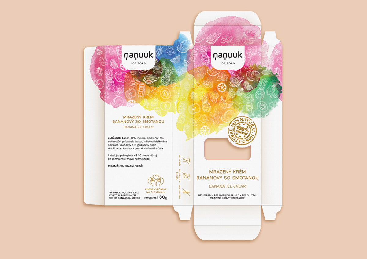
My task was to create eye-catching packaging for their uniquely shaped triangle ice pops. They requested a box-shaped, low-budget packaging with a simple laser-cut hole, where the ice pops’ various colours can be seen. We were given the logo to work with. Together with the Art Director, we planned a clean layout with a pop of colour, representing fruits and spices.


The Design Process
It was an interesting task and one of our firsts to create during the quarantine and home office period in May 2020. I researched the contemporary clean, minimalistic packaging designs and the artsy, vivid, colourful box designs as well. We discussed our ideas with the Art Director and came up with 3 different sketches/prototypes to continue with, but let the customers decide on which style they would prefer.
My first sketch was a triangular box shape, with a triangular-cut hole. The second idea to go with was a rectangular box with an ombre colour scheme and more minimalistic typography. The third option was a vivid watercolour-splash background, with fading white fruit pattern and cinnamon brown text. The third was chosen as the final and winner design. After consulting with the Art Director, we were using two Shutterstock images for the watercolor splashes and fruit pattern. I created a box for every ice pop’s flavour, distinguishing the graphics between vegan and the dairy option. The vegan version featured various fruits they use for making ice pops and the dairy variant included a milk box, some spices and herbs.
The Outcome – problems solved
Since I had only a photo of the product, I had to experiment with the laser cutting to adjust it to the size and shape of the ice pops. When we got back to work in June, I had the opportunity to test out the packaging and design prototype in print and laser. The box shape was slightly changed due to the production technique and food safety regulations.
Impact and Feedback
The client is happy and satisfied with the outcome, and now we are waiting for the approval from the State Veterinary and Food Administration of the Slovak Republic before the box can be finalized and mass-produced.

Important Keywords
Packaging design, Nanuuk Ice Pops, fruit ice cream packaging, organic ice cream packaging, watercolour ice cream packaging, Nanuuk, vegan ice cream box, food safety
Copyrights
NANUUK Ice Pops Facebook
Kanovits Print s.r.o., Korzo Bélu Bartóka 790/4, Dunajská Streda, Slovakia, www.kanovits.com
Graphic design & DTP: Eva Farkas-Czifra

