The Grace Company has the goal of cultivating the ideas of bright-mined young individuals who have great business ideas, and continue to collaborate with them while providing mentoring.
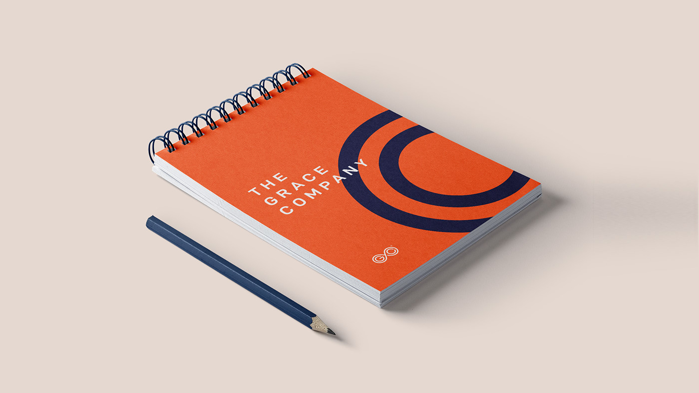
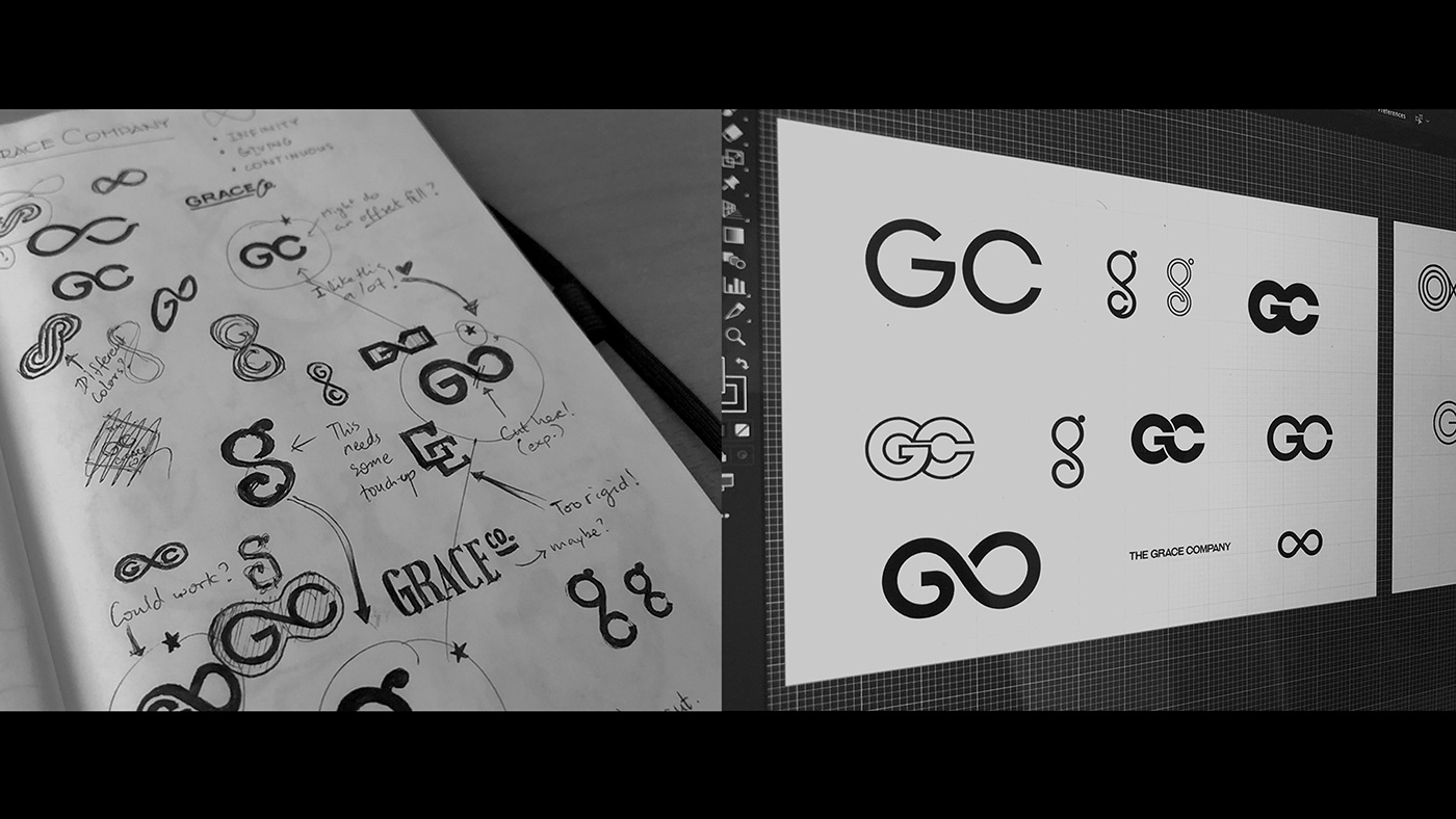
For the logo design, I took the concepts of collaboration + continuity and crafted a mark that aims to get these ideas across. The color palette that was chosen expresses youthful energy (orange), security (midnight blue). An off-white accent color was added to complement these colors. This helps the brand identity look energetic without being too over-the-top.
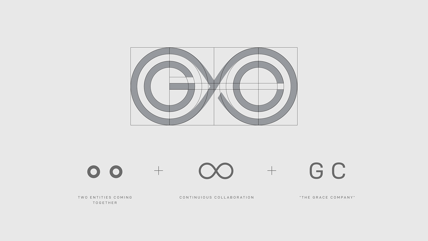


To further enhance the brand identity, a visual language of concentric arcs was created that extends from the design of the logo. This also helps the company brand be recognized even without the presence of the logo. In addition, the arcs try to again express the message of collaboration of two parties.