A brand identity for an affordable lifestyle mattress brand named Spongy. Inspired by the name and purpose of the product we were asked to create an identity which was bold, vibrant and most importantly ‘Comfy’.
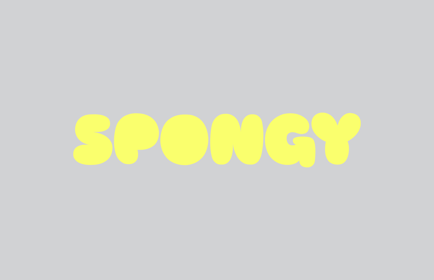
A Spongy, Comfy, Dreamy Logo
The initial brief used lots of descriptive words to describe the USP of the product. Spongy, Comfy, Floaty and Dreamy was just some of them. These words felt very visceral to use and brought up instant relative imagery. With this in mind, we decided to design a bespoke logo which was directly inspired by these descriptive words and ended up with a unique marque that was all of the above; Fat, Round, Bubbly, Soft, Comfy and of course Spongy.
The initial brief used lots of descriptive words to describe the USP of the product. Spongy, Comfy, Floaty and Dreamy was just some of them. These words felt very visceral to use and brought up instant relative imagery. With this in mind, we decided to design a bespoke logo which was directly inspired by these descriptive words and ended up with a unique marque that was all of the above; Fat, Round, Bubbly, Soft, Comfy and of course Spongy.


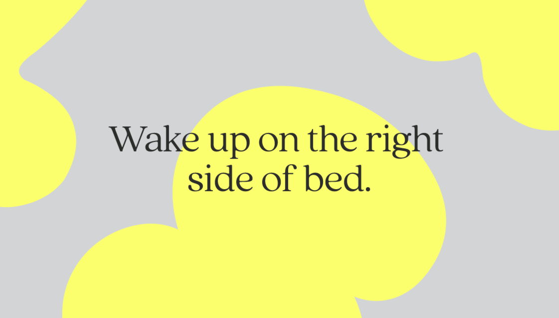
The Clouds
The logo was the starting point for the rest of the brand. When we created the cloud-like letterforms for the logo, the shapes and formations instantly made sense for us be used as ‘floating’ devices which could interact with other brand assets, such as photography, typography and illustration to form bold and engaging visuals. We called this device, ‘The Clouds’.
The logo was the starting point for the rest of the brand. When we created the cloud-like letterforms for the logo, the shapes and formations instantly made sense for us be used as ‘floating’ devices which could interact with other brand assets, such as photography, typography and illustration to form bold and engaging visuals. We called this device, ‘The Clouds’.
A Serif Font with a Human Touch
We opted for a more traditional style typeface to use as the headline font to counteract the soft nature of the graphic device and colour palette. Quincy is a serif font with rounded qualities that still make it feel friendly and human.


Creating a Colourful Brand
With the logo and device as a great starting point, it gave us an interesting base to start fleshing out the brand from. We stuck to a very limited colour palette in order to give the brand recognisability in a rather competitive and saturated space. We used black, white and grey and a splash of ‘neon sunshine’ yellow to really make the content pop.
With the logo and device as a great starting point, it gave us an interesting base to start fleshing out the brand from. We stuck to a very limited colour palette in order to give the brand recognisability in a rather competitive and saturated space. We used black, white and grey and a splash of ‘neon sunshine’ yellow to really make the content pop.


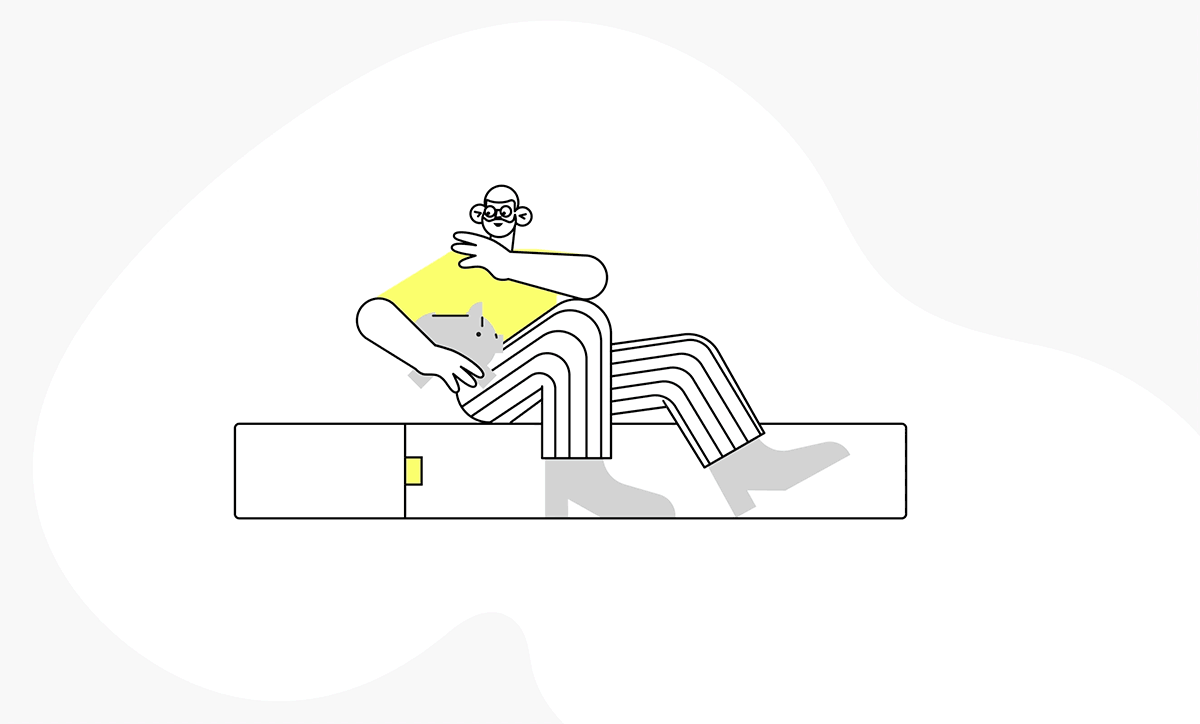
Different Personalities, One Mattress
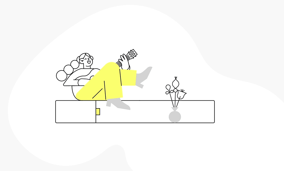
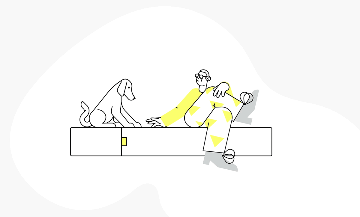
We wanted to emphasise the fact that Spongy was a mattress for everybody and with a start-up budget, we proposed to do this through illustration as this is a format where you can pack a lot of punch into very simple execution. We created multiple characters which spanned from Party Go-ers and Pet Owners to Musicians and Mothers. Using the mattress as the fixed element, we built the characters around this, each of them interacting with the product in a unique way.
We wanted to emphasise the fact that Spongy was a mattress for everybody and with a start-up budget, we proposed to do this through illustration as this is a format where you can pack a lot of punch into very simple execution. We created multiple characters which spanned from Party Go-ers and Pet Owners to Musicians and Mothers. Using the mattress as the fixed element, we built the characters around this, each of them interacting with the product in a unique way.

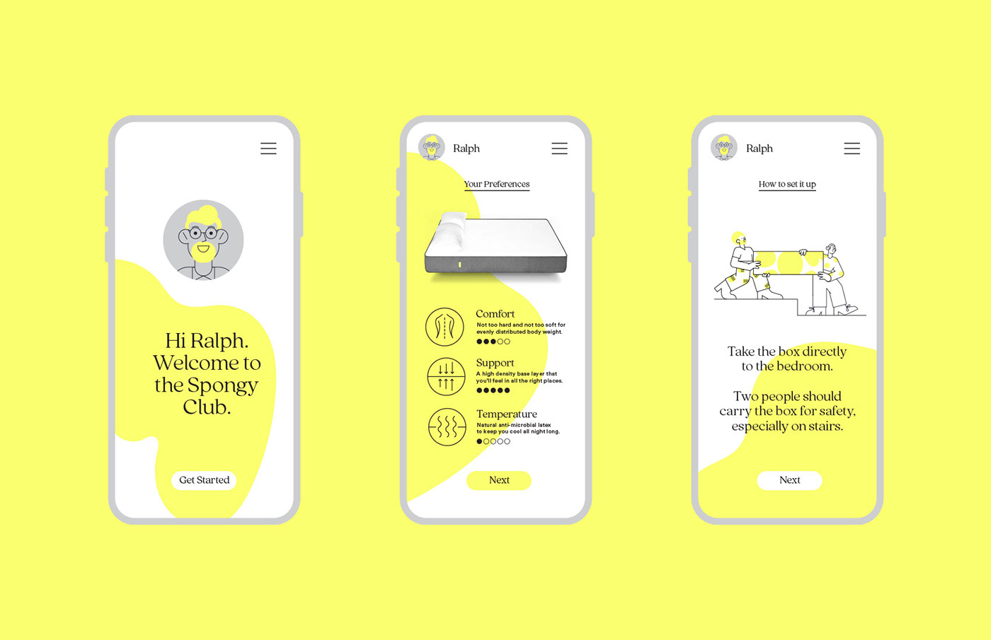
An Easy, Go-To Brand
The brief was to create a brand that felt friendly and reliable and we achieved this by making the process as uncomplicated for the audience as possible. We used the illustrations as a tool to explain simple steps to both choosing the product as well as setting it up once they had received it.
The brief was to create a brand that felt friendly and reliable and we achieved this by making the process as uncomplicated for the audience as possible. We used the illustrations as a tool to explain simple steps to both choosing the product as well as setting it up once they had received it.
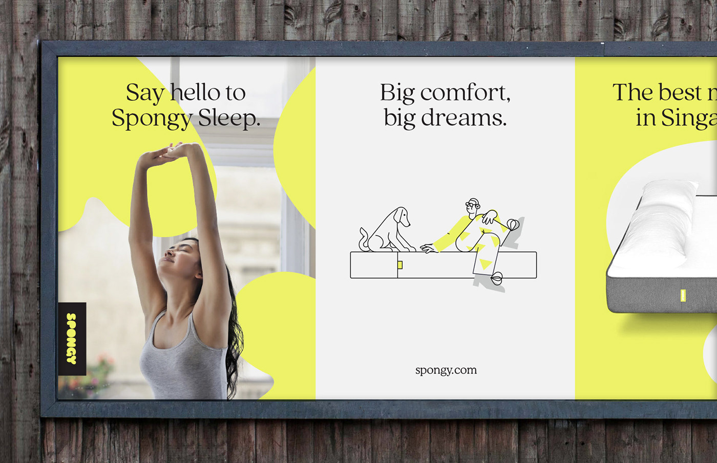

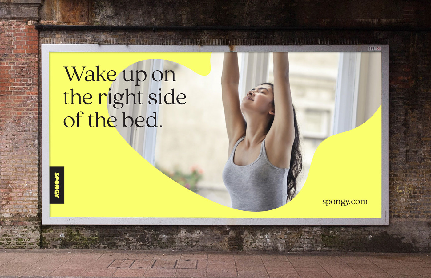
Celebrating the People, Not the Product
With the market being heavily saturated for modern mattress brands, the client vision was to evolve the identity to celebrate the story behind the people who use the product, rather than the product itself. From Party Go-ers and Pet Owners to Musicians and Mothers, we created an identity that reflects the real-life experiences the audience shares – from the messy mundane to the really random.
With the market being heavily saturated for modern mattress brands, the client vision was to evolve the identity to celebrate the story behind the people who use the product, rather than the product itself. From Party Go-ers and Pet Owners to Musicians and Mothers, we created an identity that reflects the real-life experiences the audience shares – from the messy mundane to the really random.
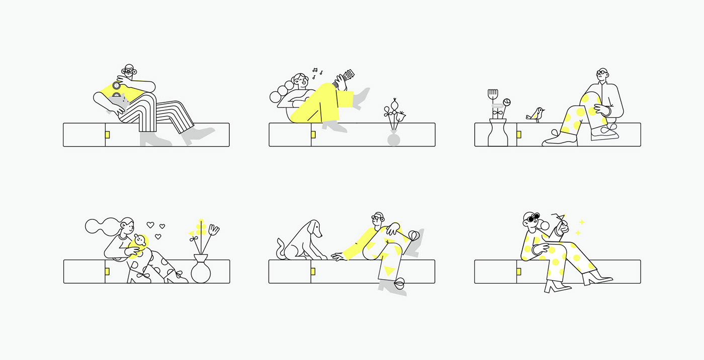
“ From Party Go-ers and Pet Owners to Musicians and Mothers, we created an identity that reflects the real-life experiences the audience shares – from the messy mundane to the really random.”


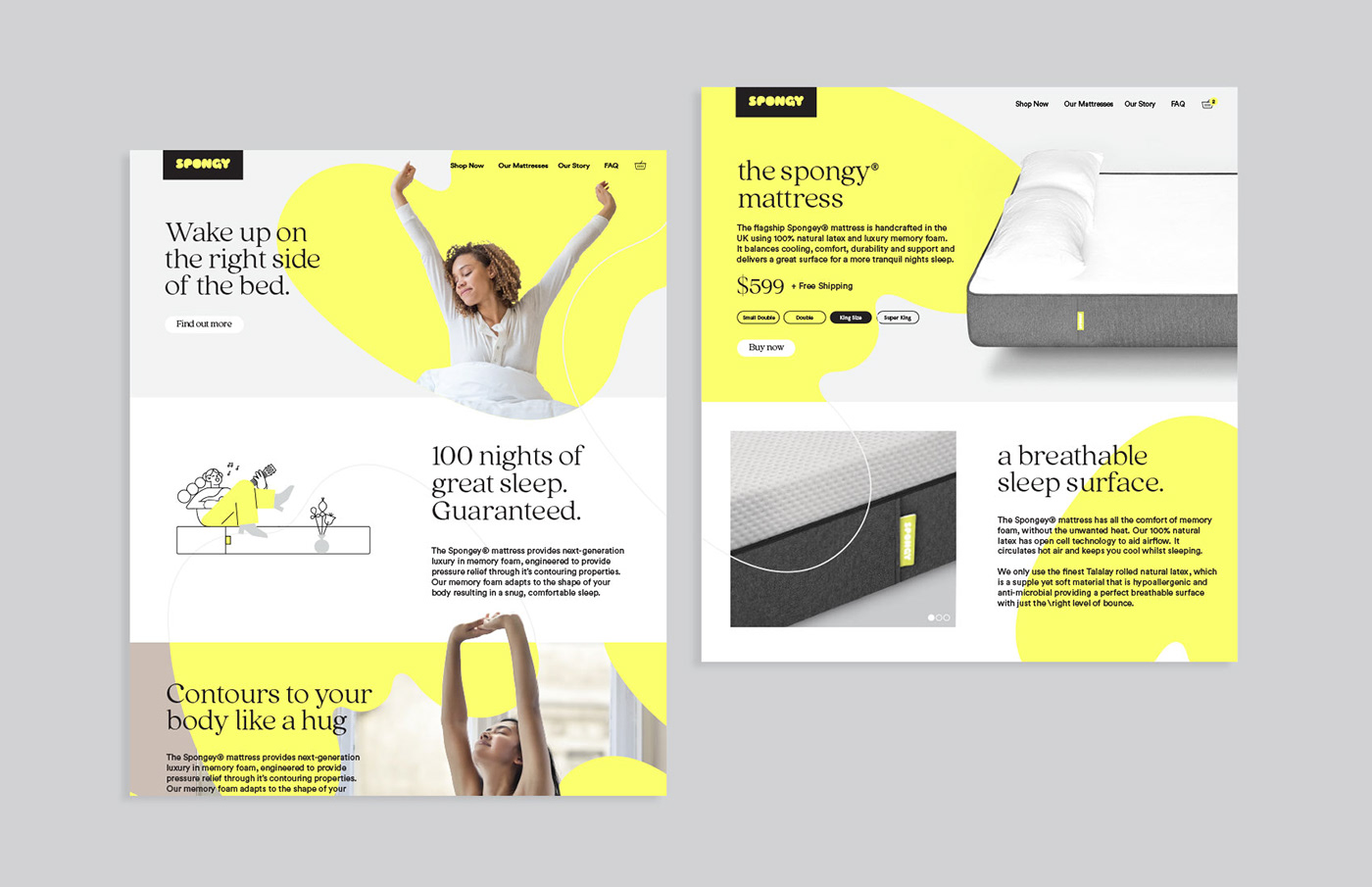
Super Simple Product Experience
A key part of the journey is the product experience, including buying online. We rendered the assets as a graphic framework which allowed us to represent the experience in fresh and interesting ways which felt right for the audience.
A key part of the journey is the product experience, including buying online. We rendered the assets as a graphic framework which allowed us to represent the experience in fresh and interesting ways which felt right for the audience.