


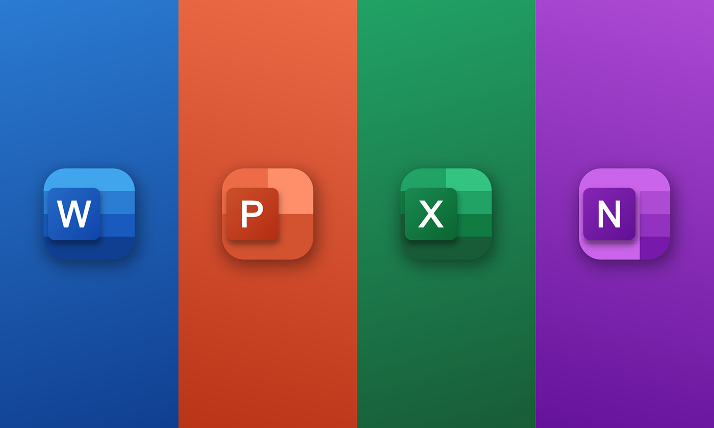
I'm excited to share with you my icon redesign concepts for Microsoft Office 365! The inspiration behind this project was quite simple: I was feeling a bit bored (we designers can't resist a creative challenge!).
As I was scrolling through my phone, I came across the current icons of Office 365, and you know what happens when designers aren't quite fond of something—we dive into a redesign frenzy! So, here are my fresh and innovative takes on the icons. Let's inject some excitement and creativity into the digital world!
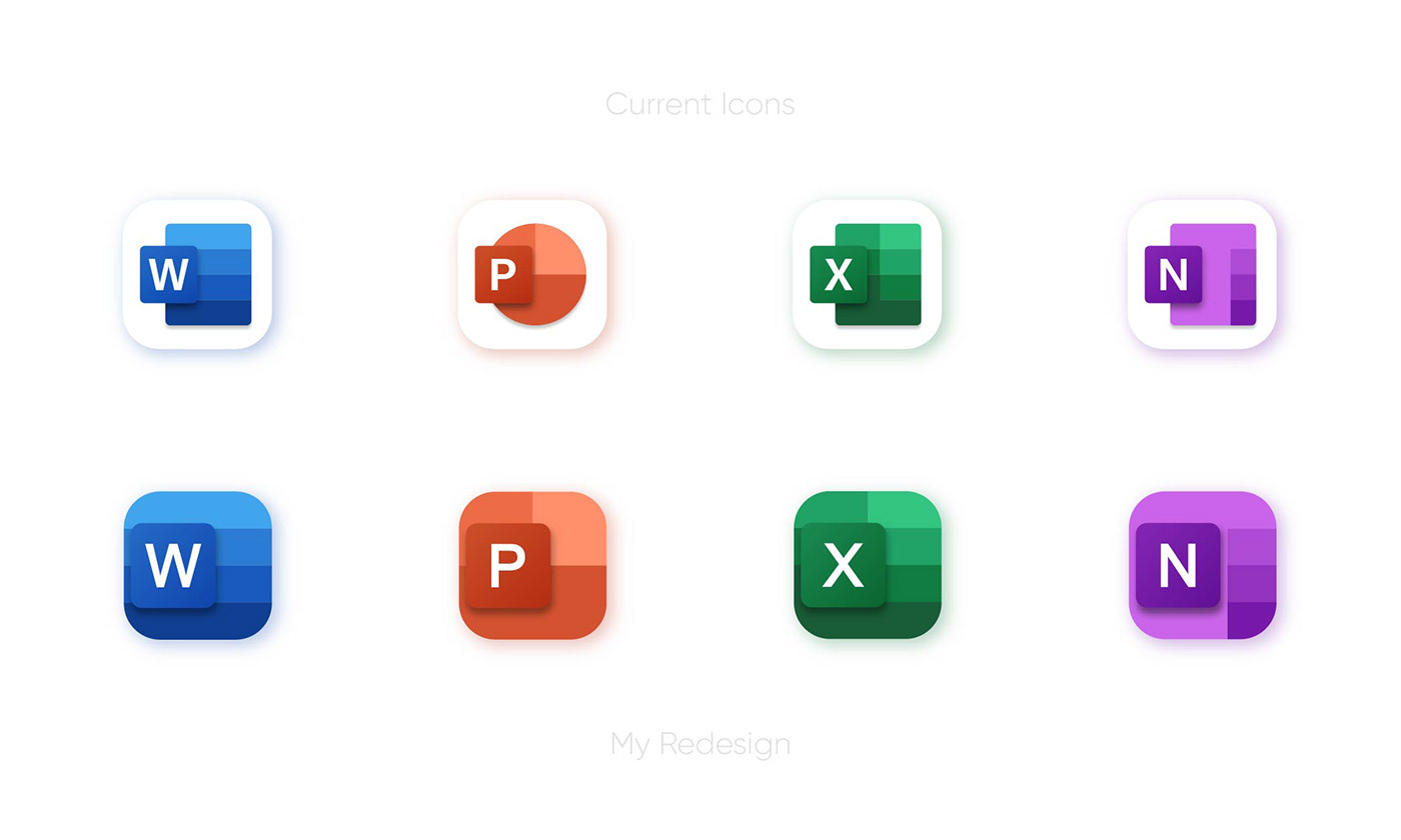
The original icons were initially designed for Windows 10, which is why they may not be visually optimized for iPhone icons. As I compared the current icons with my redesigned versions, I noticed a significant difference in terms of graphical suitability. The current icons tend to have excessive white space, which can impact the overall aesthetic. With my redesigned icons, I aimed to create a more balanced and visually appealing composition that better aligns with the iPhone icon standards. Let's bridge the gap and bring a fresh look to these icons!
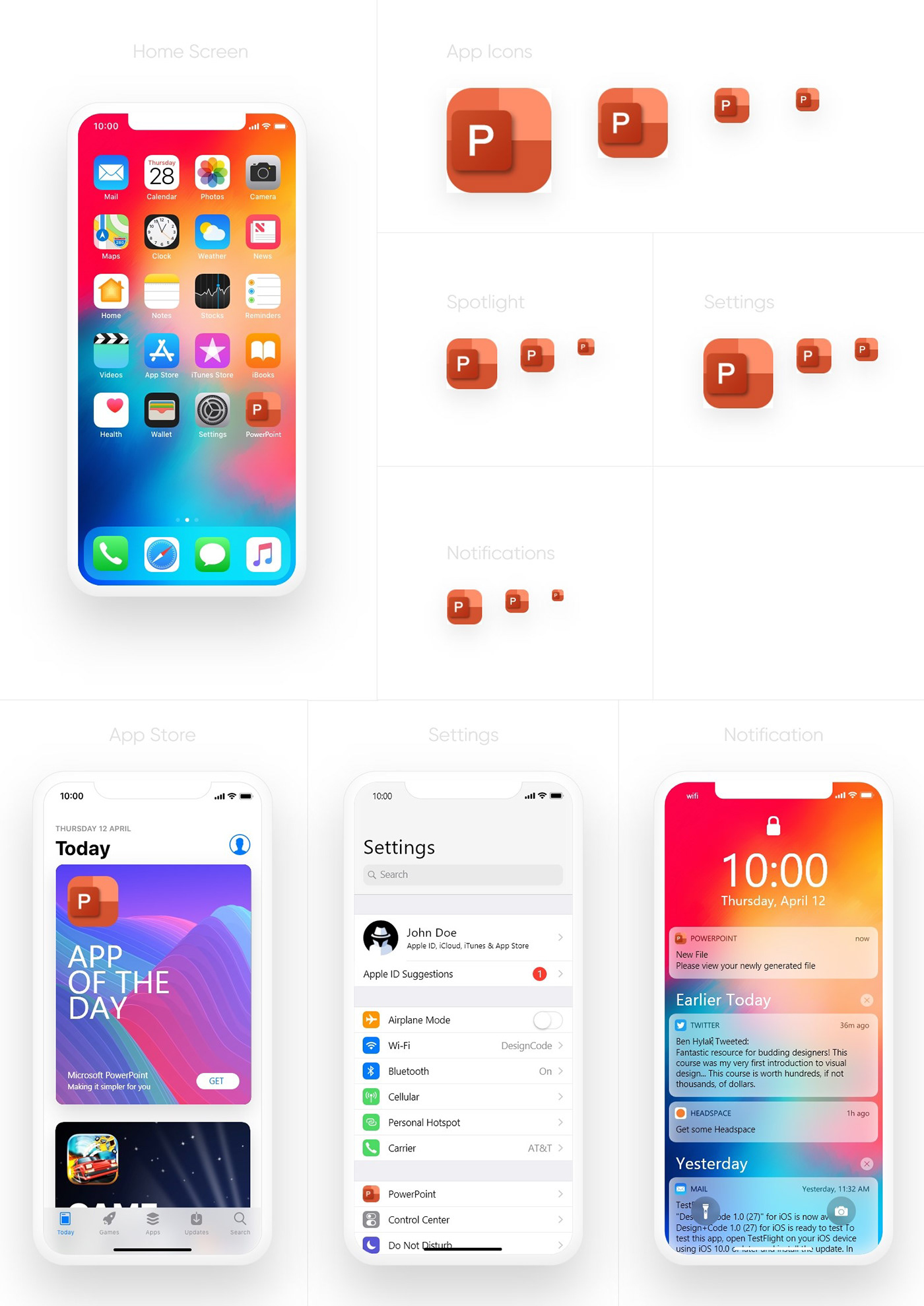
In this presentation, I showcase how my redesigned icons will appear across various screens, including notifications, settings, and the app store. I've created a sequence that starts with the redesigned Word icon, followed by PowerPoint, Excel, and OneNote. Simply swipe down to view all four icons and see the cohesive visual theme I've developed. Additionally, I've included presentations for the app loading screen, demonstrating its appearance in both light and dark modes. Get ready to experience a fresh and unified look for these icons!

Microsoft Word Icon Presentation
Microsoft PowerPoint Icon Presentation

Microsoft Excel Icon Presentation

Microsoft OneNote Icon Presentation
Presenting the app loading screens for the redesigned icons, featuring both light and dark modes. These screens showcase the static versions of the redesigned icons, offering a glimpse into their visual appeal and style. Experience a captivating loading experience that complements the overall theme of the redesigned icons.

App Loading Screens - Light Mode

App Loading Screen - Dark Mode


