HAIR MNL:
YOUR MANE AUTHORITY
YOUR MANE AUTHORITY
OVERVIEW
HairMNL is the first mover in making professional haircare more accessible in the Philippines, carrying industry-vetted products from Kérastase, Davines, TIGI, L'Oréal Professionnel and Keratin Complex just to name a few. What they do best is take care of you and your hair specifically, and with the highest industry standards. They came to us to help them build a distinct visual & verbal voice, to talk about how to professionally take care of hair and what it means to people.
WHAT WE DID
Brand Strategy
Brand Survey
Brand Identity
Brand Collaterals
Menu Design
Brand Survey
Brand Identity
Brand Collaterals
Menu Design

HairMNL already had a good and loyal following at the onset of the project, together with solid know-how on e-commerce and analytics. However, with the rise of other e-commerce giants carrying some similar (and sometimes counterfeit) products, they needed a stronger way to compete. The goal was to emphasize the professional, industry-level quality of their products and services, together with the personalized expert haircare advice that they provide to their very specific audience.
Putting together their penchant for professional with their market's sensibility for sensitivity, we endeavored to create something that fulfilled expectations for ease, expertise and identity all in one brand.

DESIGNING FOR EXPERTISE
The goal was an overall look that is professional, bold and unique. Considering that most professional hair products are premium as well, we also needed to design for poise and polish while remaining approachable.

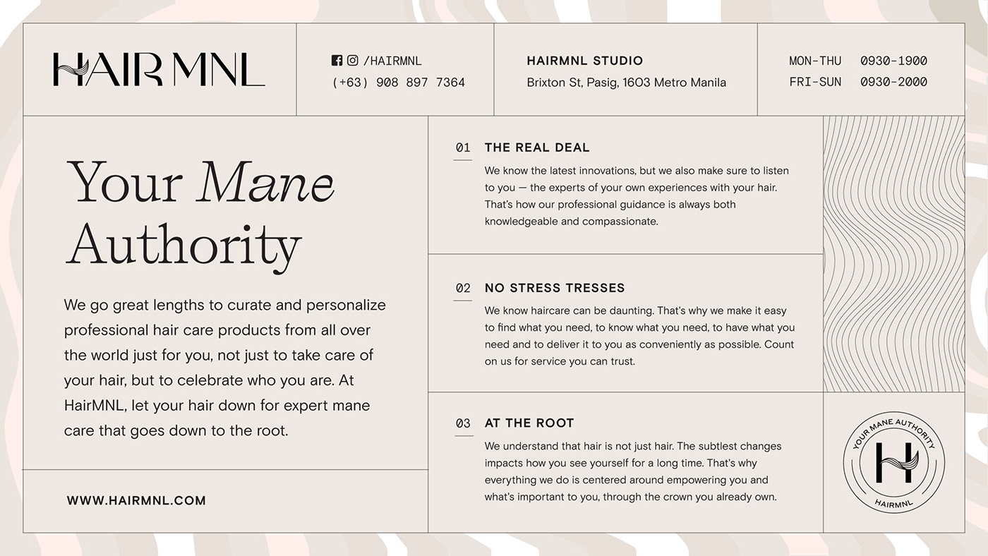
The HairMNL brand mark is a custom elegant serif type. Detailed accents were designed into the type to resemble the flow of hair and to help make the HairMNL brand unmistakeable.

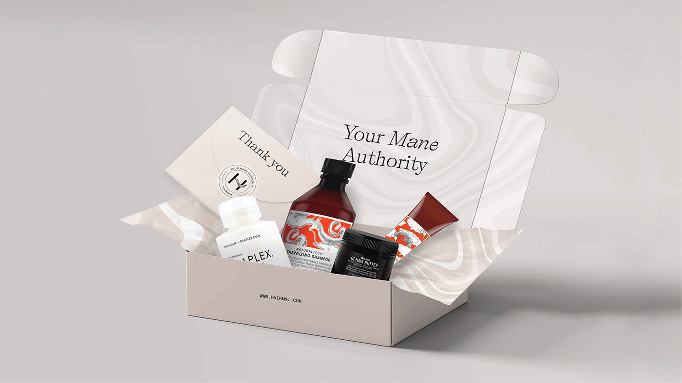
A seal of authority was also designed to further establish their expertise wherever needed. It makes use of the H as a monogram, as well as the brand tagline that we wrote for them.
As many of their important touchpoints are information- and product-heavy, we kept the color palette neutral and elegant. This is supplemented by the marble and hairlike graphic patterns. Also serving as key visuals, these add a feeling of flow and fluidity all throughout the brand.

Icons were created in line with this to help organize chunks of technical information, tag products when needed, and aid navigation online or offline. Seals were created for the major hair issues, and different hair types were illustrated to acknowledge and represent the unique hair conditions people have.


One of the biggest challenges of the brand was streamlining information. Whether it was product categories or services, we tried to find easier ways for customers to sift through many technical products, understand what they're for, then find what they need.

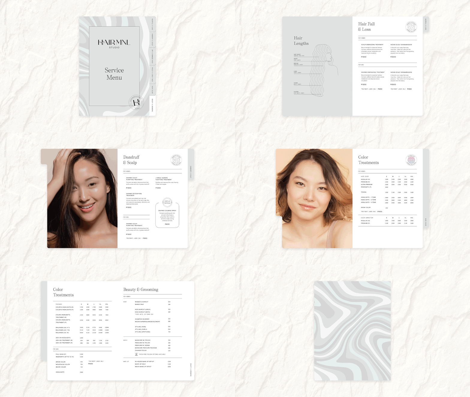
For the service menu of HairMNL Studio, we recategorized services according to specific hair issues, which may also be found as tabs. We also put treatment services first before everything else, so HairMNL's professional and expert side can be further emphasized. A few other visual aids were put into place, such as the guide to hair lengths and some of the icons as well. Photos were also used to provide crucial visual breaks for information-heavy spreads. This menu especially illustrates how strategy and design can work together to achieve the objectives of a brand.
Social media templates were also designed for customer engagement and education, while ensuring adaptability to the many different products and brands that they carry. All of this came together to create a brand that helped people understand haircare more easily, further demonstrating both expertise and approachability through a visually beautiful and compelling identity.
THE FUTURE OF HAIR
THE FUTURE OF HAIR
Lastly, we also created guides to help HairMNL execute the brand even post-project, ensuring the longevity of the messaging we designed.

Brand pillars as applied to brand copy

Moodboard with color, texture and mood guidelines to guide photography
A tone & language guide was created to break down the voice that HairMNL should adopt, to be able to fulfill its three brand pillars of Expertise (The Real Deal), Ease (No Stress Tresses) and Identity (At the Root) through how they speak. A photography guide was also created to complement the rest of the brand's graphic identity. A texture palette was recommended to subtly represent different hair types and issues even in non-graphic touchpoints.
YOUR MANE AUTHORITY
Get expert, personalized haircare by messaging them, checking out their products or visiting their Instagram or Facebook pages.
Get expert, personalized haircare by messaging them, checking out their products or visiting their Instagram or Facebook pages.


