Overview
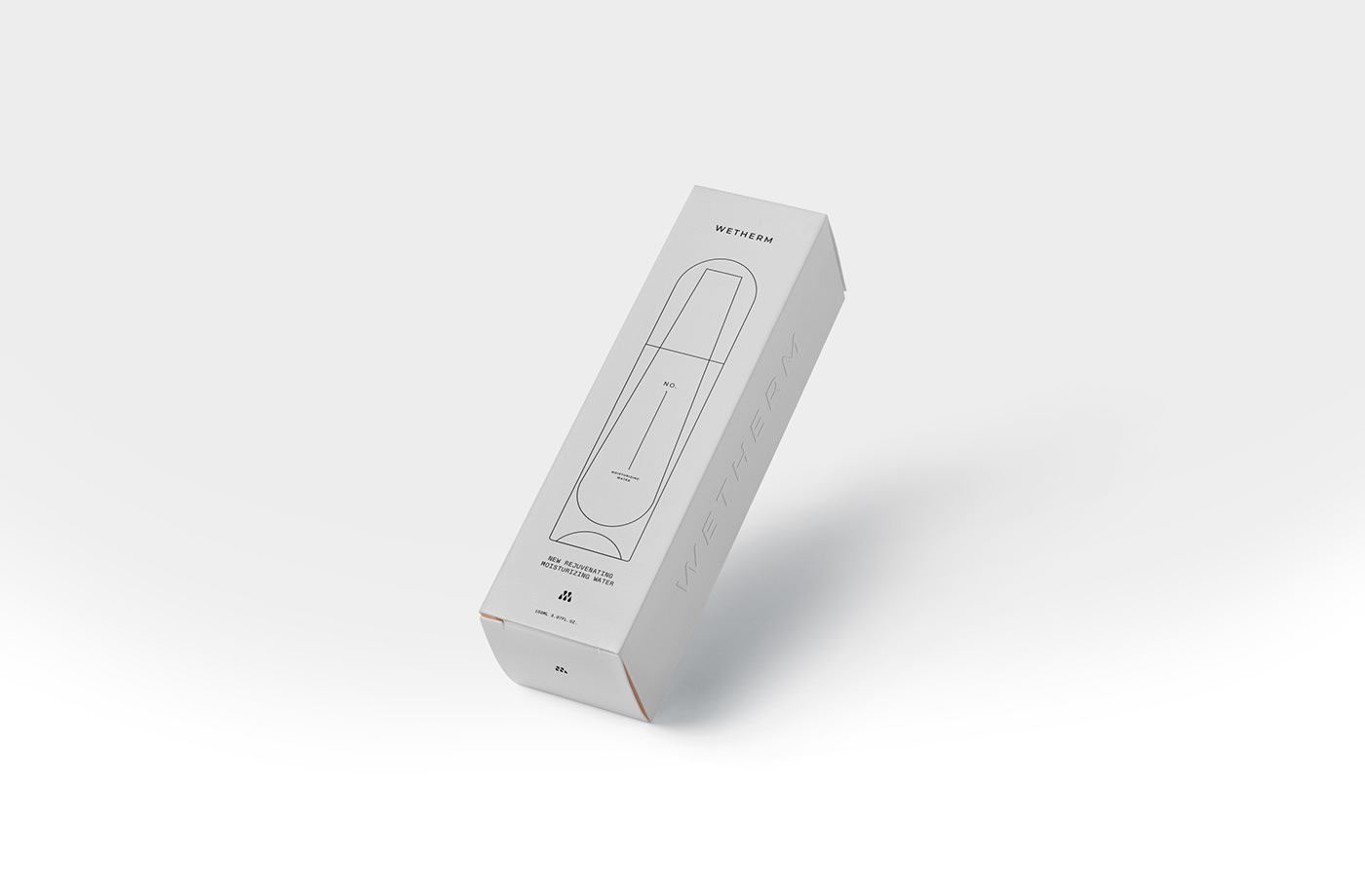
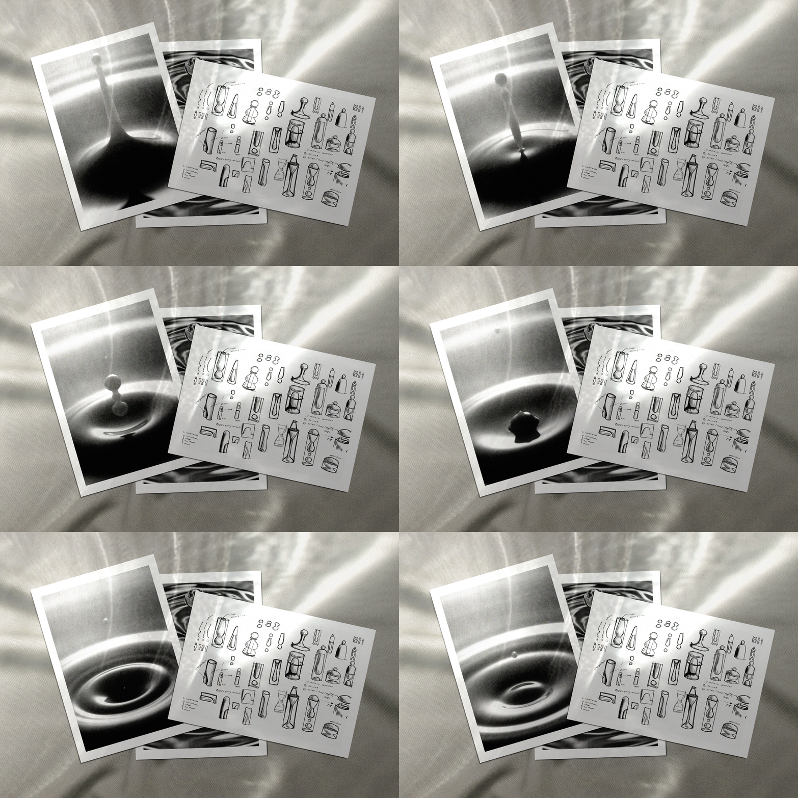
While redesigning the brand, I focused on the essence of the WETHERM brand – water. WETHERM has been focusing on nourishing women’s skin through moisturization, employing spring water as the core ingredient. This is exactly why water inspired me in new designs, and became the concurrent theme across my aesthetic outcomes.
When let alone, water naturally assumes the shape of droplet. A round water droplet symbolizes peace and perfection. Yet, with the right aesthetic touch, the contour of a water drop can be made minimalistic and futuristic.You will find a water droplet as the main theme across different entities we propose here.
Bottle Design
a. Contour and typography
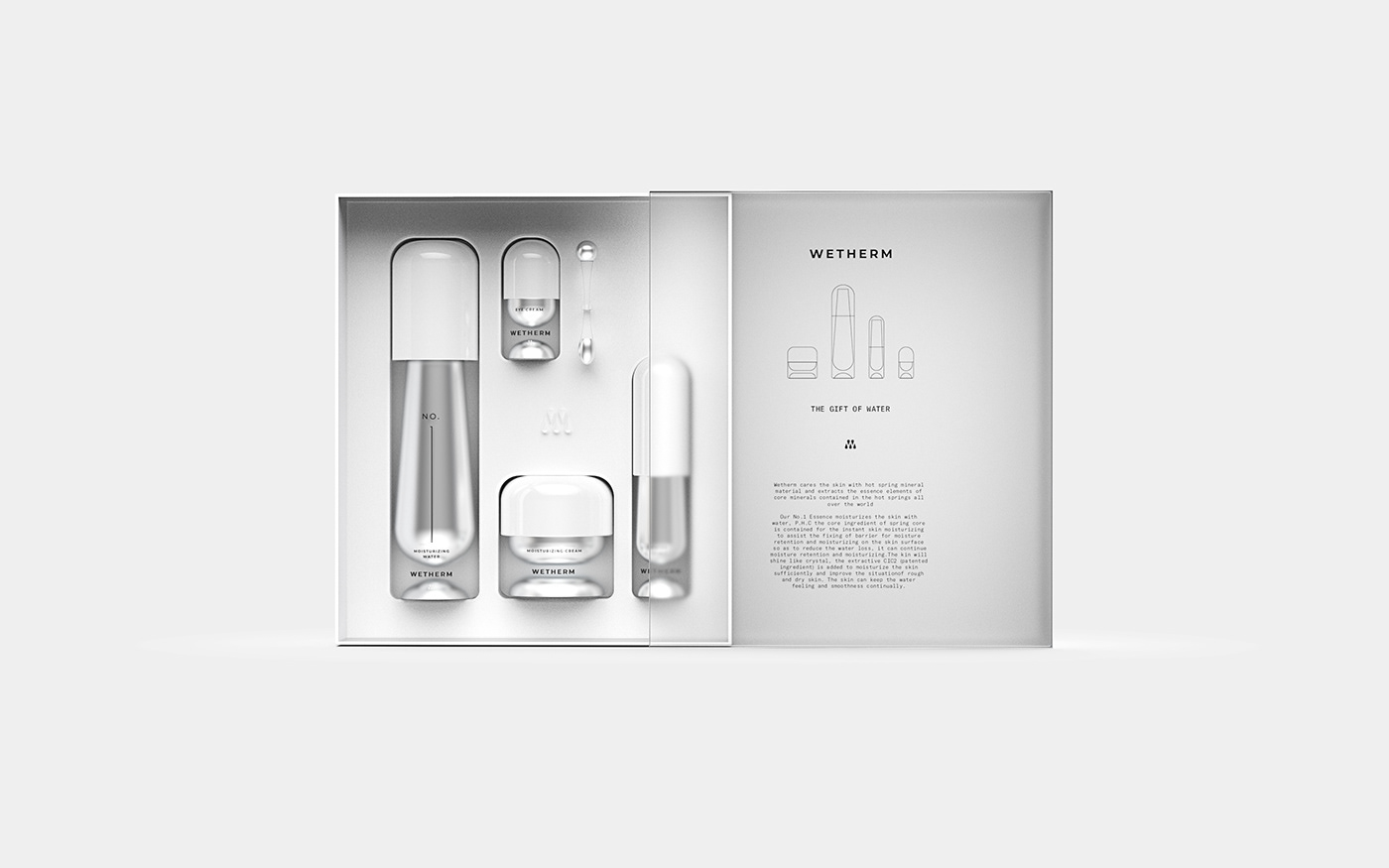
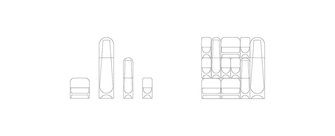
The proposed WETHERM bottles has a beautiful proportion with a modular perspective that forms a grid design. The typeface on the bottles is elegant and light, appealing to female consumers. The outline of the body is minimalistic and futuristic, appealing to young consumers.

b. Outer and inner parts
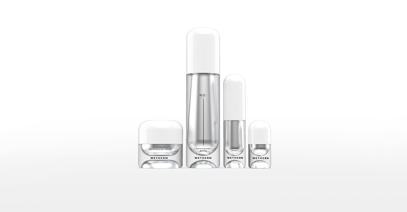
The body of the WETHERM bottles is made of frosted glass, symbolizing the moisture in the atmosphere condenses on the outer surface of bottle. The inner part of the bottle maintains the water droplet shape, symbolizing the flexibility of water. The inner part is in silver, symbolizing the reflective color of water. These elements of the outer part make sure that the viewer easily understand that these products have impressive moisturizing power.
Brand Identifier
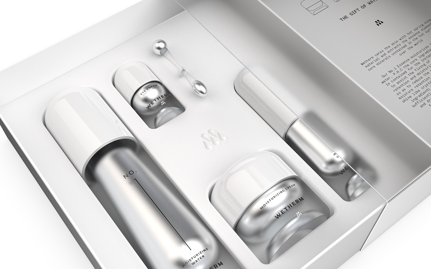
The logo delivers coherent impressions of the brand to the customers in two ways: First, the symbol’s contour stems from the letter W in the logo typeface. Second, surrounding the illusionary letter “W” is five water droplets, repeating the core ingredient of the product – spring water. With these elements, the brand logo leaves a strong, coherent impressions of WETHERM to customers as “the” high-end brand with a moisturization expertise.

