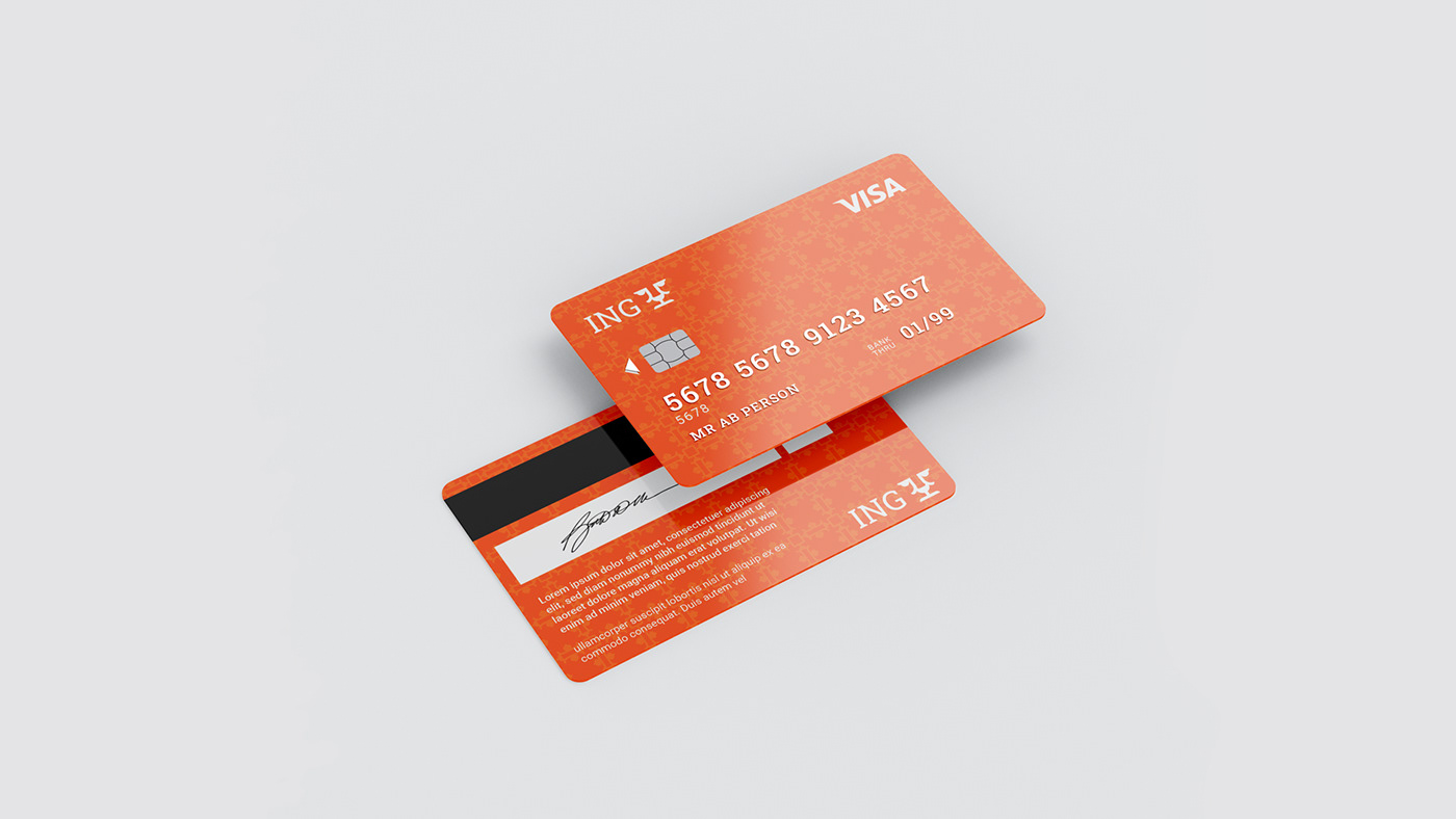
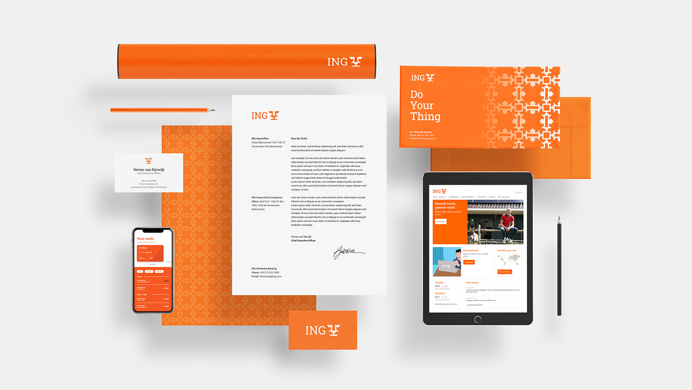
ING's
is a global bank with a strong European base. have 53,000 employees serve around 38.4 million customers, corporate clients and financial institutions in over 40 countries, and corporation headquartered in Amsterdam.
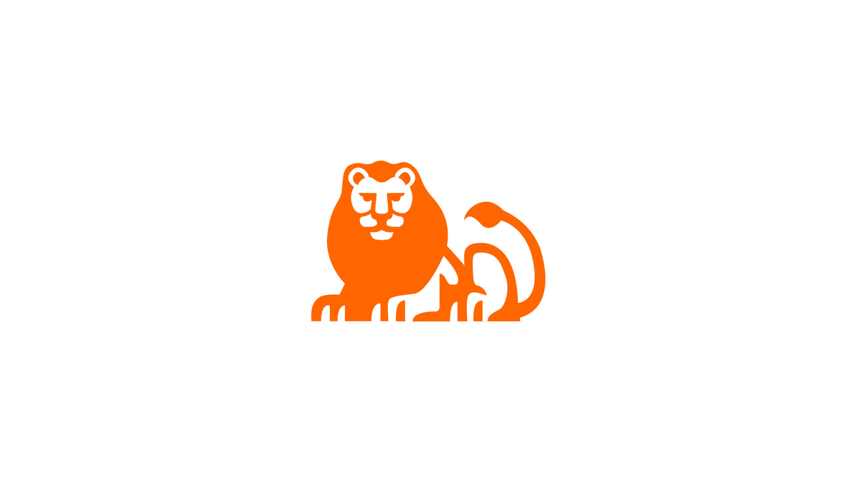
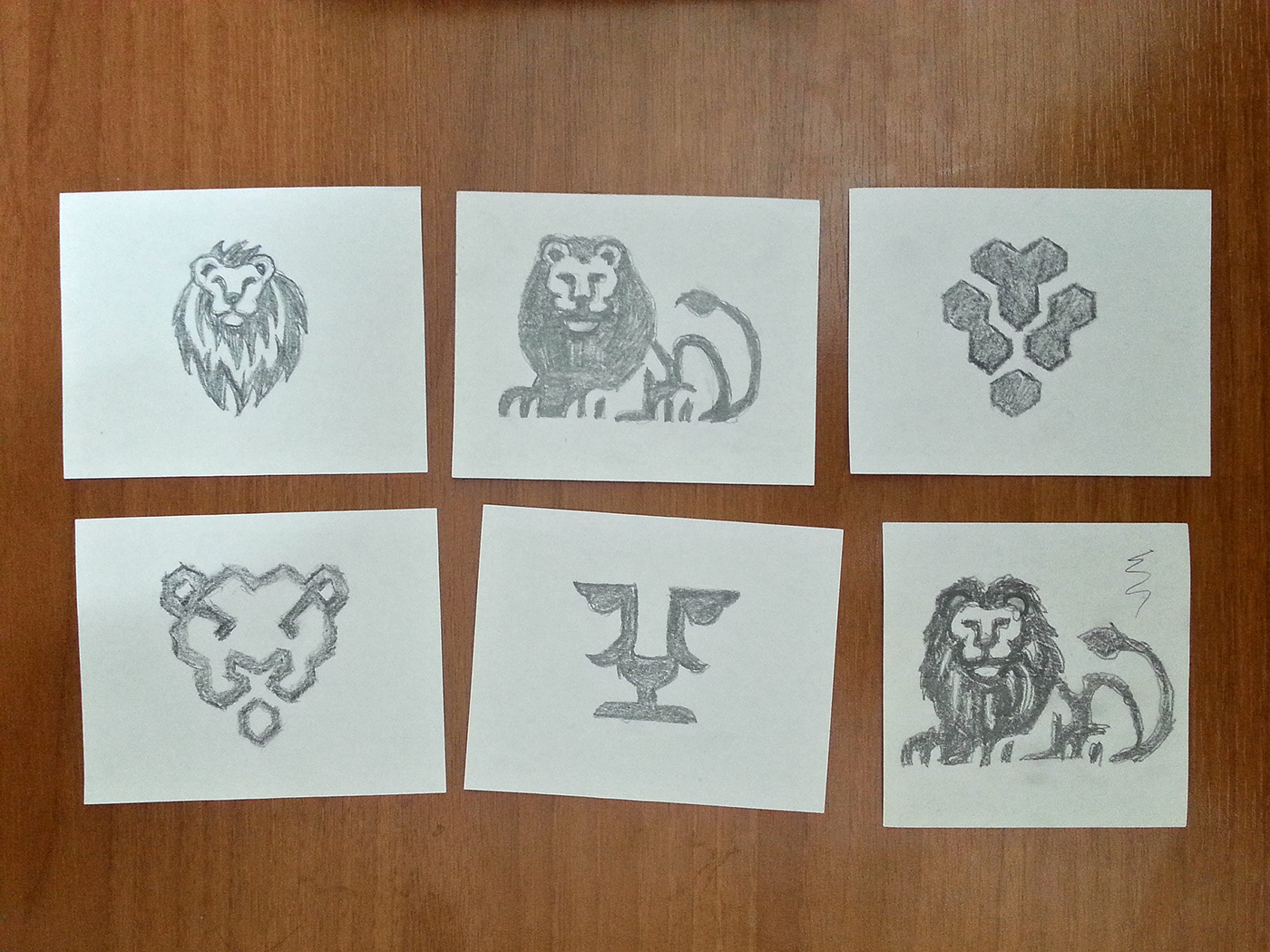
What does the lion stand for?
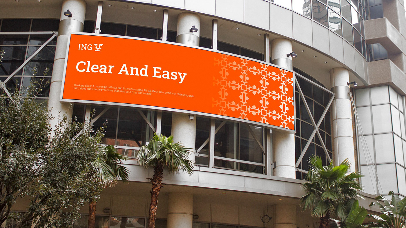
The lion goes way back to ING’s Dutch roots - lion is the country’s national symbol. The lion symbolizes strength, courage and authority. The orange color is the national color of Netherlands where the banks it from. Orange stands for energy and vitality according to the psychology of color.
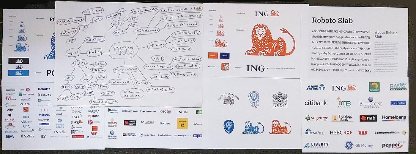
The Problems Of Current Visual Identity & Logo
The logo is very complicated, difficult in extrude print And expensive because of its details.
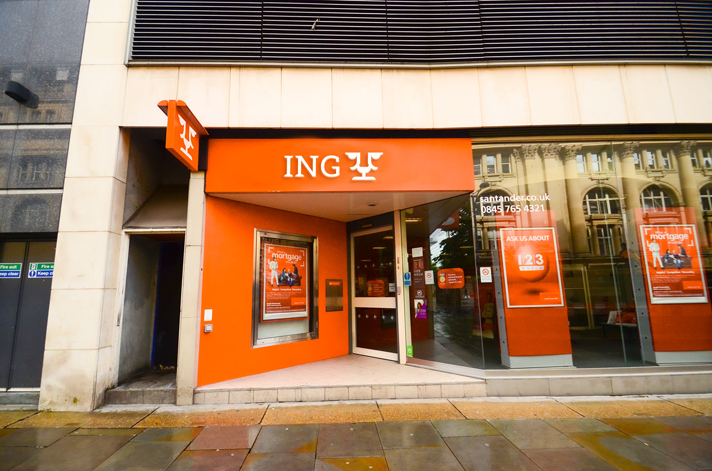
You cannot use this logo on an orange background, Even if its colors are reflected.
also It does not work on small sizes.
The Challenges:
Create a new simple, appropriate and distinctive logo. Can be used in small sizes. And stay away from the many generic logos of the lion. Maintaining existing customers. and make it timeless logo it does not need to be re-design Again.