


—
Chichester at Home is community based directory of food, drink and gardening suppliers offering home delivery to the people of Chichester.
Set-up as a direct response to the restrictions imposed by Covid-19, the directory serves as shop-window for local, quality suppliers; providing an accessible alternative to the standard supermarket offering.
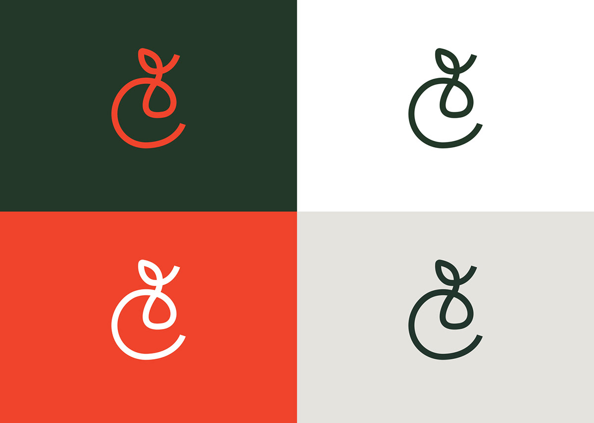
Reflecting a delivery journey from one point to another, we designed a hand-drawn ‘C’ logo mark incorporating a looped piece of fruit with a leaf. This idea was developed further by using the continuous-line device across social media posting and website iconography.
For clarity and impact we used a bold and characterful sans serif font for the logotype and supporting typeface; selecting a vibrant but earthy colour palette to emphasise the natural produce on offer.
Set-up as a direct response to the restrictions imposed by Covid-19, the directory serves as shop-window for local, quality suppliers; providing an accessible alternative to the standard supermarket offering.
Reflecting a delivery journey from one point to another, we designed a hand-drawn ‘C’ logo mark incorporating a looped piece of fruit with a leaf. This idea was developed further by using the continuous-line device across social media posting and website iconography.
For clarity and impact we used a bold and characterful sans serif font for the logotype and supporting typeface; selecting a vibrant but earthy colour palette to emphasise the natural produce on offer.
—


