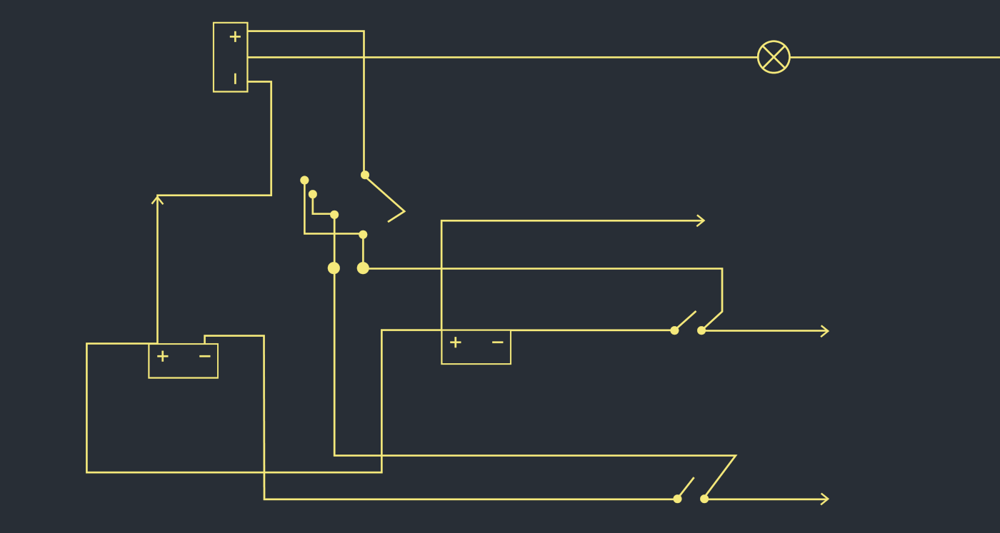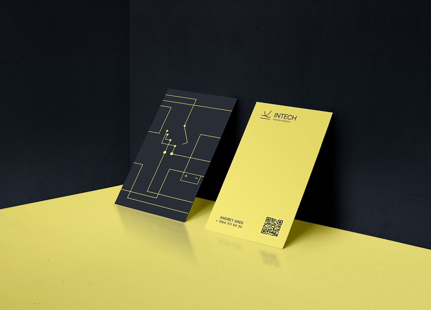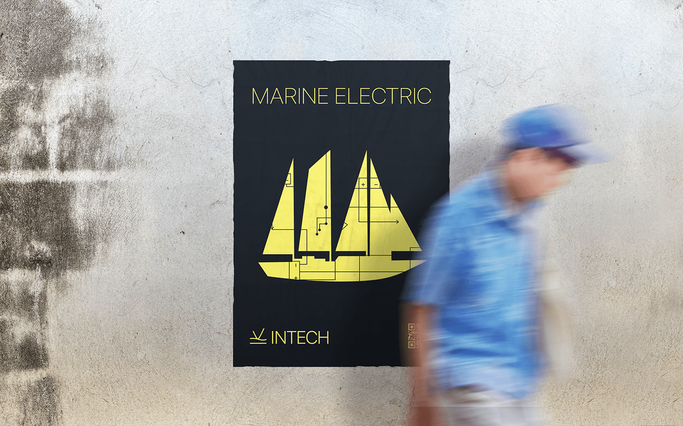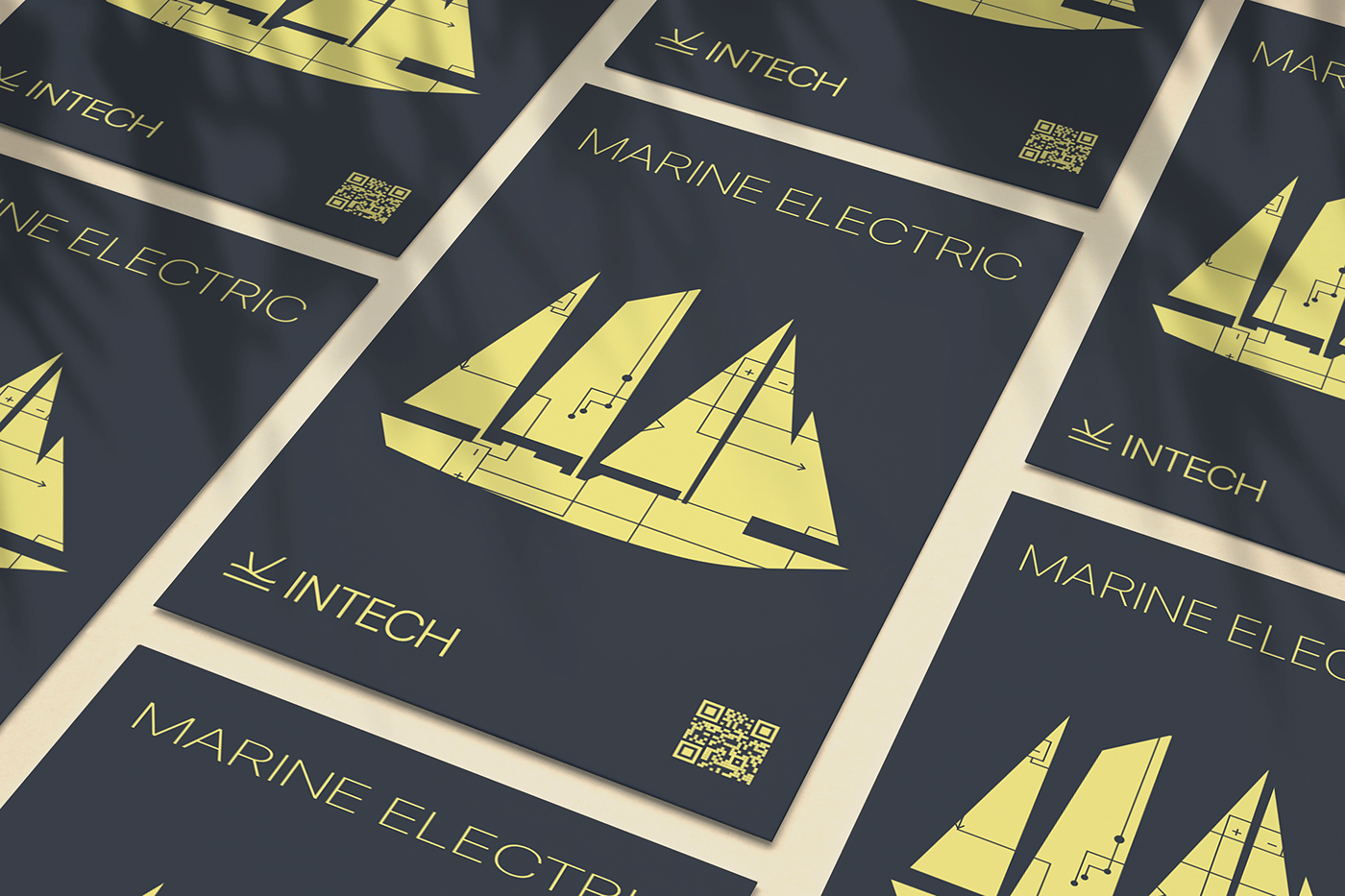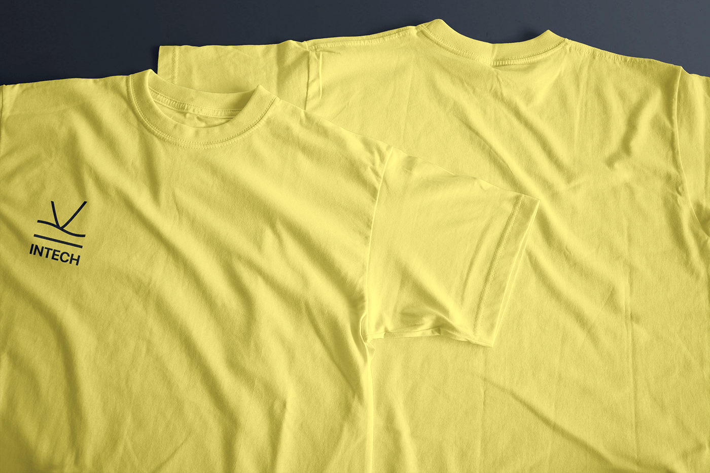
The logo is based on the fact that we are, first of all, specialists in electrics and electronics, which means we are dealing with direct and alternating current. We took its graphic designations as a basis.
In addition, the current is the directed movement of the carriers of the electric charge. This means that the logo should be dynamic, as well as convey the image of a company that moves in step with the times and uses up-to-date approaches to solving problems.
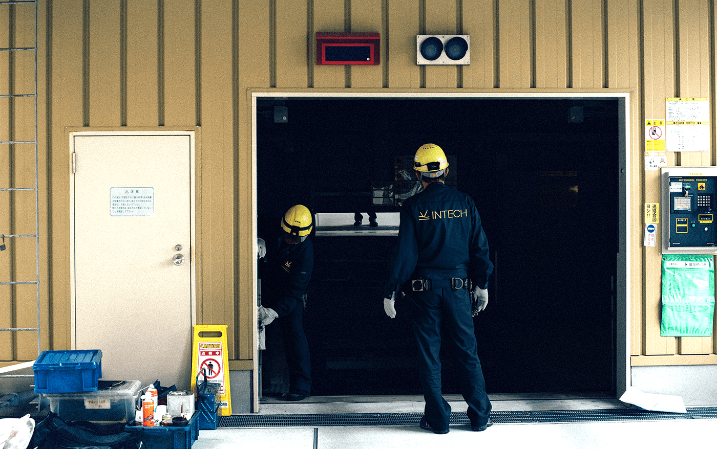
It is equally important to secure an image of expertise. And already in visual identity to show that we bring everything we started to the end. That any challenge is within our reach. Therefore, the done sign is introduced.
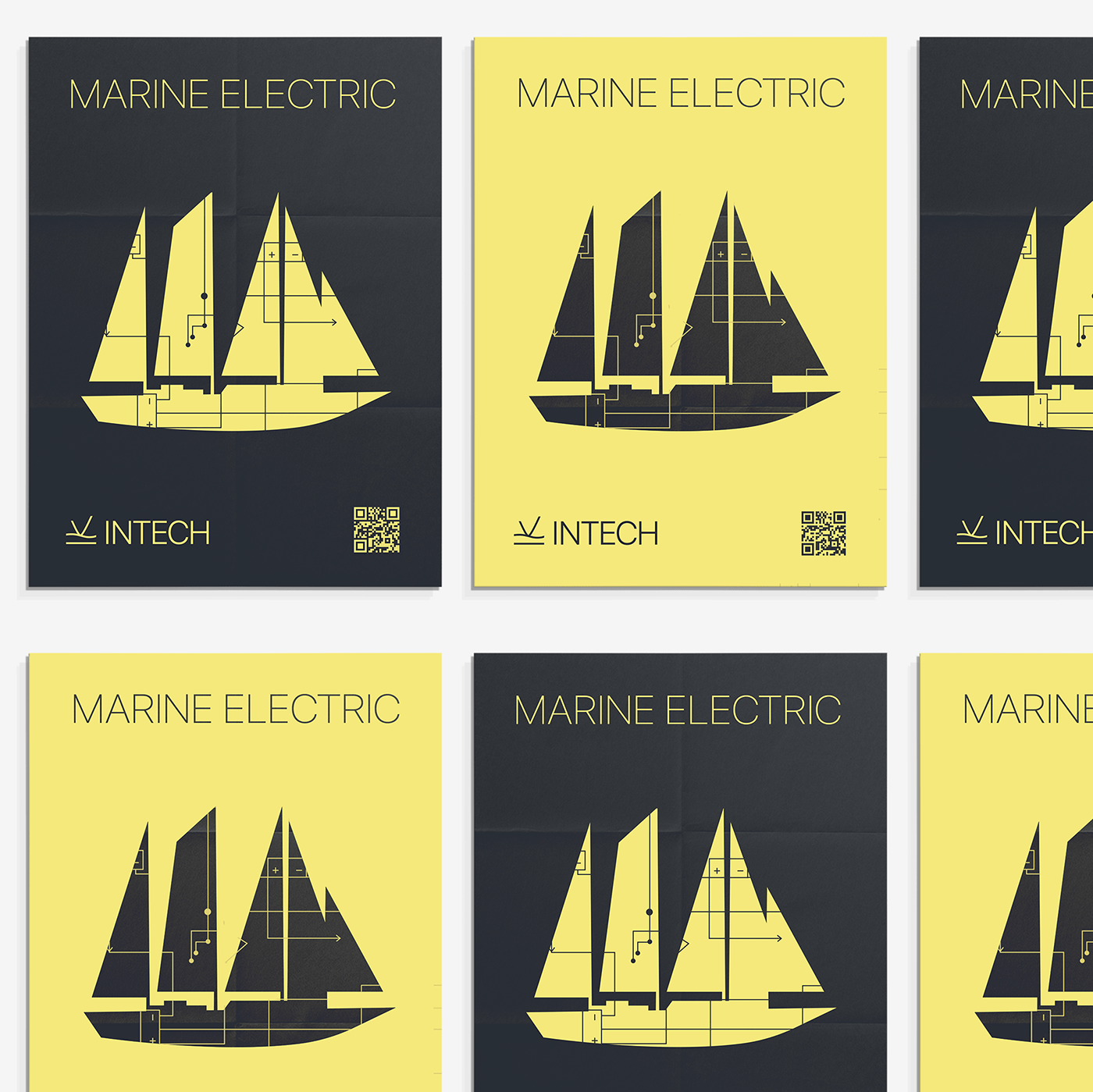
And for people who understand absolutely nothing in physics, it will be easy to find in the mix of graphic elements the bow of the yacht, plowing the waves.
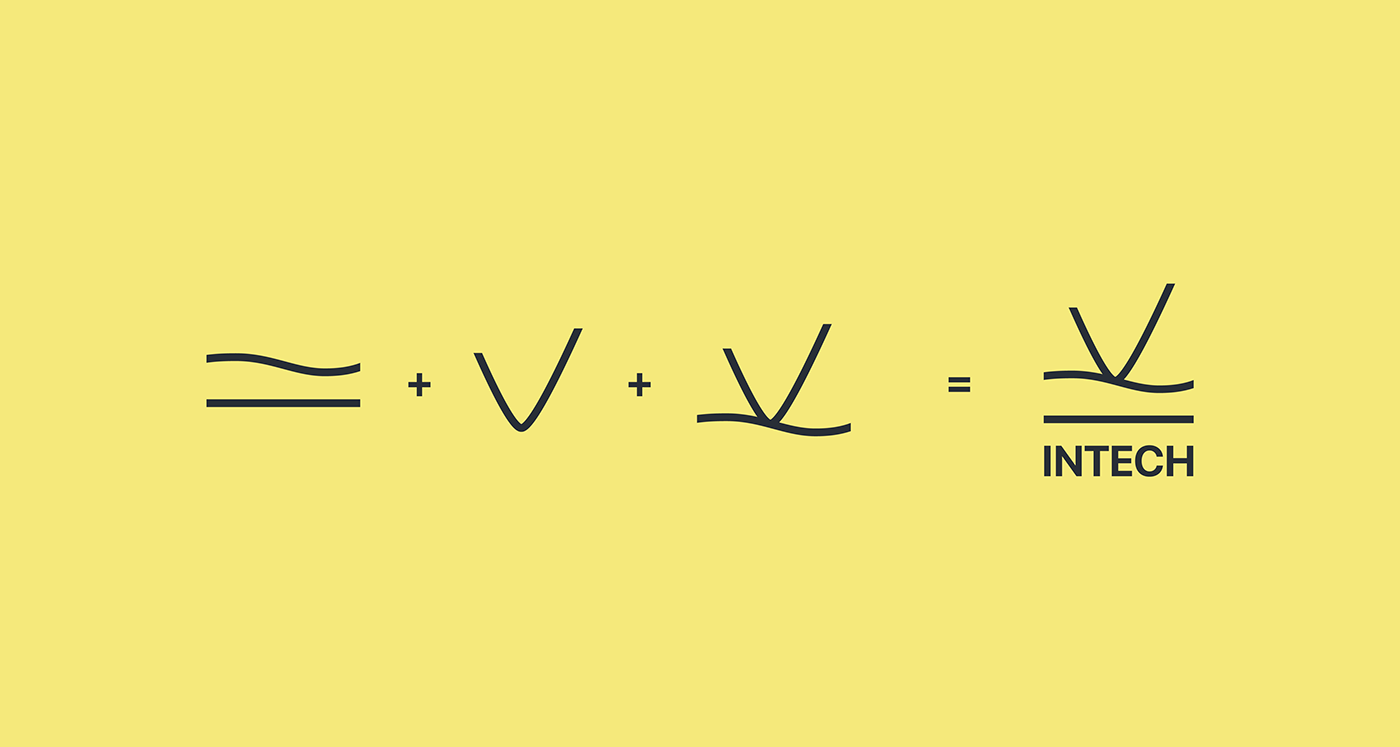


The pattern is a working electronic diagram of a yacht.