GT Walsheim
Geometric grotesque by Noël Leu
Geometric grotesque by Noël Leu

In its heart GT Walsheim is a geometric sans serif, but it has a certain roughness in its design. While the capitals on their own are great for titles, don’t understimate Walsheim in text size. With its eight weights from Ultra Light through Ultra Bold it looks great in every situation. As Typedia wrote about it:
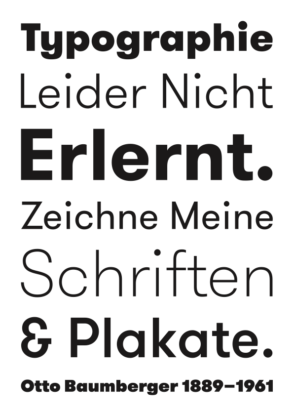
Otto Baumberger’s typography on early 20th century Swiss posters defined GT Walsheim, a geometric grotesk by Noël Leu. The eight weights — ranging from ultra light through ultra bold — include the distinctive Baumberger 'G'.
Baumberger was one of the great early Swiss poster designers. Baumberger stated that he never really had an education in typography. He invented his own typefaces as he needed them while designing his posters. At first the type used on the posters seem to be random experiments, but once you take a closer look, you realize that they share certain design aspects which occur throughout most of his work. Especially the uppercase G with its very unique design is interesting. Many posters by Otto Baumberger show type with the same G and very similar overall characteristics.

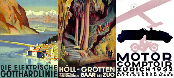
Original posters by Otto Baumberger. See the 'G' that is present in most posters by Baumberger.
