
Selected and favourite
Logos, Marks & Monograms
2018-2020
A selection of different styles of favorite markings that I've been working on over the past three years.
During this period, I was lucky enough to work with a wide range of brands in various fields: from jewelry to engineering corporations.
During this period, I was lucky enough to work with a wide range of brands in various fields: from jewelry to engineering corporations.
This collection reflects my love for font logos, as well as ideas that I like to find and reflect in logos.

CLIENT
Irkutsk Oil Company
MARKET / BUSINESS
Oil industry
THE CONCEPT
The three lines symbolize the energy that comes out of the soil.

CLIENT
Velvet Models
MARKET / BUSINESS
Parent model agency
THE CONCEPT
The ability to see the future model not only as a model but also as a person makes the parent Agency different from others in its industry.
This difference is conveyed through the simplicity and uniqueness of the letters in the logo.

CLIENT
013 — Anastasia Lokteva
MARKET / BUSINESS
Photo studio
THE CONCEPT
A photo studio is shooting on the lens of a professional camera, where there is a magnifying glass. There is a glare from the light on it – this is a well-known image. I replaced the 0 in the name with a lens with a glare.
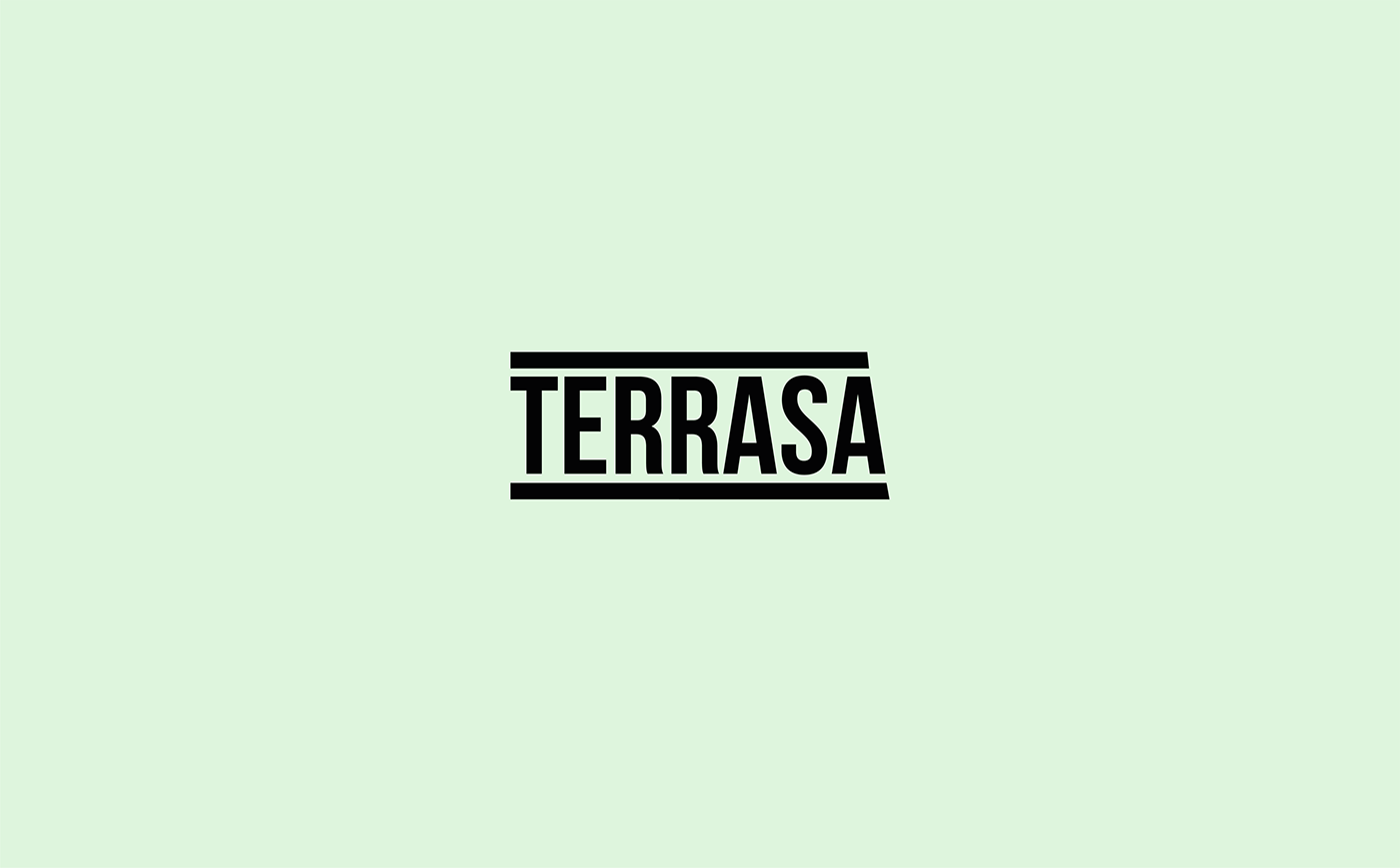
CLIENT
Terrasa
MARKET / BUSINESS
Marketing agency
THE CONCEPT
The agency works with both ATL (above-the-line) and BTL (below-the-line), so the company name is placed between the lines, symbolically forming a terrace.

CLIENT
B2B Service
MARKET / BUSINESS
Cleaning products foк business
THE CONCEPT
The smooth line in the logo follows the movement of the hand when wiping the surface and symbolizes the company's flexible approach to its customers.

CLIENT
Cointer
MARKET / BUSINESS
Crypto exchange
THE CONCEPT
Cryptocurrency — digital information encrypted with a binary code that consists of 0 and 1. 0 — absence, and 1-presence. 0-digital money, 1-physical money. Counter is an exchange of zeros for ones and ones for zeros. This concept is embedded in the company name.

CLIENT
Crossbow sport association of Russia
MARKET / BUSINESS
Sport
THE CONCEPT
20 anniversary competitions in crossbow shooting. The brand name includes an anniversary number and an image of a crossbow.

CLIENT
Konoplex
MARKET / BUSINESS
Agro industry
THE CONCEPT
"Hemp agro industrial association" includes companies that grow and sell non-narcotic hemp. The central sign of the association was a stylized hemp leaf enclosed in a circle, as a symbol of the association of different companies.

CLIENT
Yulia
MARKET / BUSINESS
Bloging
THE CONCEPT
Logo for the blog of a girl who talks about traditional food from different countries, considering it as a source of culture of a particular country. The logo has a font contrast, which gives a reference to notes made in a notebook while traveling.

CLIENT
Maria Churkina
MARKET / BUSINESS
Jewelry
THE CONCEPT
Simple jewelry requires a simple font logo, and the entire character of the brand is revealed in the identity.
The word Prosto in Russian means "simply".

CLIENT
J'amaia
MARKET / BUSINESS
Clothes store
THE CONCEPT
The idea comes from a hanger with clothes from a boutique. Multi-level things hanging down form a rhythm that I passed on in the logo.
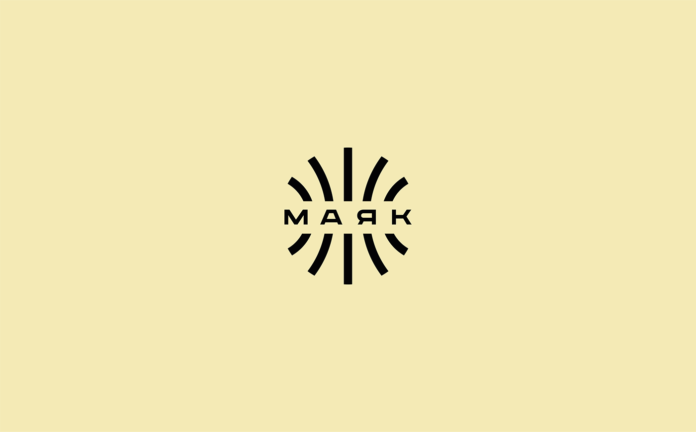
CLIENT
Маяк
MARKET / BUSINESS
Сreative association
THE CONCEPT
МАЯК (Lighthouse) — parties for those who are tired of clubs and want to spend an evening in a pleasant creative company, learn something new from the world of music, video and art.
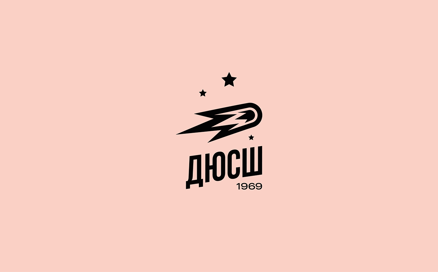
CLIENT
ДЮСШ
MARKET / BUSINESS
Sports education for children
THE CONCEPT
The children's and youth sports school celebrated its 50th anniversary. Children are a boundless source of dreams and talent, they are little stars and big comets who are moving to meet their sports dream.

CLIENT
Сделка.РФ
MARKET / BUSINESS
IT / Real estate
THE CONCEPT
This is a product for online real estate transactions. It connects major developers with banks and realtors. The logo has an original design that fully reflects a serious and at the same time modern approach to conducting online business.
CLIENT
Transmashholding
MARKET / BUSINESS
Sport
THE CONCEPT
The largest manufacturer of trains and wagons in Russia has launched its own sports League, which involves more than 10 plants from all over the country that are part of the holding. The logo includes an image of a running track at the stadium, as well as an image of a rail.
Thanks for watching! Put like!
Write to us — mail@dkcd.ru
Follow us on Instagram — designkomunikate, krylowdima
Follow us on Instagram — designkomunikate, krylowdima
Inspiration telegram channel — designkomunikate
© Design Komunikate. Studio


