

Brief:
Change is hard. Sometimes we lack information. Other times, our routines and habits are really persistent, even if we wish they weren’t. Can technology help people and communities change their behavior to meet their goals? In this uncertain time, where everything is changing, the activity I decided to focus on was “Home Office” and how my participants are dealing with the activity level. I asked my participants to tell me more about their work routine and how they behaved during the day. The change I would like to focus on more specifically is their activity level throughout the day in home office.
My mission:
Design an interface that facilitates personal or social behavior change.
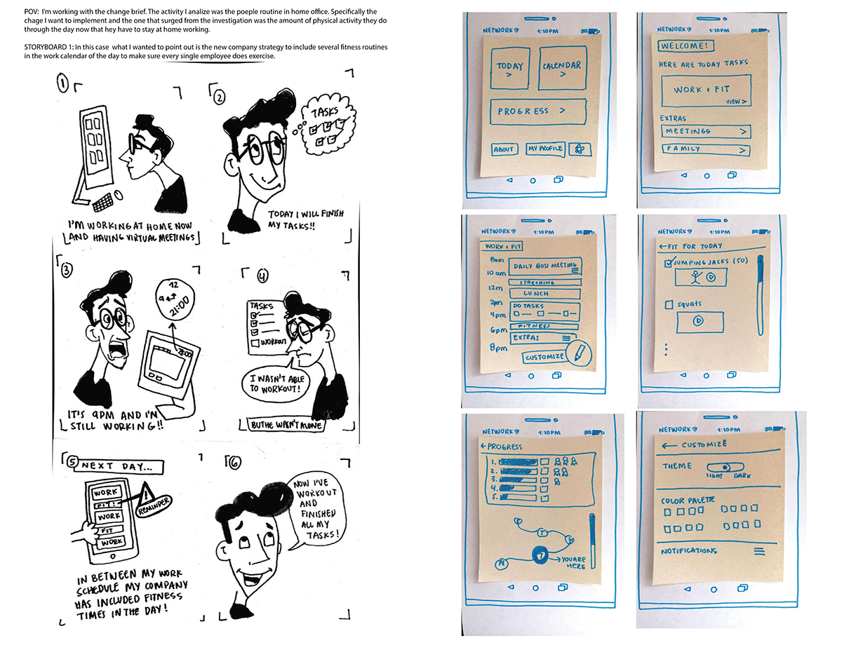
What I found observing people allowed me to brainstorm specific opportunities for design innovation. Using that design inspiration I chose to come up with two different design ideas that address/engage the chosen point of view to address the user need for a break when working at home office. Storyboards were used to convey to clients potential solutions to a given problem….problems discovered during needfinding.
By doing it this way allowed me to tell a story and explain how a user will interact with the design, without the need to draw a single pixel or code a single line. Storyboards are generally used during the discovery phase of a project, or during pitching activities when we are trying to dazzle a client with our creative thinking.

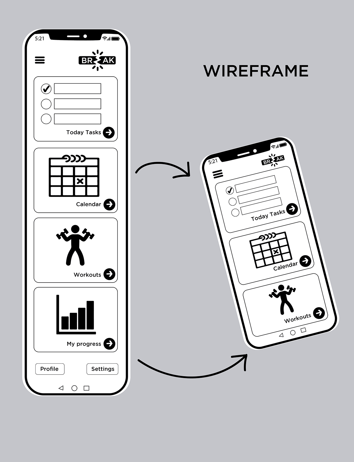
In order to organize in a better way the app, a user flow chart was created to understand the possible ways the user could deviate from the app. This allowed me to do base screens and work from that by understanding the aesthetics of the design. This were introduced into Figma app, in order to create a prototype that could be user tested and analyzed.

Following that, a a low-fidelity wireframe was created. This wireframe provided the main details about the layout of a screen and the information it holds, but leaves out smaller details and styling.
I believe that heuristic evaluation really helps analyze the prototype in a deeper sense. By conducting the experiment there were many insightful ideas to include. Major problems identified with the paper prototypes are for freedom and error prevention. In both cases, there was barely a recovery when the user got to a certain point of no return.
Following this initial sketch of the app I tried to find representative testers who I would expect to use your app. This time your user will not be writing down the problems they find for me. It was then my job to try to learn of the journey they took in the app, the feedback they provided me was invaluable for my next iteration in which my goal was to find ways to improve my overall interface.
With their feedback I tried to be objective by don’t writing problems off. Defining some general patterns in people’s behavior. When I identified some interesting points, I thought deeply about them — asked questions, recreated the different tests, analyzed the decisions people made, other paths they could have taken, and so on. Which led me to the following app redesign.
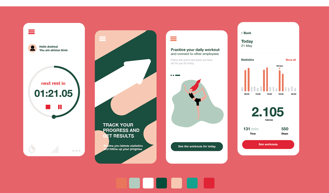

From the user testing, I identified many design breakdowns or opportunities and their potential solutions. Each solution will manipulate, or have consequences, on the user’s interaction in some way. For instance, changing the size or location of a button may increase the likelihood that a user follows an optimal navigational path. So, I measured the effect of this manipulation by counting the number of users to follow this path, and those who didn’t. Finally all the designs were polished and Break was born.


The identity of the app explicitly wanted to reflect calm through its color palette, but at the same time staying fairly professional because it’s target user are workers . The logo, as explained above reflected in a literal sense the break and in a more simboling one it aimed to represent what taking a break meant, by making a guiding path into wellness.
The overall purpose of this app is to help through technology users make their way to jumpstart a healthier lifestyle. Let tech be your office buddy in helping them to stay active and healthy while they’re working. The following are some screenshots of some screens found in the Break app.

App Prototype
Thank you for your time.
Capstone Project
Interaction Design Specialization
UC San Diego
Coursera
July 2020
Interaction Design Specialization
UC San Diego
Coursera
July 2020


