Challenge
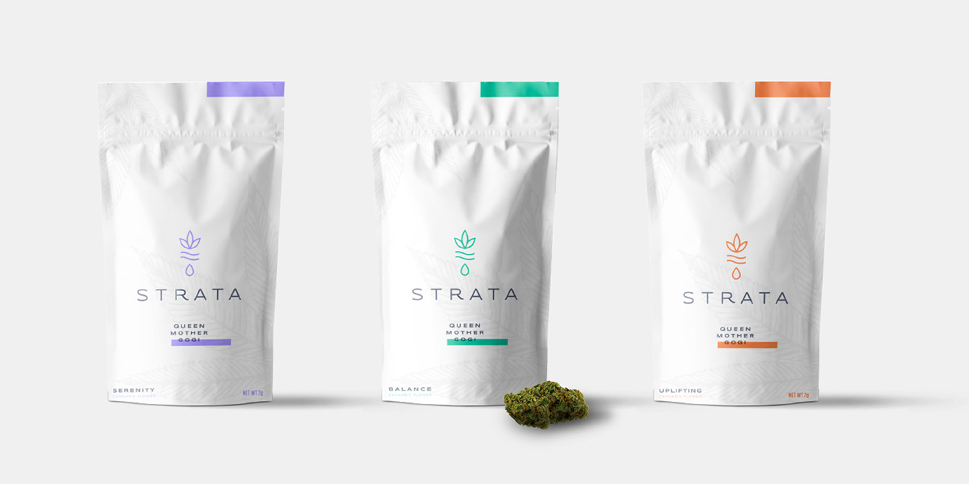
We were tasked with building a new visual identity that spoke to Strata's new target audience, which was primarily affluent moms. This included building out a logo with illustrations and patterns, and we were to then take the updated identity direction and apply that to various packaging concepts.
Solution
The existing brand spoke to the science of crafting the perfect strain, so we instead chose to speak to the experience and feeling elicited when taking the product. We focused on keywords that are consistent with each strain and the mood in which they provide: "Serenity" for Indica, "Uplifting" for Sativa, and "Balance" for Hybrid. We implemented these keywords into the brand system, and they loved the resulting concepts. The chosen design, which we called "Cultivation" embodies the balance and care that is needed to not only cultivate the perfect strain, but also the balance cannabis brings to the life of each and every consumer. Cultivation is the clean and unfiltered cannabis experience that Strata seeks to provide, using vibrant colors, patterns, and illustrations. The leaves in the mark act as a symbol of hope/aspiration and revitalization (as well as the underlying cannabis intent), the drop acts as a symbol of renewal (underlying representation of life/the consumer), and the inner lines represent the balance between the two.


