

NORSE
Brand Identity / Logo Design / Art Direction
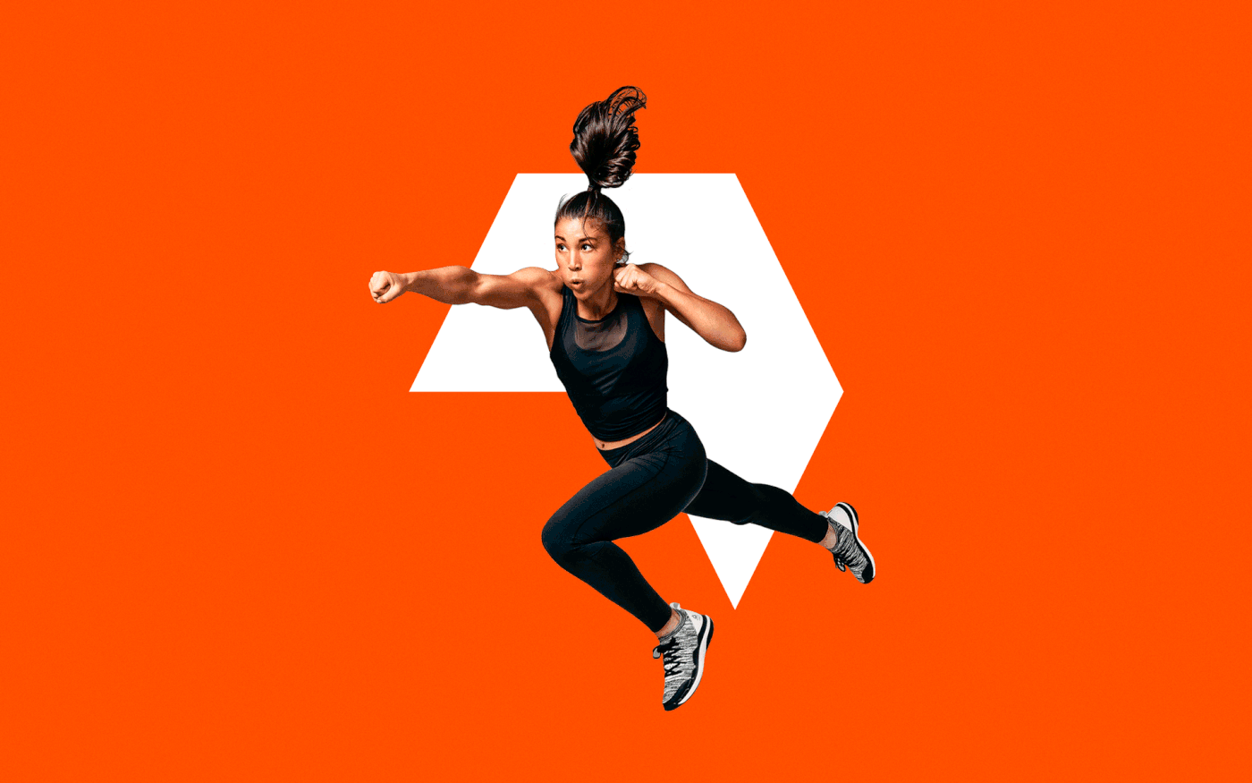
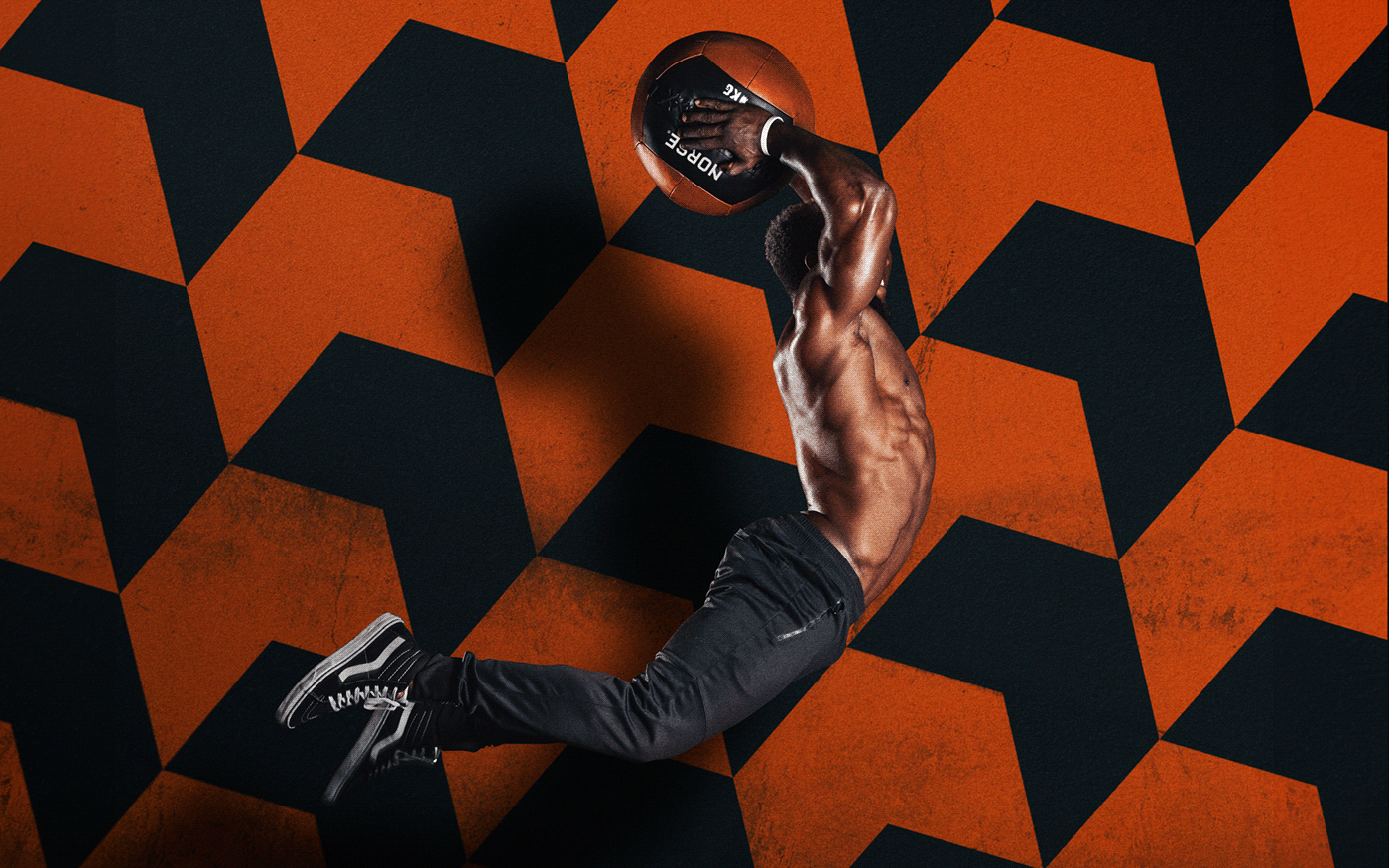
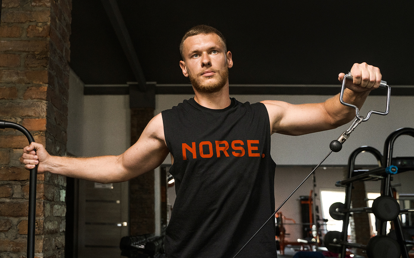
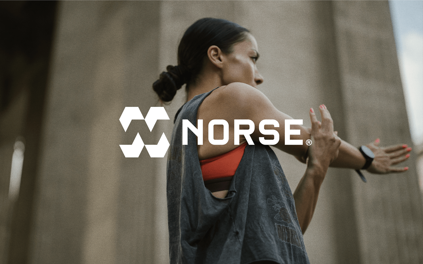
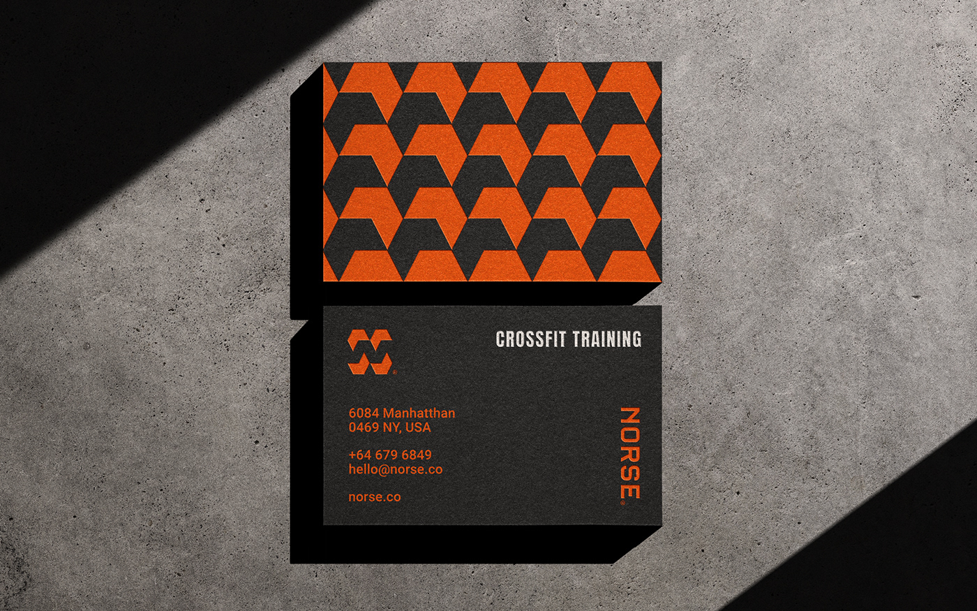
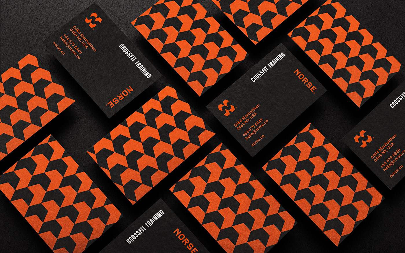
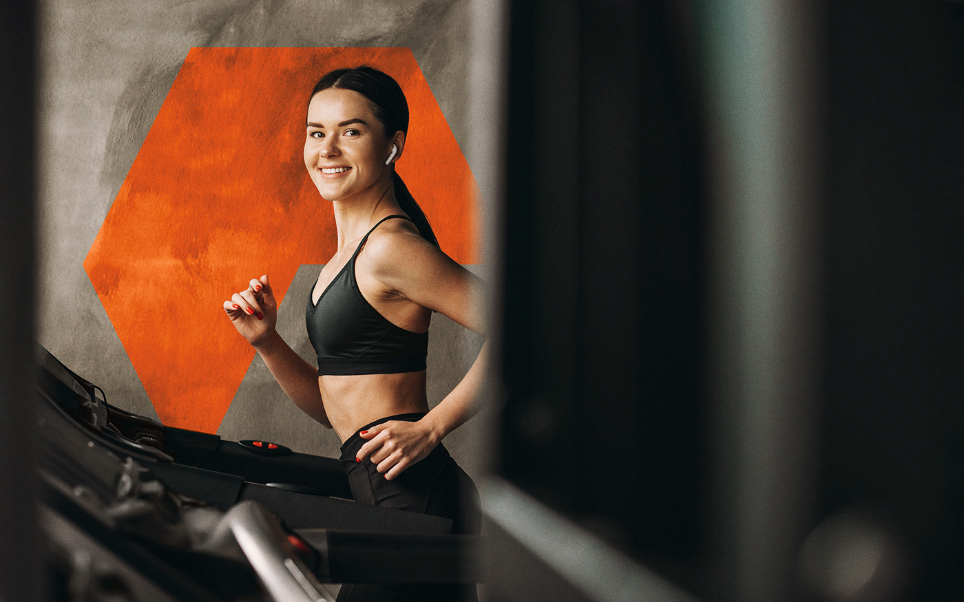
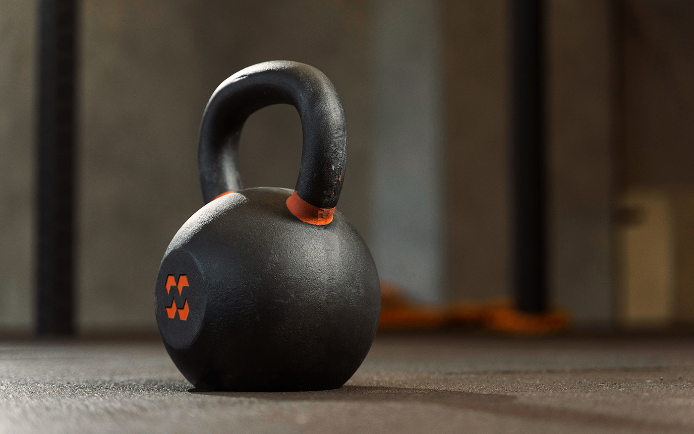
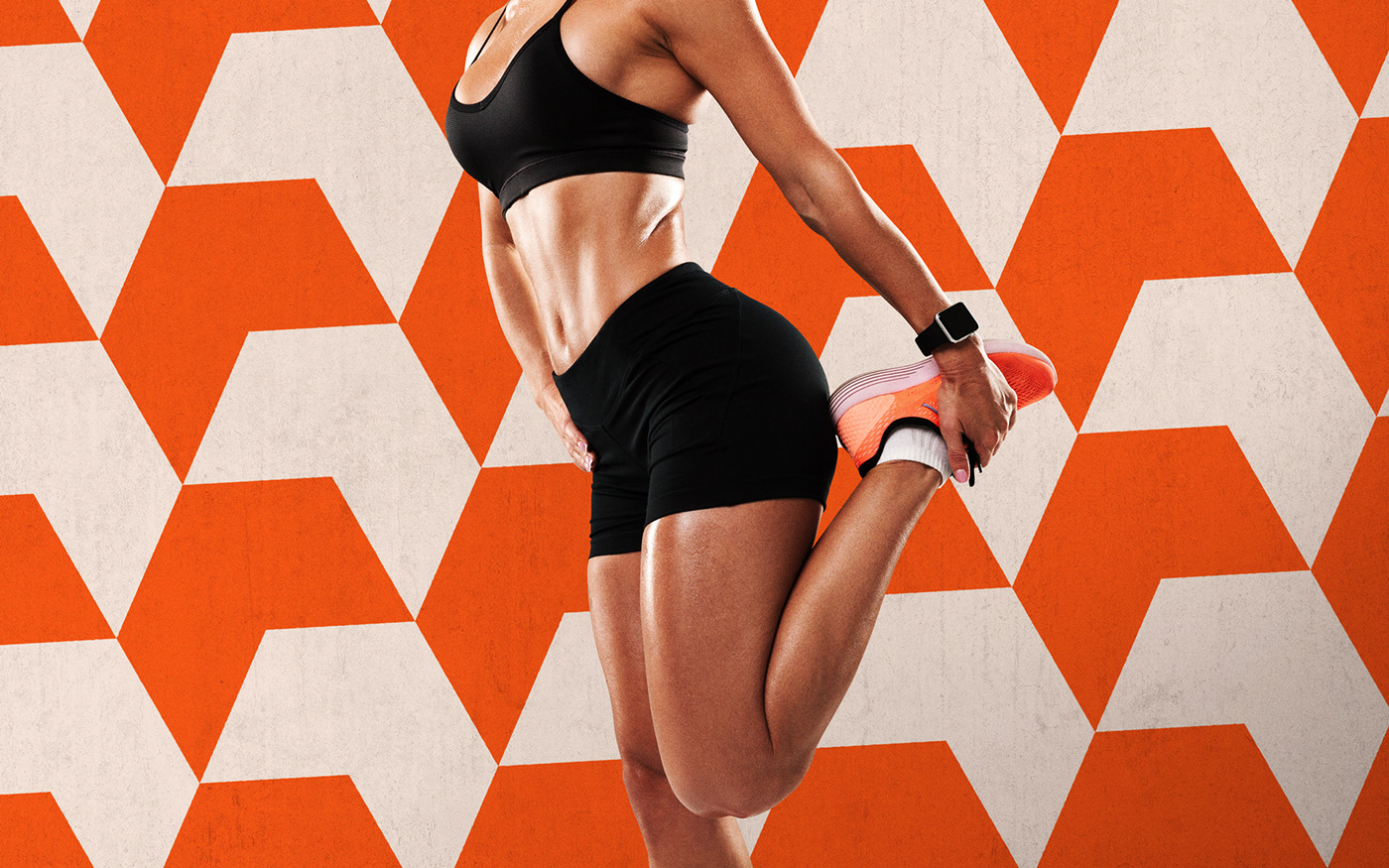
Norse® is a crossfit company that designates a specialized training method based on constantly varied strength exercises, with functional movements performed at high intensity.
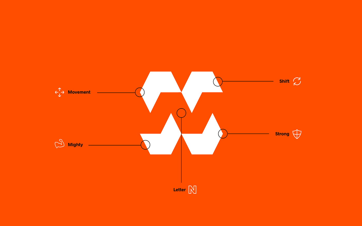
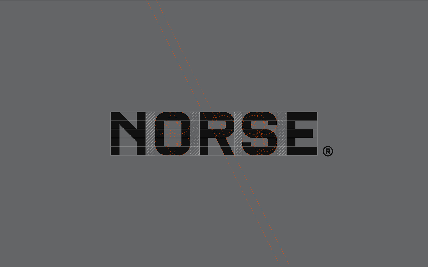
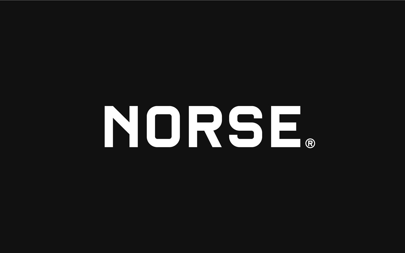
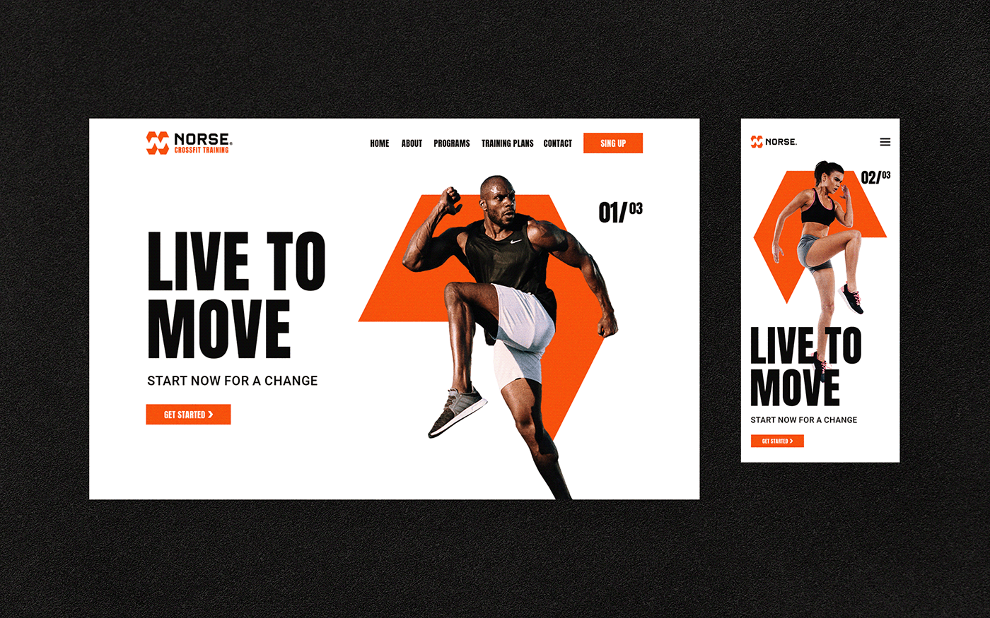
The brand was developed in 2018, with the concept of movement and strength, the main values of the brand. The result is a dynamic visual identity that reflects a lot of strength from the modern symbol, the typography, the contrast of its textures and colors.
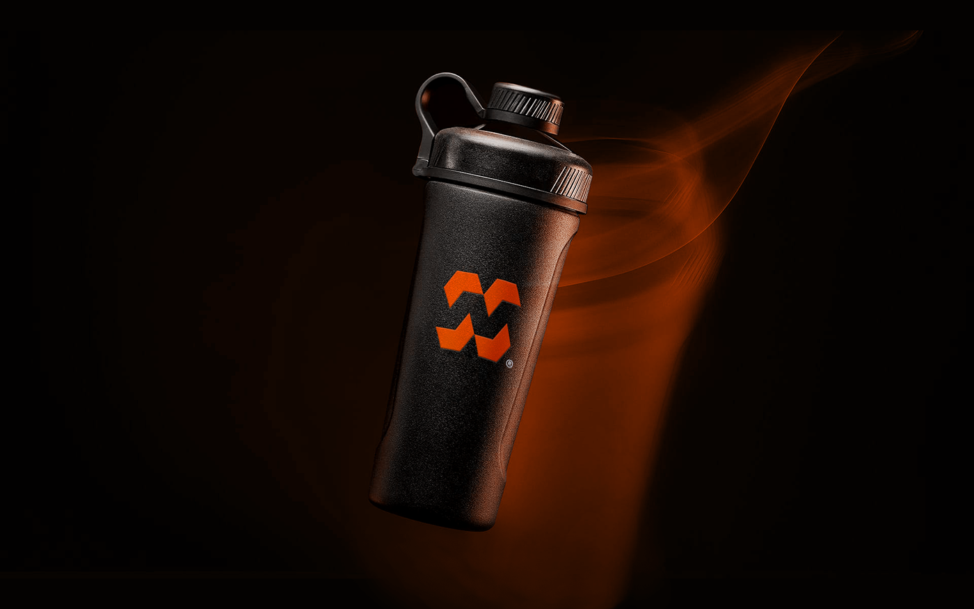
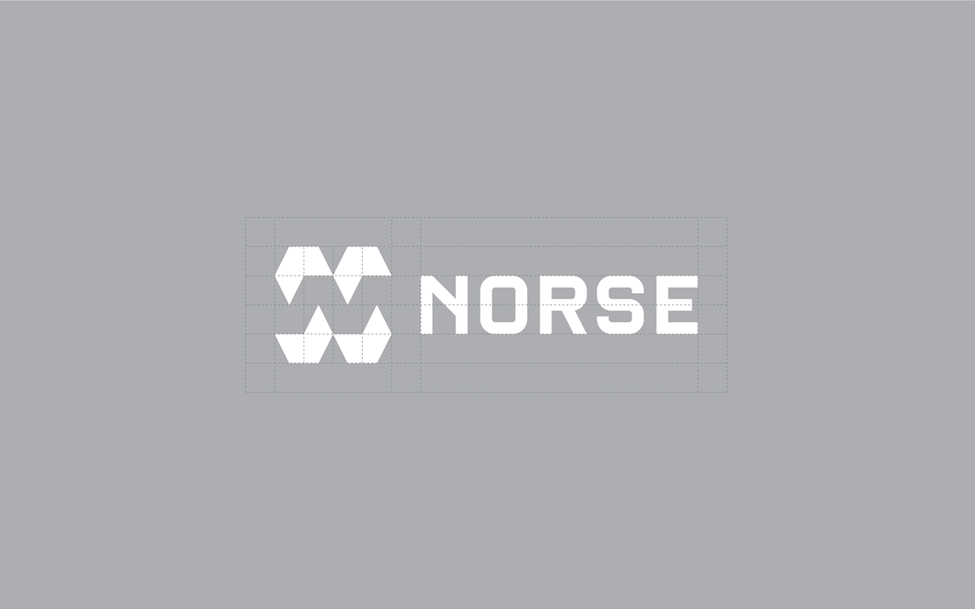
The logo is represented by four solid arrows in a geometric way to create a negative space inside and form the letter N, in this way we managed to create an iconic symbol.


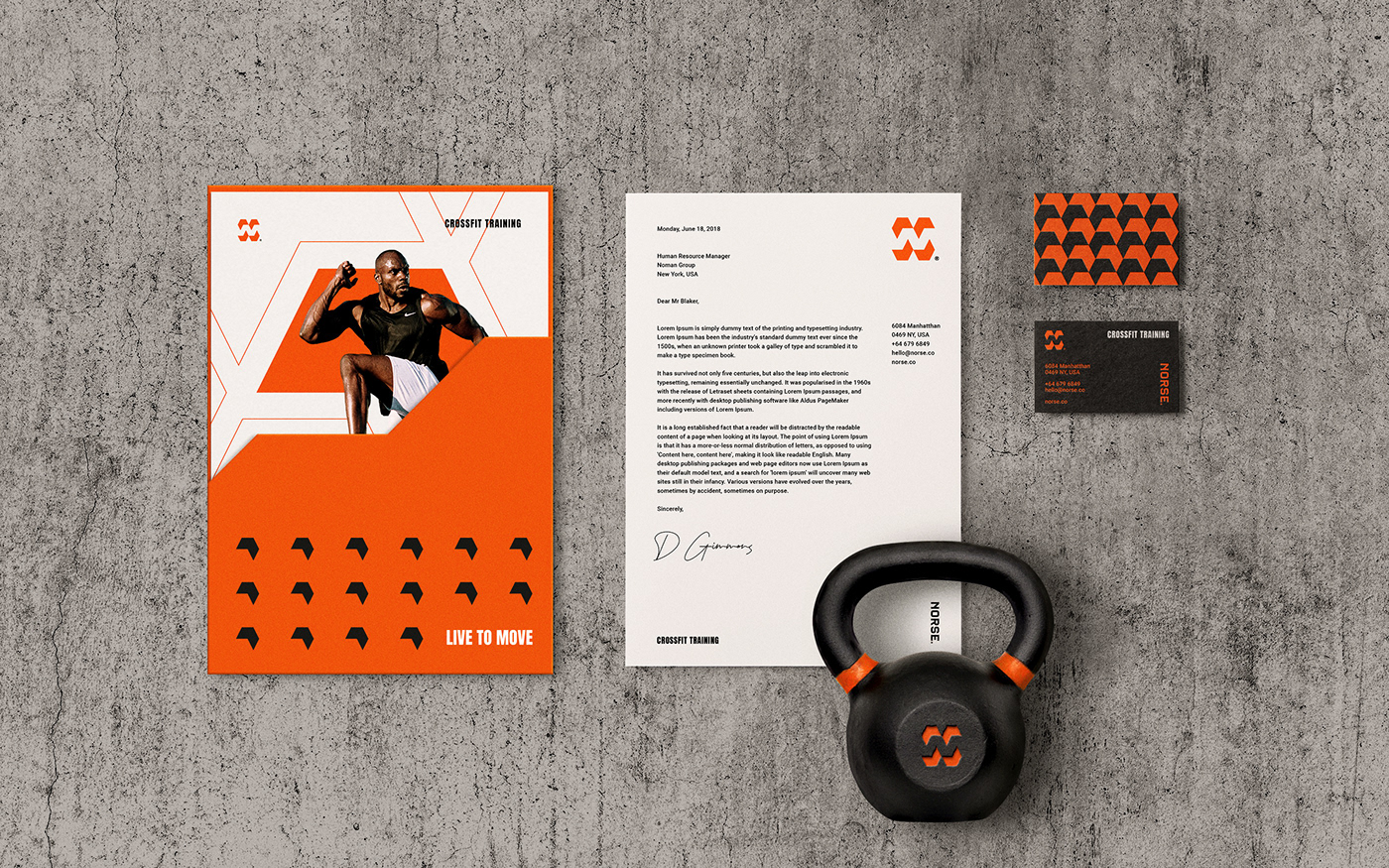
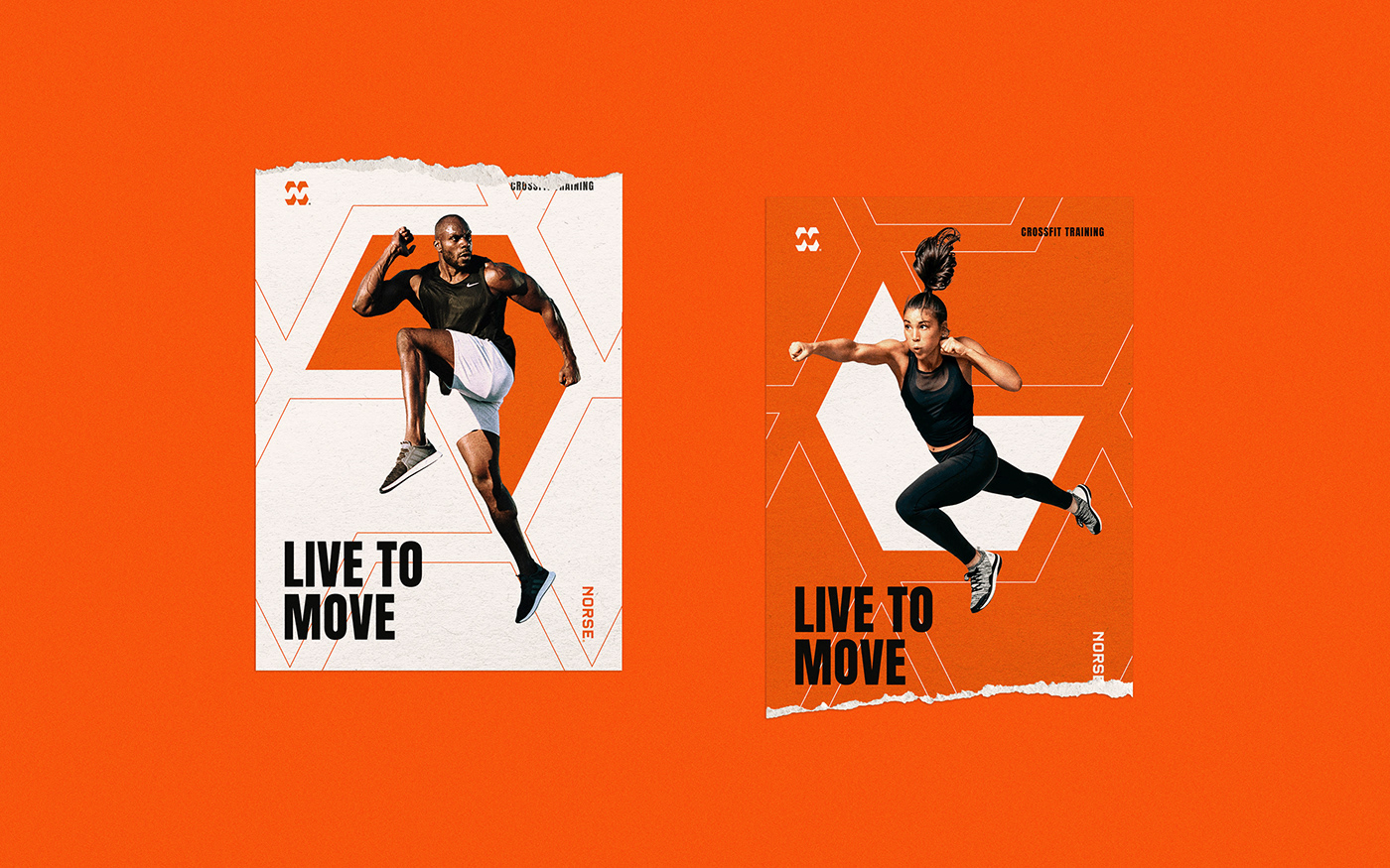


*All of the photos used in the designs belong to their respective owners.
Thanks for
WATCHING & APPRECIATION
Contact:
Follow:


