


Spud Buds Branding
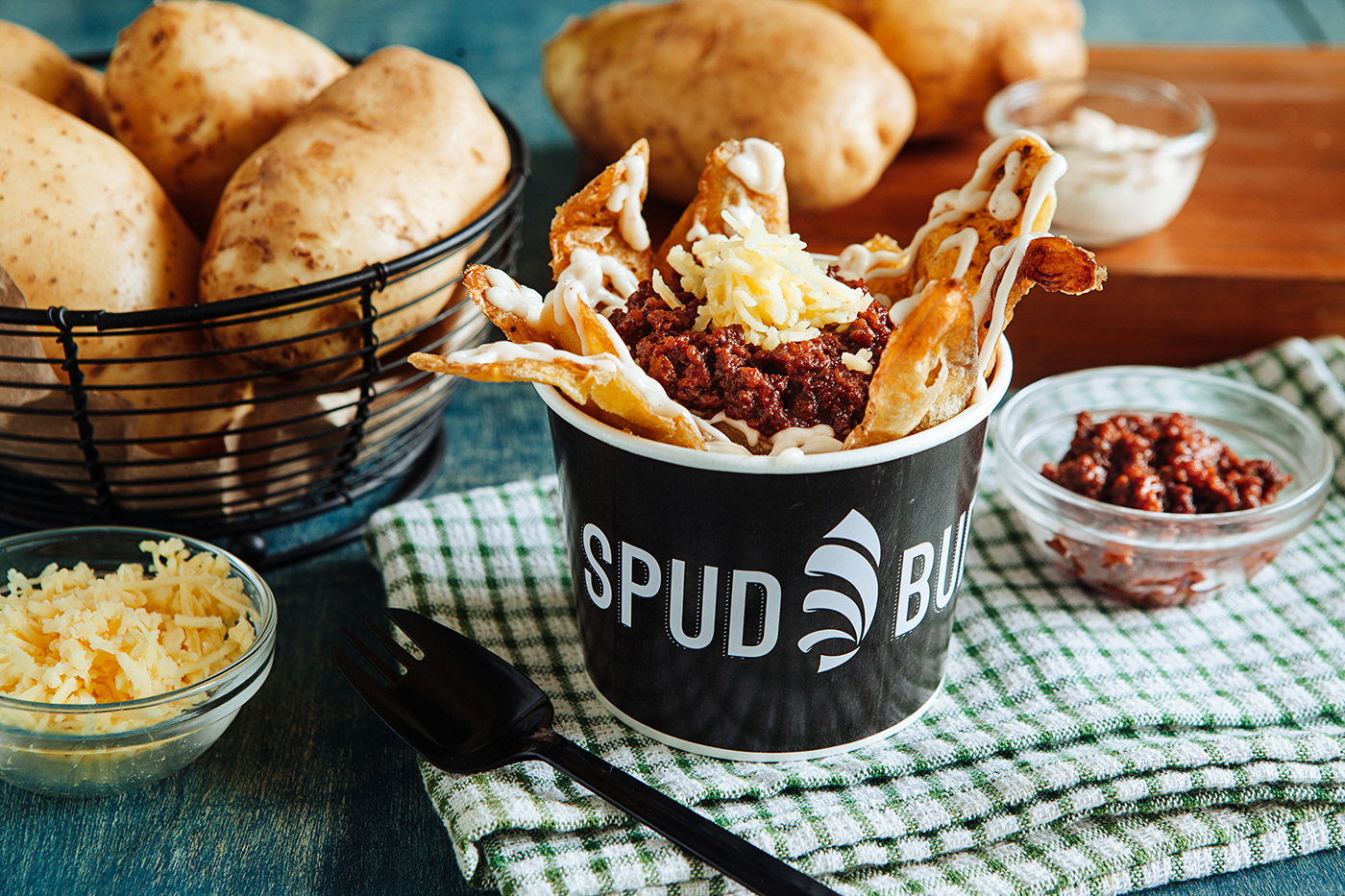
Spud Buds is a proudly Filipino brand about the love for potatoes. Locally sourced potatoes from Northern Philippines are transformed into products ranging from potato skins with different types toppings to a variety of packed potato snacks.
The look and feel of the brand needed to stand out from the numerous potato brands in the Philippines, most of which lean towards the cartoony side. The brand settled on this modern take that is still relatable to potato snack lovers out there.
Logo Design
Rationale: The idea originated from the first product of Spud Buds, the potato skin. Combining the mark with strong, bold typography gives the whole brand a modern feel.


Product Labels
For the packaging, color was a key element as Spud Buds offered a number of flavors for their potato snacks. Honing in on the different flavors and associating them with key colors, but still keeping the look consistent, was important. The pack labels have gone through several iterations already and keeping them looking as one family was always a driving design decision.


Print Designs


GP: Logo Design • Print and Layout • Packaging • Social Media Marketing
—
Homegrown & Handcrafted Potato Snacks
Credits: Antidote Brand Divergence Inc. & Spud Buds


