
/identity/packaging
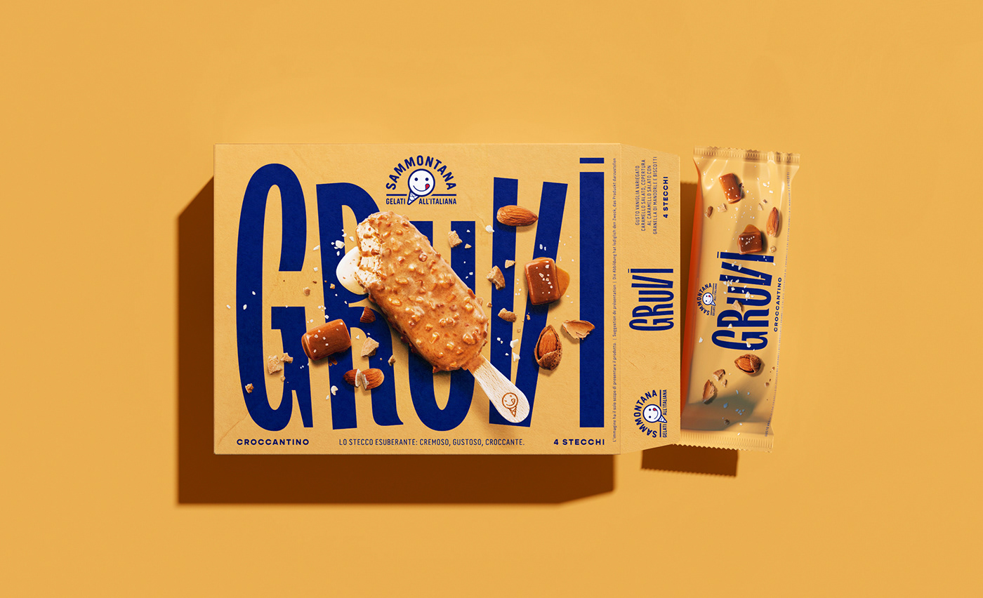
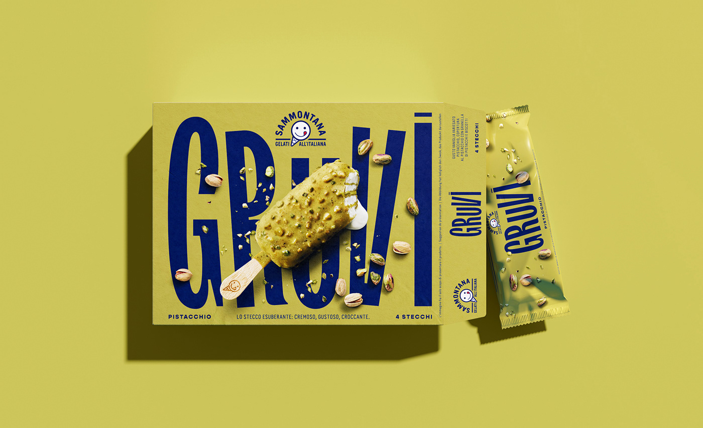
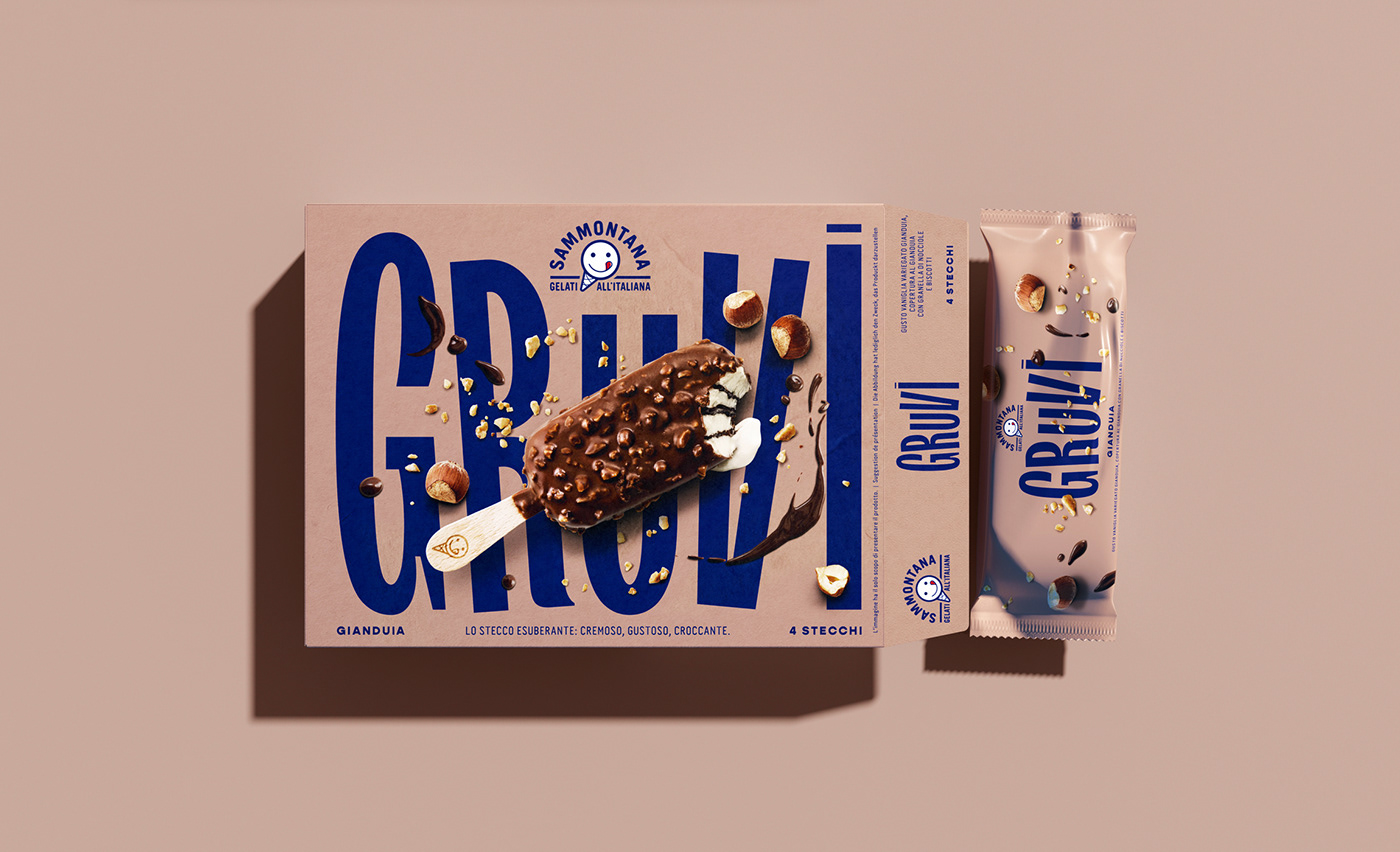
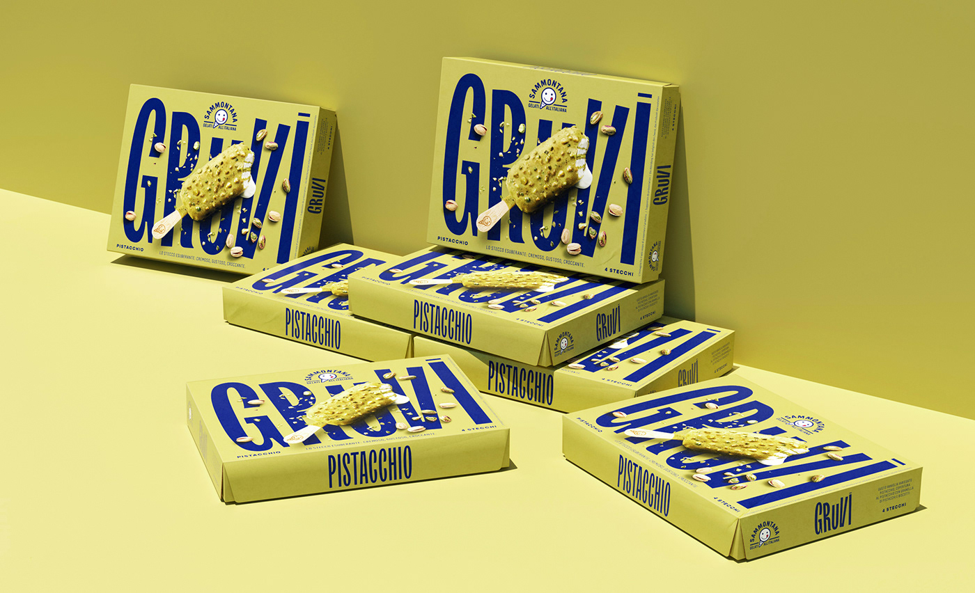
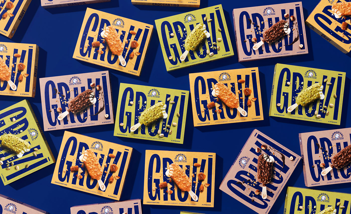
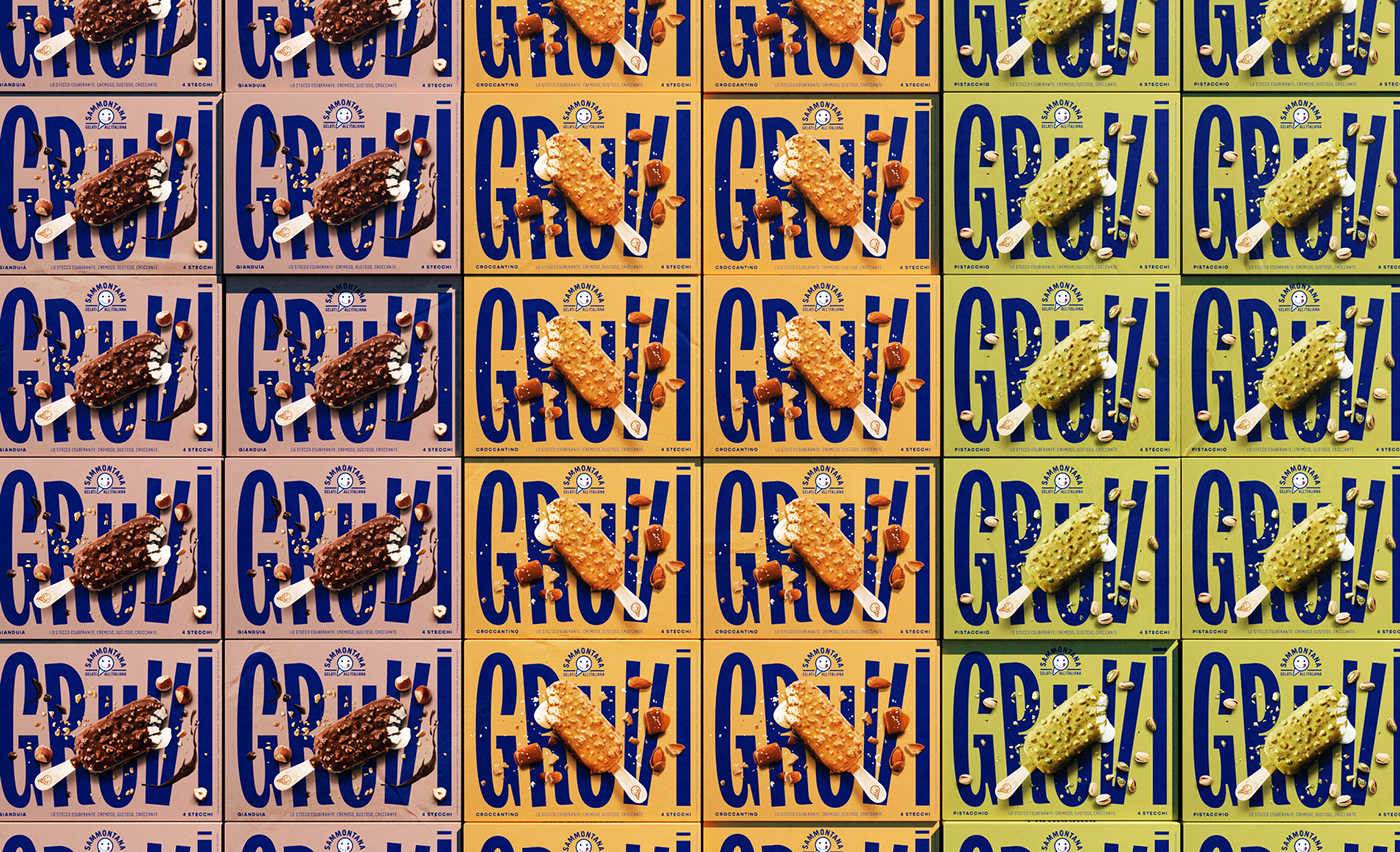
Sammontana Gruvi
Packaging design for a new, surprising ice cream by Sammontana. Put some groove in your gelato!
CLIENT
With over 70 years of history in ice cream making, Sammontana is the Italians’ favorite industrial ice cream and frozen goods brand. The Group operates in 5 production sites around the country and counts over 1000 employees. Sammontana indubitably means Italian Summer.
ASSIGNMENT
Create the identity of a new surprising ice cream bar: it’s soft, it’s creamy, it’s crunchy. Three different feels for this unexpected and irresistibly yummy gelato. Express the personality of the product and its Italian “artisanal” quality.
SOLUTION
We chose the product name thinking the different tastes of the ice cream as a groovy beat. The logo design, the typography, the shooting art direction, they all express the idea of movement and the exuberance of the ice cream and its contrasts. Smooth colors on the background and a “soft touch” finishing for the pack oppose a bold blue (brand color) typography, a catchy type and a high-contrast photography. The result is a striking pack that embodies the essence of the ice cream and that feels as inviting as its content!
PROCESS
Creation of naming, type design for the logo of the product, following art direction of the photographic shooting of the still, definition of the color palette for the four packaging references.
---
Creative Director: Davide Mosconi
Designer: Andrea Mastroluca
3d Artist: Gabriel Cellini
---
YEAR 2020