J•POP was a small food stall selling economic Japanese food mainly for university students around there. I was asked to re-brand a Small Medium Enterprise near campus and the reason I chose J•POP was simply because it was my all-time favourite stop whether it was lunch time or… at the end of a tiring day of school—well basically whenever I’m hungry.
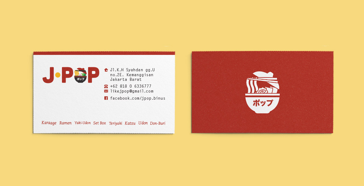
The concept for this was to keep the design at a minimum size as possible—since the stall was quite small—and to keep it somehow friendly. Imagine yourself in an evening’s chill eating ramen inside a small friendly shop. Oh, and the red colour is actually cliché. You know, it’s Japan. To increase appetite like you would encounter in common fast food chain restaurants.
Roles:
Design
Printing
Printing
This work is part of my university assignments. Any photographs used might belong to their respective owners.